About

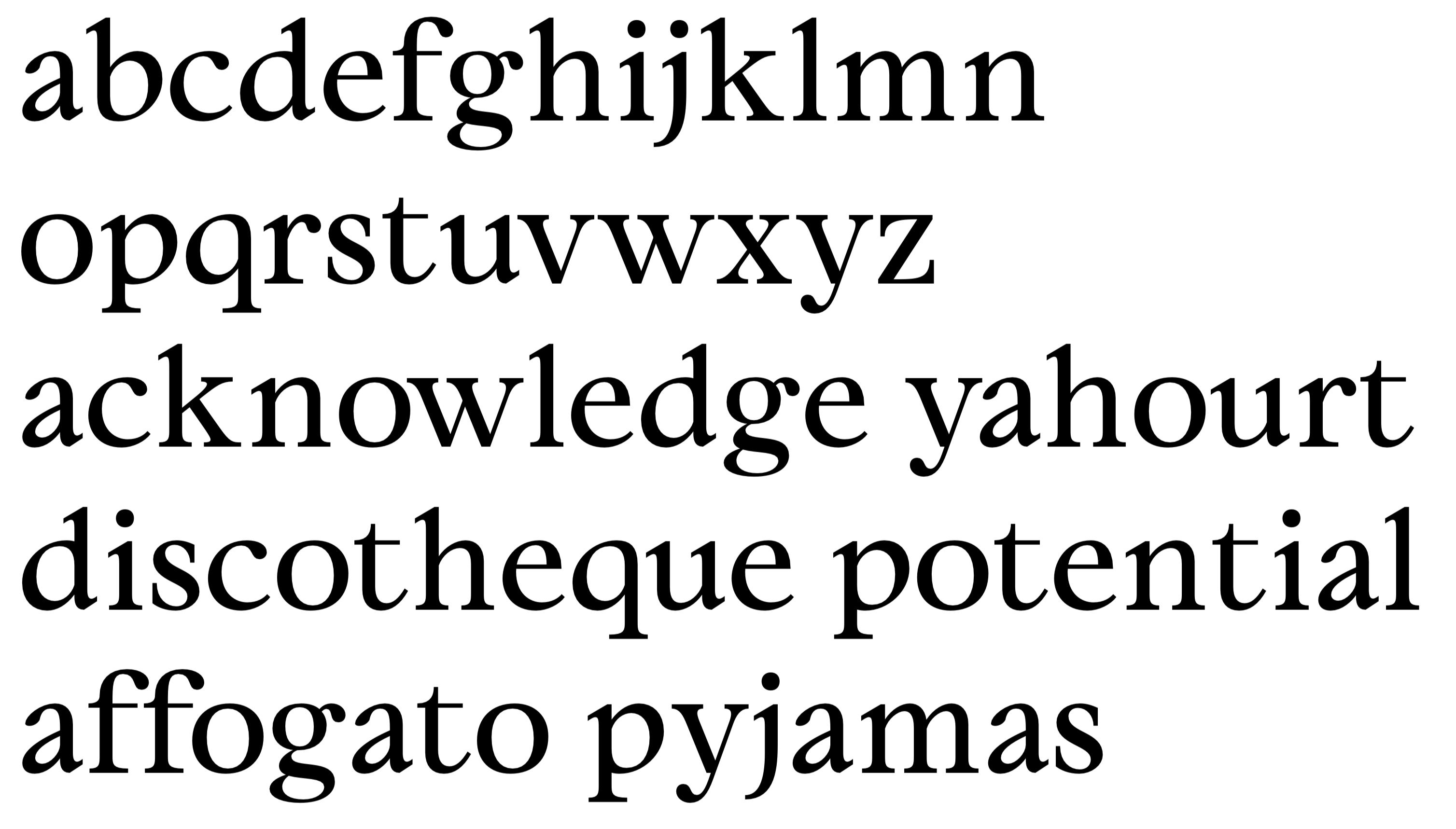
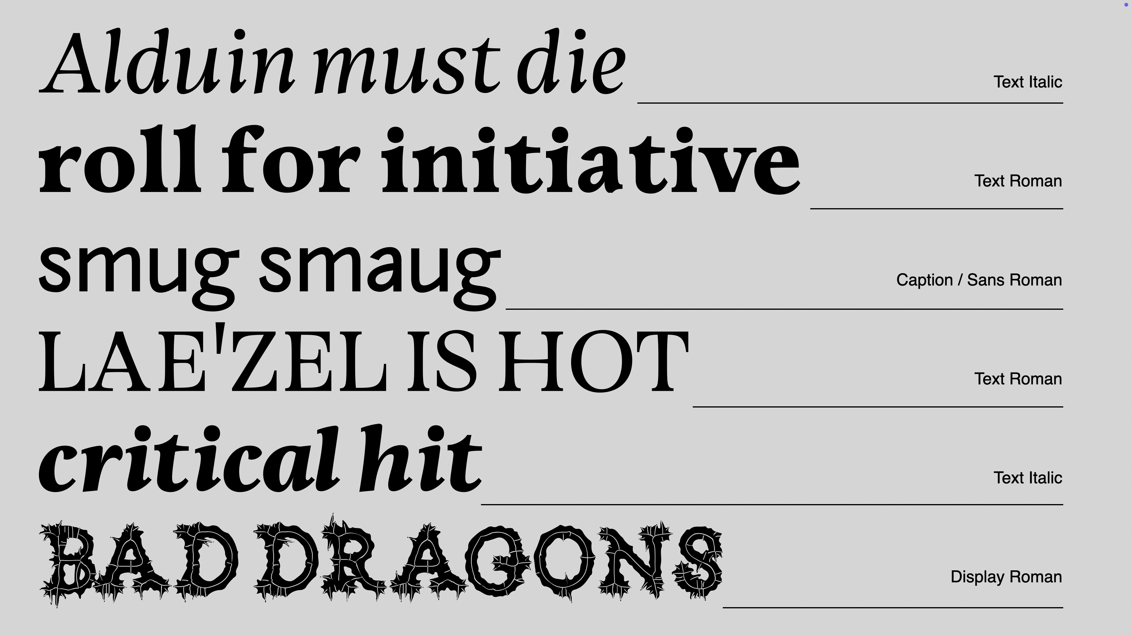
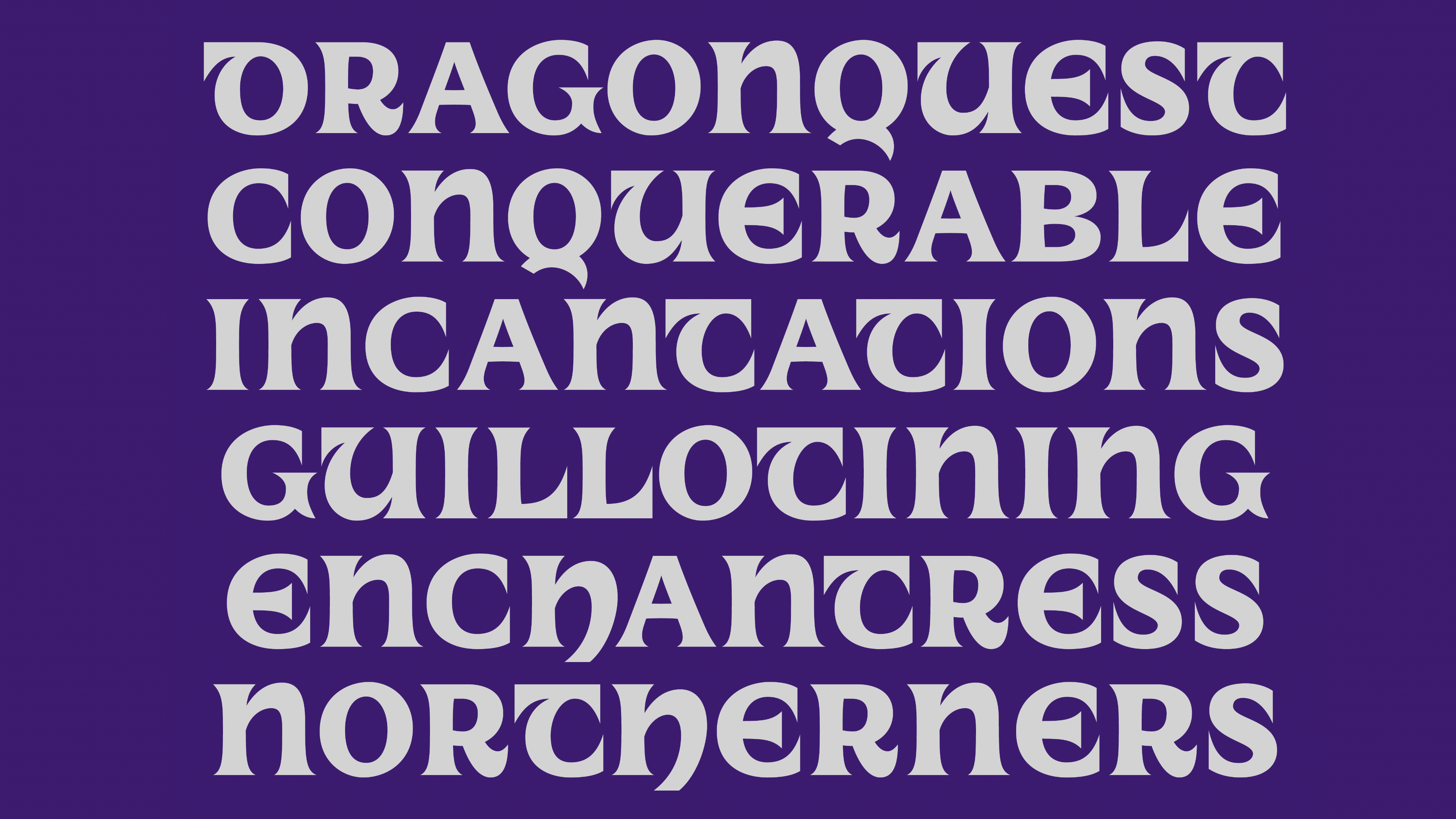
In the land of Gods and Monsters, type is a fantasy. Type is an artistic endeavour. Type is a world. Fantasy is my escapism. I find immense comfort in the imaginary worlds I create, in my mind and in type. It is not that reality is not fulfilling; type enhances it. Type is a conduit for enchantment. For enchanting myself. A portal to realms yet unseen. Type design is creating letters. Letters make words, make sentences, make texts, make books, make worlds, and universes. Shapes of letters matter as much as the meaning of the words they compose. They are as much of a vessel for storytelling than the images the words invoke.

One might see type as purely utilitarian; I see it as a powerful source of magic. Building a character set leaves me in awe. Every time. I am expressing imaginary worlds without words. And yet with so many letters. Transcending confines of conventions, evoking profound emotions and narratives, is the true power of type design. I approach type like a fighter and a scholar. I conceive typefaces whose intent is to embody the feeling of utter joy that letters give me. In this world, though reality and fantasy blur, digital realms intermingling with tangible experiences, type remains. Quoting the powerful character Yennefer in the Witcher book series, my favourite invented universe of all time: "Magic is Chaos, Art and Science; it is a Blessing, a Curse, and Progress". And Magic is Type Design.
My name is Anne-Dauphine Borione, also known professionally as Daytona Mess (a nickname inspired by Lana Del Rey's song Daytona Meth), but everyone calls me Ando. I am a French, display and experimental type obsessed type and graphic designer. I am known to explore the fine border between legibility and illegibility, readability and unreadability, a practice infused by my years of studying fine arts at the Central Saint Martins where I graduated from in 2016. After a master degree in Typography and Graphic Design from the ECV Paris, and completing TypeMedia, I taught at the ECV for a year in Paris and am now working on building my fantasy themed future foundry, TypeLair. When I am not type designing, which frankly almost never happens, I can be found wielding my sword and casting spells, clearing Faerûn of goblins, playing loud pop music, but mostly riding or slaying dragons, depending on my mood.

Dargon is my first ever text typeface. Let me tell the tale of how it spawned into existence!

Process

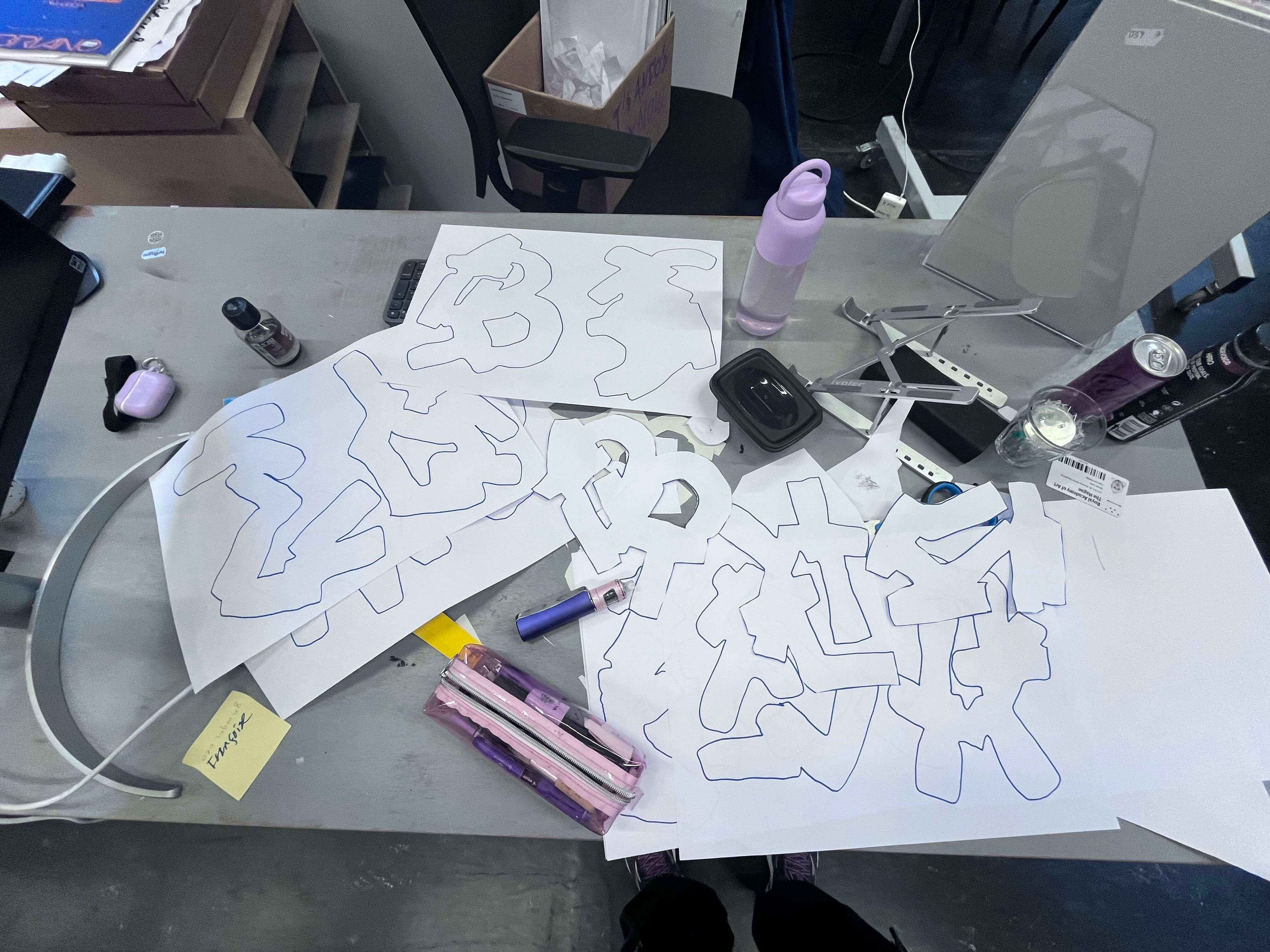
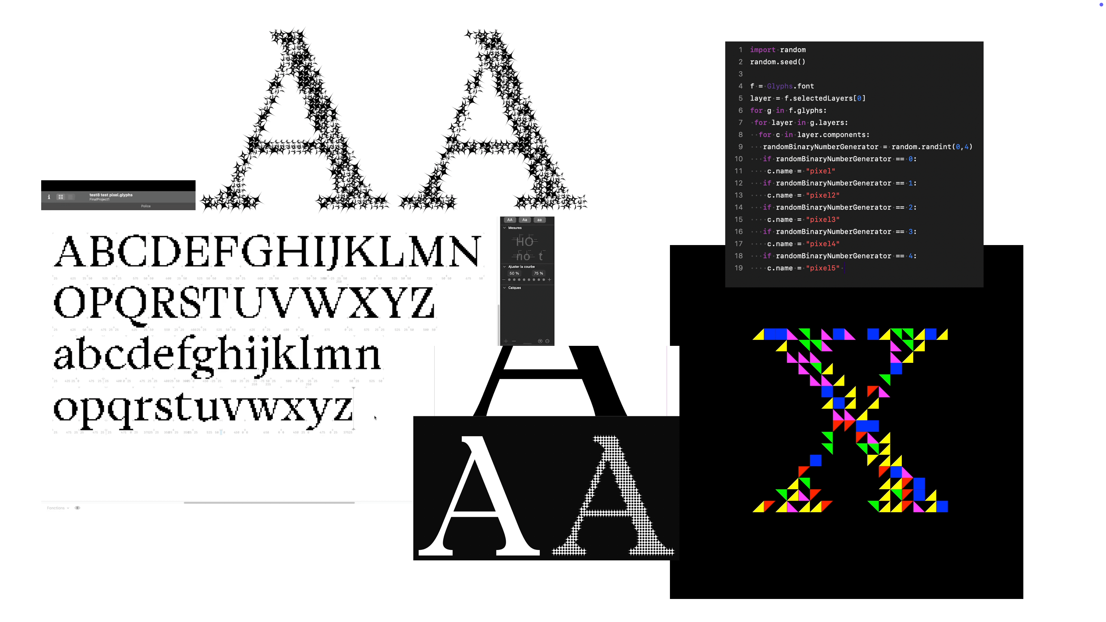
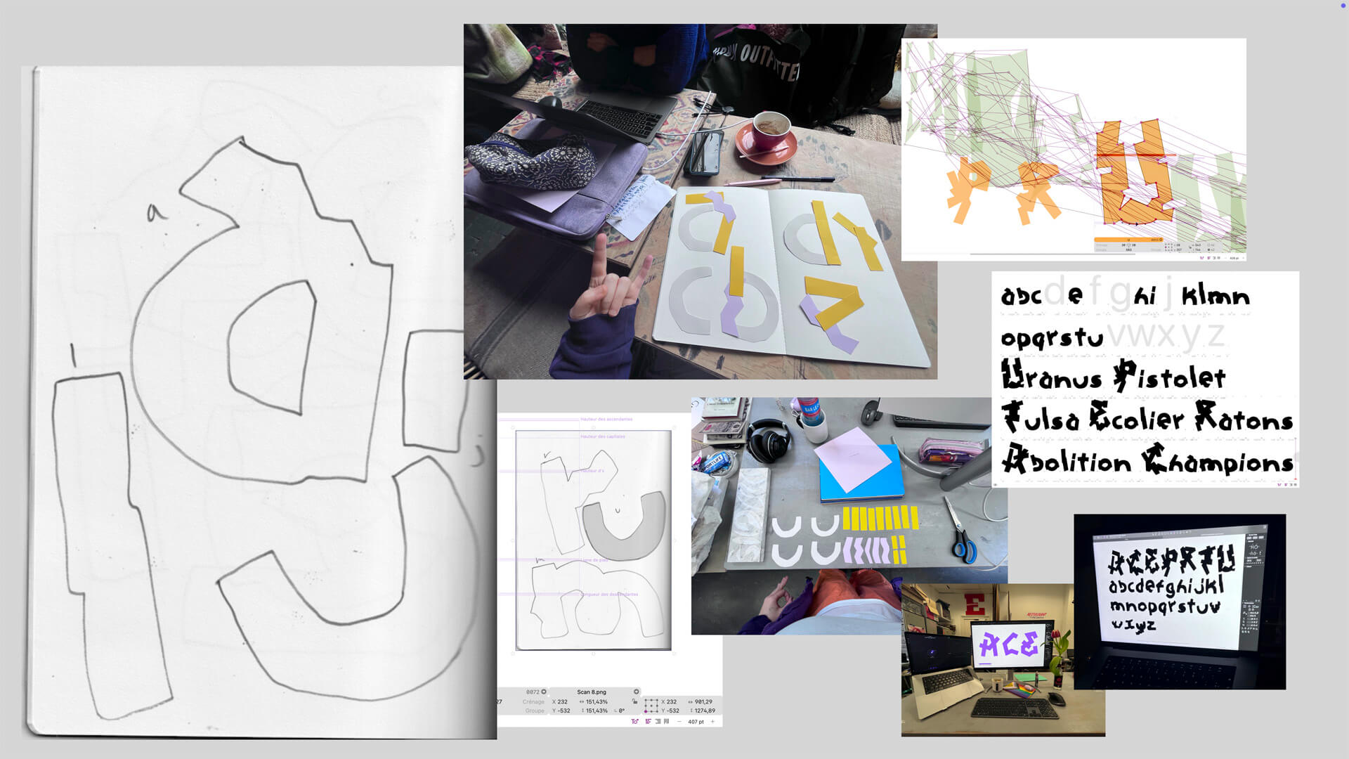
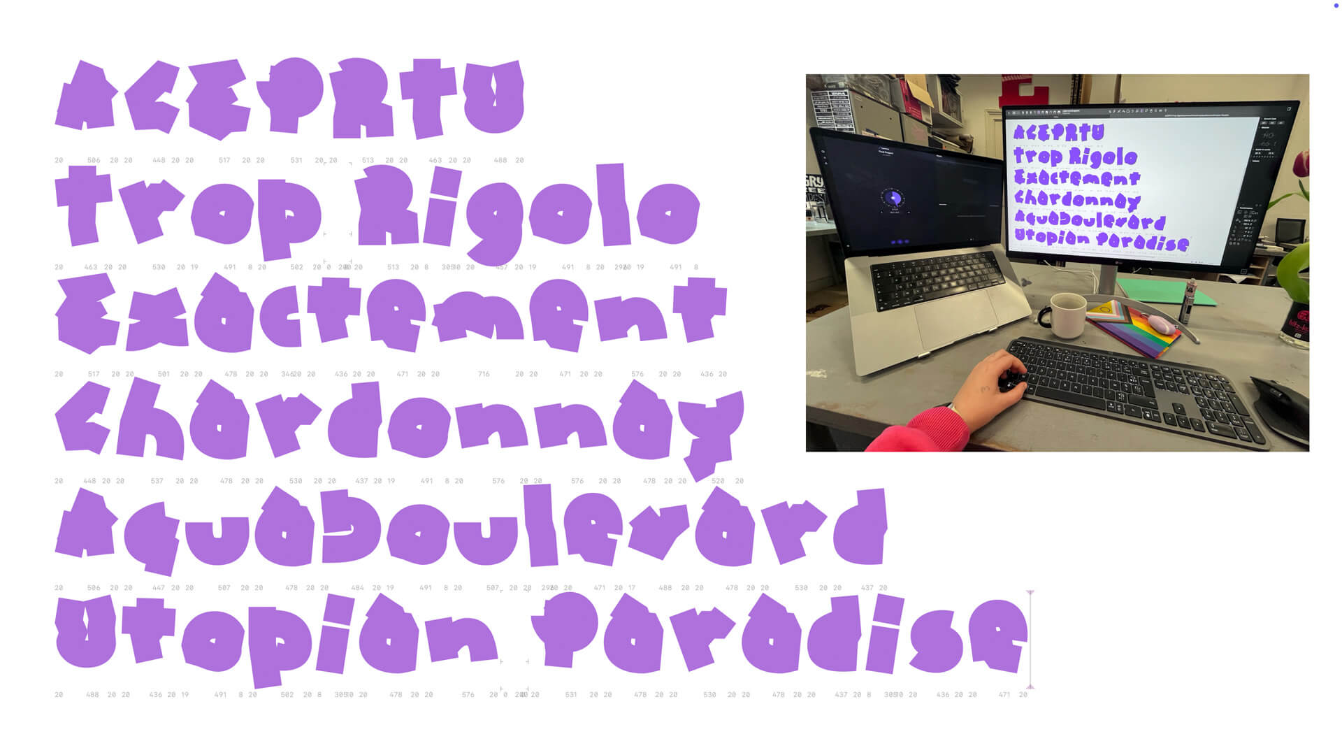
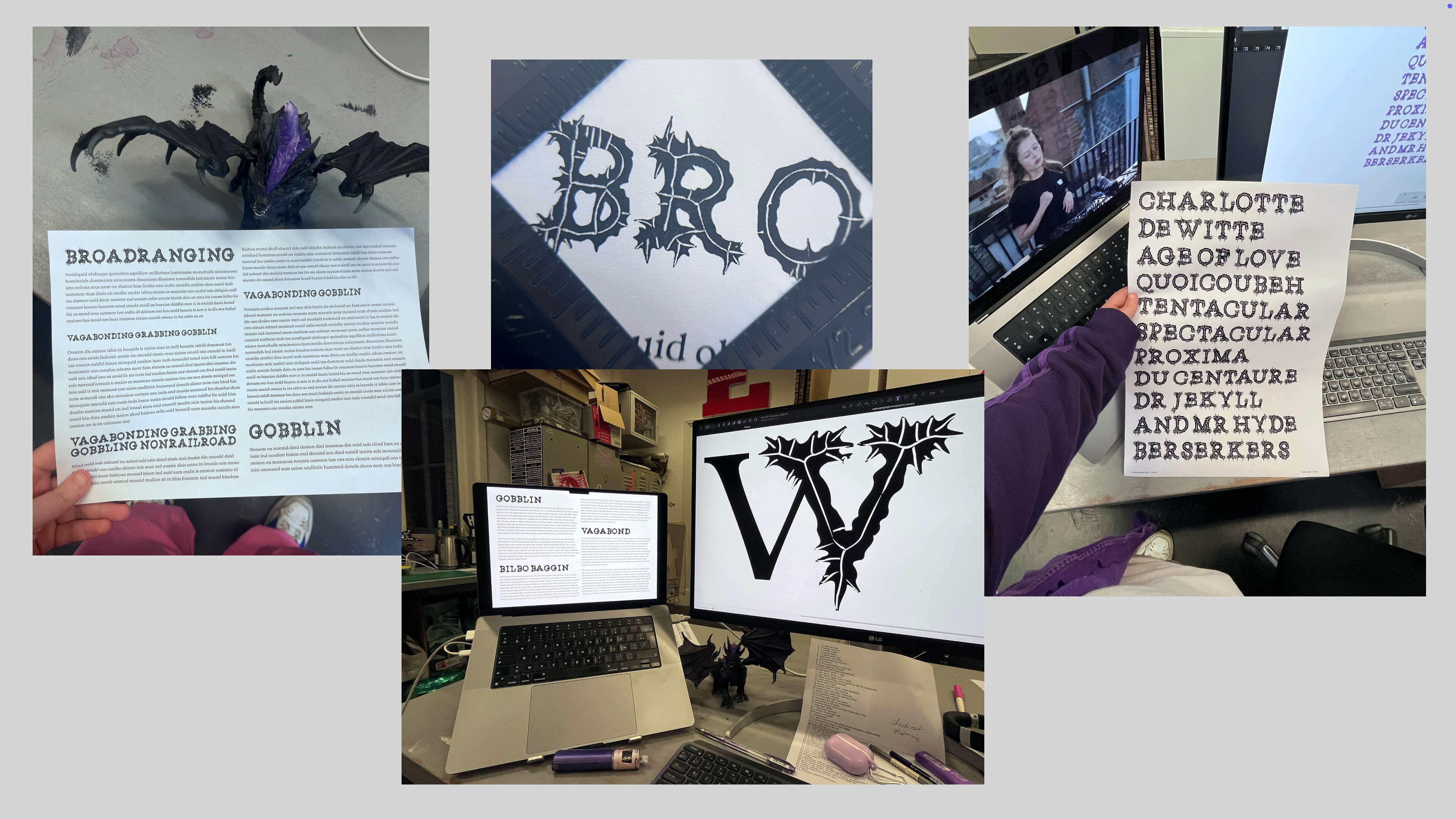
Dargon was originally not meant to be. I approached the final project kick off with a mind full of display type ideas, as per usual for me; the tool, the skeleton, the module, the world, the parasite. The trait all these ideas had in common was simple: I wanted to get out of my comfort zone and prove myself I could explore something I had never tried before.

After toying a lot with the idea of the tool, I am very grateful for my classmates for showing me that in my case, a text font would actually be the most interesting approach in order to reach this goal.
I started sketching from my contrast project class from the first semester, and the draft of a text typeface started to unravel, with all its kinks and learning curves. I proofed a lot, which was very new to me.
I realised, I did not want to just draw a "perfect" text typeface, because it wouldn't feel truly like who I am. I promised myself to put all my expectations to the side, and to have one mentality to rule them all: trust the process.
I also started sketching a display, and at this time, I was already starting to name my styles with Dungeons and Dragons classes, as I was very interested in the concept of conceptualising design spaces, and also was getting obsessed with Baldur's Gate 3.
I made a few detours, notably exploring my paper cut modules idea. I was still hesitating between this idea and the text font at this point, but quickly took my decision to go with the latter.
I had a typeface draft, but no context. Weirdly enough, the answer didn't came to me right away. One of my teachers asked me, what is the scope of your project? Well... If you know me, you know fantasy is a huge part of my life. I love almost everything about it.
Once I settled on fantasy, the first context I dived into in order to determine my design space, is collectable playing cards. In particular Magic The Gathering, that I have loved the aesthetics of for a long time. I looked for the styles used, for the weights used, and used my findings as a basis for my design space. I knew I wanted Text Regular, Text Bold, Text Italic and Text Bold Italic, and maybe a display and a display italic. In order to have a feel for the display, I started researching posters and book covers related to fantasy. Which helped me determine I actually wanted to try a display that would be more flavourful than what I had before.
To recapitulate, I was doing a family, based around the concept of fantasy, with at its core a regular text weight. I was really happy with the direction I was going in, having a lot of fun and doing the unexpected.
I made a lot of back and forth mentally to try to figure the boundaries of my context, because it’s hugely important for me to determine my design space, as the concept has a capital influence on it. What I honestly like the most in fantasy is stories of, you would never guess it, dragons, so I was wondering if I wouldn’t base my design space on it.
I looked at a lot of board, card, fantasy, games in general, to find a specific usage, as I originally wanted a board game as my application. I went to the board game café next to my place, and looked at fantasy games to see which typefaces were used in the manuals and on the packagings. I wanted to see which styles and which weights had which usages. By April, I was thinking that my typeface could be used in a variety of applications, such as for instance a remake of Dragon magazine, layouts, a website header and book covers in its display style, and yes, also board games and card games, maybe books. I kept thinking back of the cards. I let go and chose it as my main application. Once I had my application, I went through many iterations of my design space. Once again my classmates proved incredibly helpful in determining what I wanted, but it remained a question mark for a long period. Based on my analysis of the anatomy of a playing card that I had been looking at, I started sketching a potential, more accurate design space. The idea would be to have in place of a picture, either an illustration, or something else, in a setting. So for example, a specimen could be a deck of 26 cards, for each uppercase of my display.
But let's go back in time a bit. Honestly, once I determined I wanted to do fantasy, everything became smoother. Thinking about it, I actually did NOT want a more flavourful display, as I originally thought I would; I was having too much fun learning how to do text. I am glad one of my teachers encouraged me to try it anyway. After a rocky start, I pushed through and finally I managed to go to a direction I liked. I wrote down the instructions to reiterate the 28 process steps I took to experiment, and chose one of the steps.
The display that resulted is my interpretation of something draconic in type, such as fangs, wings, or scales. It could also be reminiscent of obsidian stone, stalactites and stalagmites, it’s open to interpretation.
I started a colour font with the intent of creating something reminiscent of magic, and also gold engravings, aging type on old book covers …
All these ideas were difficult to work with. I decided to go back to the drawing board in terms of display. I first researched generic fantasy display and dragon typefaces. I also found some video game covers from the eighties that I absolutely loved, and who had an uncial feel. I started sketching for an uncial inspired style. I produced a lot. I finally settled on a name for my family, Dargon. I chose playing cards as my main application.
In parallel, I continued developing the text, including an italic as well.
Soon graduation came, and so I started working on the process book and specimen … In my kick off presentation, I wrote three simple words as a guideline for the entire project: surprise, expand, experiment. I am elated to say that a text font was the key to reach this. Dargon is the recipient of the 2024 Gerard Unger Scholarship by TypeTogether.

Specimen

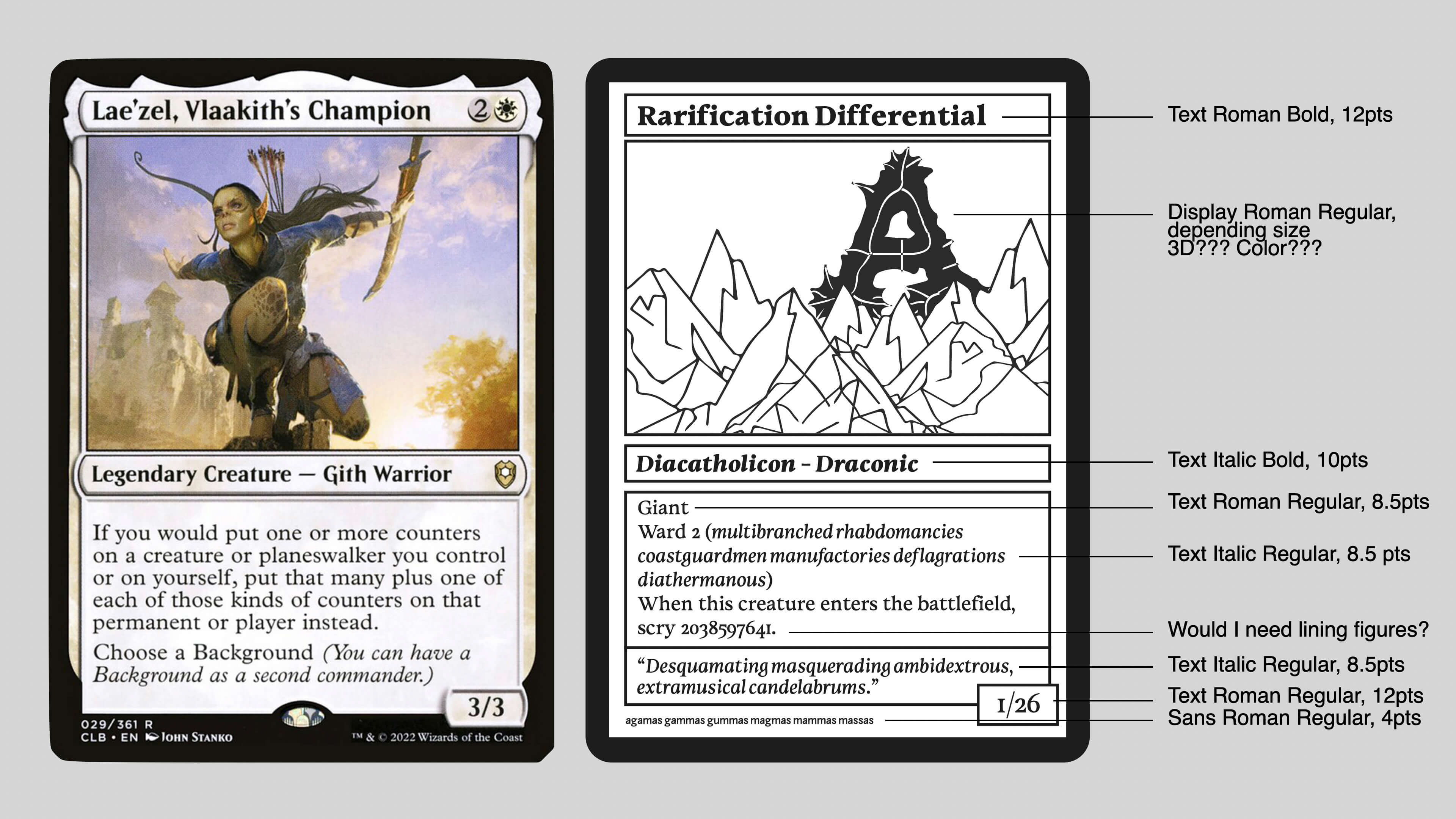
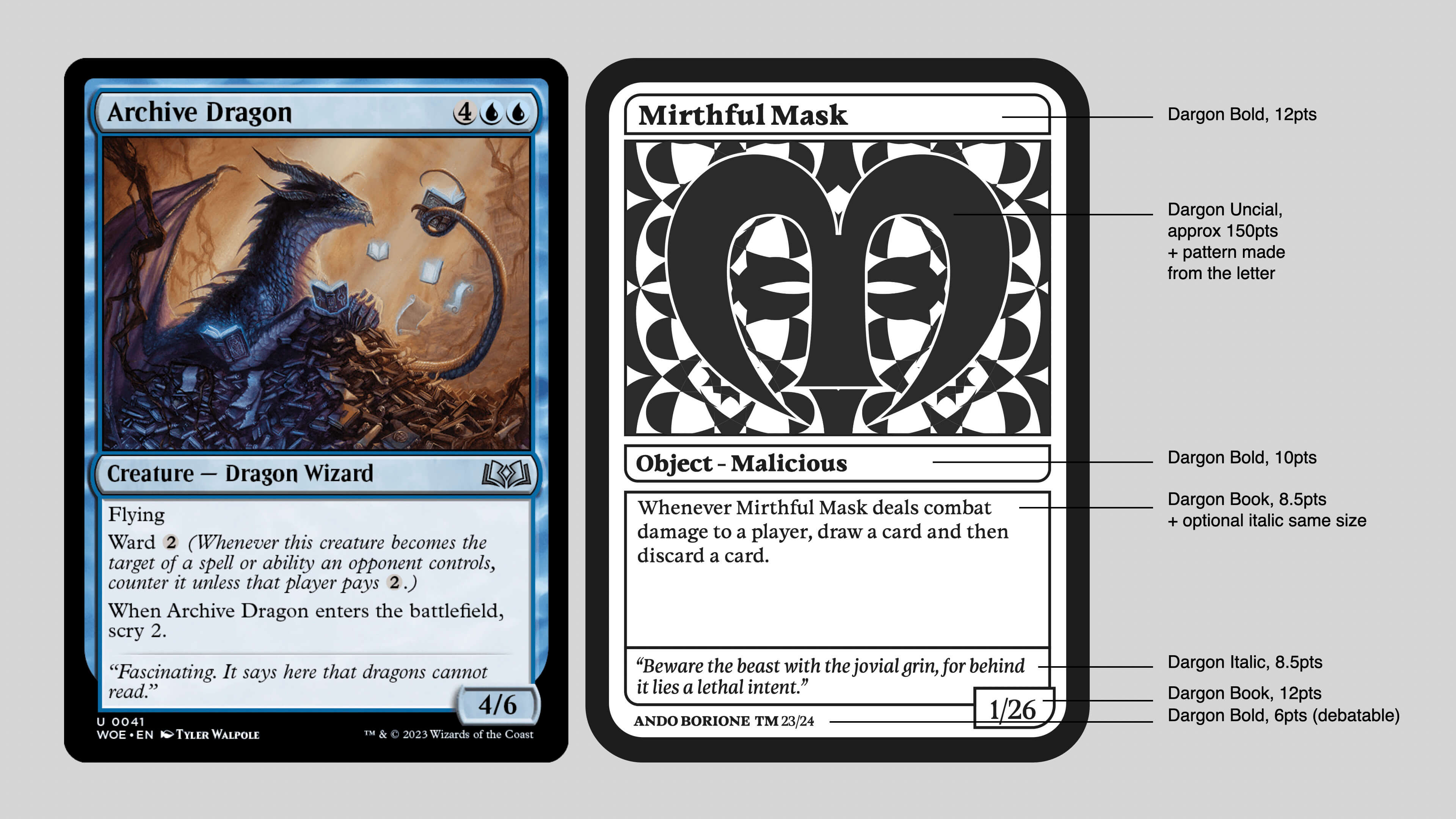
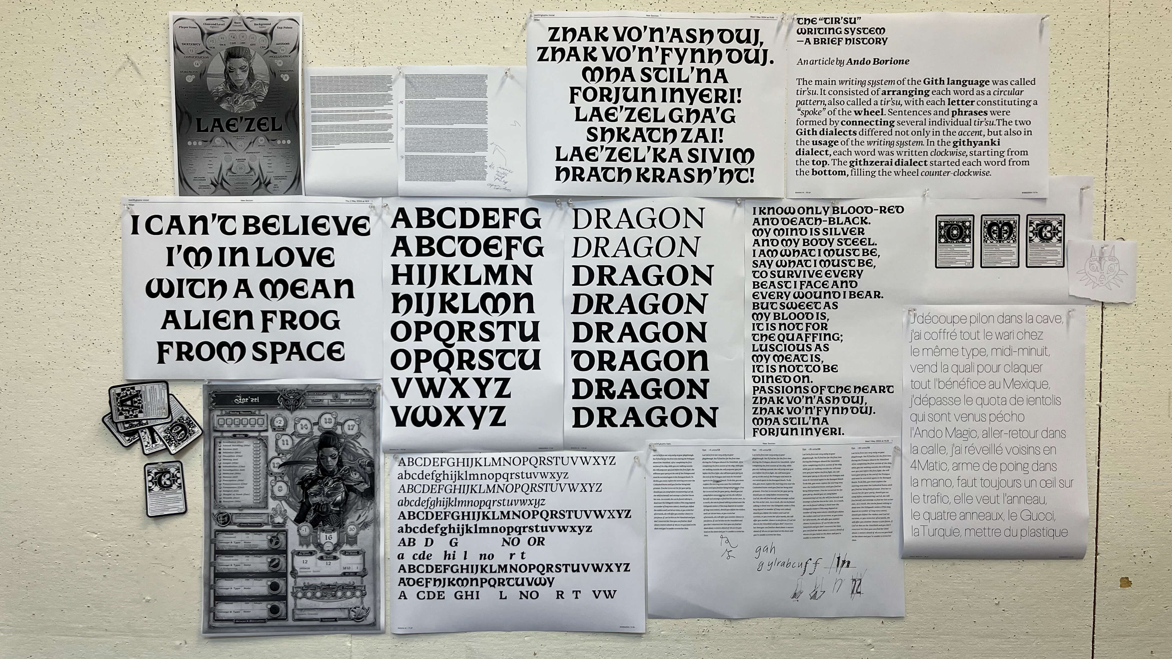
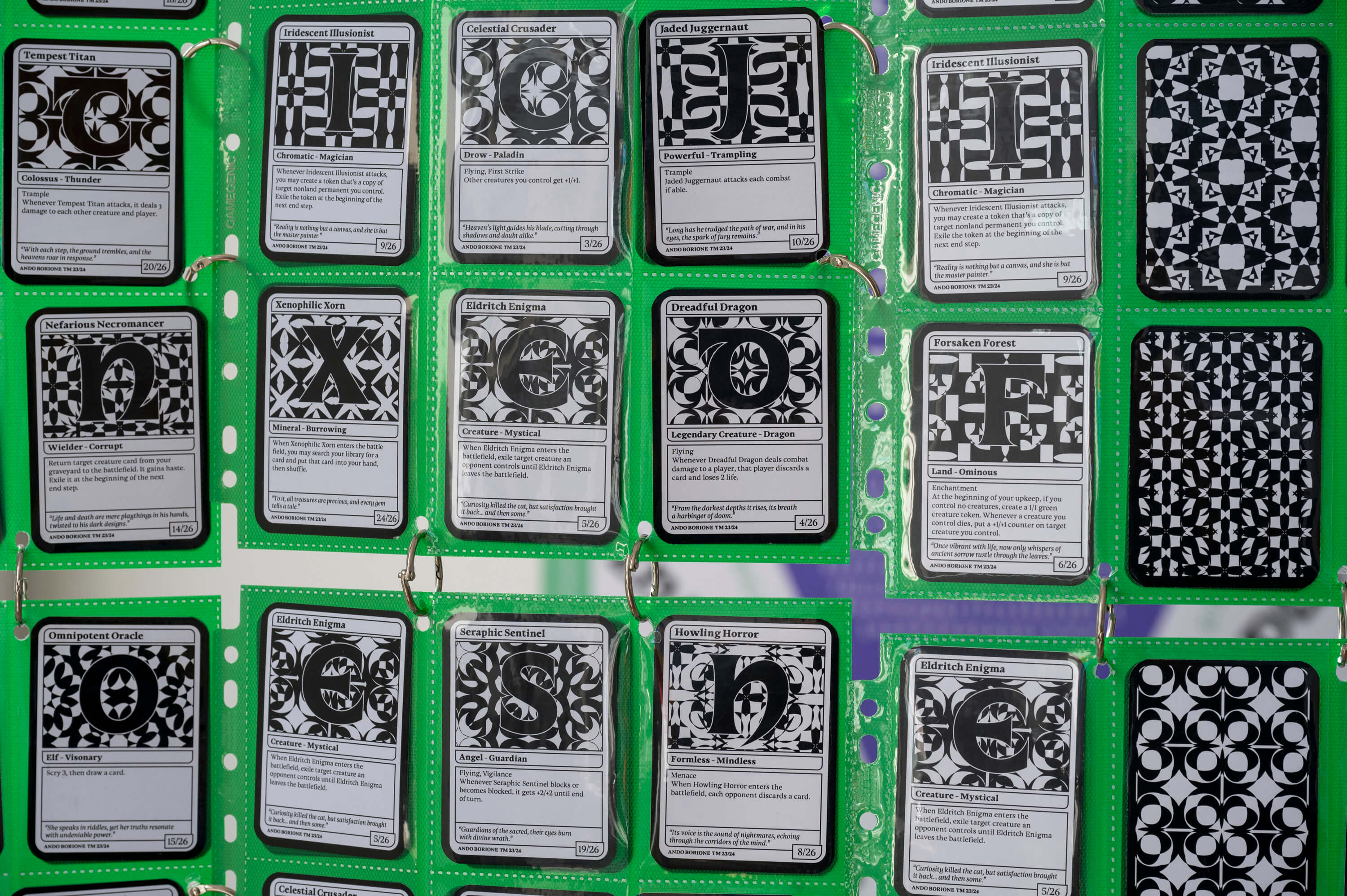
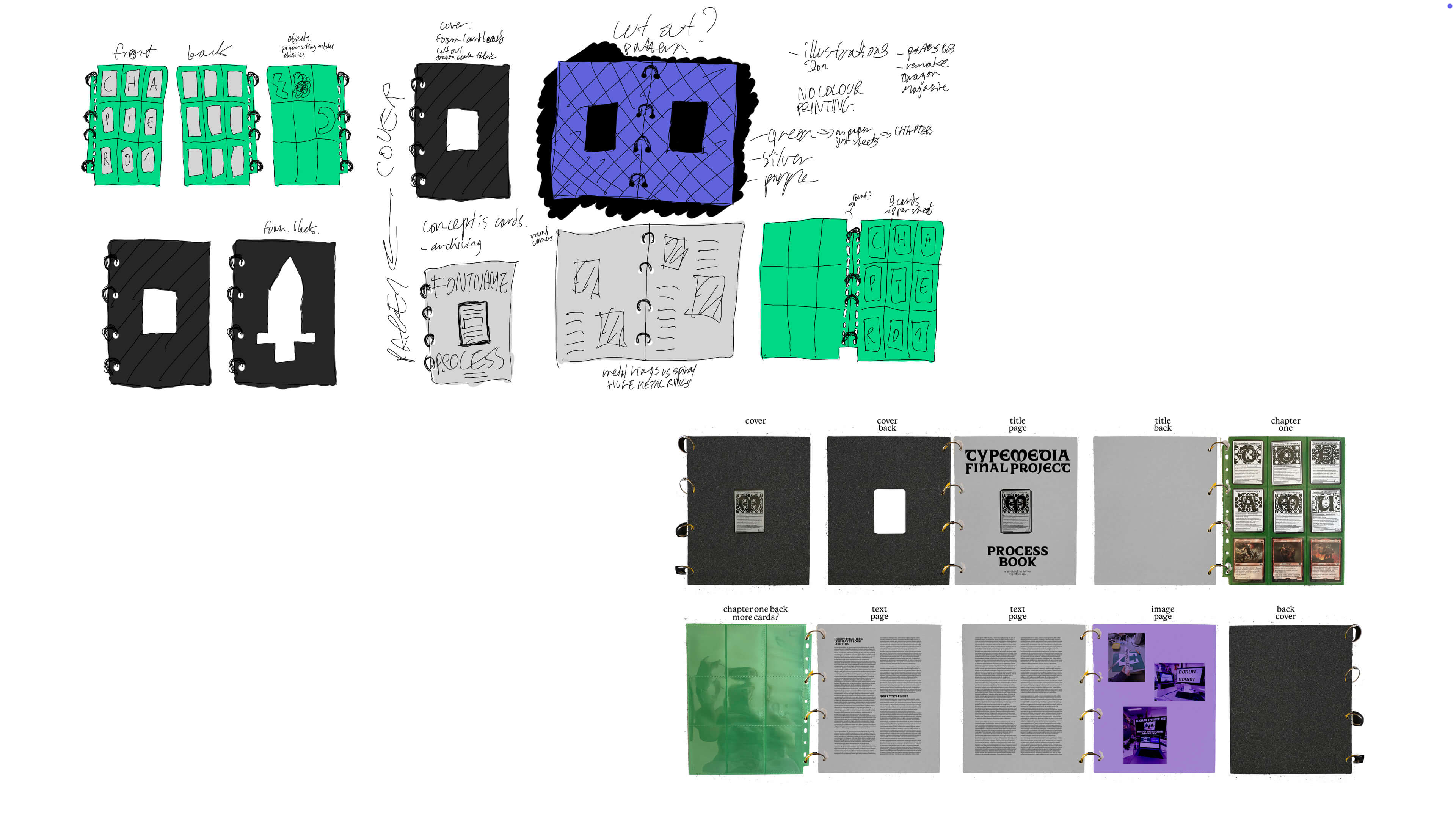
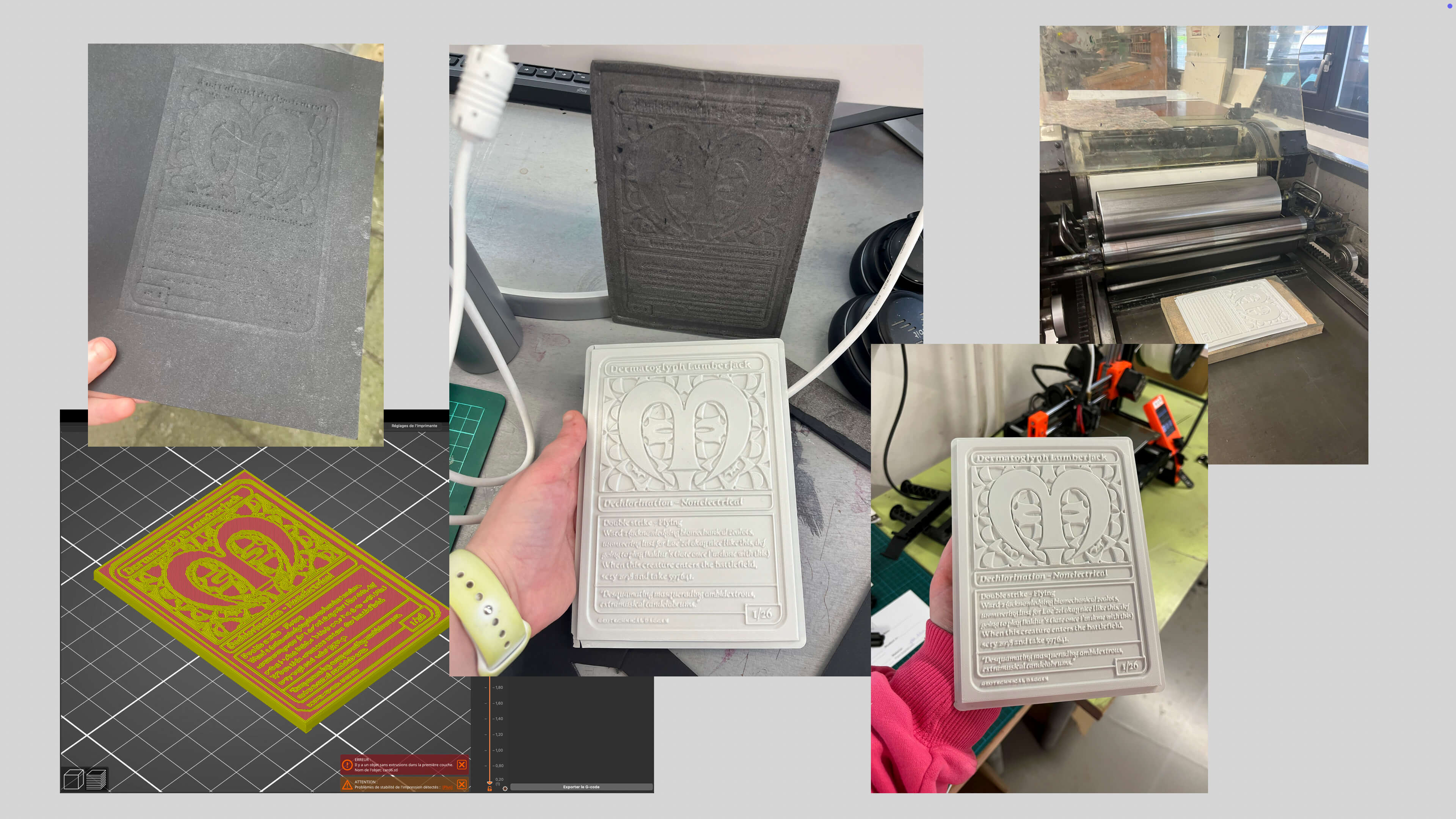
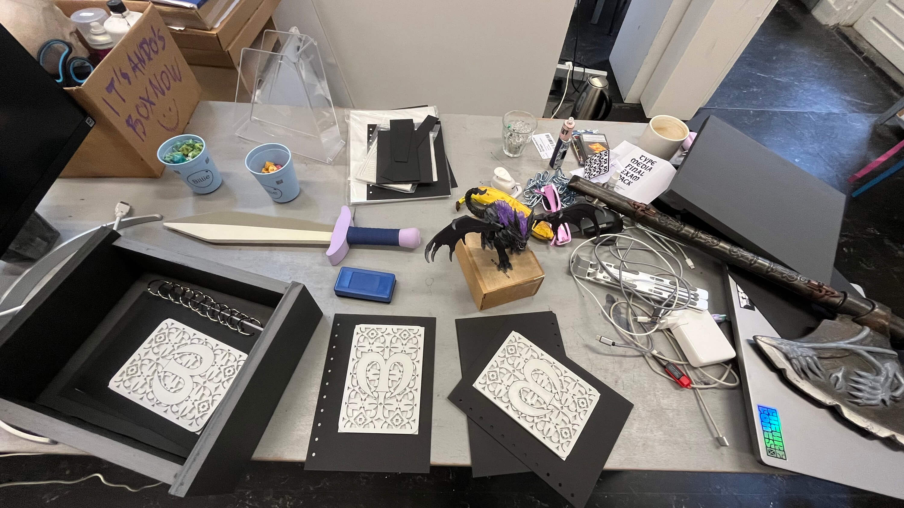
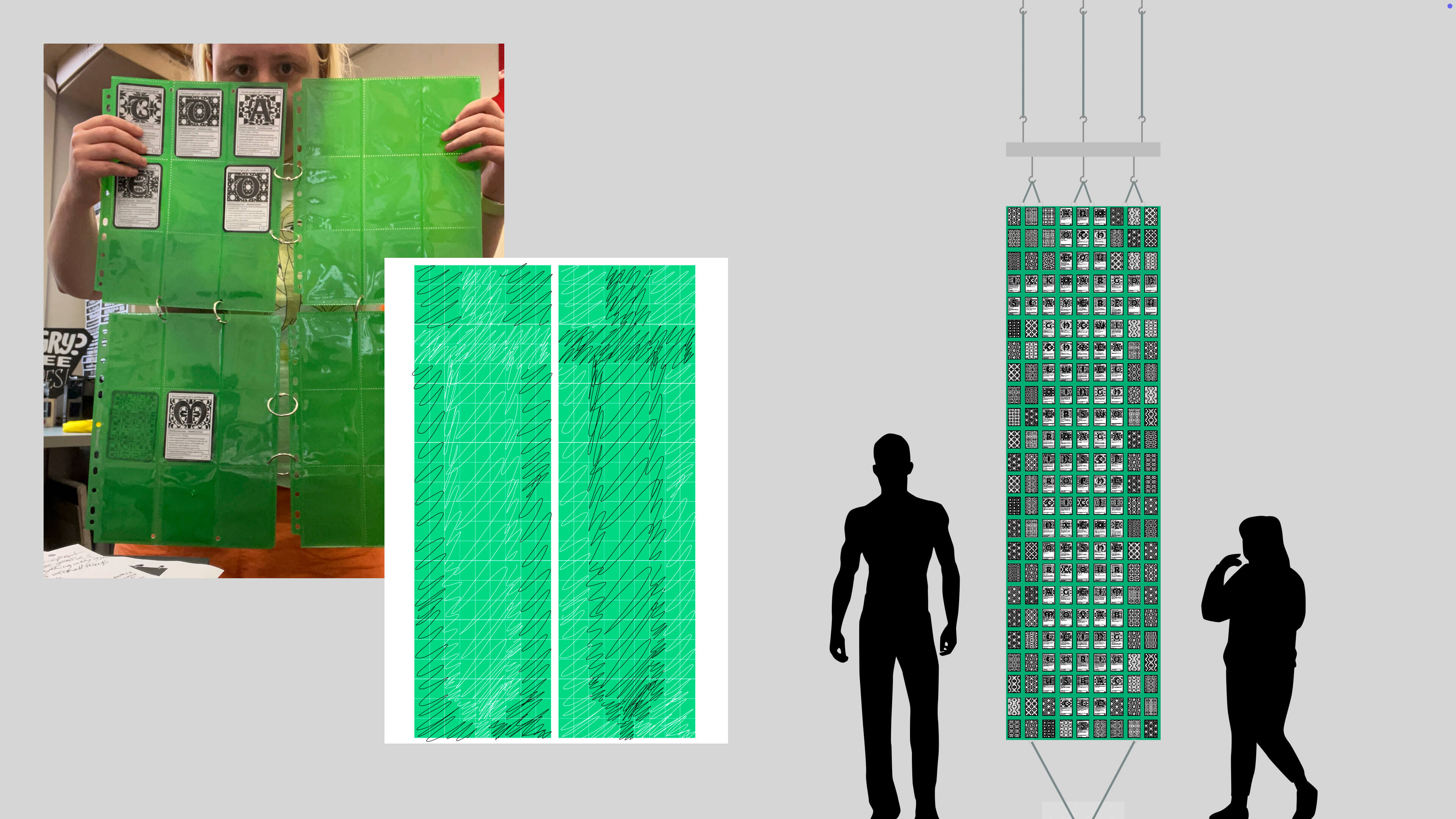
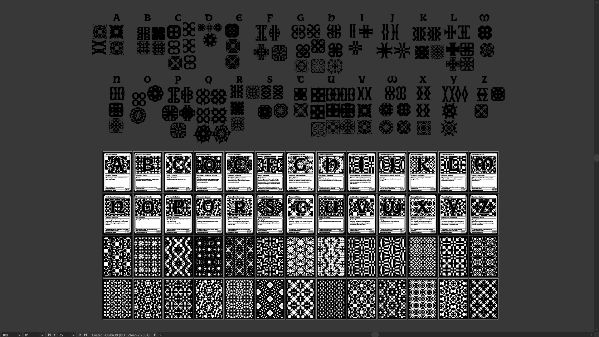
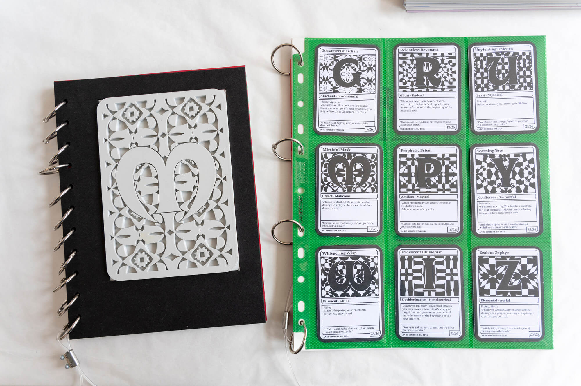
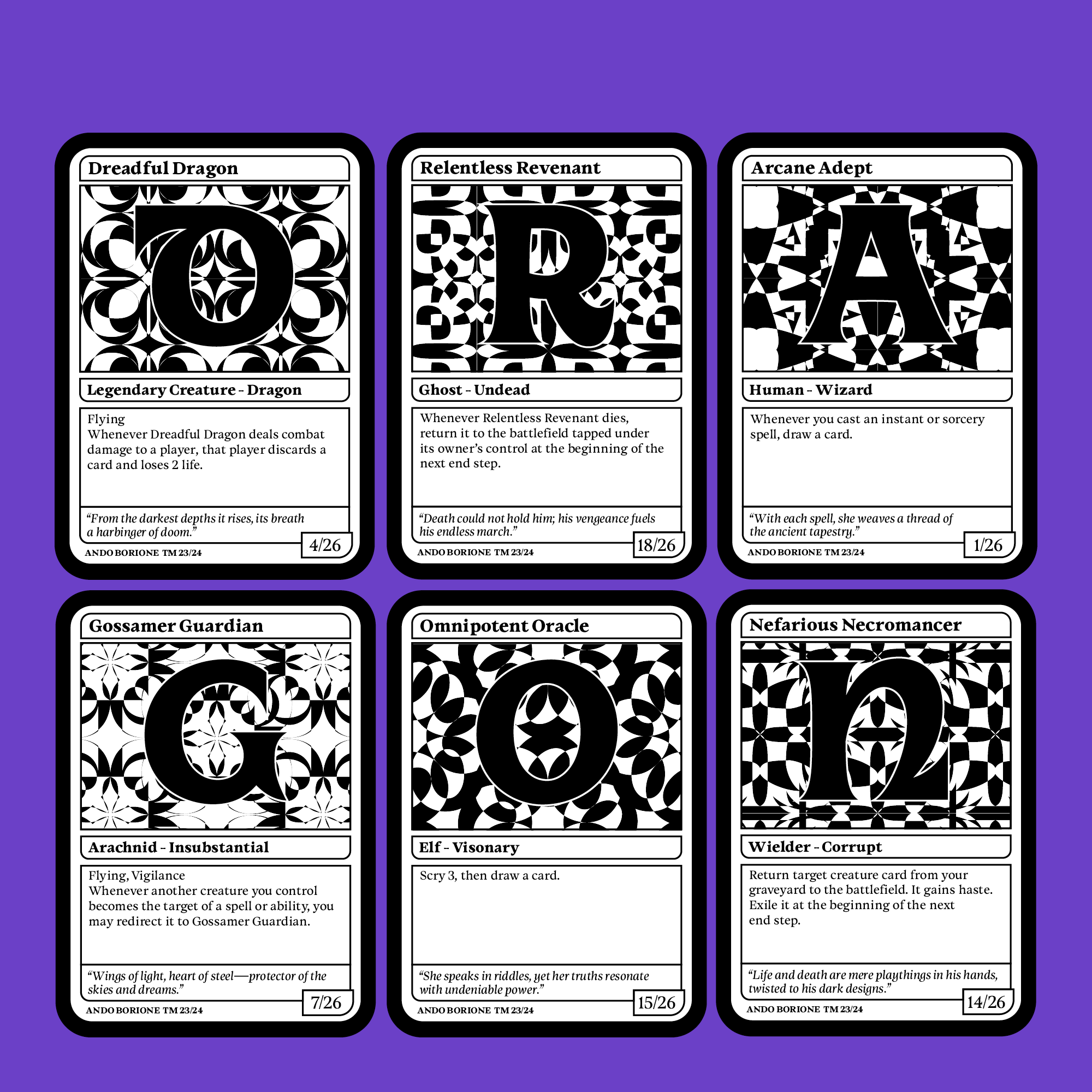
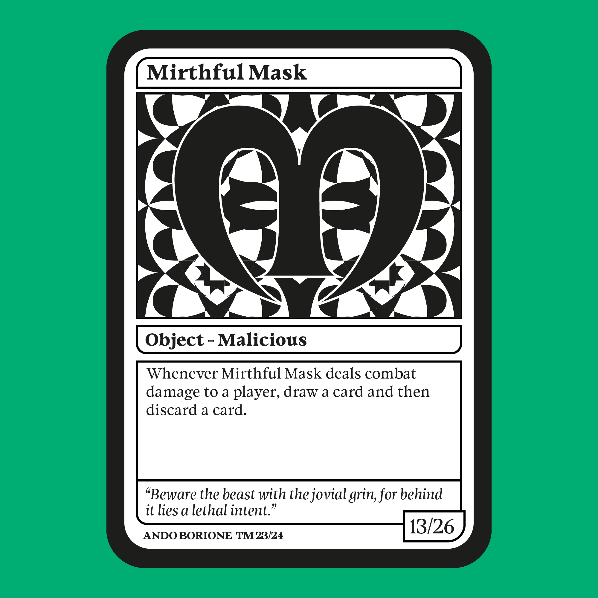
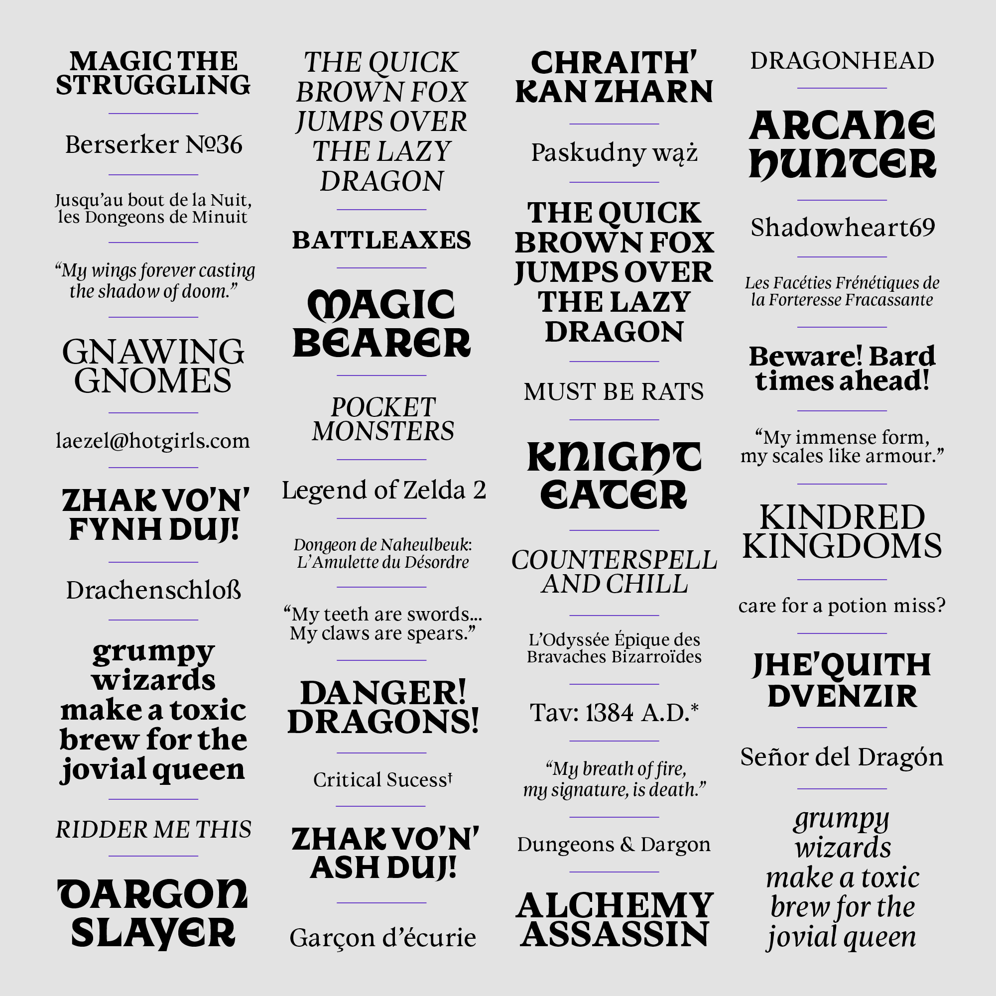
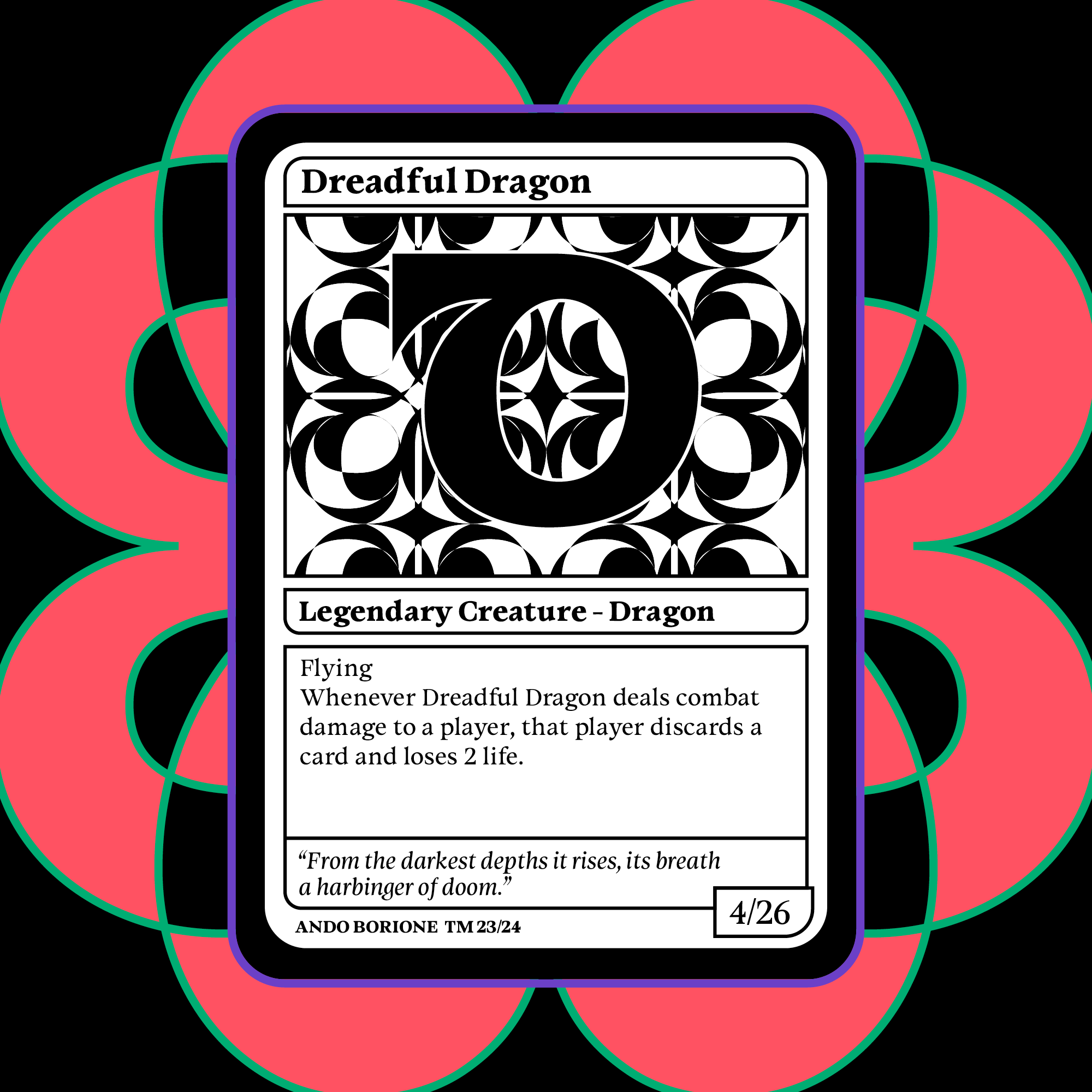
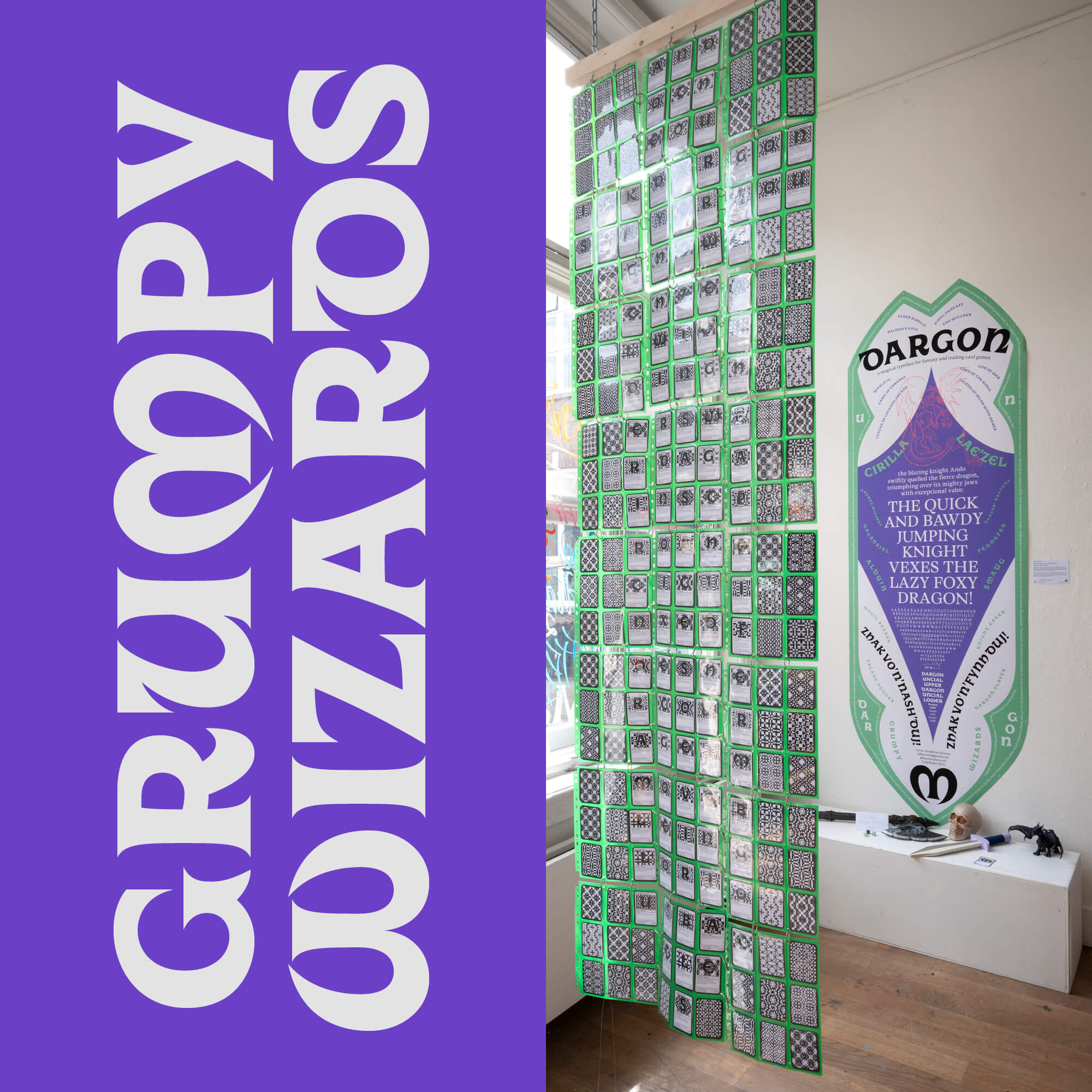
When it came to making the process book and specimen, I knew I wanted something related to my main application, collectible playing cards.

I sketched process book ideas, and made some tests at the 3D printing workshop: printing a big card for my cover. I went to the letterpress workshop to attempt to emboss it. It was very fun. I really wanted to start using my typeface in context, so as part of my specimen, I started remaking Baldur's Gate 3 character sheets and Dragon magazine covers.
I discussed with one of my teachers the possibility of creating an installation called Dargon Slayer, based on the cards I was planning for the specimen. I started building it extensively, and it was featured in the graduation exhibition. Over 400 cards total, making pangrams, in the shape of a sword. The back of the cards were patterns made from each letters.
In the end, I am very happy with my process book and specimen :)
I wanted Dargon to be an exploration of something I had never tried before, and as much as I love editorial design, I had never worked with cards before, and I still do today. I had so much fun. Here are a few images of the final digital specimen for Dargon!

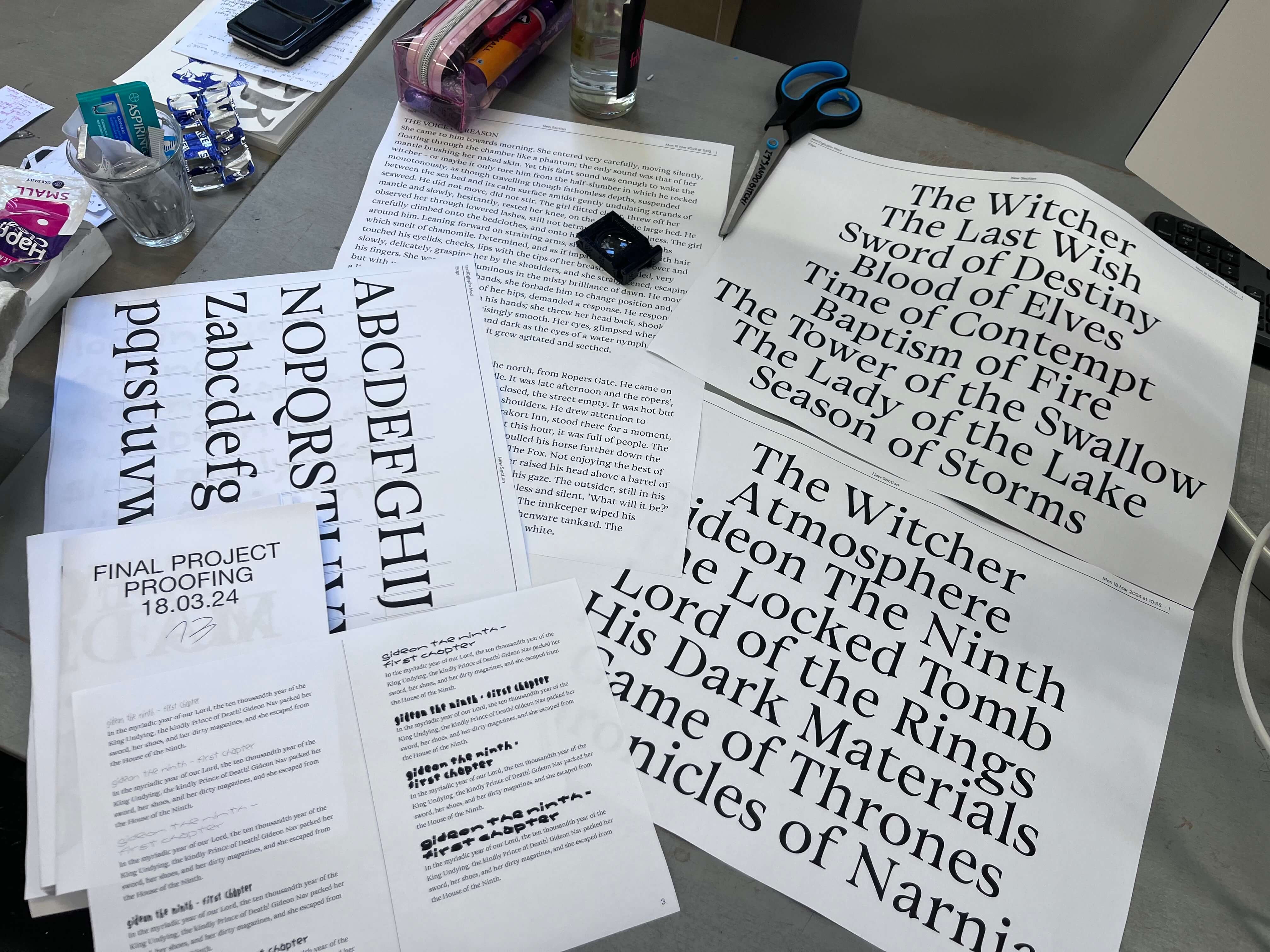
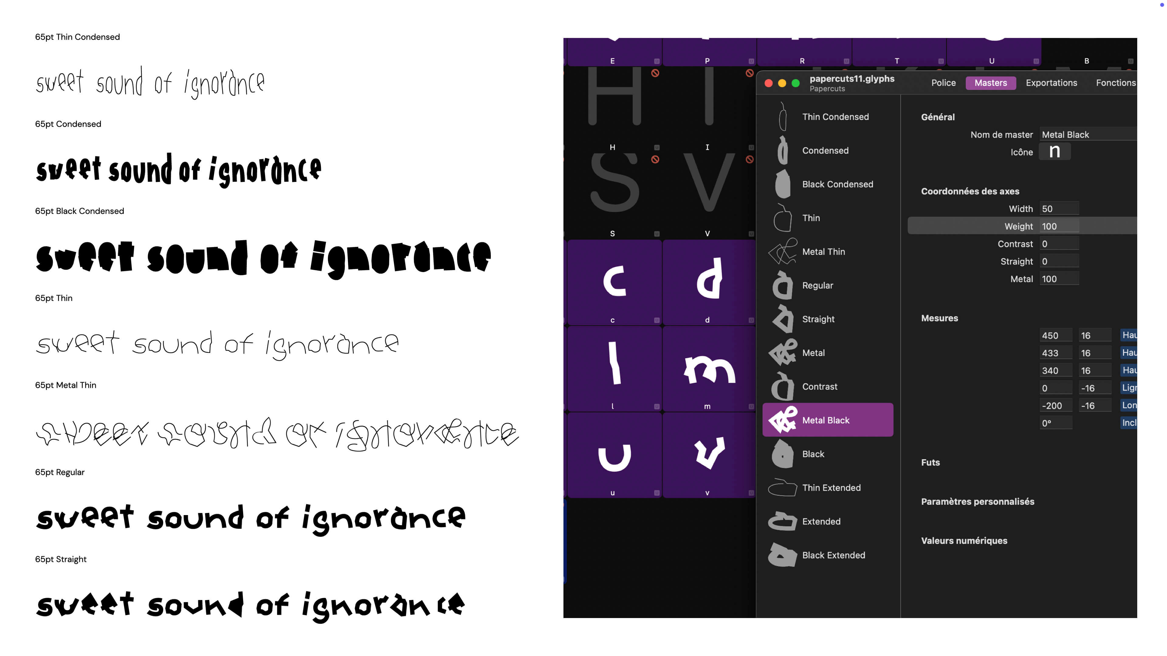
In conclusion! In my kick off presentation, I wrote three simple words as a guideline for the entire project: surprise, expand, experiment. I am elated to say that a text font was the key to reach this.

Dargon is the recipient of the 2024 ↗ Gerard Unger Scholarship by TypeTogether.

Thank you so much for reading! Please don't hesitate to reach out if you wish to discuss letterforms or fantasy with me :) Even better if both!