Aerograf, by Felix Bamforth, is a project that, along the way, took several shapes, twists and turns and explored multiple avenues before becoming what it is today.
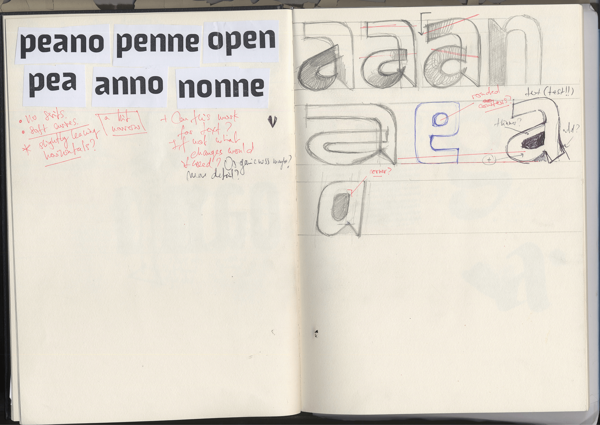
This allowed the exploration of several topics, looking to understand their significance in the context of type design. Most of these topics gravitated around the question of what constitutes an ideal creative process: How does one approach sketching? How can programming be embedded in the design process? What is the value of originality in type design? How to use reference material? How do you manage an increasingly bigger design space? How do you think in systems?
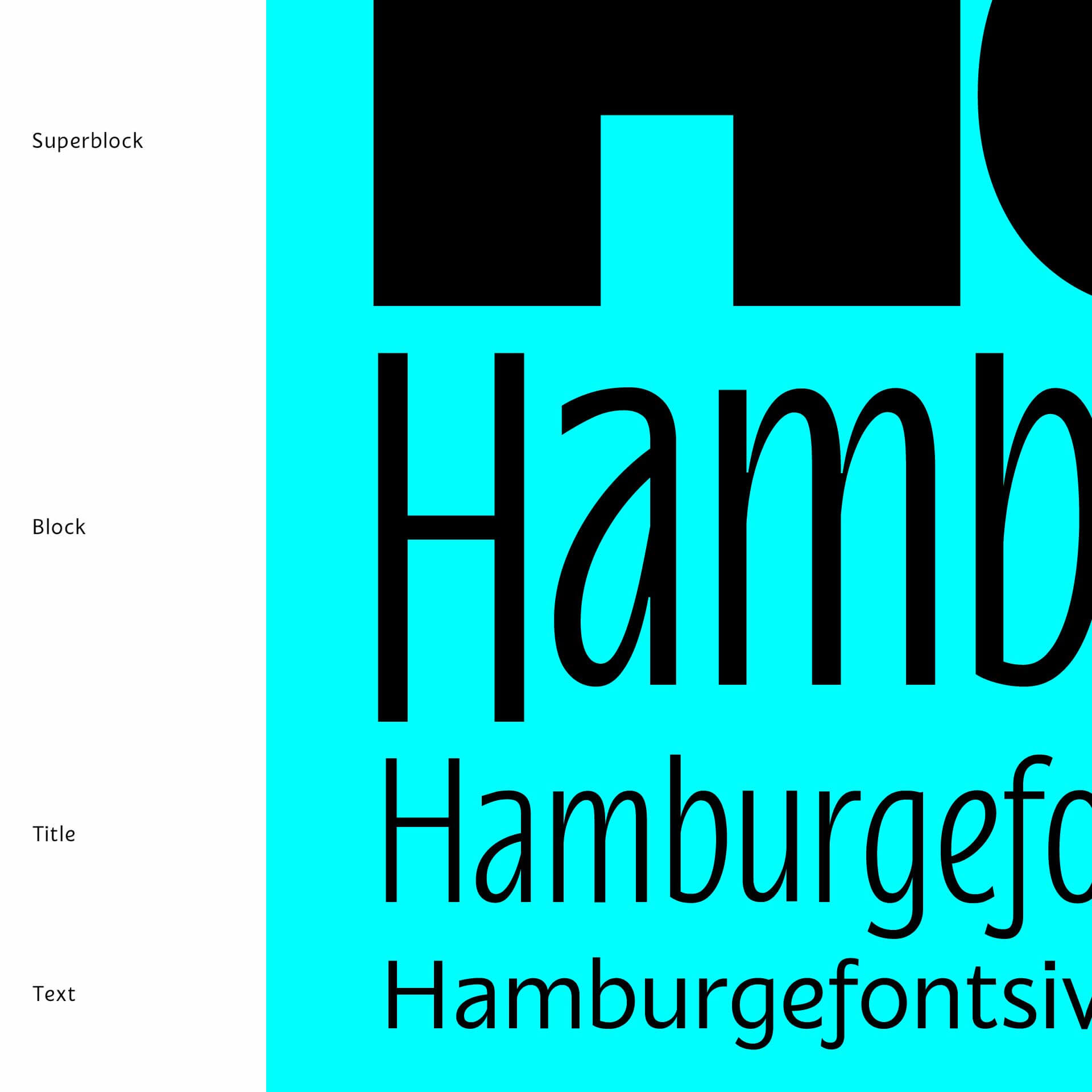
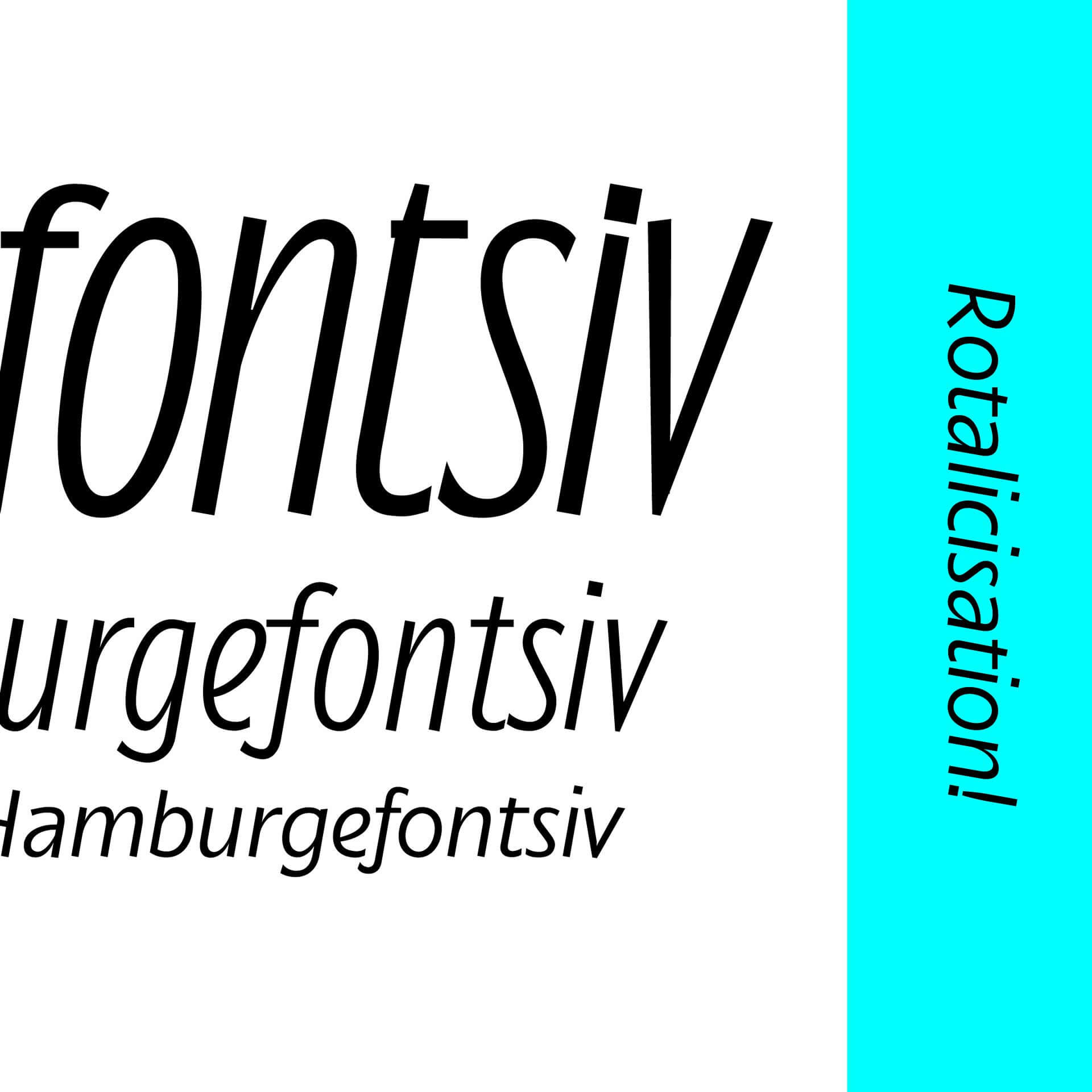
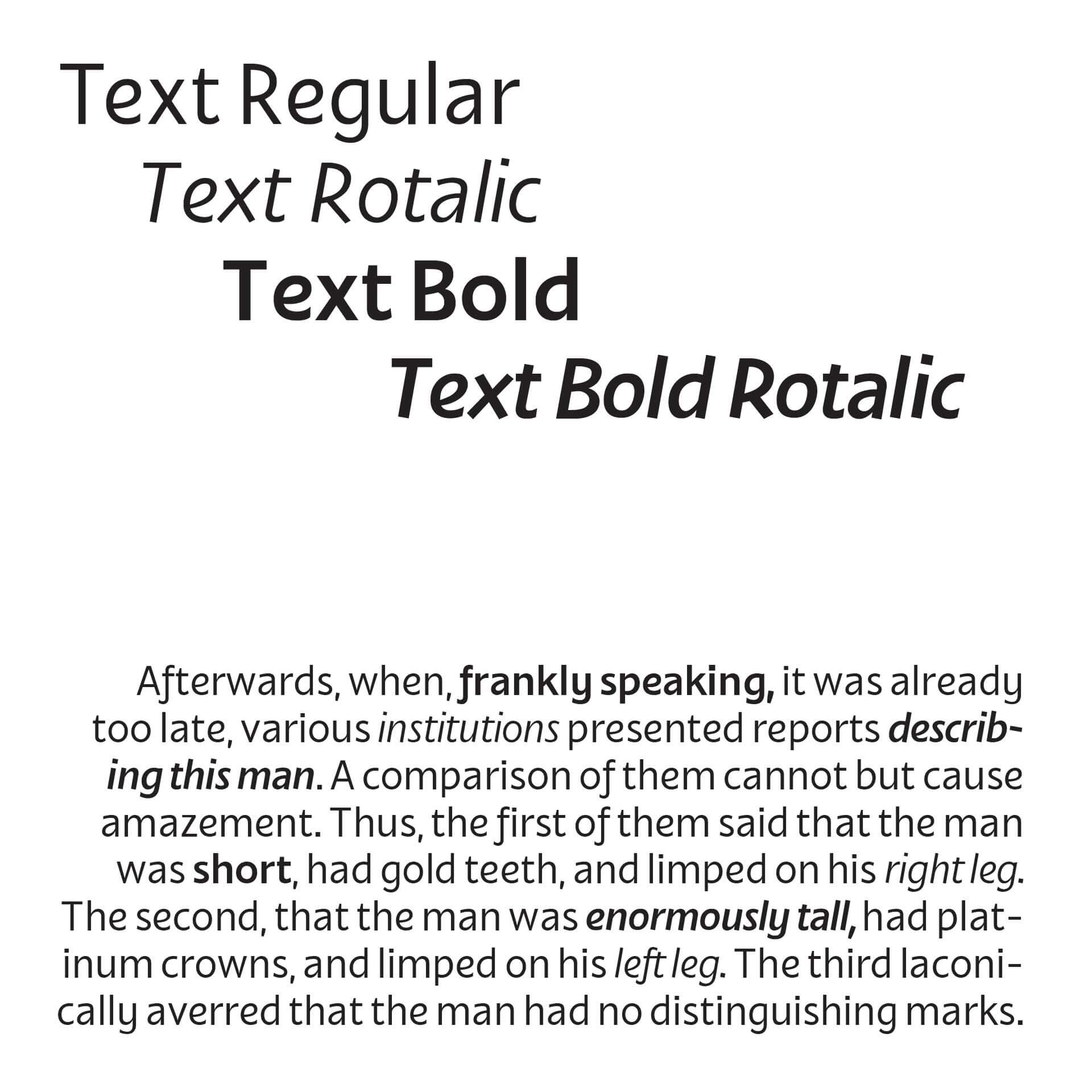
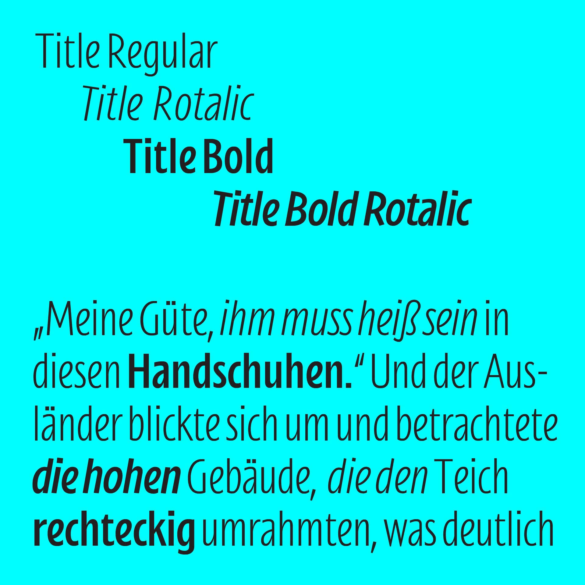
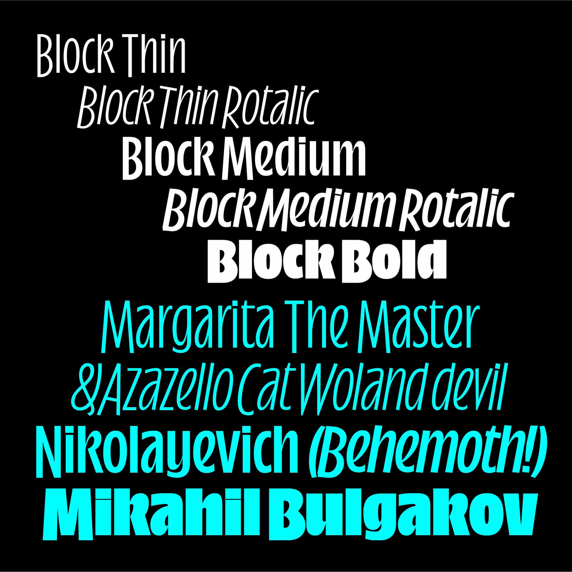
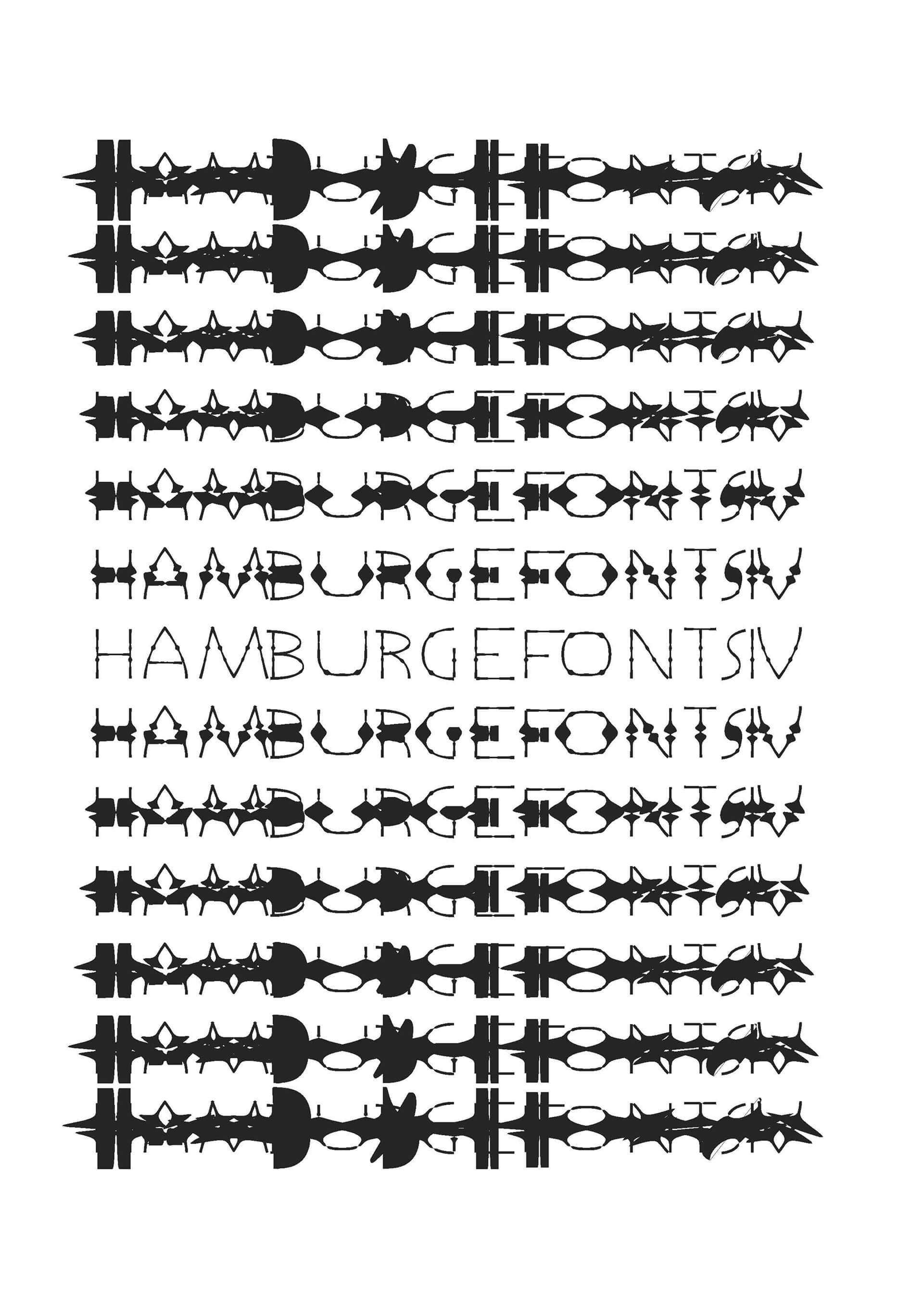
An amalgamation of all these questions, Aerograf became a “quite serious, with a sort of hidden springiness” (F.Berserik) sans-serif family. It is made out of four main optical groups:
Text, Title, Block and Superblock, as well as some playful ornaments and colour font “filters”, each group offering a regular, italic, bold and bold italic. Each optical size, as well as the matching Rotalic, was built according to the size’s requirements, using a suite of scripts.
Felix Bamforth is a German Scot who grew up in France. Growing up drawing, his first contact with letters was through graffiti. After theoretical communication studies in Edinburgh, he moved to Berlin, where he further studied communication design, reigniting his passion for drawing and letters and developing a keen enthusiasm for creative coding. He currently lives and works in Berlin.
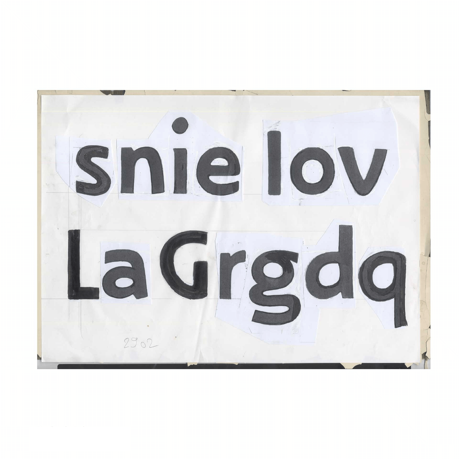
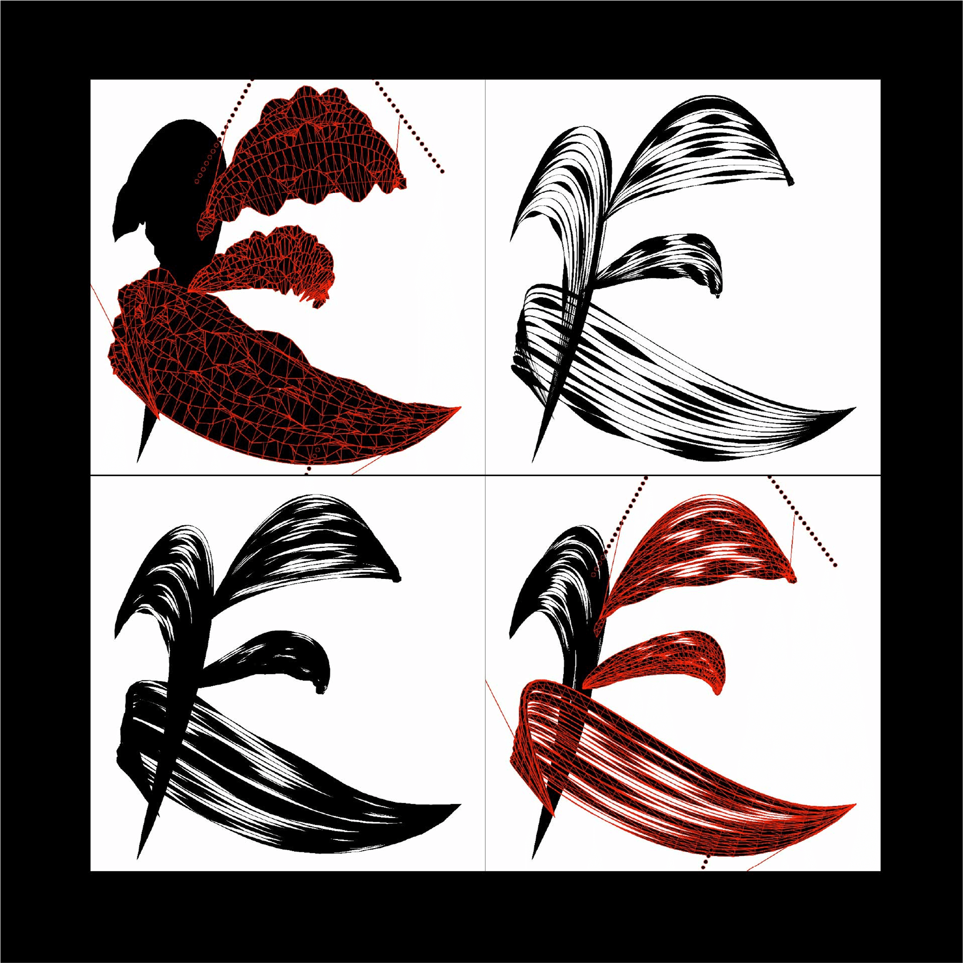
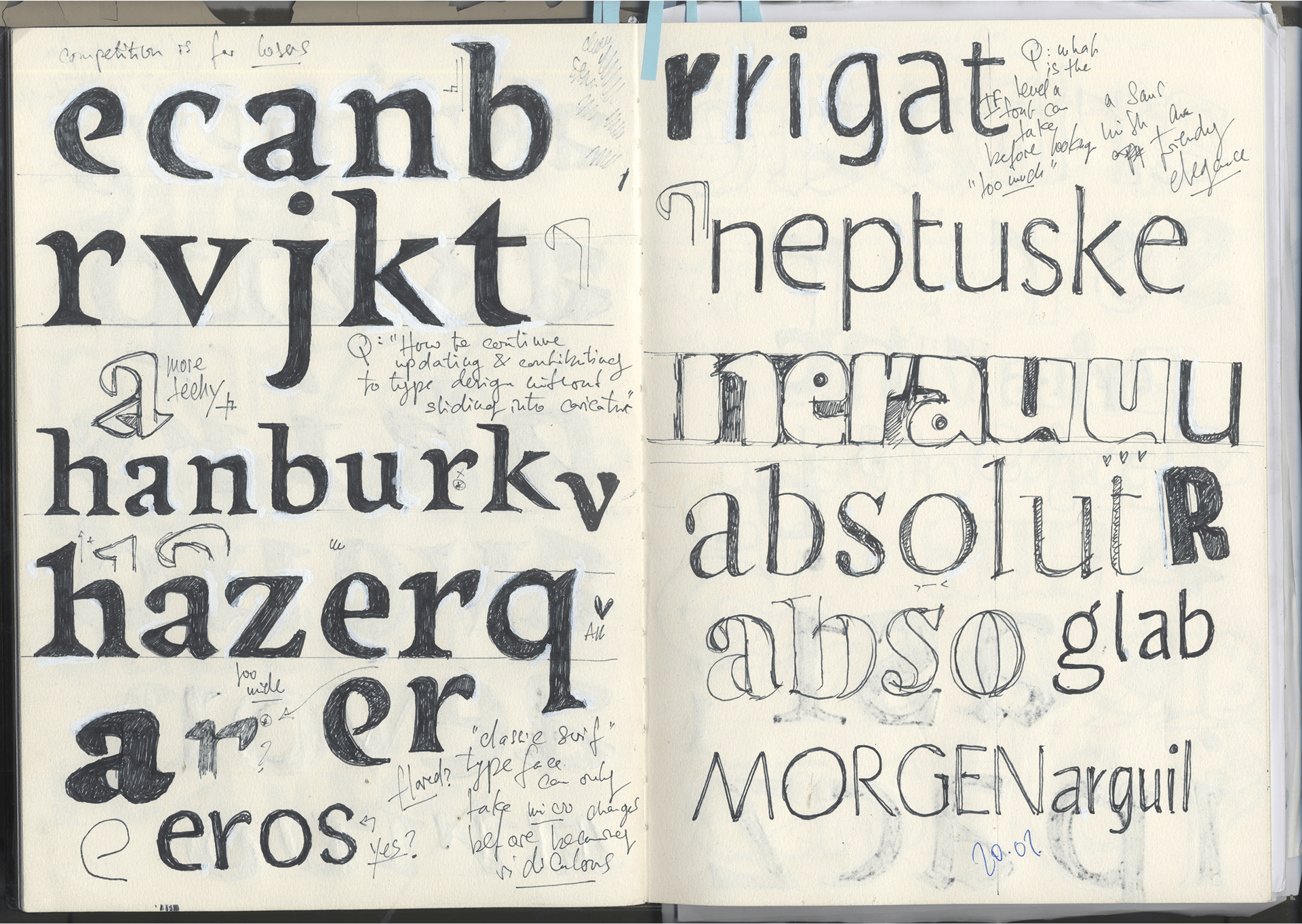
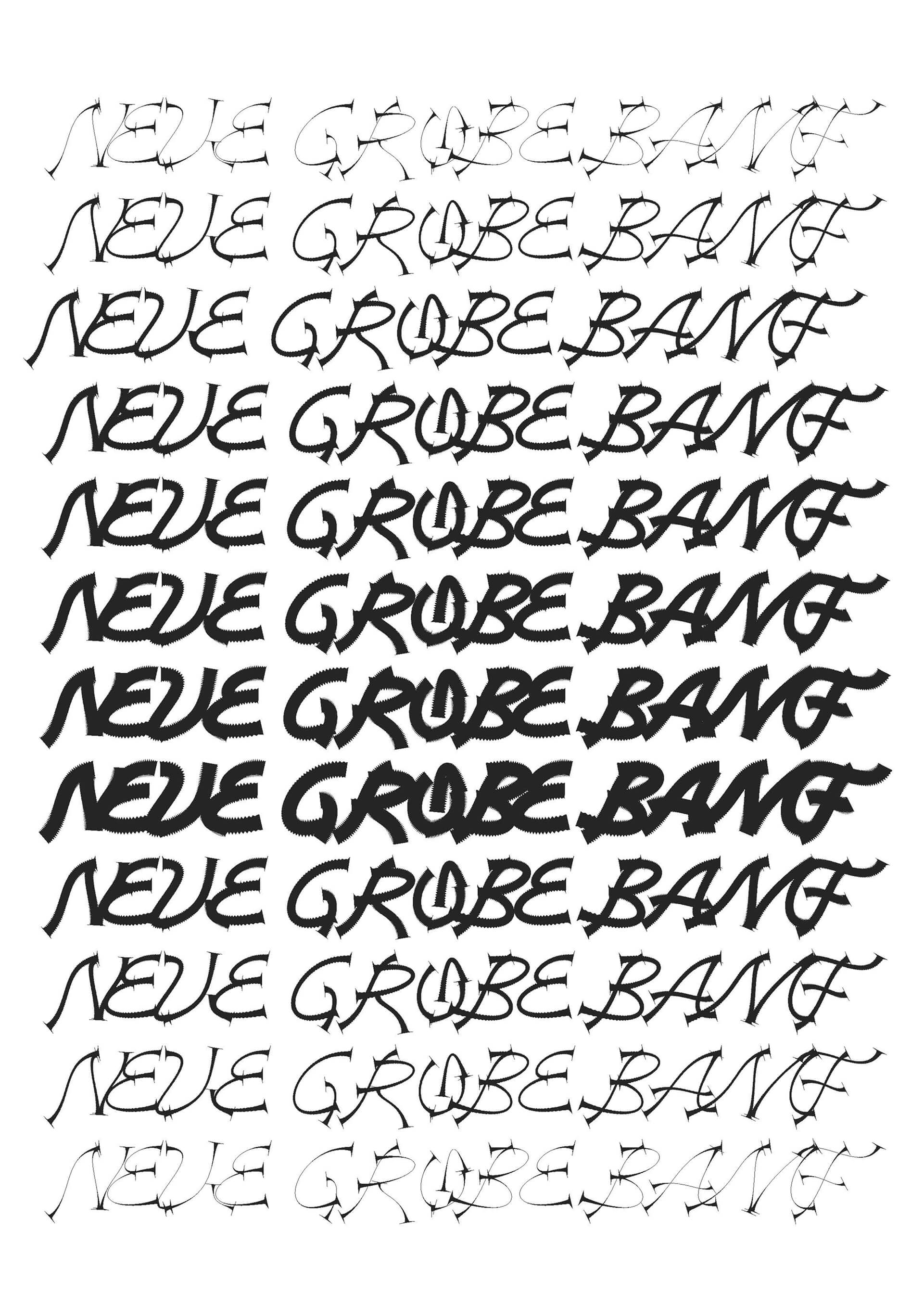
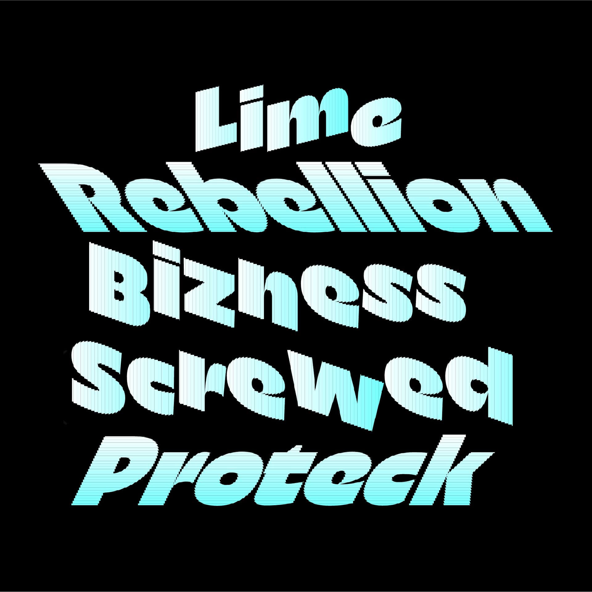
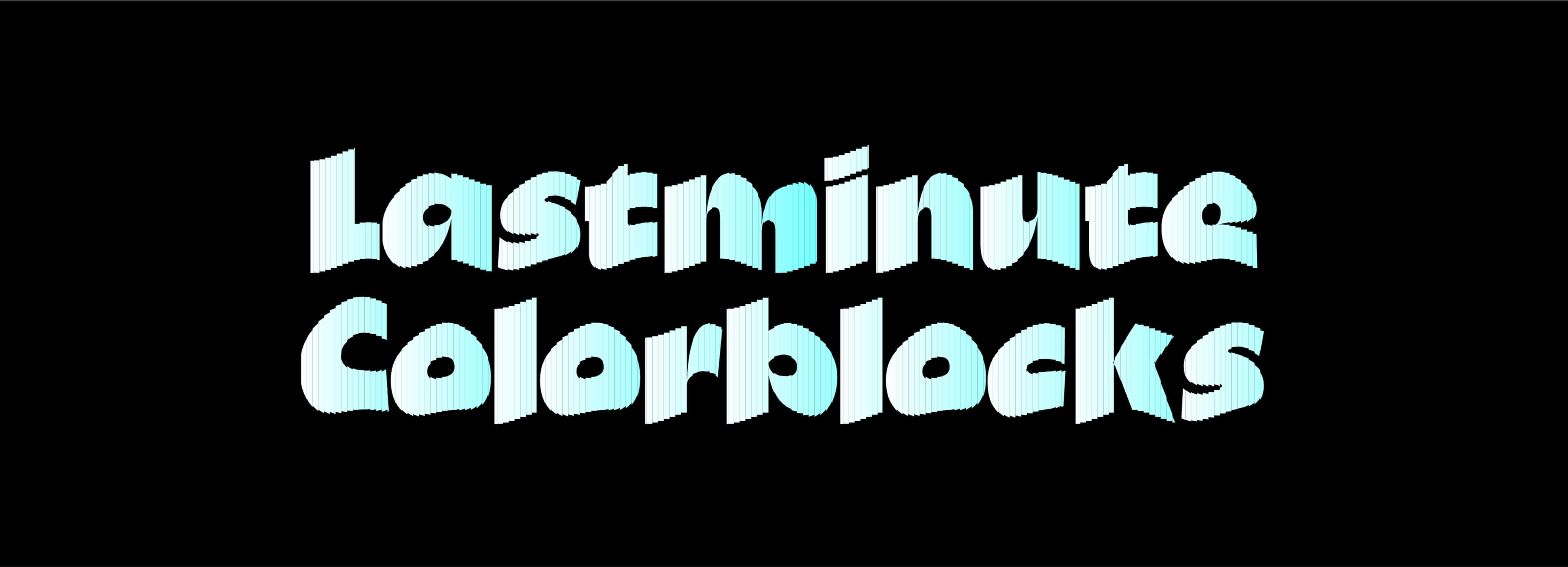
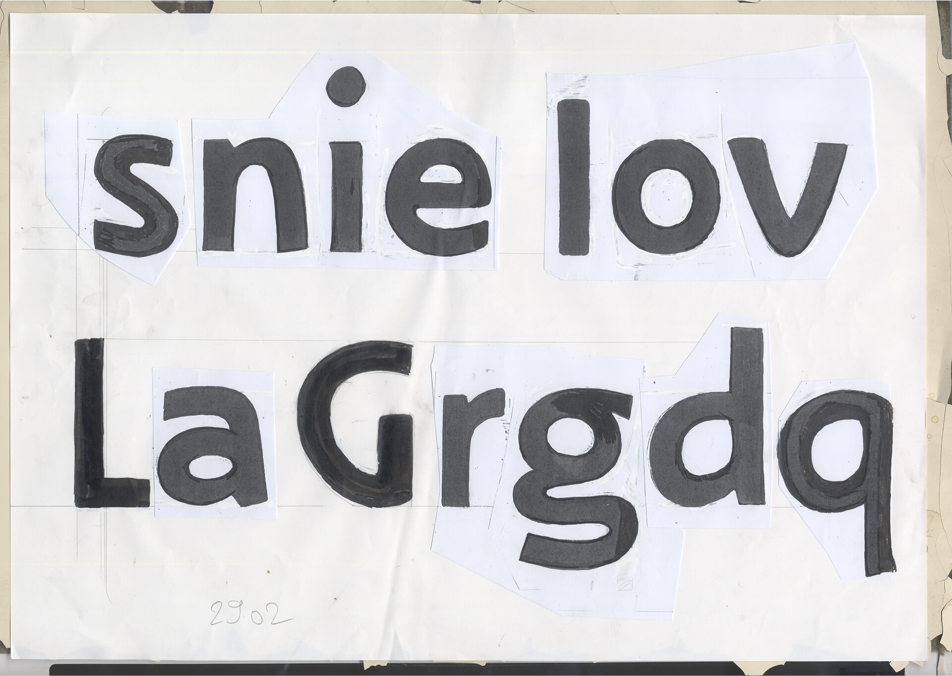
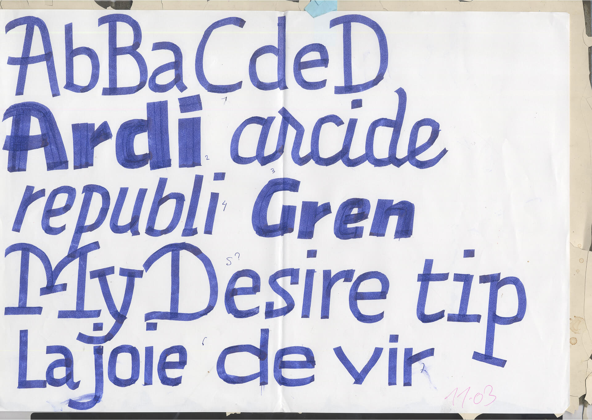
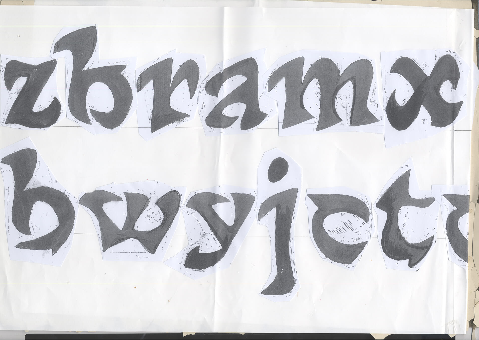
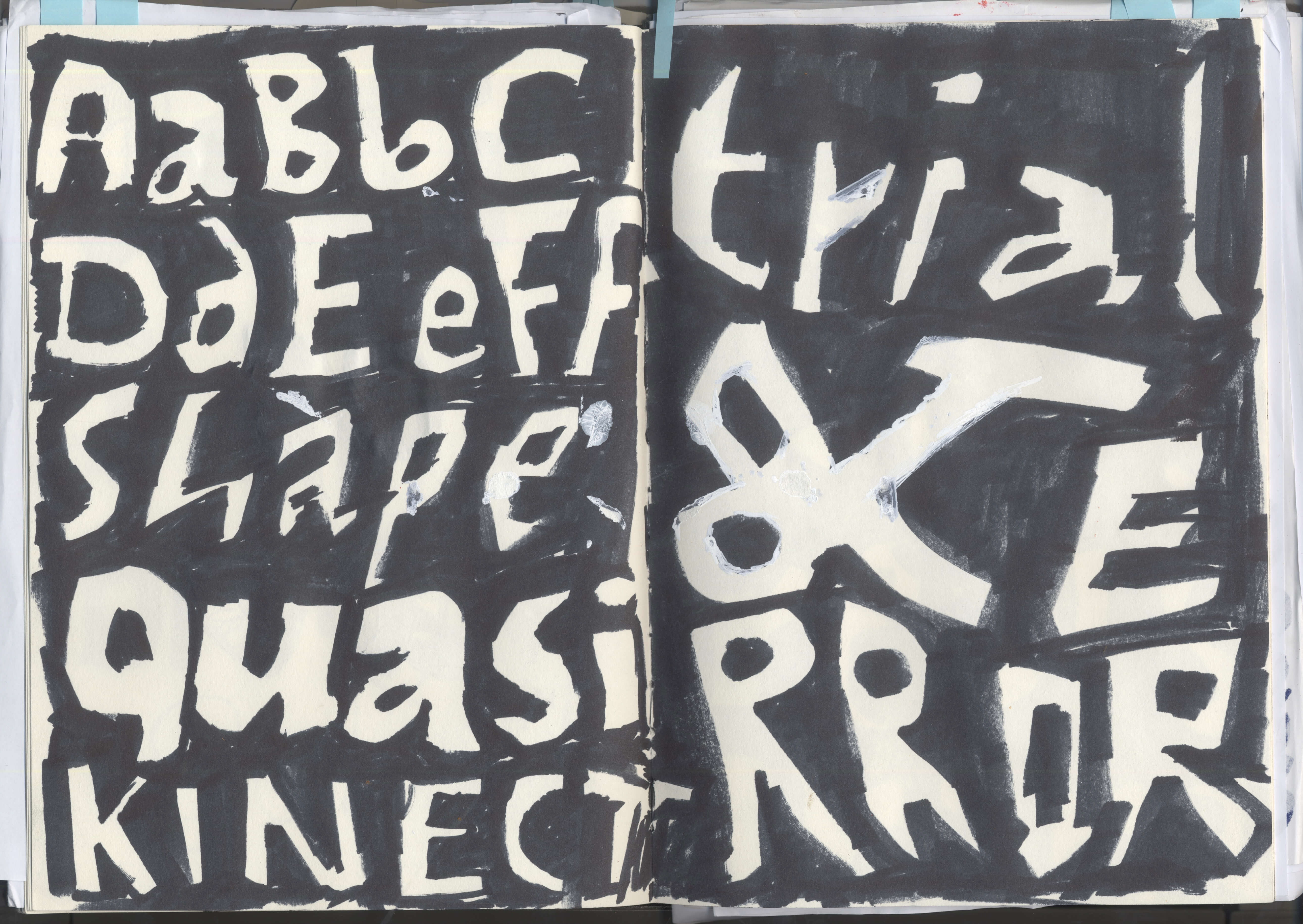
As mentioned in the previous post, the process for Aerograf took many detours, each offering a new set of valuable information, before becoming what it is now. These slides offer a glimpse into some of the stages at which Aerograf was throughout the second semester: Sketching on paper, first digitisations, writing as opposed to drawing type, going totally experimental, more digitisation, going even more experimental, finding a the right tone with digital drawing, experimenting with colour font technology and making procedural ornaments.
Looking back, everything was about learning to see: learning to see the things that work and that don’t, and especially learning to see how much potential can be hidden in little things. This then became a quest to search for the most simple means to produce the best impact possible.
Finally, here is a more detailed overview of the current style groups for Aerograf. Text, Title, Block and Superblock. For each group, Felix attempted to at least make four basic styles: Regular, italic, bold and bold italic. The italics/rotalics were created using a script and were then adjusted manually. At this stage, only the superblock style needs to be completed whereas the block style has an additional, intermediary medium weight, offering a middle ground between the two extremes.
Ornaments were added towards the end, more as an experiment. One of the most interesting explorations was the color font filter (see previous post, first slide). This script, using COLRV1 tables, would be added on top of an existing design to decompose it, colour it and even make it variable.
That’s all, folks! If you have any questions or feedback, feel free to DM me directly @felixbamforth on instagram.