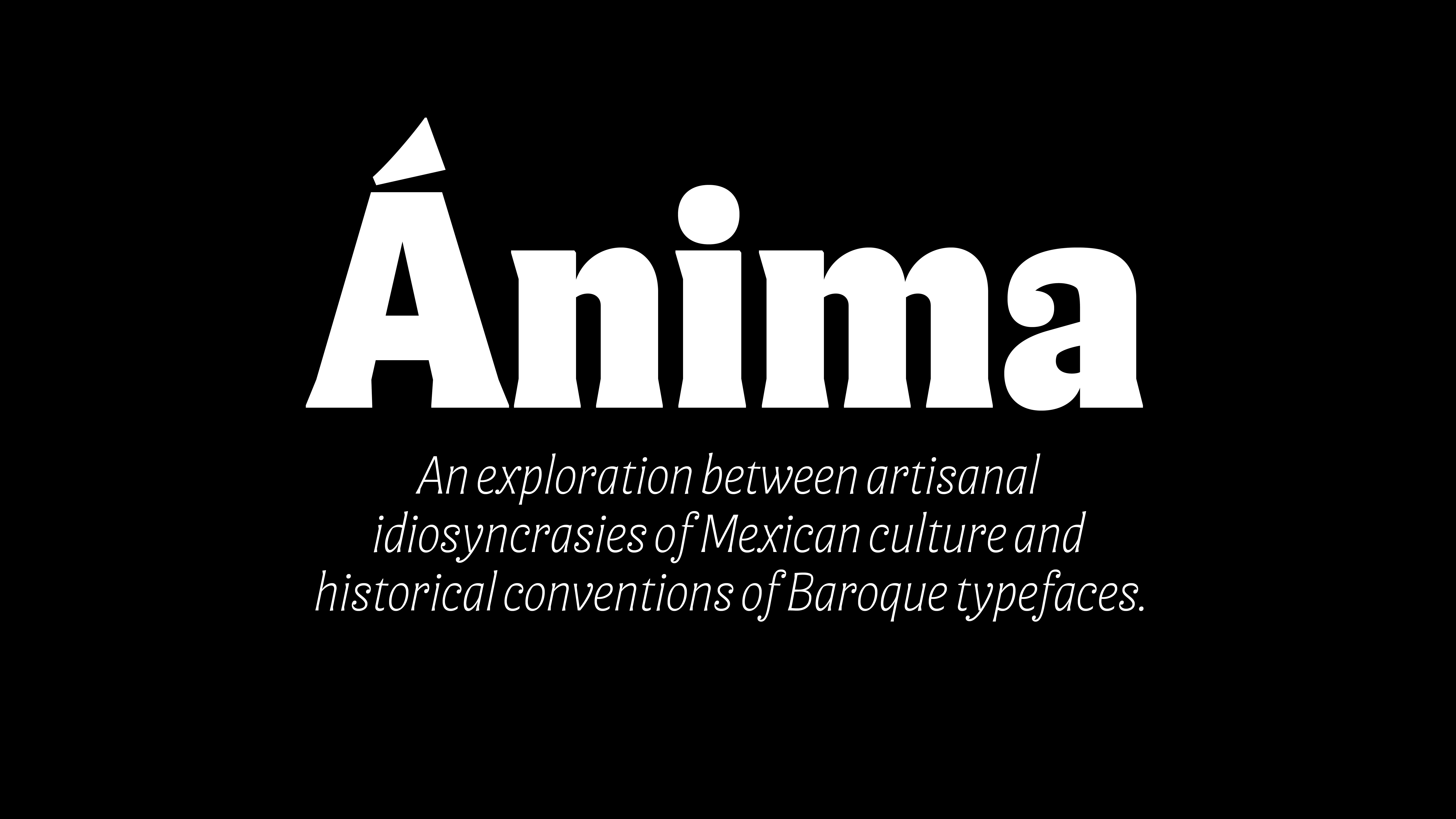
anima began as an exploration to find a meeting point between ancestry, craftsmanship, and type design.
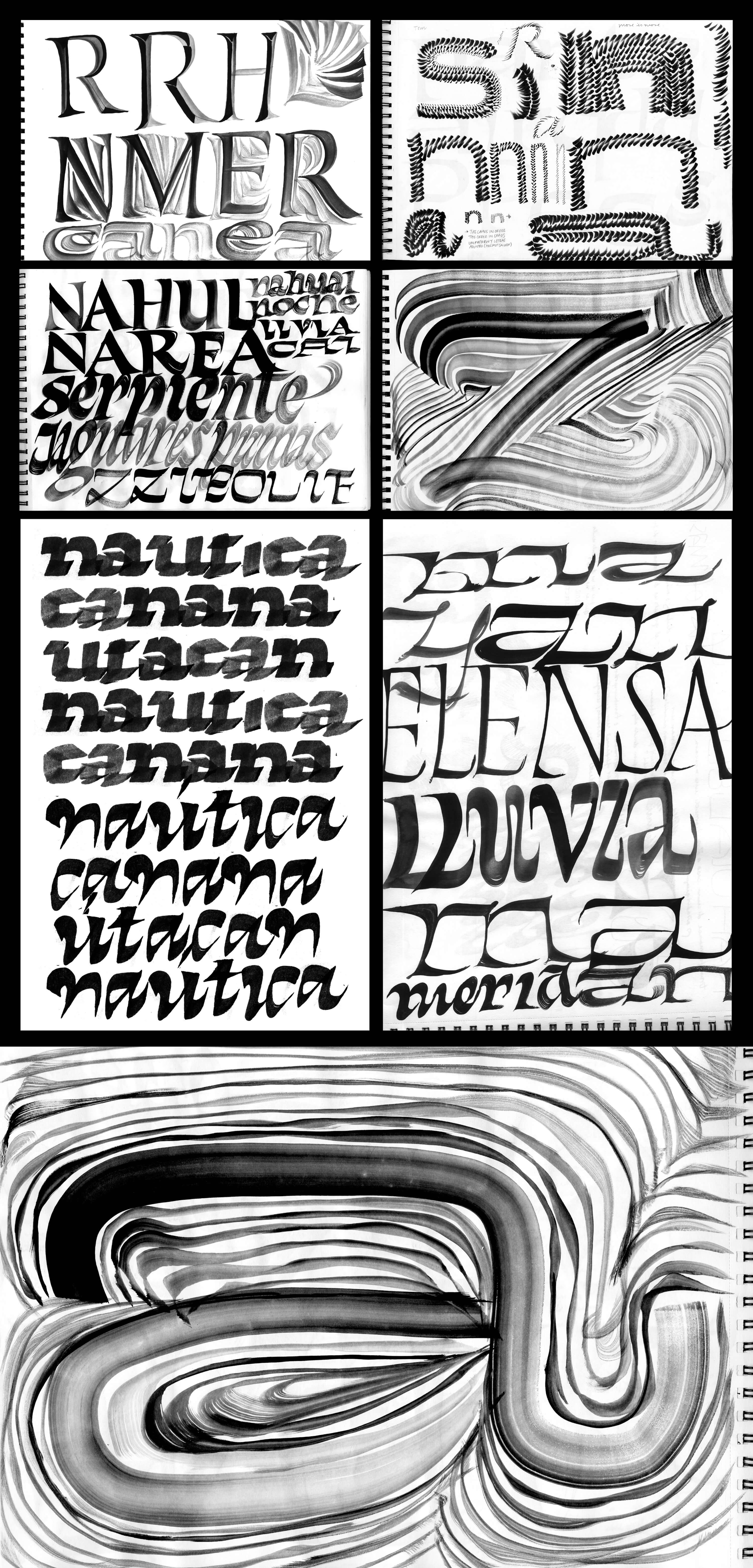
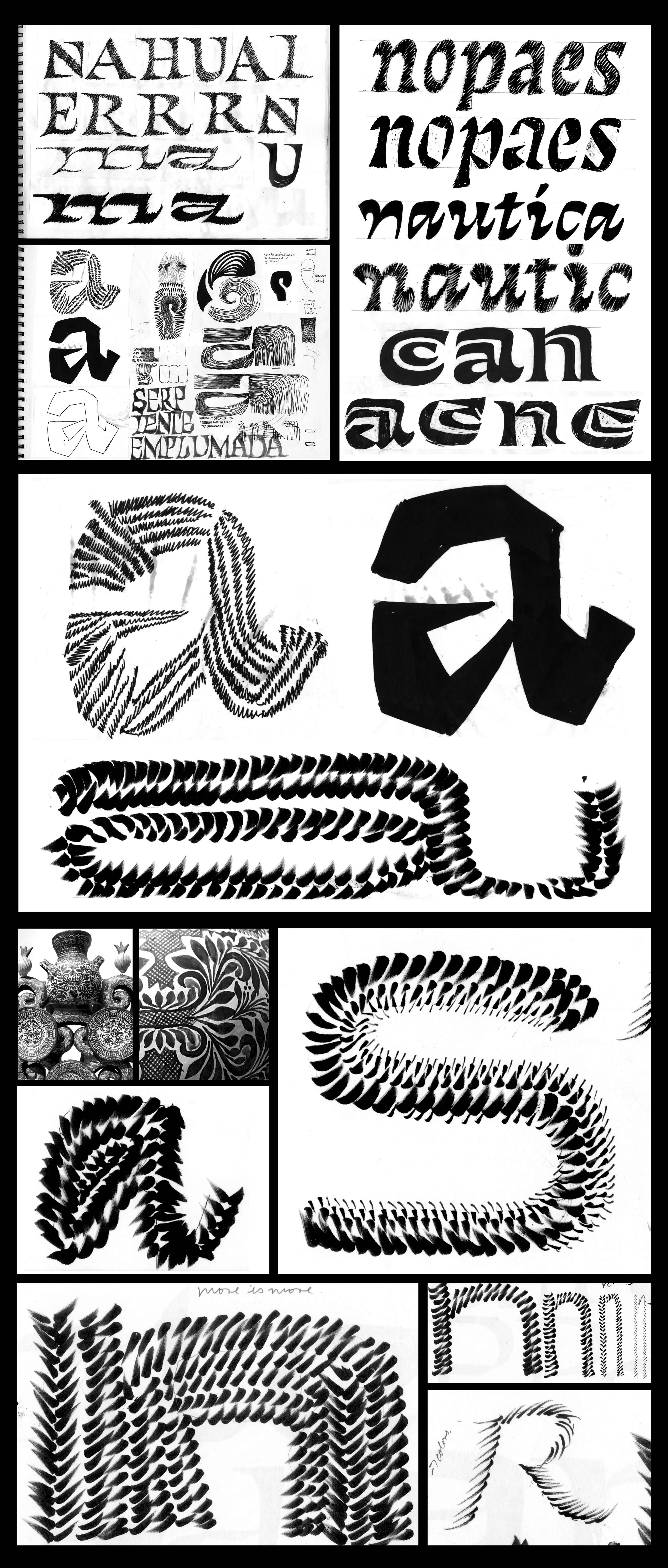
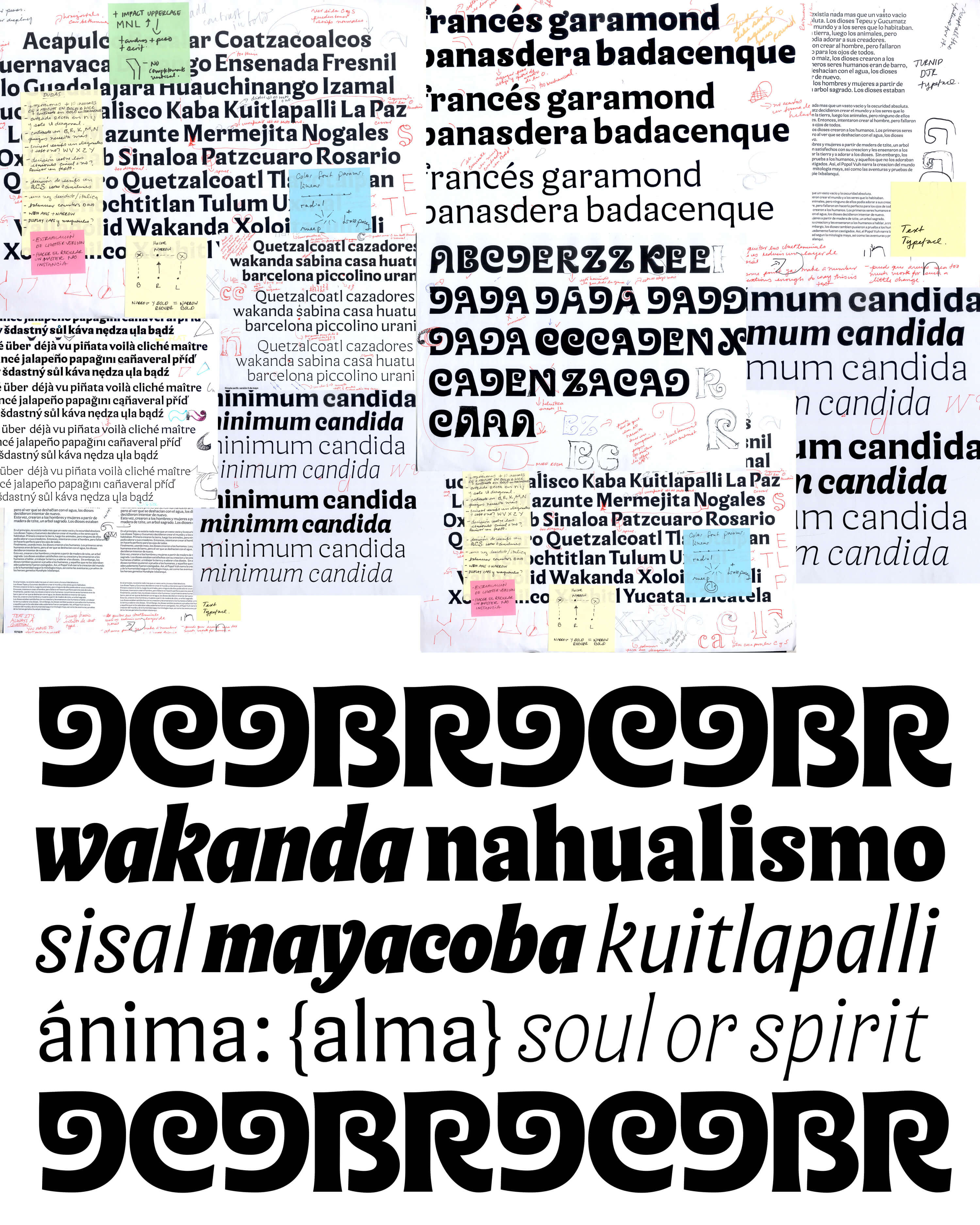
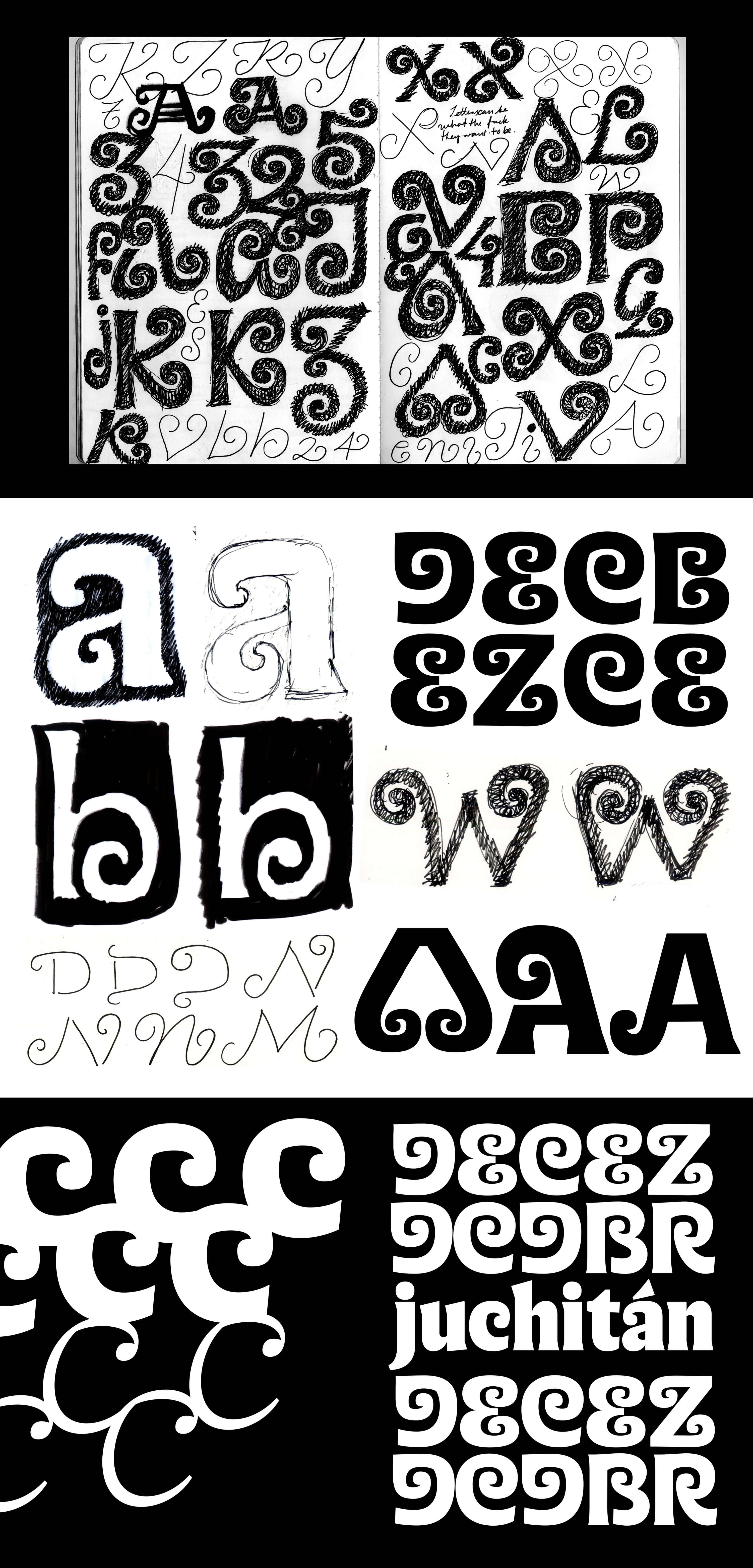
The sketching process for anima was long and complex, involving shape research with different tools and from different perspectives
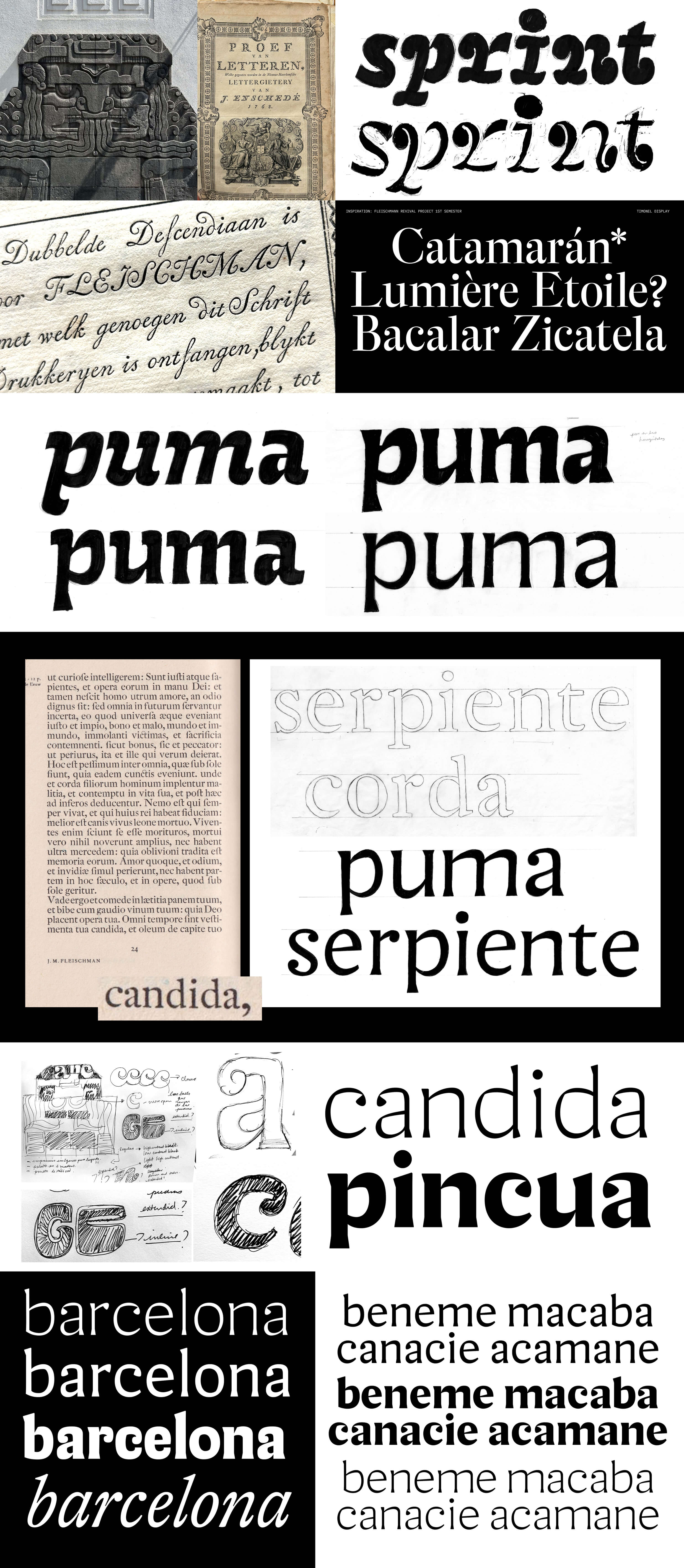
drawing inspiration from patterns and textures found in Prehispanic carvings and crafts.
The idea of “more is more” was always obsessively present at each stage of the process, questioning how much is the right amount of “more” and
when it becomes just “unnecessary drama”.
I’ve always been drawn to the subject of ornamentation, patterns and textures, an influence I attribute to my cultural background.
Where I come from, there’s nothing simple or minimalist. It’s actually completely the opposite and there’s something about that complexity
and sense of “muchness” that has always spoken to me. This was something I wanted to imprint on my project.
Much of my experimentation revolved around those ideas: patterns, texture itself, and texture in text.
I wondered in what ways I could play with the parameters of letterforms to control those textures.
At what point do letters become an image? How do you sketch in a way that actually tests a coherent type system?
These questions and the entire exploration became a reflection on the true purpose of a sketch within the design process.
The turning point for anima came at a later stage in the process, when I decided which path to take and found a way to add the “right” amount of
certain ingredients to the recipe, integrating the knowledge I had gained during the first semester while developing my revival project based on
the Enschedé Foundry and Fleischman’s Baroque typefaces.
When I first discovered Fleischmann’s work, I was very intrigued, and I became kind of obsessed with it. There was something fascinating about
the uniqueness of his shapes, the texture of his text typefaces, the unexpected contrast, the optical sizes, the distinctive features, and
the ornamentality.
It was during that research that I learned more about Baroque typefaces, and of course, their expressive, and decorative aesthetic completely
resonated with me, specially after all the sketches I had already developed.
So, in an experimental way, I aimed to bring some of that Fleischmann baroqueness into the present, filtered through my own project and
perspective.
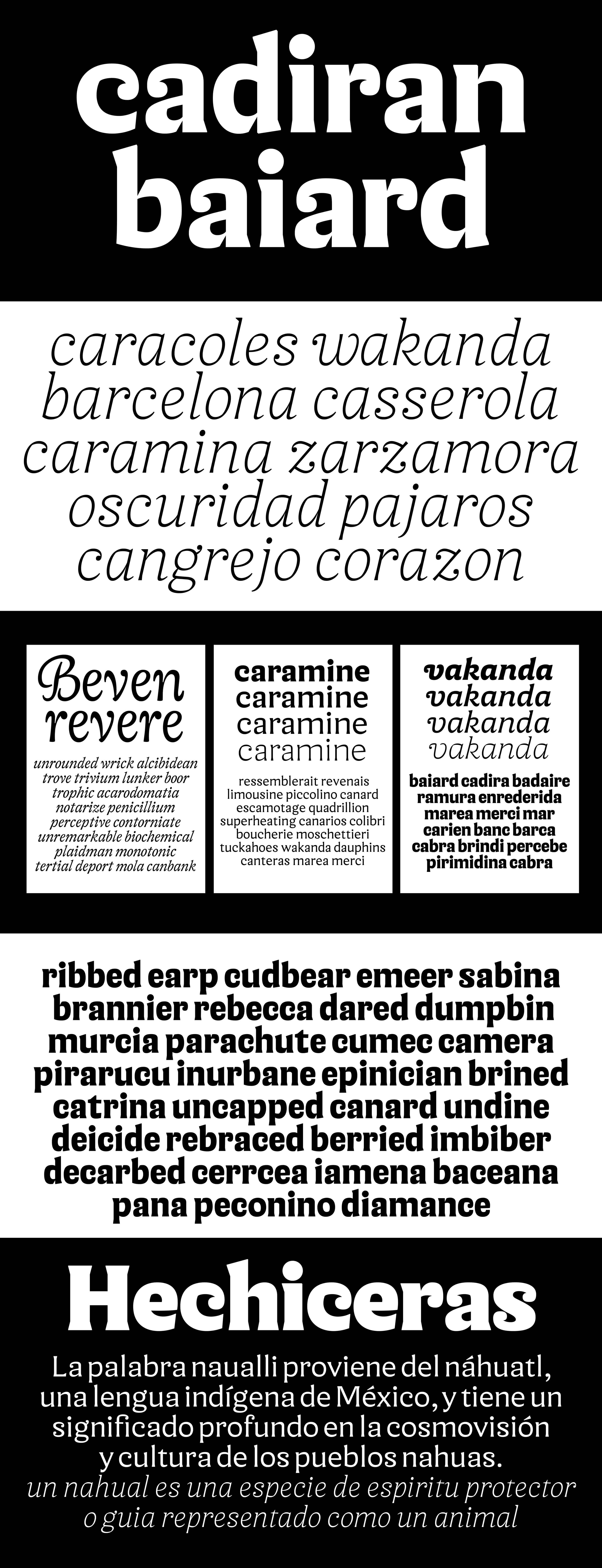
The foundation of anima became a blend of an exploration of Fleischmann’s proportions and ornamental features across his optical sizes,
combined with personal brush calligraphy explorations inspired by modern interpretations of pre-Hispanic carvings found in Mexico.
It’s the Baroque style that builds the bridge between them. Baroque in Mexico, a style from the 17th and 18th centuries, merges European
elements with indigenous traditions, creating a unique version of Baroque that incorporates pre-Hispanic elements and local craftsmanship.
In Erik van Blokland words, “anima is a line between two points far removed by time and space.The attempt to interpret Mexican cultural and artisanal references through the lens of an 18th-century German punchcutter living in Amsterdam might seem unlikely, but along this process it became a natural, unquestionable perspective.”
For me, in the context of my personal search for meaning in my own work and this project, Fleischmann’s work became the perfect example of
“more is more” — but in just the right amount.
I like to believe that, with the right balance of certain elements and a clear sense of when more is truly more, there’s a point where these distant worlds meet and that’s where anima exists.