
Mint Tantisuwanna is a type designer and lettering artist based in Bangkok, Thailand. Her bachelor’s project on contemporary Thai blackletter received a Special Mention from Granshan in 2019. She did the Type@Cooper Condensed program in New York, spent a few years working at a local foundry in Bangkok, and eventually started her own practice. While freelancing, she was awarded Sharp Type’s Malee Scholarship and later studied at Type and Media in The Hague. Today, she designs type full-time at Typotheque, where she recently released Pristine, her graduation typeface, which was selected as a winner of the TDC71 Certificate of Typographic Excellence. When she’s not drawing letters, you’ll likely find her in the kitchen cooking something spicy!
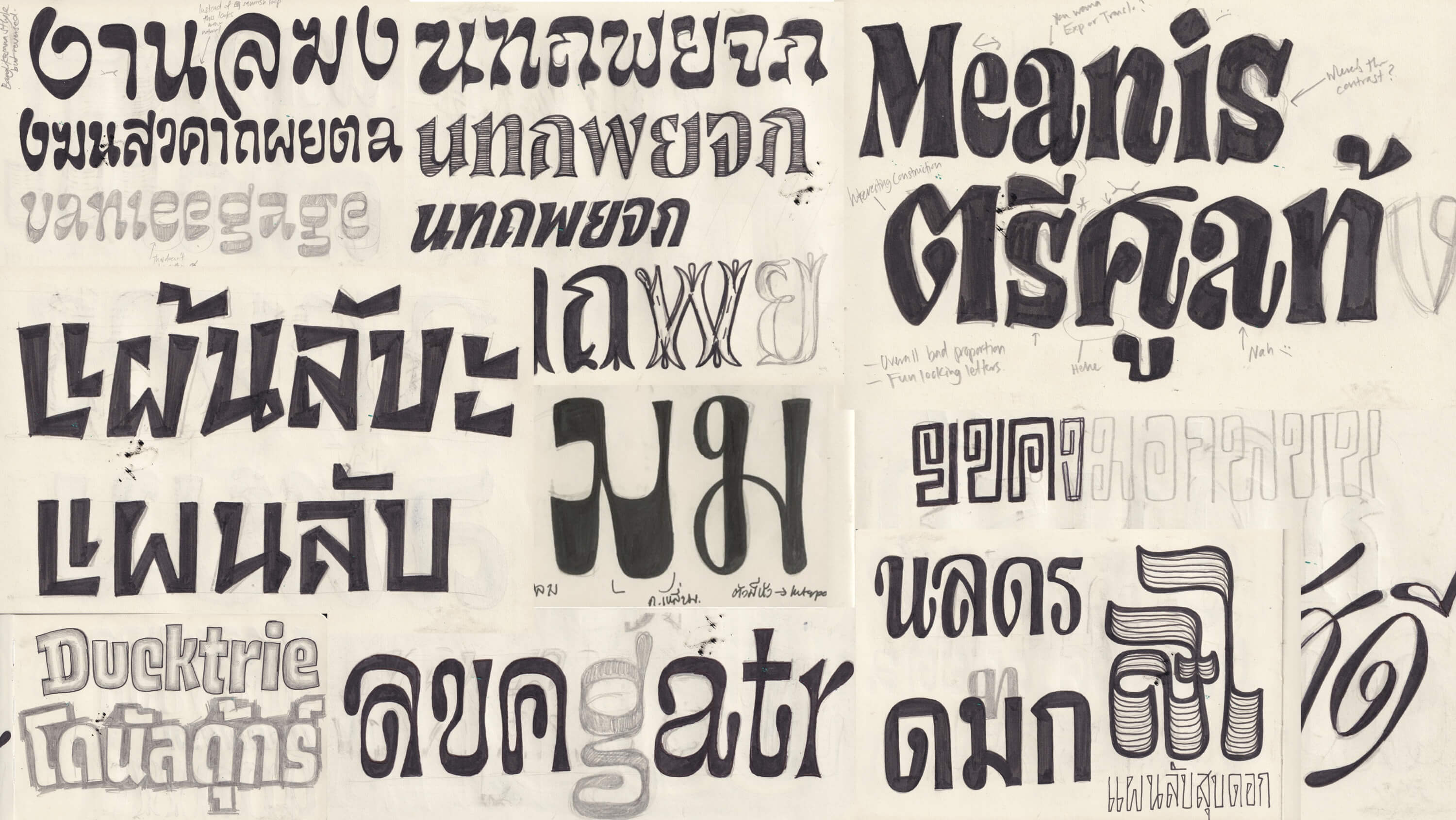
Pristine was nothing like how Mint expected the final project to be.
She has always wanted to try more expressive styles but after all the initial sketches,
she ended up choosing a more sober path. The original idea was to create a Thai–Latin
type family where both scripts influence each other equally — an exploration of cross-script
design without defaulting to one script as the master.
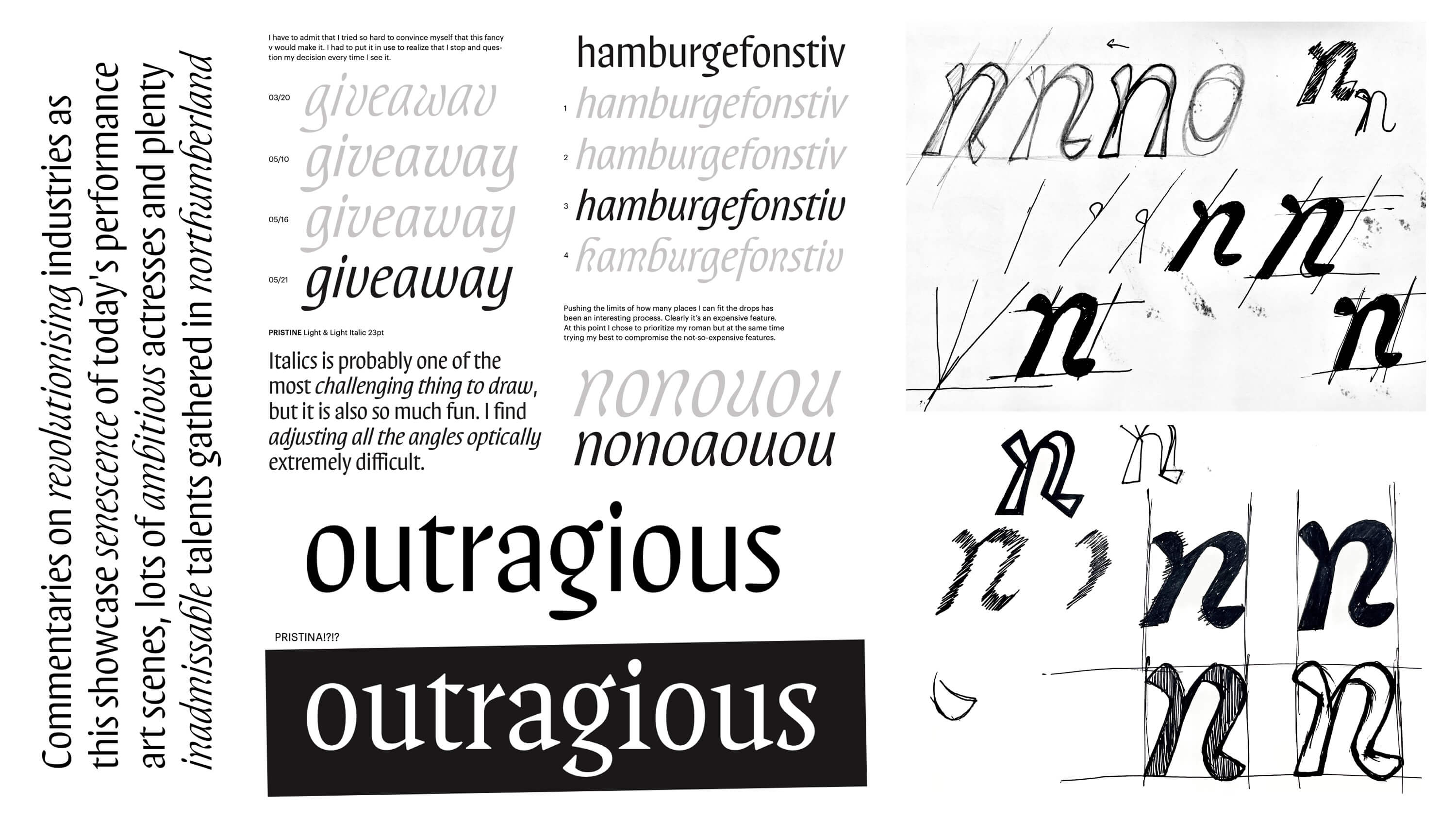
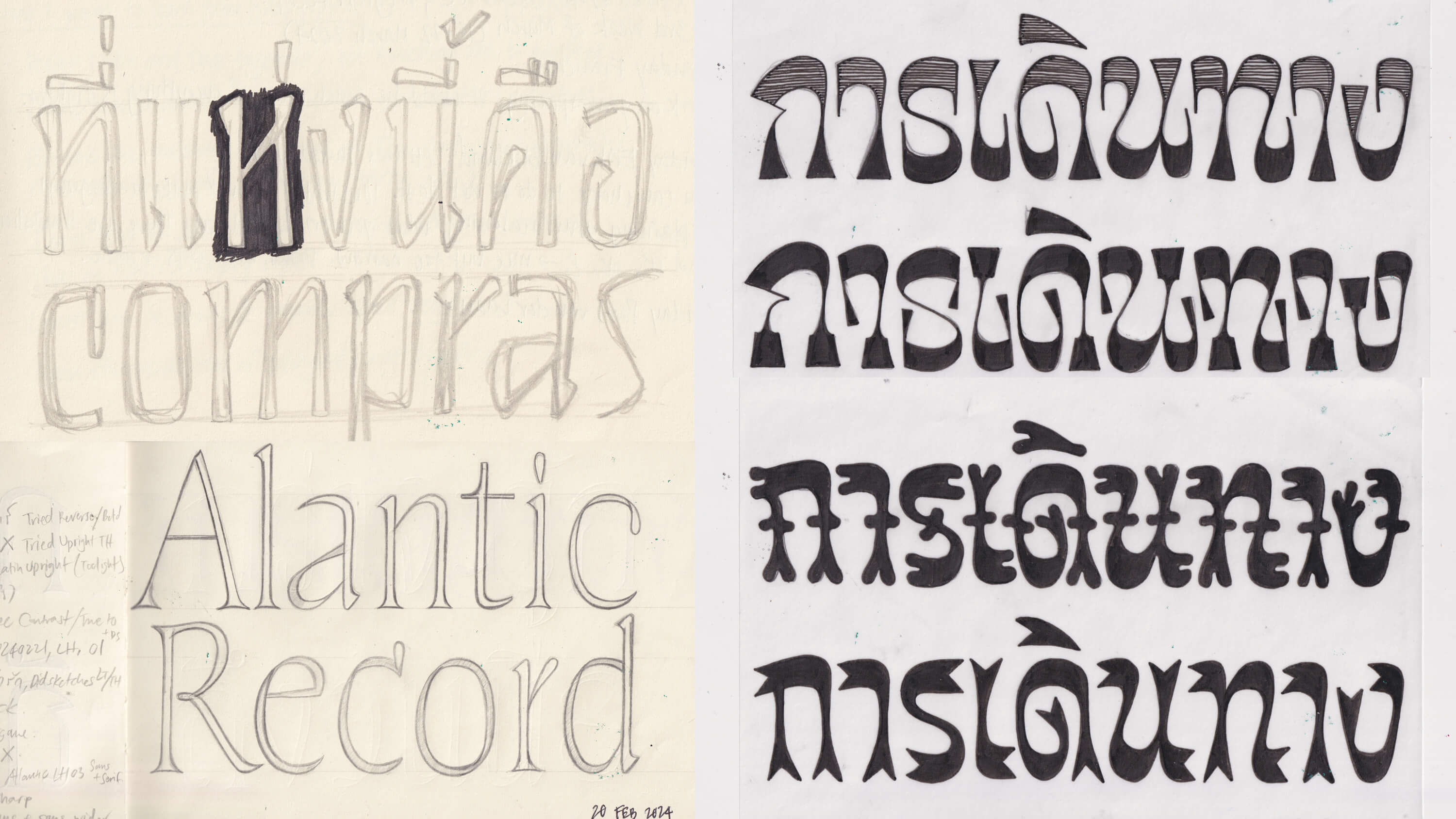
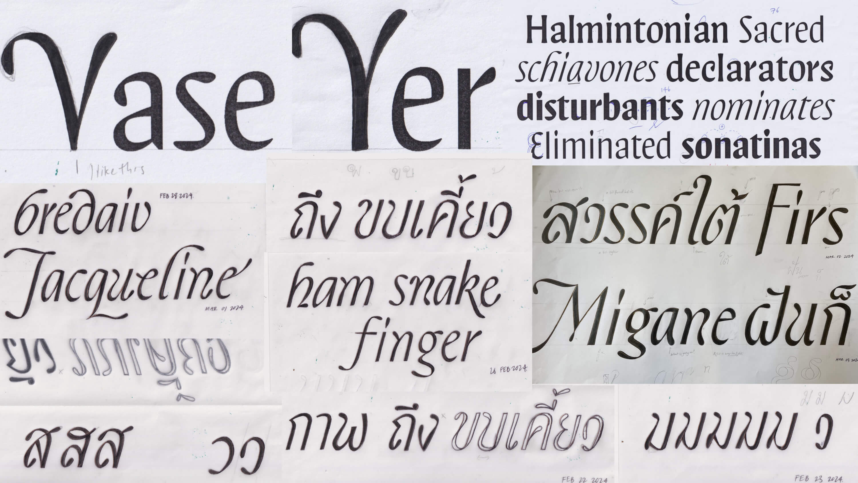
The project started with a Thai italic drawn alongside a Latin italic. The initial Thai
sketch aimed to find a space between traditional looped and loopless styles — resulting in
soft, organic shapes with semi-loop features. In this early version, the “drop” terminals
(teardrop-shaped endings) were important for the legibility of Thai. For Latin, however, those same
terminals served more of a decorative purpose.
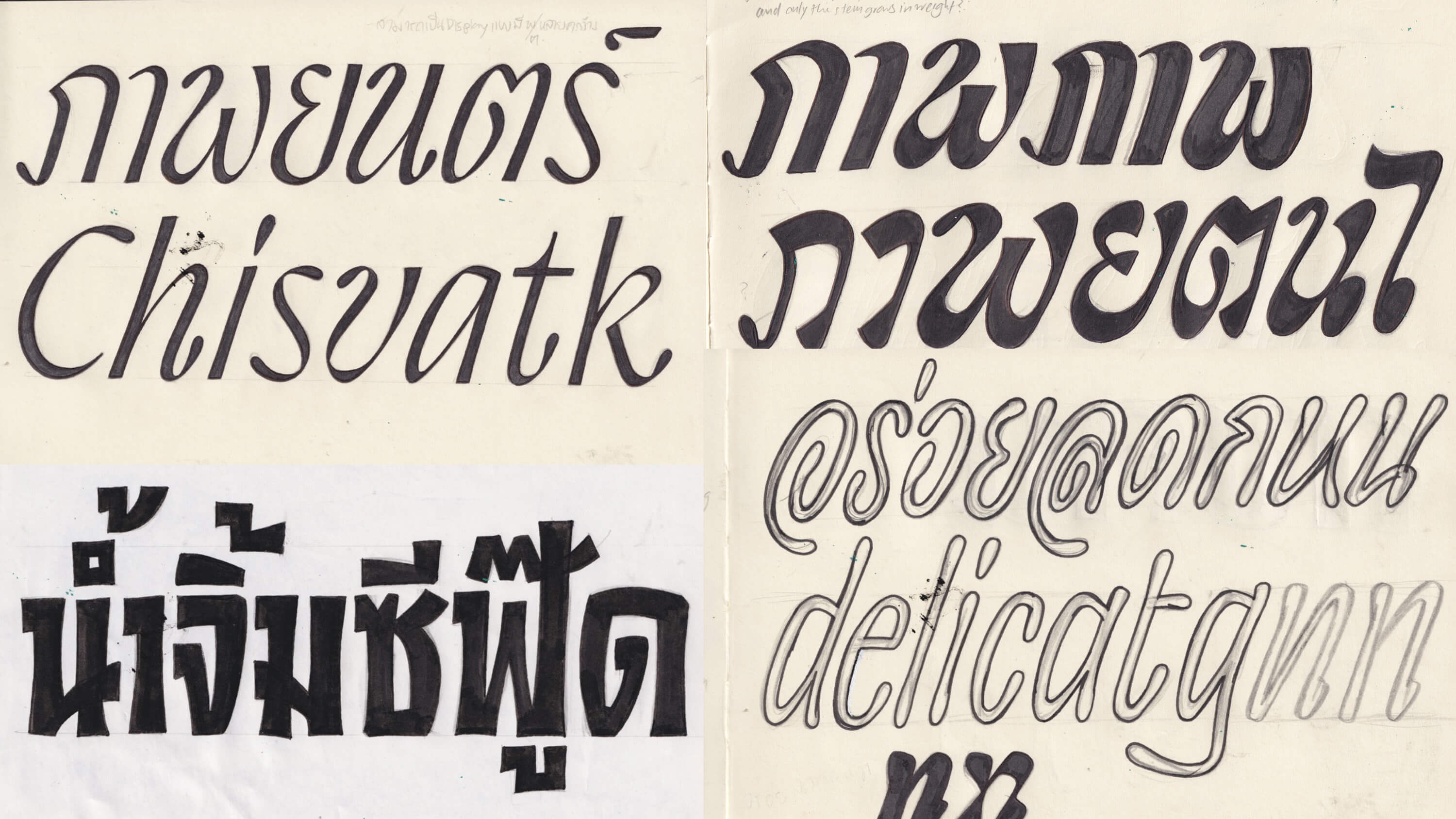
As the design evolved, the focus gradually shifted from italic to roman. The drops in Latin became
more structurally integrated, while the Thai moved toward a loopless model — still expressive,
but more restrained and contemporary.
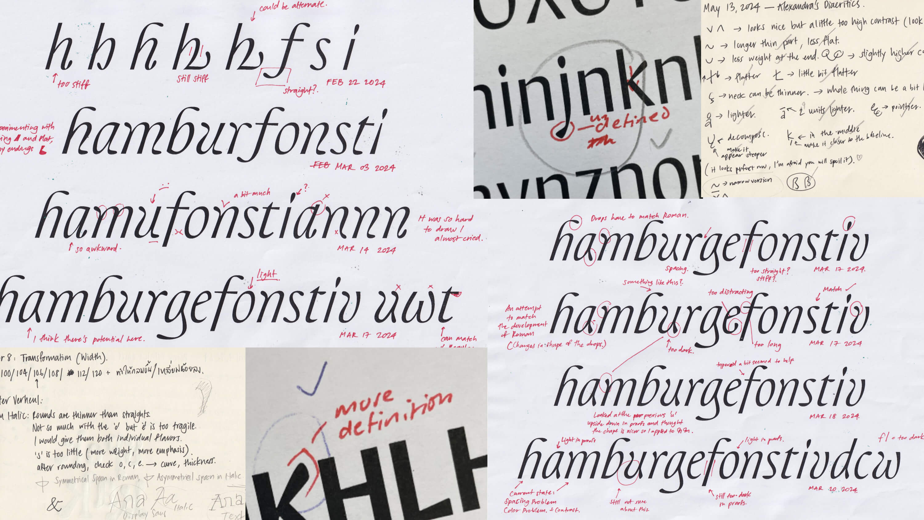
Once the parameters of the project became clear — broad-nib contrast, sans serif structure — the
challenge was to find the right balance between the two scripts. Each demanded its own design
solutions, but the goal was a shared tone of voice. Designing a multi-script typeface isn’t just
about visual harmonization; it requires a deep understanding of how each script behaves in
its native environment — both functionally and culturally.
Every script carries historical and emotional associations. In Thai, broad-nib writing takes the
form of Thai blackletter, also known as Thai Naris. Unlike its Latin counterpart, Thai blackletter
has no roots in medieval manuscripts. Instead, it’s deeply connected to street culture — Chinatown,
pawn shops, market vendors, food stalls. Its tone is loud, practical, and unmistakably local.
Pristine was designed to move away from that traditional Thai blackletter tone. The goal wasn’t
to reject the broad-nib logic, but to reinterpret it — to ask what a contemporary Thai broad-nib
voice might sound like. Latin was treated with equal care. In Pristine, Latin and Thai don’t
just sit side by side — they shape one another. The final design is the result of mutual accommodation,
not compromise.
It’s not just about soft, round terminals or sharp-cut stems. It’s about rethinking familiar styles
and expanding the expressive range of both scripts — together.
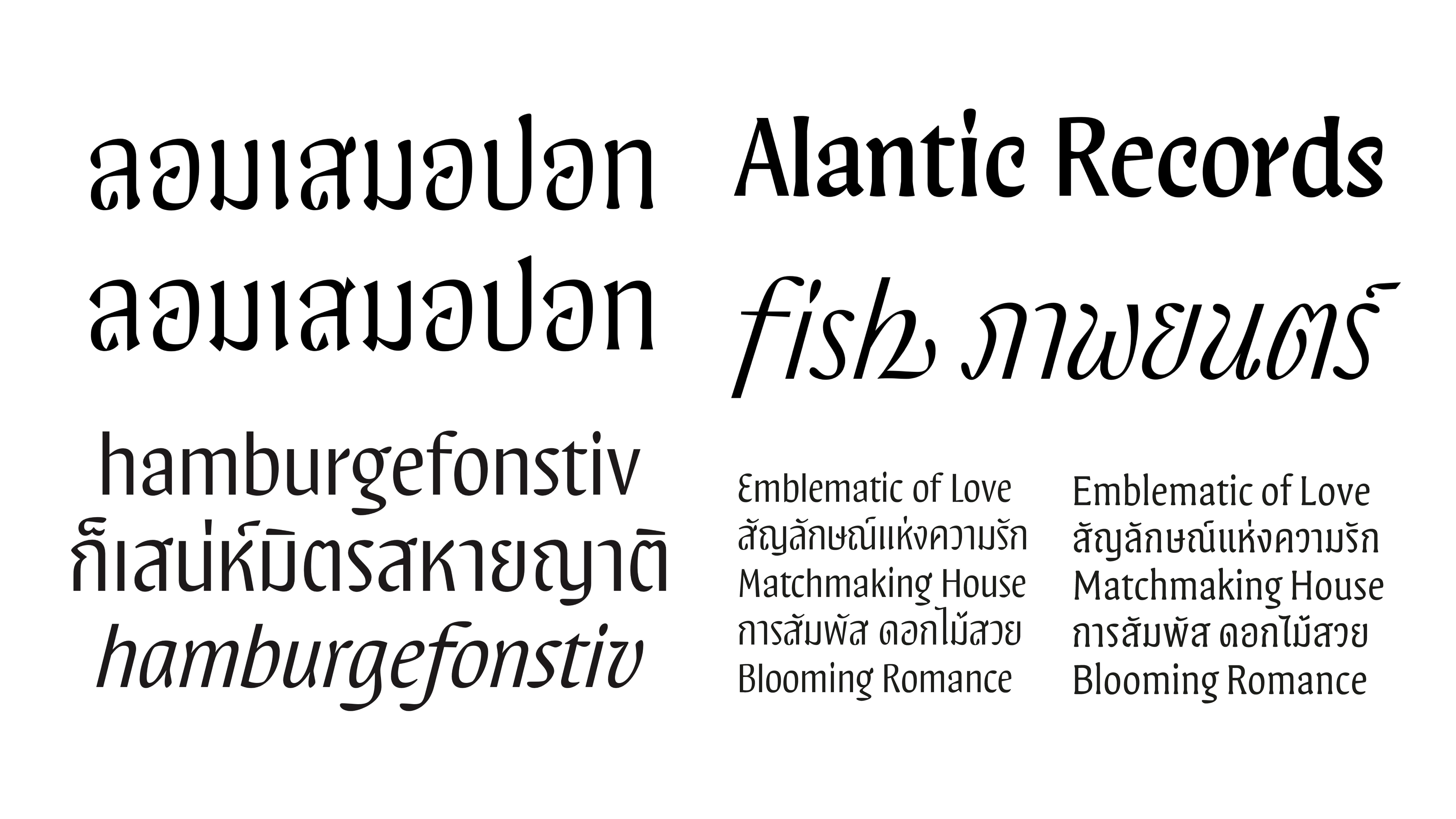
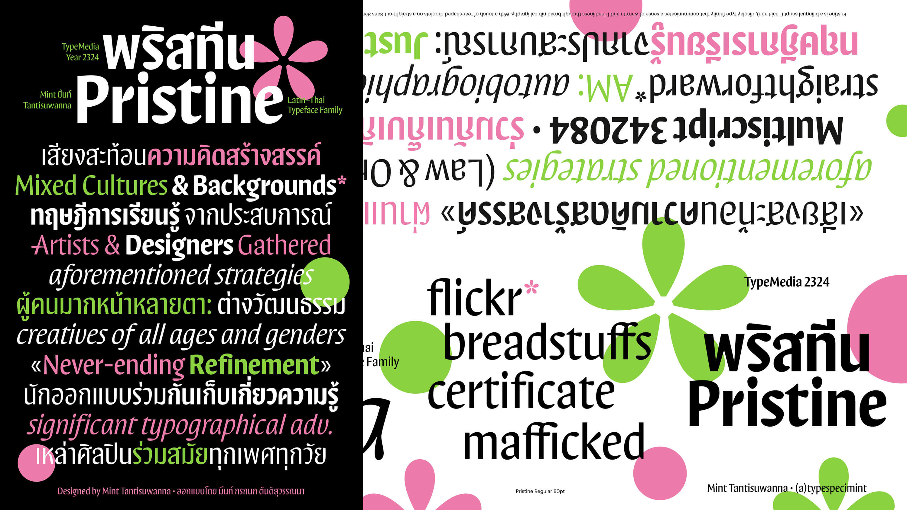
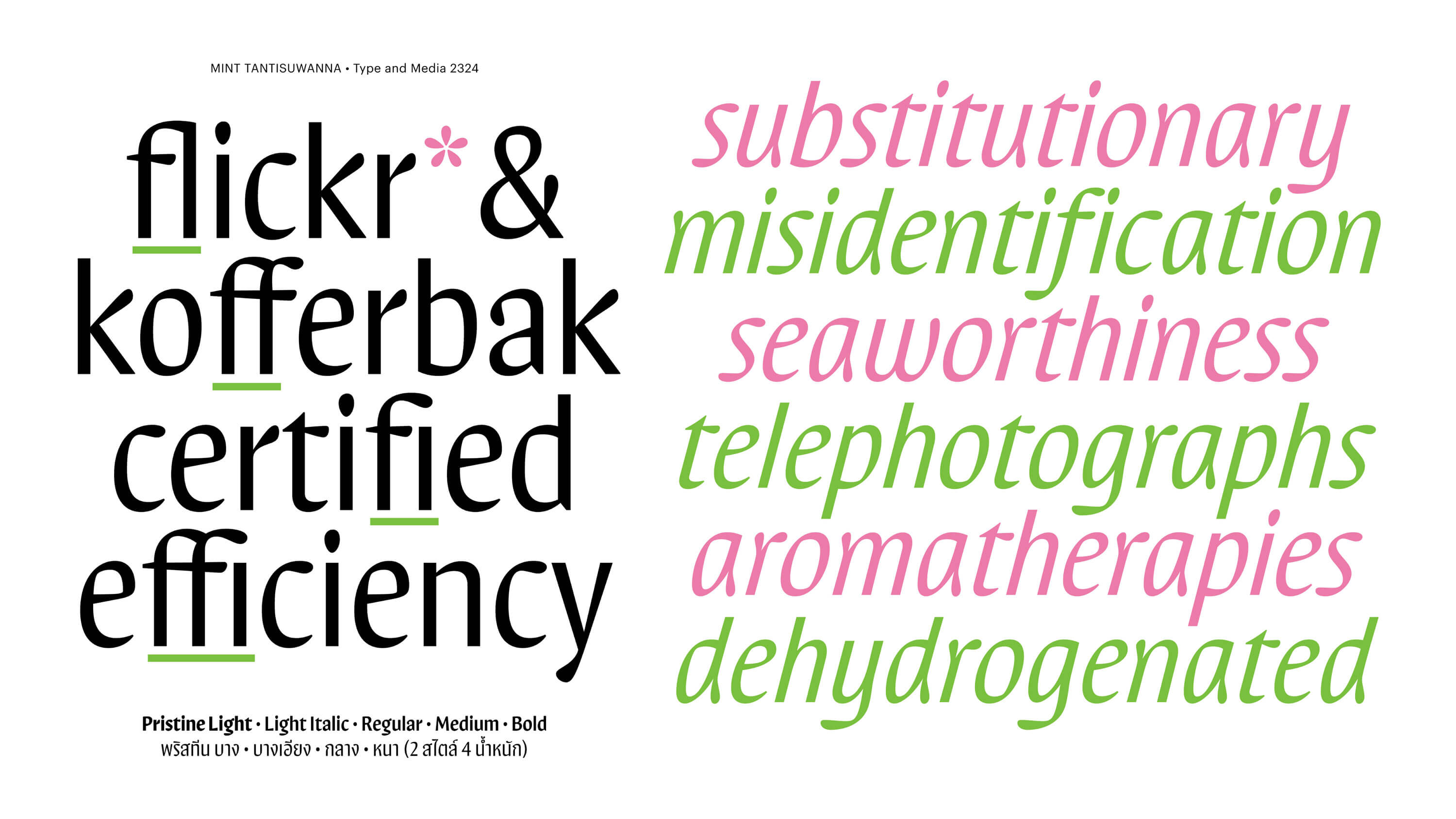
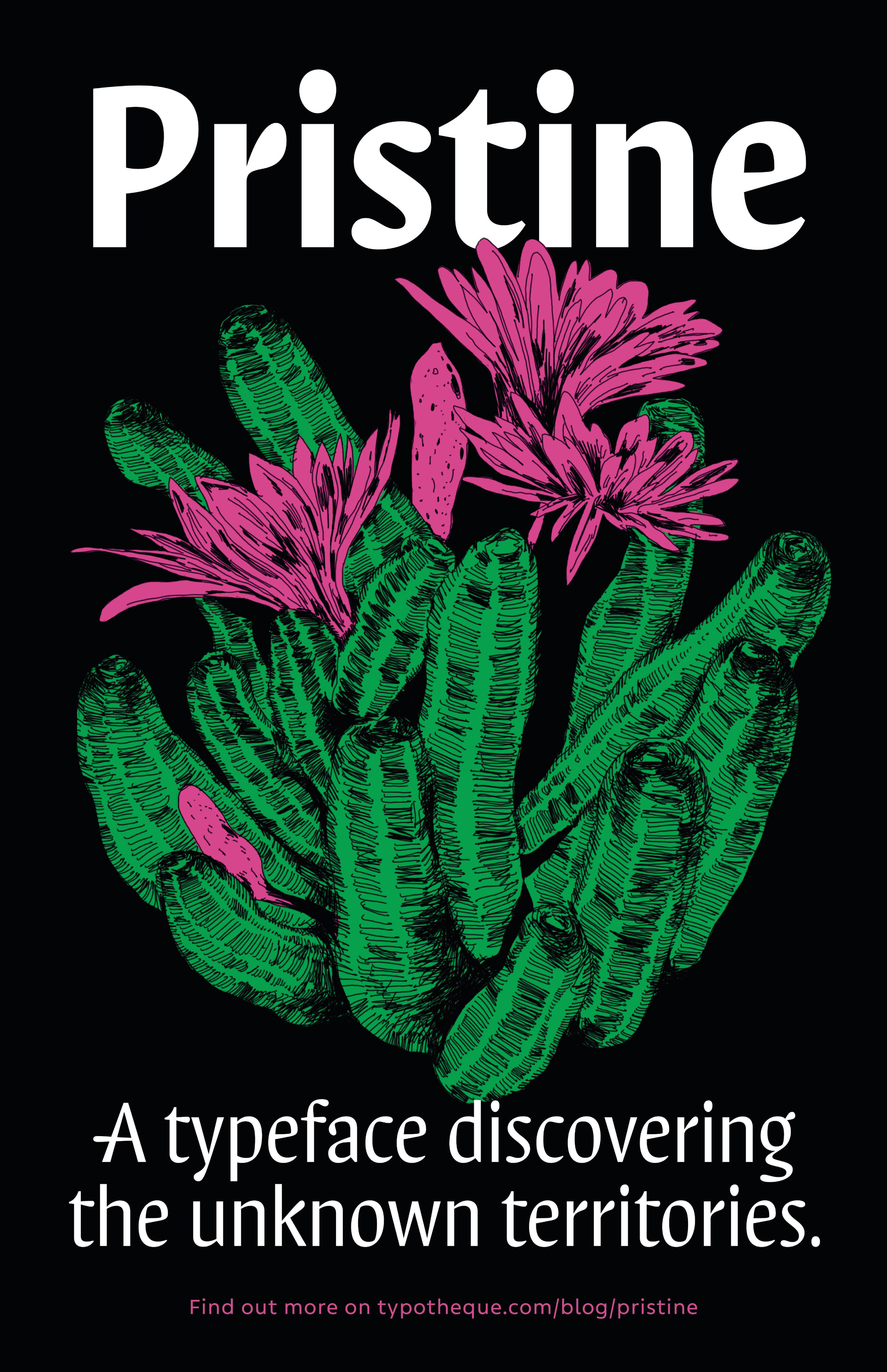
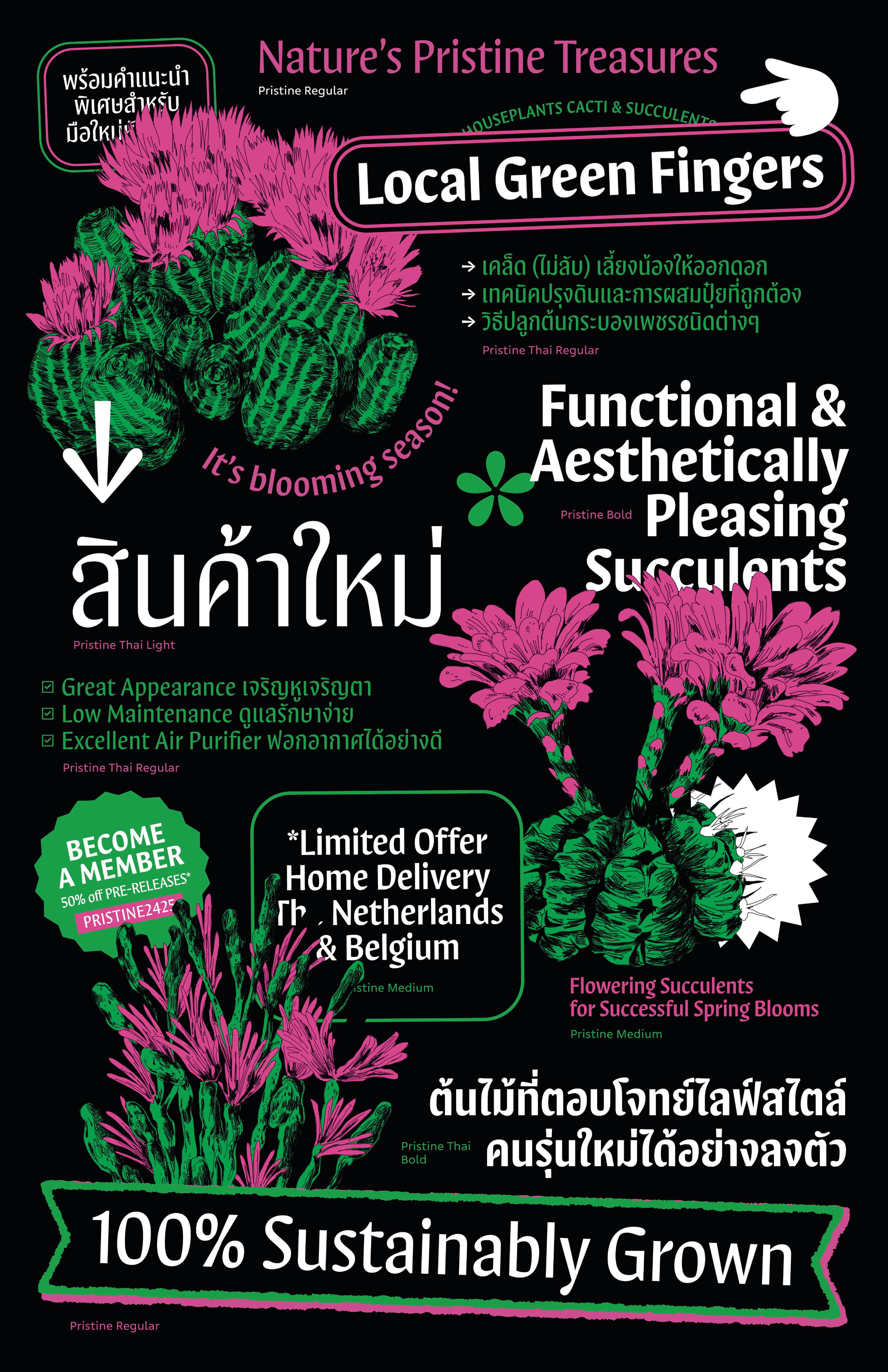
Pristine is a distinctive, hard-to-categorise typeface designed to bring an informal, warm personality to both Thai and Latin scripts.
Pristine began as Mint Tantisuwanna’s thesis project during her master’s in Type & Media at the Royal Academy of Art (KABK) in The Hague.
Her initial goal was to design a typeface developed simultaneously in Thai and Latin — distinct scripts with different conventions — while achieving
a shared tone of voice. The result is a typeface with soft, rounded terminals and sharply cut stems, giving it a cheerful, unpretentious character.
Designing a typeface that spans multiple scripts requires more than simply applying the same stylistic features to each.
Instead, it demands a deep understanding of the cultural and visual context of both languages. It’s about making intentional
choices — sometimes contrasting — to achieve visual harmony and a unified voice. In Pristine, subtle loop — inspired forms in
Thai help define the letterforms, while in Latin, similar shapes serve as flourishes that add a sense of informality.
Together, they form a charismatic duo that brings just the right touch of personality — approachable, modern, and expressive.
Now available on typotheque.com/fonts/pristine