About

I’m Zhenya Spizhovyi — a designer, calligrapher, and lettering artist from Ukraine. I first studied design at the Kyiv State Institute of Decorative and Applied Arts and Design named after Mykhailo Boichuk. At the time of this publication, I live in London. After the full-scale invasion of Ukraine began, I found myself in Berlin. Meeting like-minded people, my passion for typography, lettering, and calligraphy, and the desire to grow and move forward — all of this led me to apply to TypeMedia.

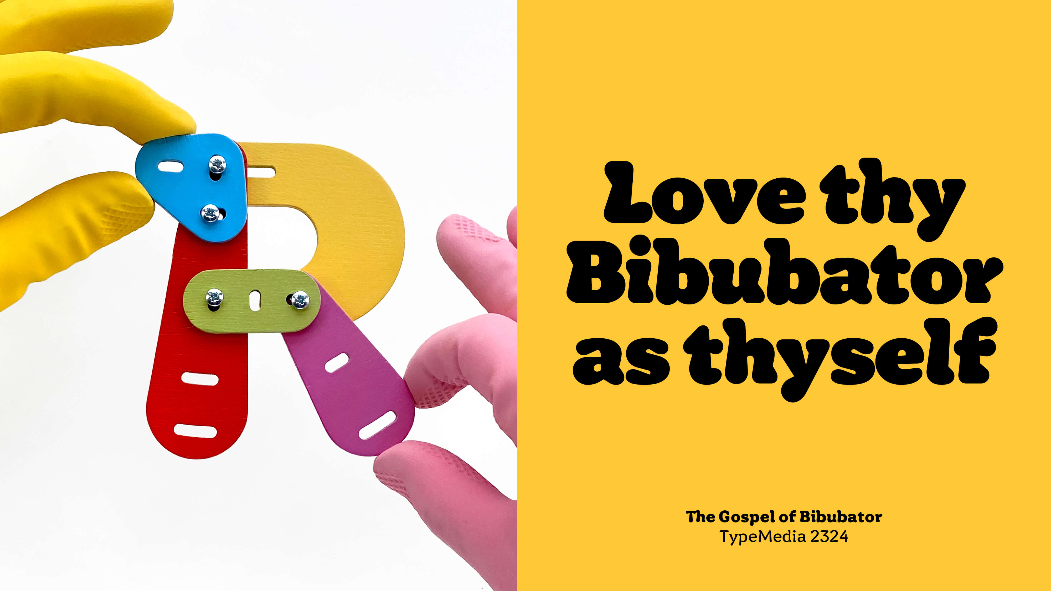
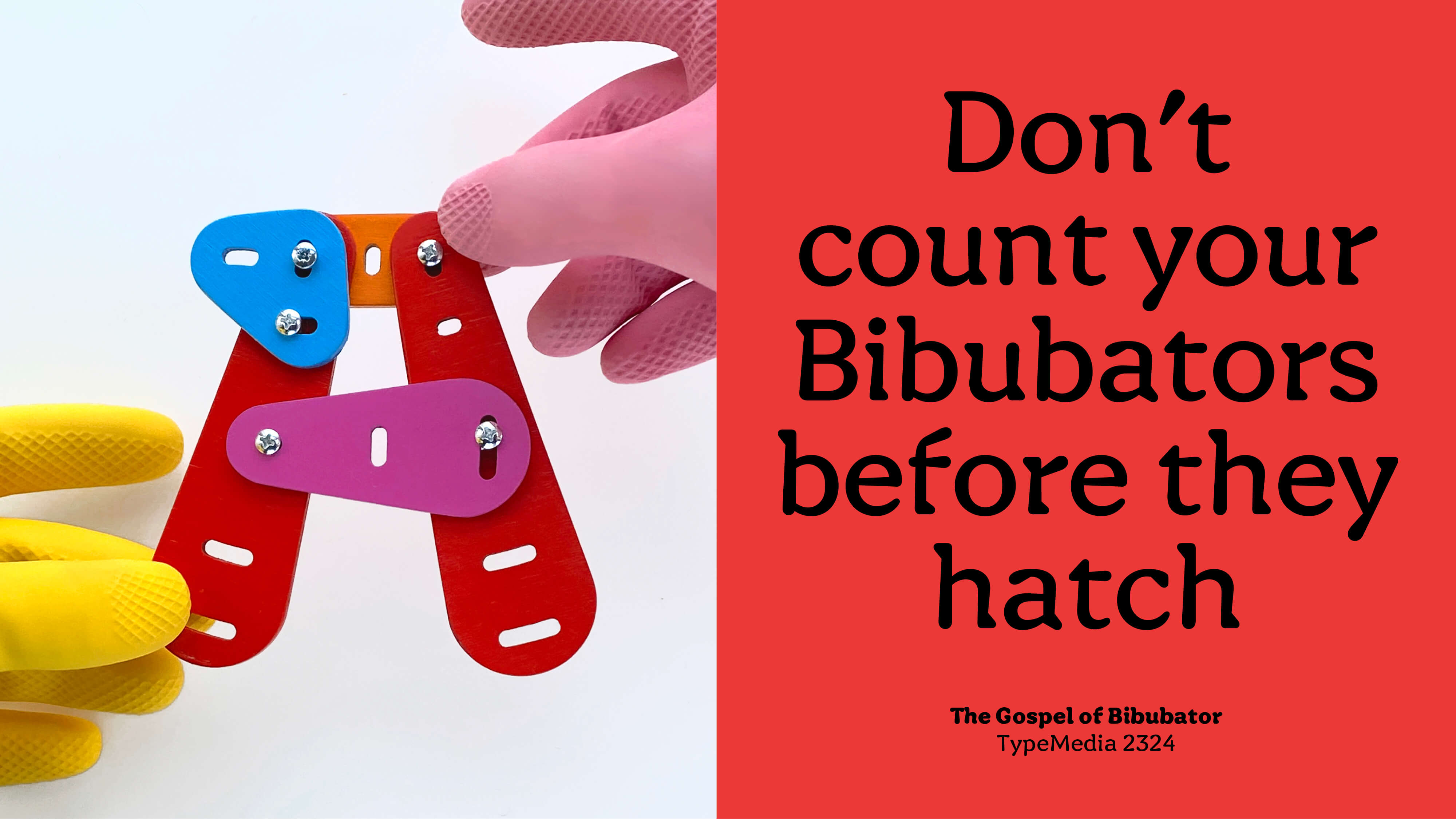
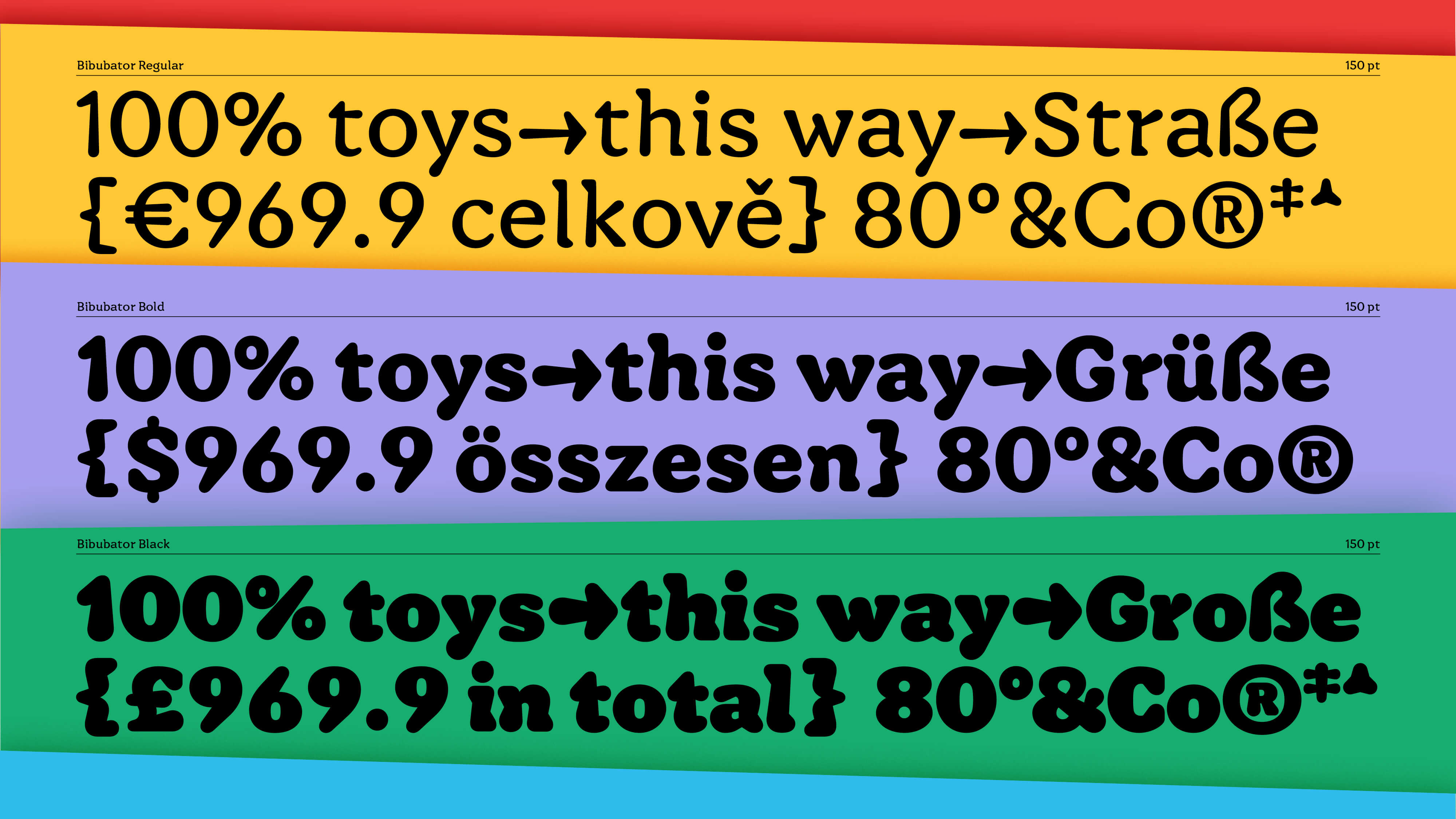
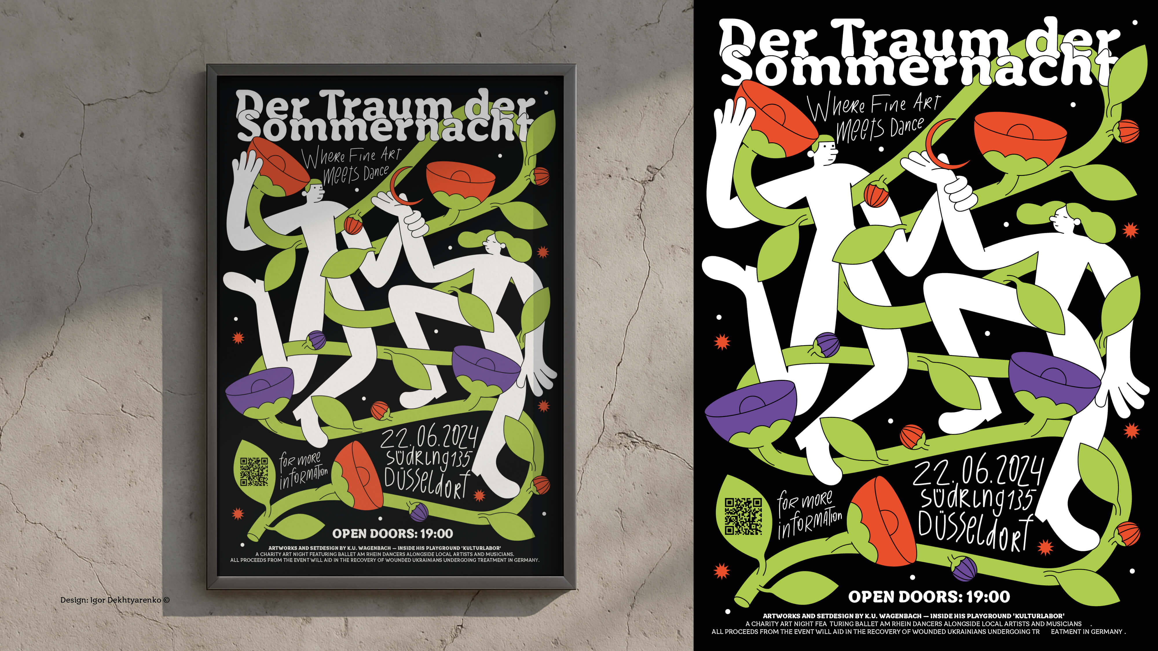
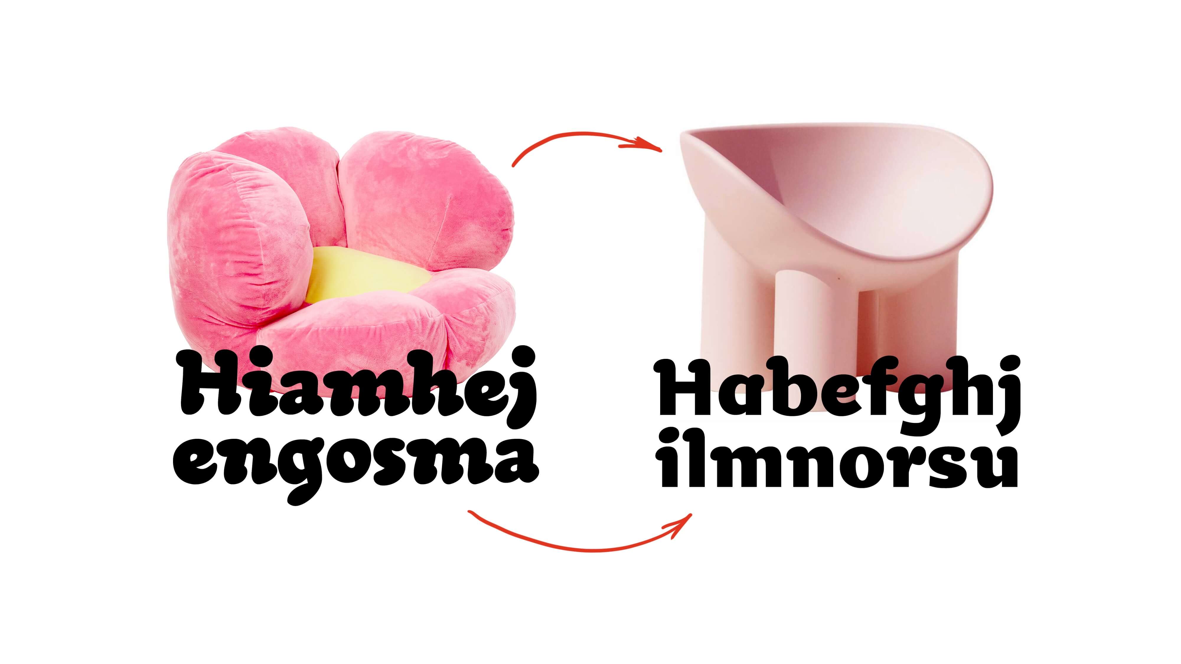
Bibubator is an intuitive search for form, inspired by reflections on my childhood and the environment I grew up in. More broadly, it’s an attempt to understand how childhood shapes our taste and aesthetic as designers. 
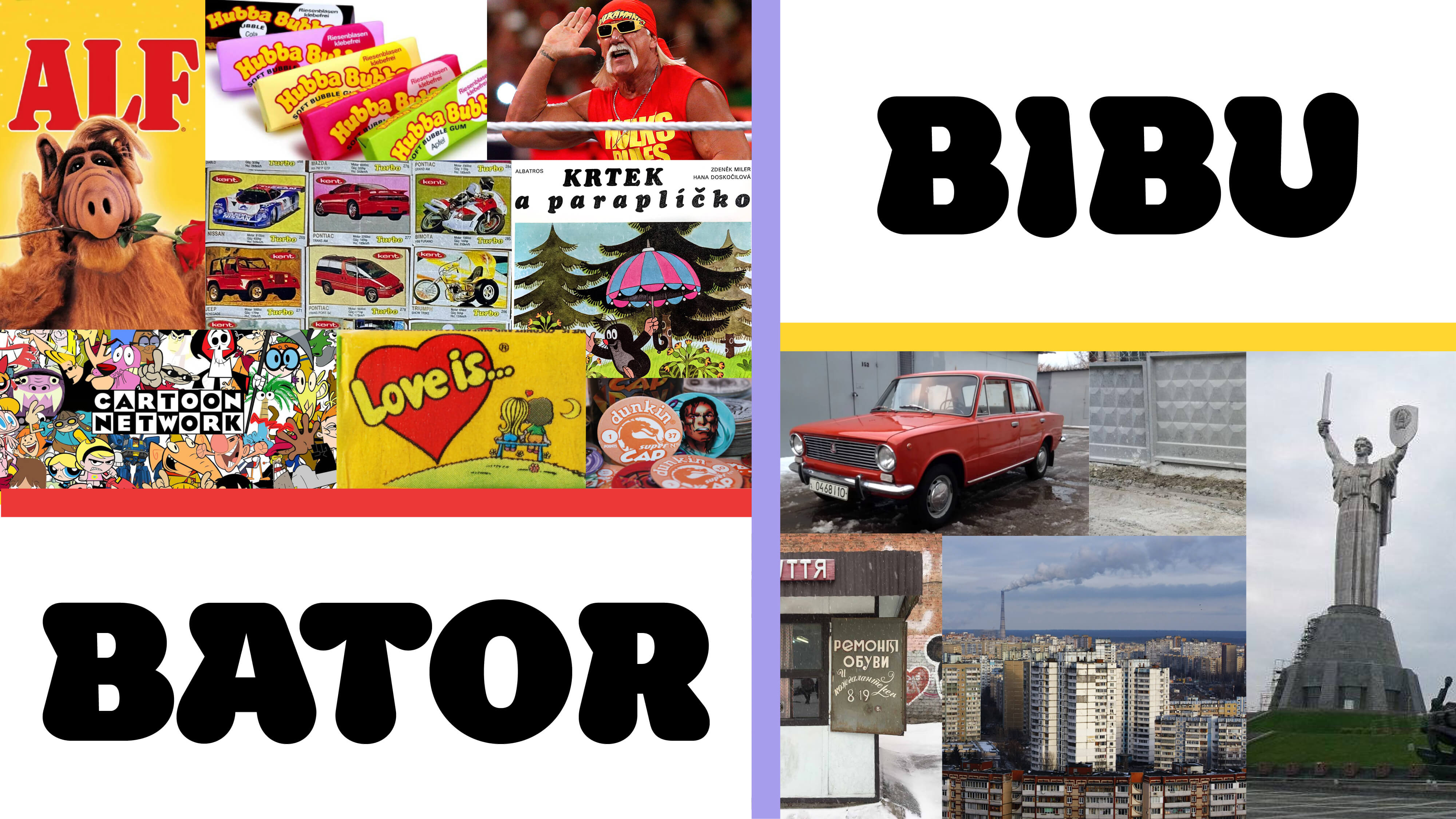
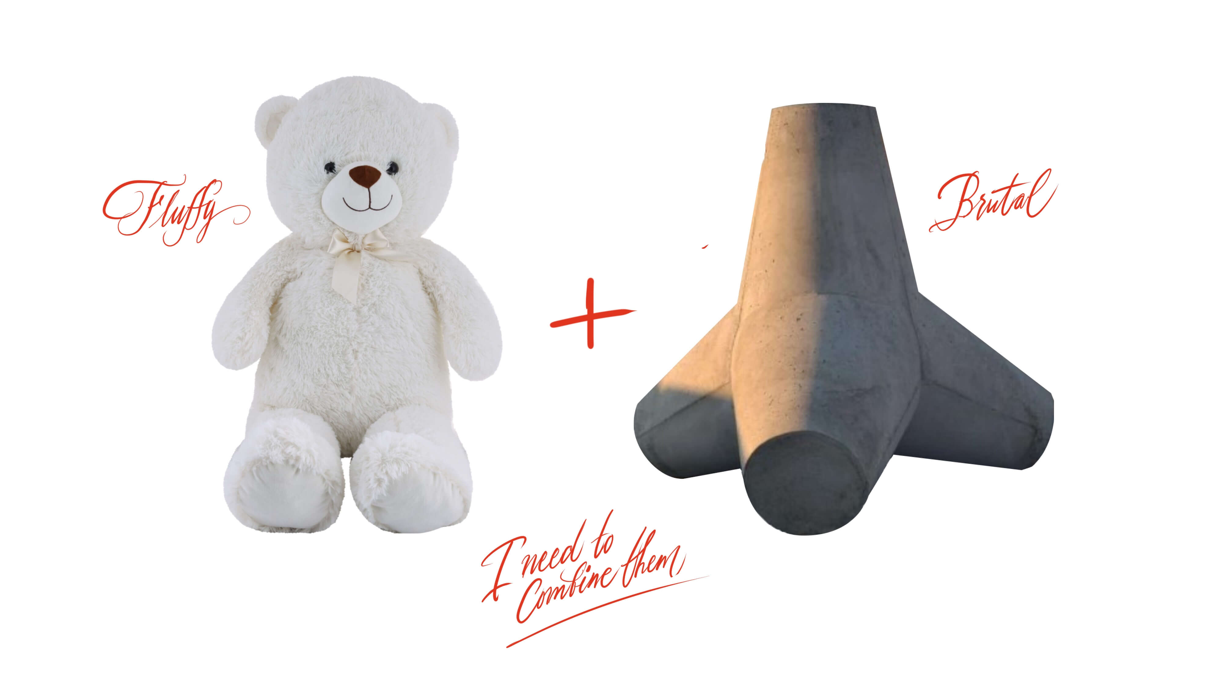
Growing up and forming my identity in 90s Kyiv, I absorbed the raw aesthetics of the post-Soviet transition from a socialist system to an open economy, while also witnessing the early years of an independent Ukraine, open to Western culture and markets.

This contrast between two clashing and hardly compatible cultural paradigms became a metaphor and a driving force for my visual research. The mix of brutal industrial forms and soft, childlike playfulness is reflected both in the shapes and in the name of the project — Bibubator. As an extension of the digital typeface, I also created a physical wooden construction set, which became a conceptual and promotional addition to the project.

Beyond the conceptual side, this project was also a way to explore and define my own method of developing a type system: field research, sketching, structuring and analysing material, navigating creative crises, working with font technology, production, presentation, and finally promotion — all of these were essential parts of the process and the experience I gained.

Process

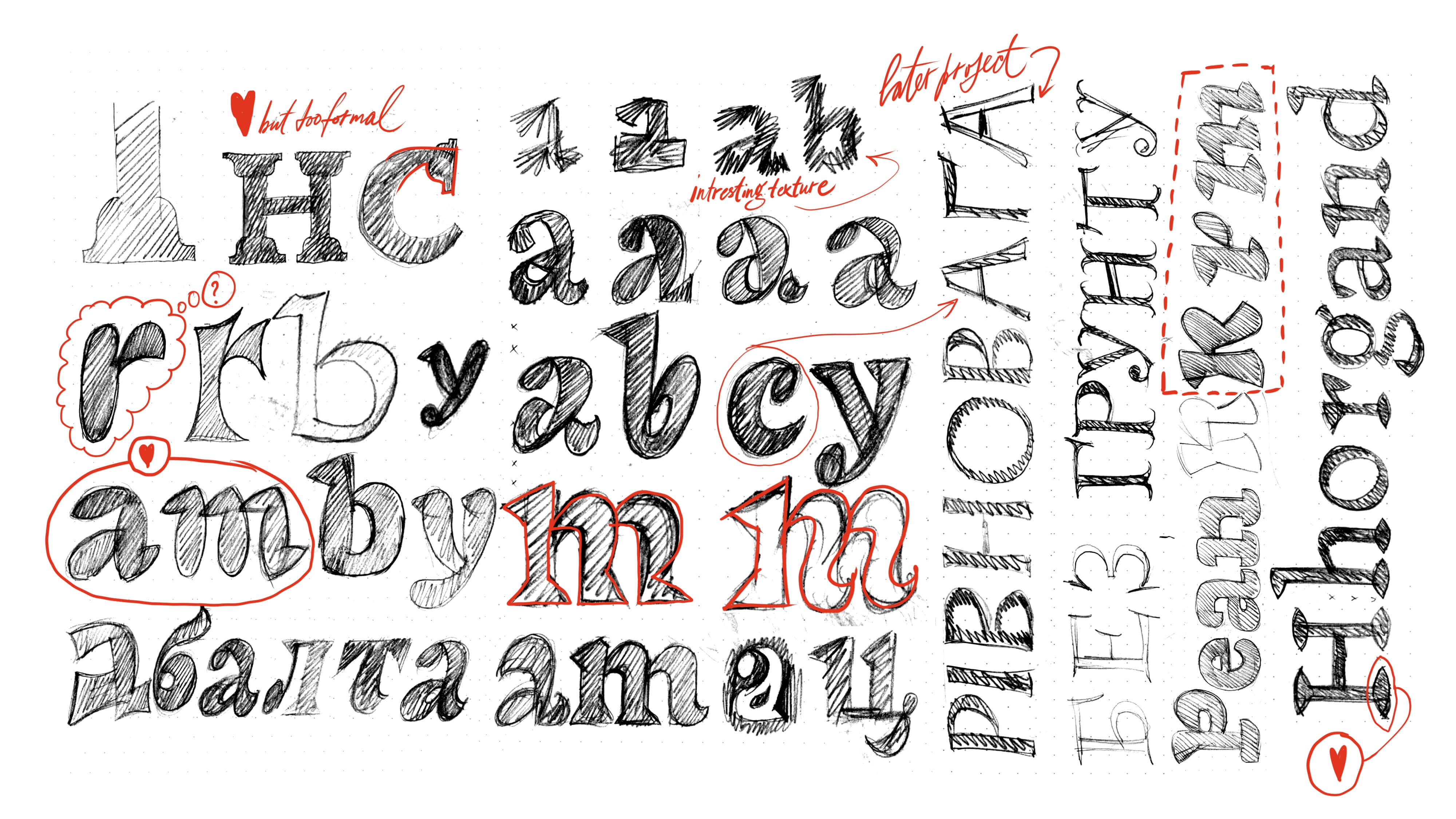
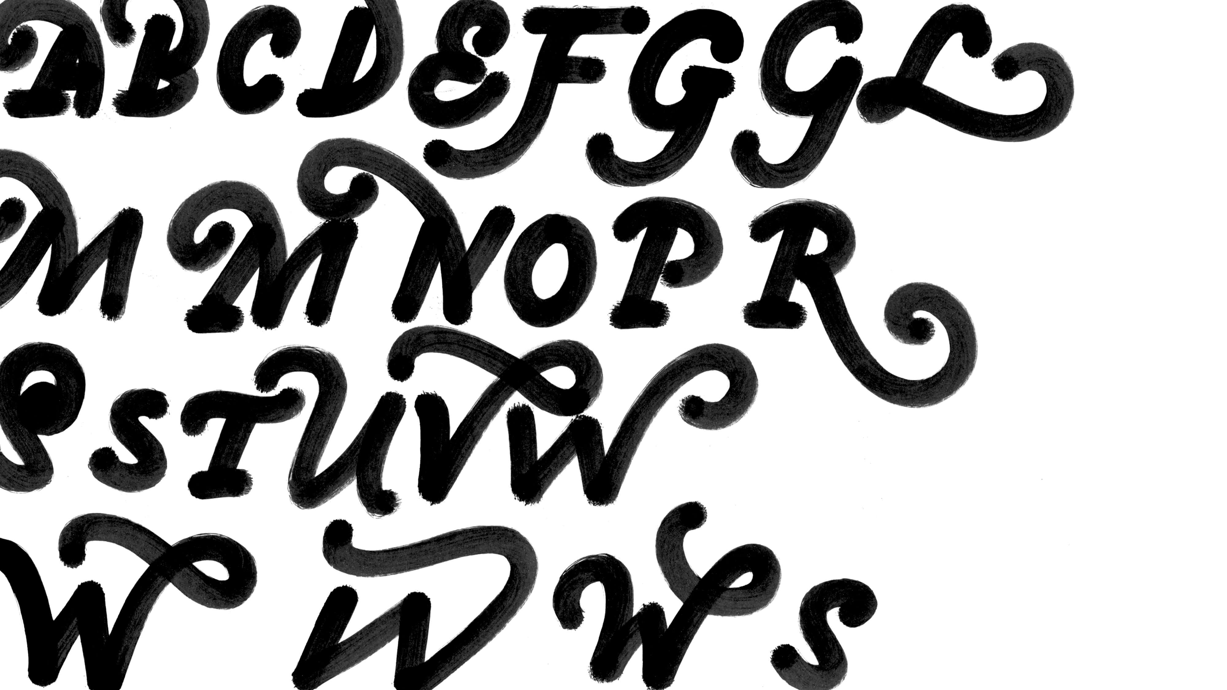
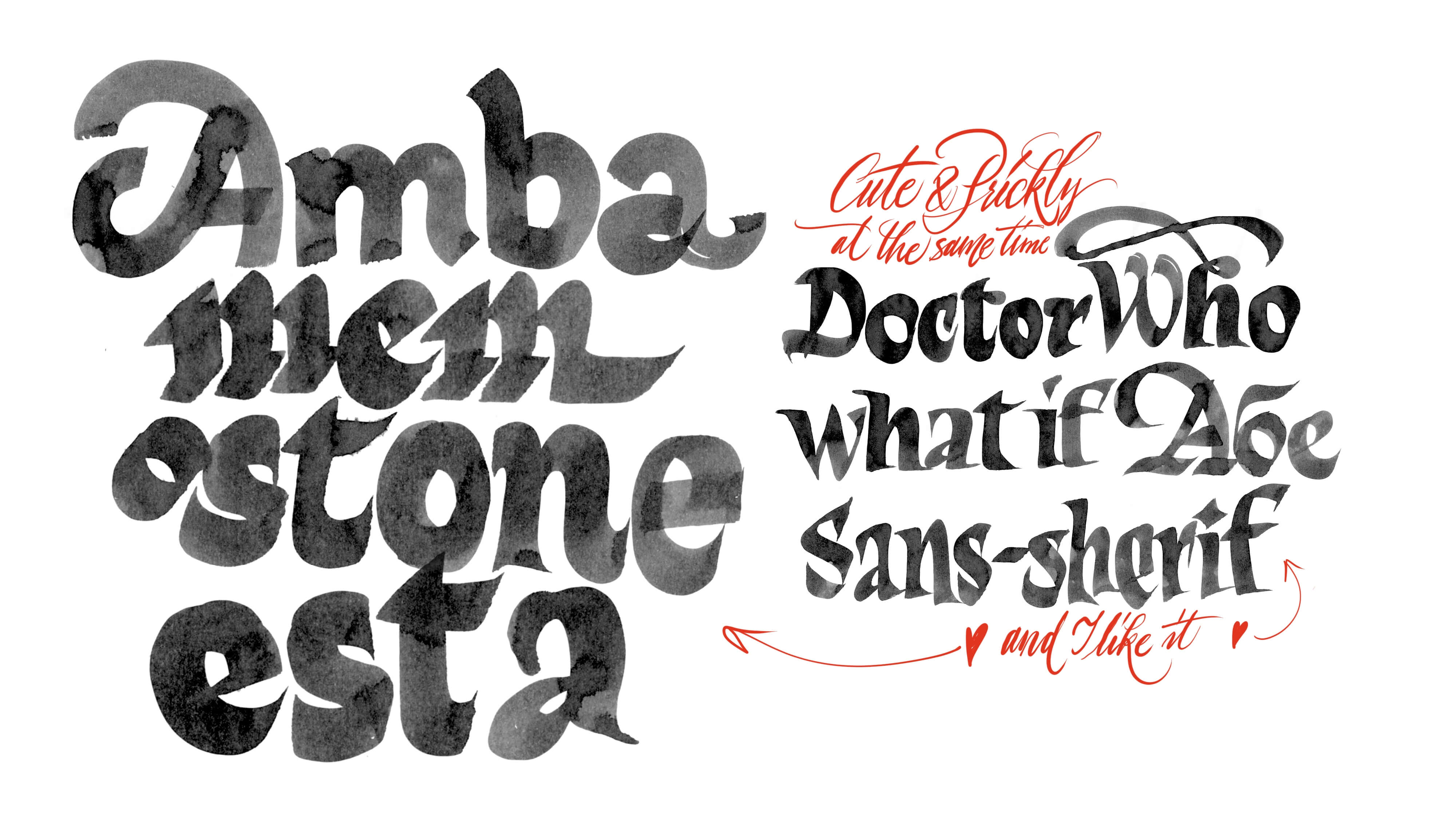
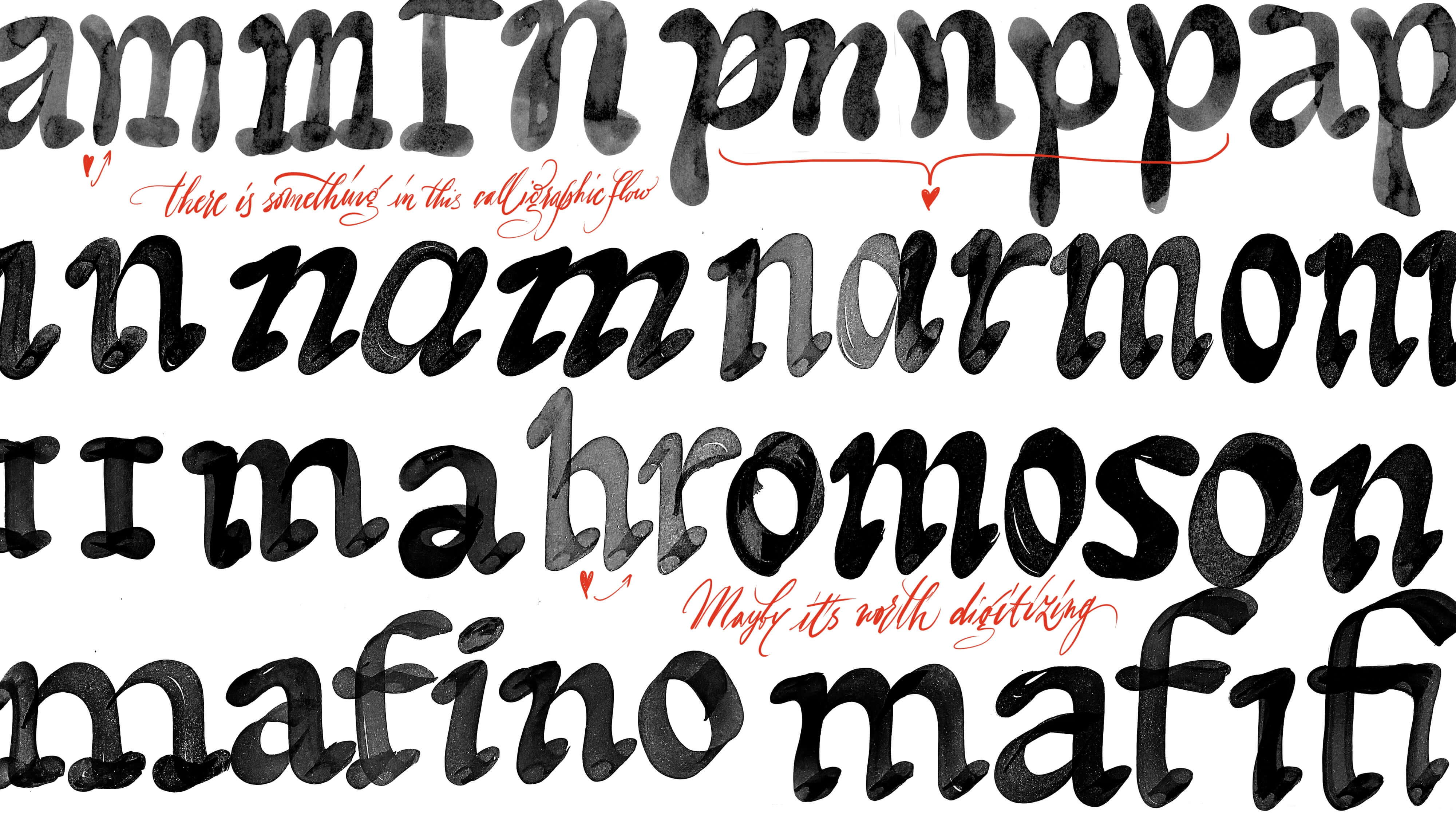
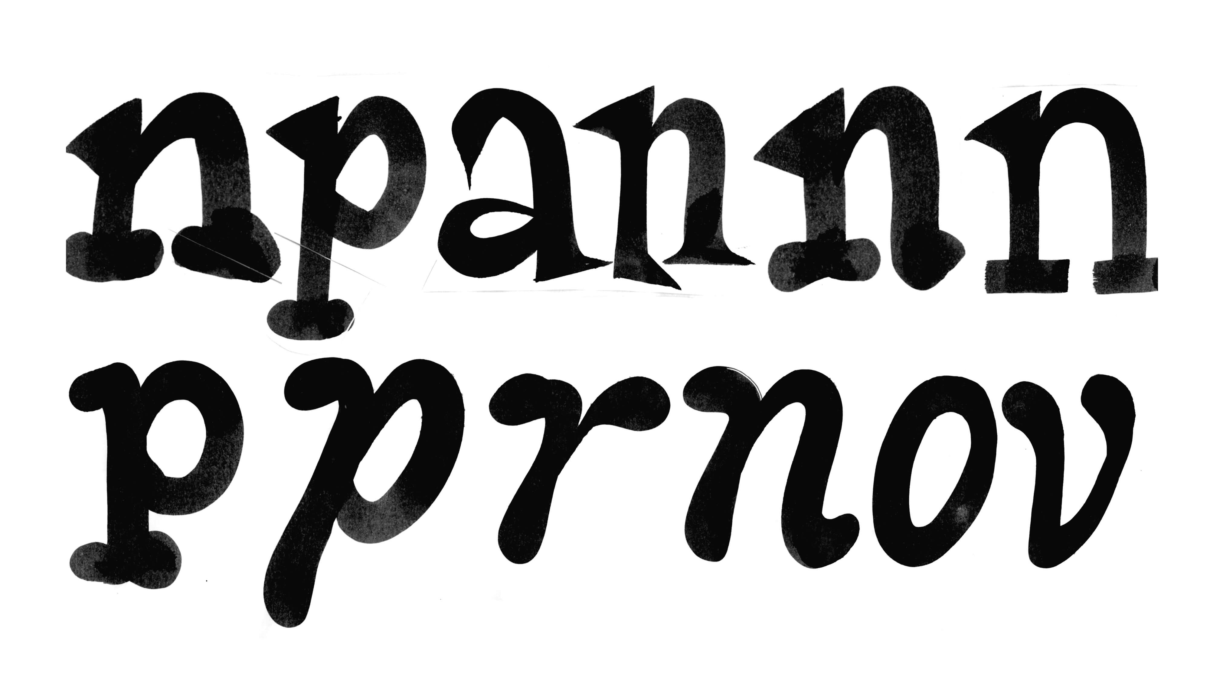
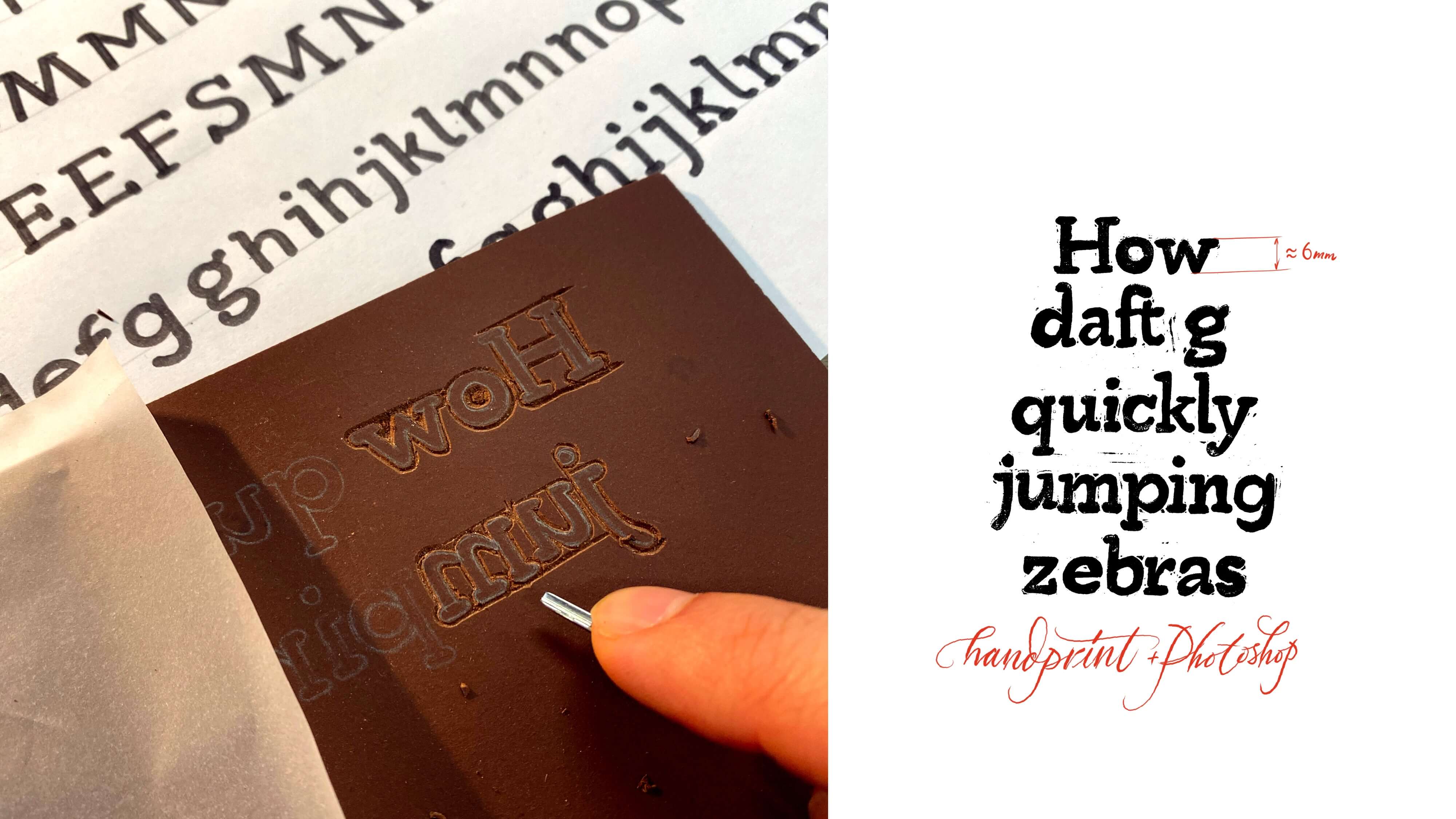
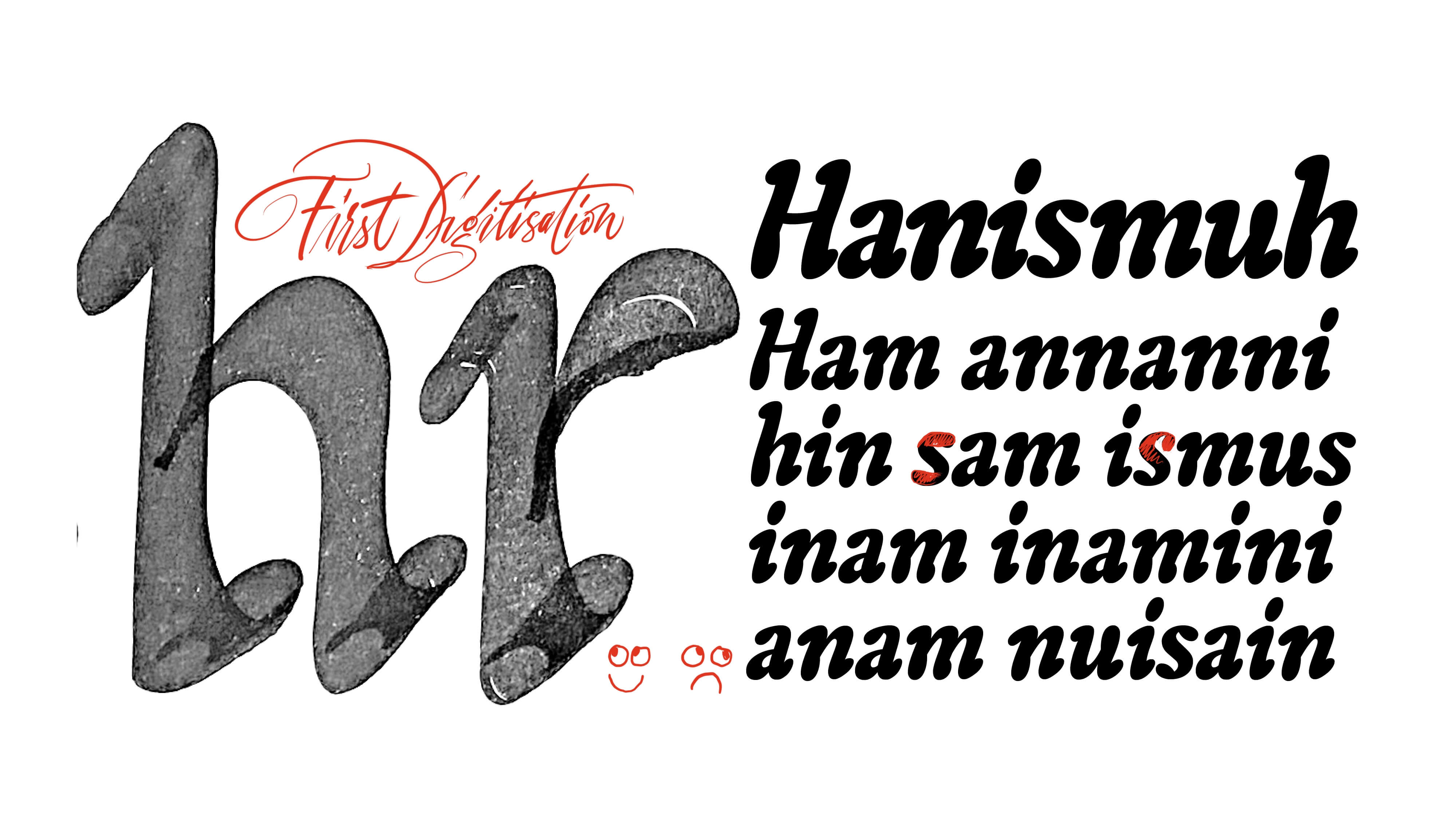
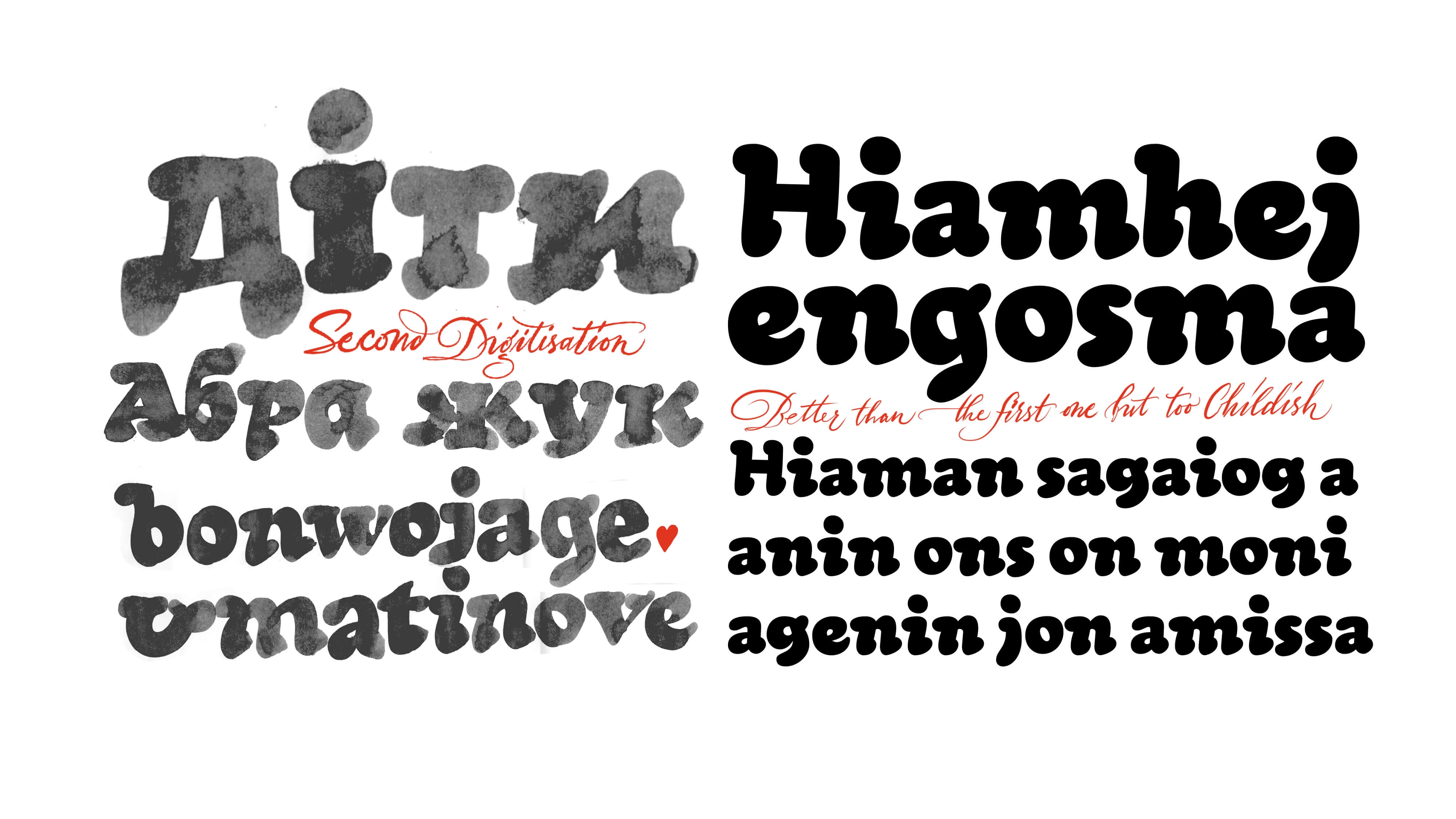
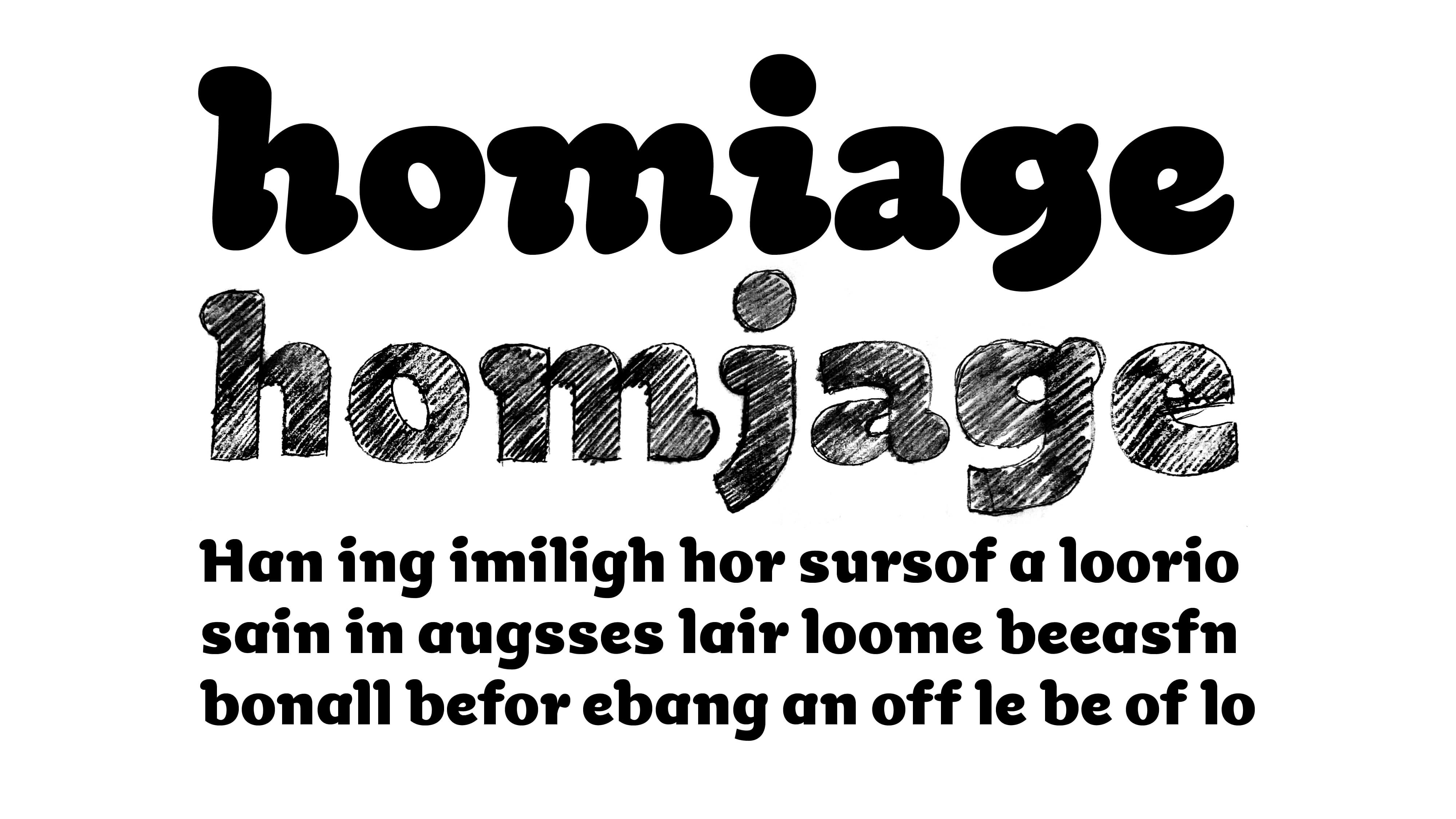
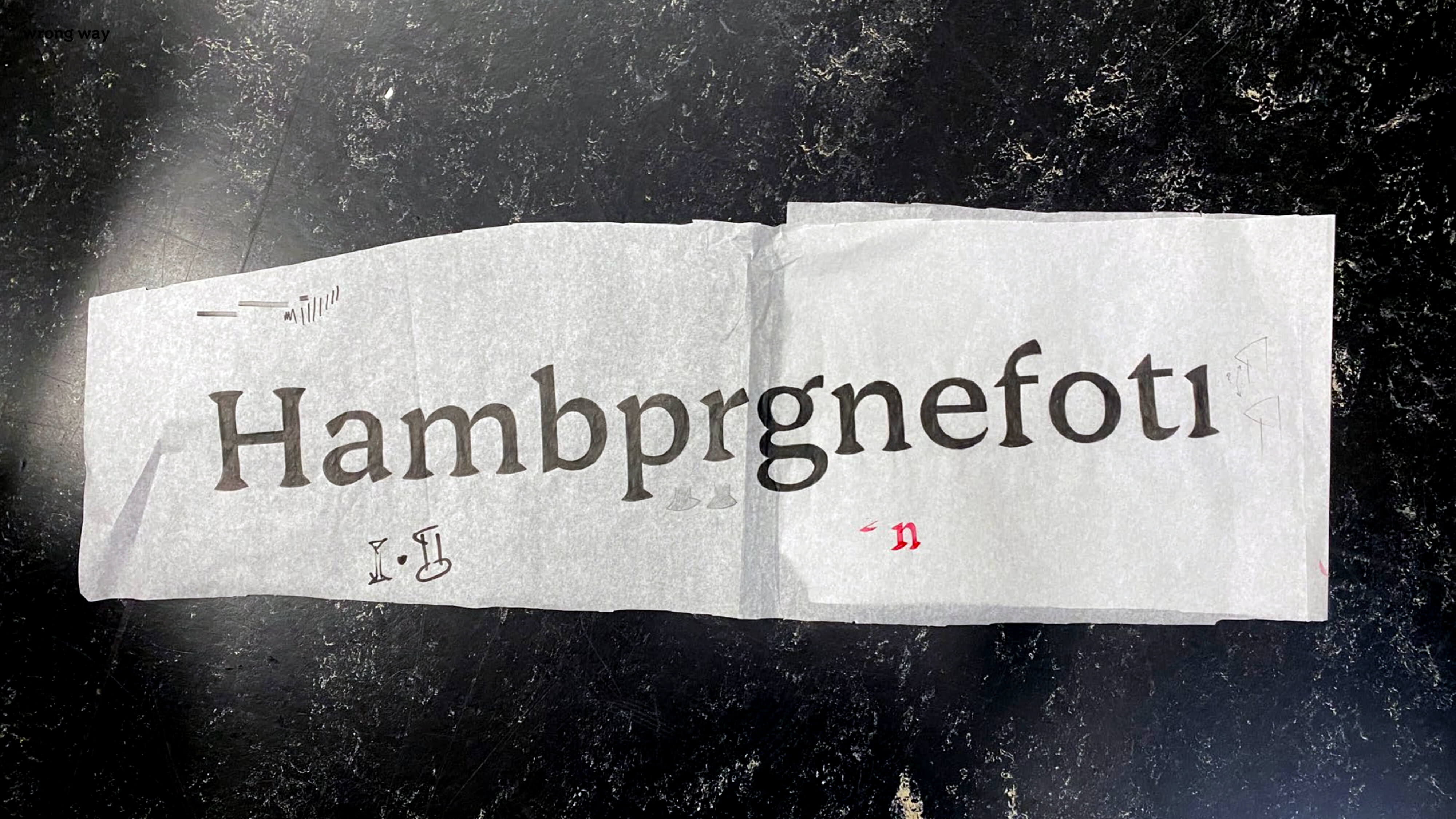
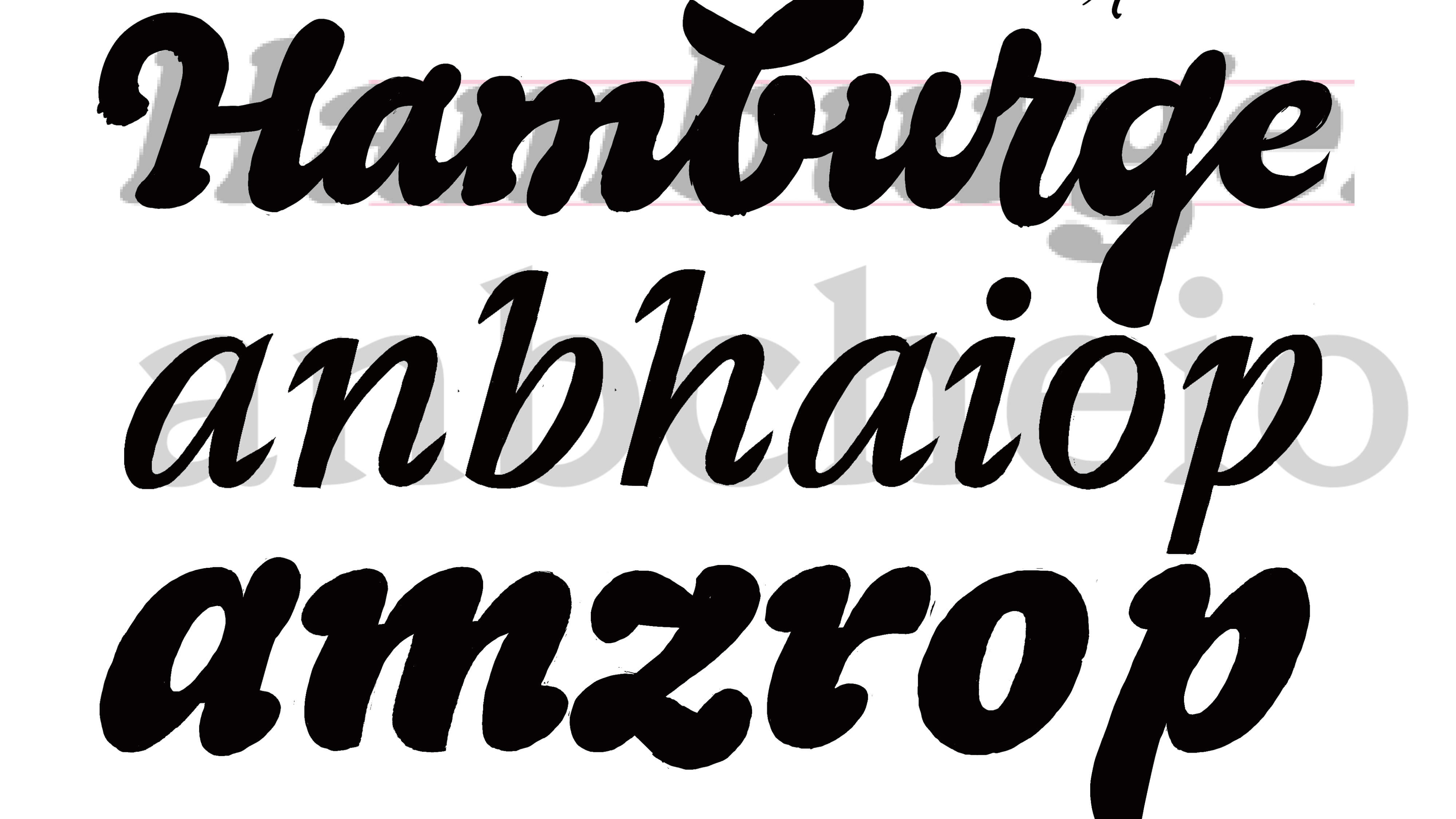
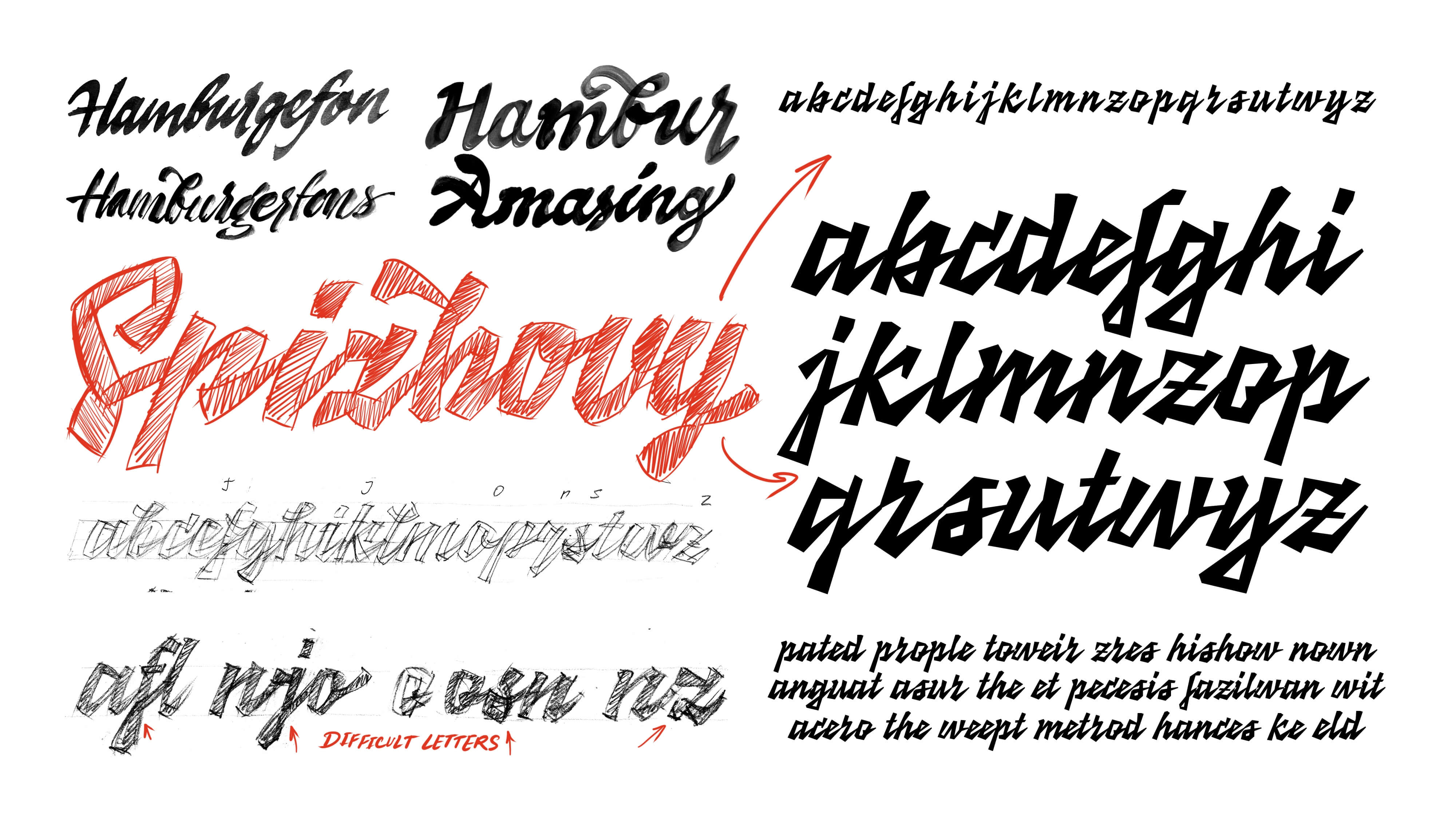
How do you start something when you don’t even know where it’s meant to go? I began with what I knew best — lettering and calligraphy. But I wasn’t aiming for beautiful calligraphy in the usual sense. I explored forms intuitively, keeping in mind a theme: childhood and children’s type. Ironically, by the end, I had to work to remove the calligraphic influence from the project.

While searching for the shapes I needed, I combined the process with things I enjoy — like linocut. Carving small calligraphic letters helped me strip away excess and simplify forms. It was fun, but I realized the method was limited by the tools and material. Later, with the same goal, I looked at how digital letters distort when printed very small. That helped me shape some terminals and serifs.
Perfectionism is both a whip and a treat for many type designers. It pushes you forward and holds you back at the same time. That’s why learning to plan and let go is a skill in itself. At some point, I just had to start digitizing. And I did.
I picked the two calligraphic sketches I liked the most and began vectorizing them.
Very quickly I realized two things: (a) the liveliness of calligraphy gets lost in digitization, and (b) what I liked as calligraphy looked too childish in text. That helped me define the direction for development. Choosing the right visual metaphors kept me focused and clarified the aesthetic I was aiming for.
At some point in the process, trying to balance softness and straightness, I drove myself into a dead end — a phase I later called the Cooper Black crisis. I kept circling around an image in my head, but everything I made ended up looking like Cooper Black.
To break out of it, I explored more dead ends: interpolating between sharp and rounded shapes, trying swashes, scripts, and other failed attempts now buried in dark folders or piles of forgotten printouts.
Discussions with teachers and classmates were essential. During one of those, I realized the system I was building could split into two directions. I chose the one that leaned more toward display use, and that helped me move forward and overcome the Cooper Black phase.
The idea of mixing soft and hard forms found its expression in the interaction between form and counterform. Once I had the mood and structure of the bold weight — the one I spent most time on — I started expanding the system with a text weight and other styles.
Building a wooden and metal construction set turned out to be a perfect match for the project. On the other hand, I didn’t have an italic. And merging incompatible ideas in one typeface is hard and usually not rewarding. I managed that, but it took a lot of time to make the system both expressive and functional. When I had to choose between continuing the italic or building the physical set, I went with the option that gave me more joy — and I never regretted it.

Specimen

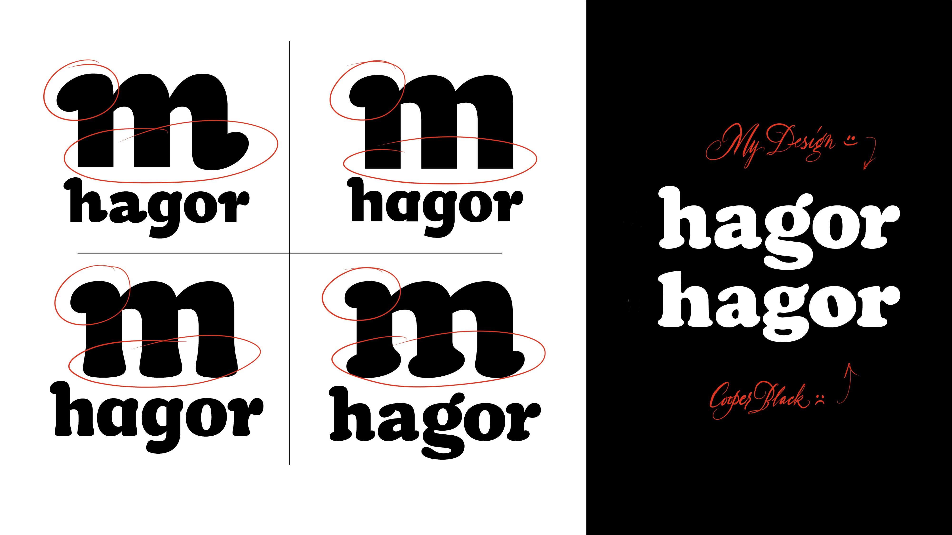
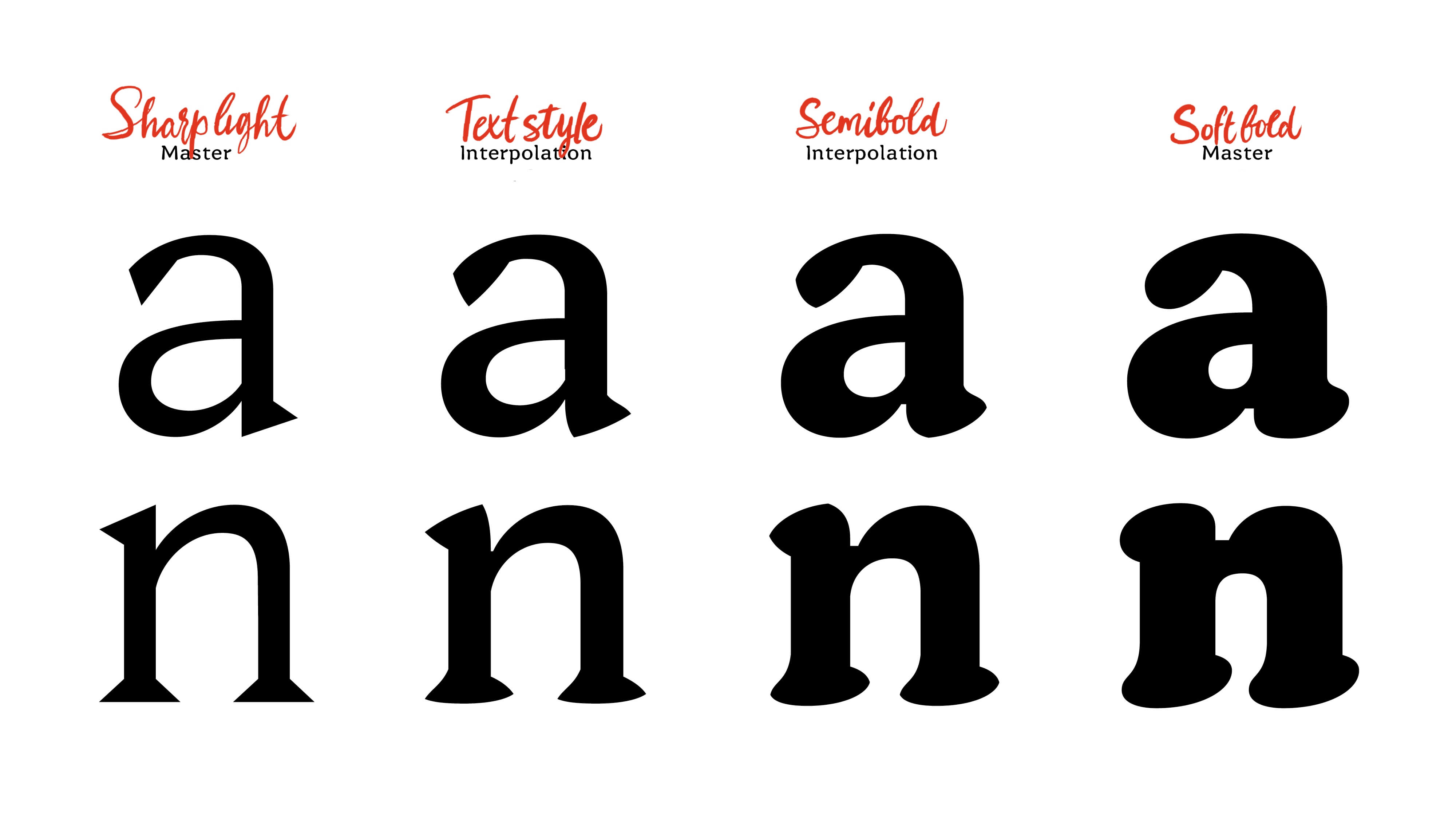
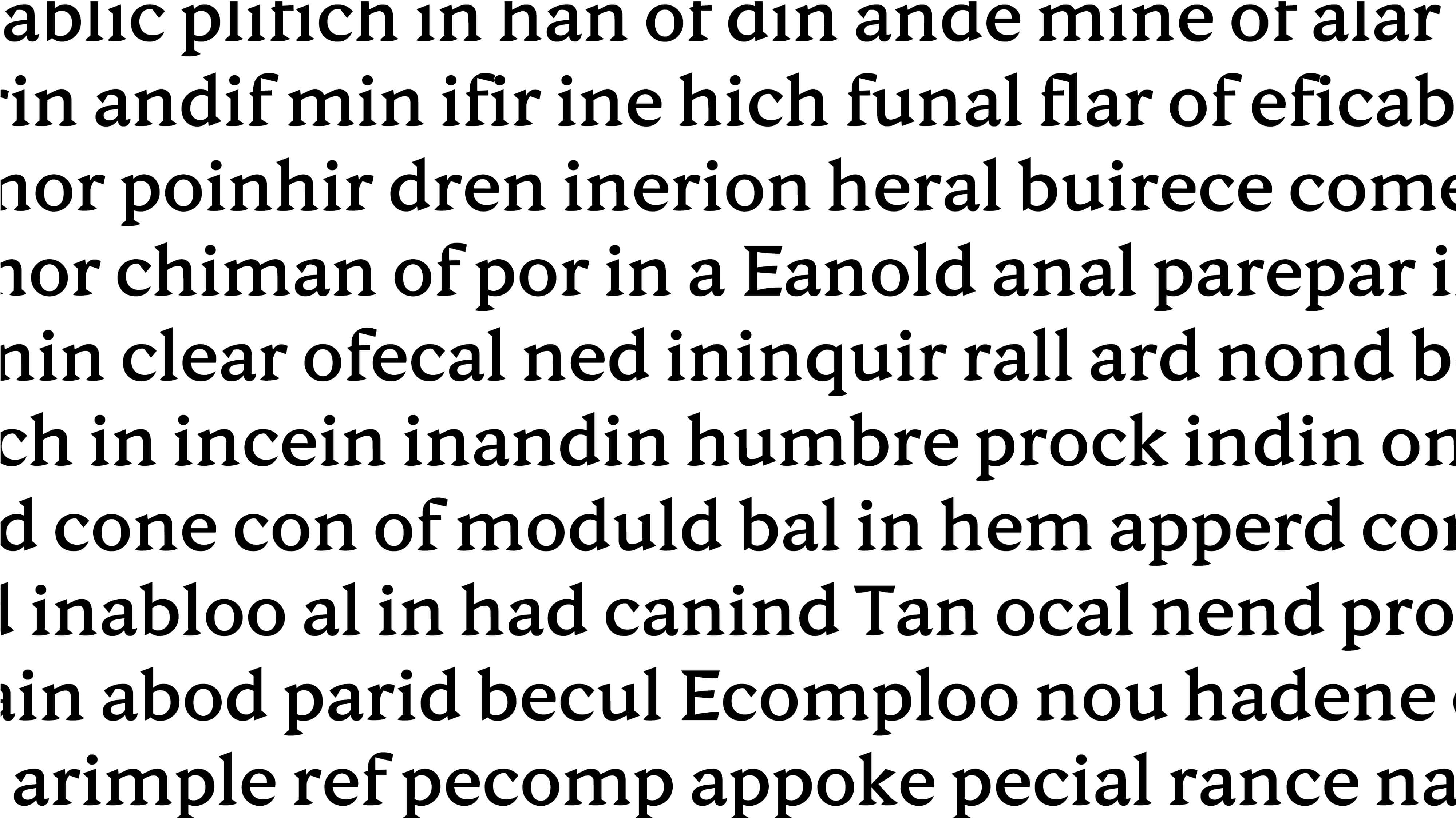
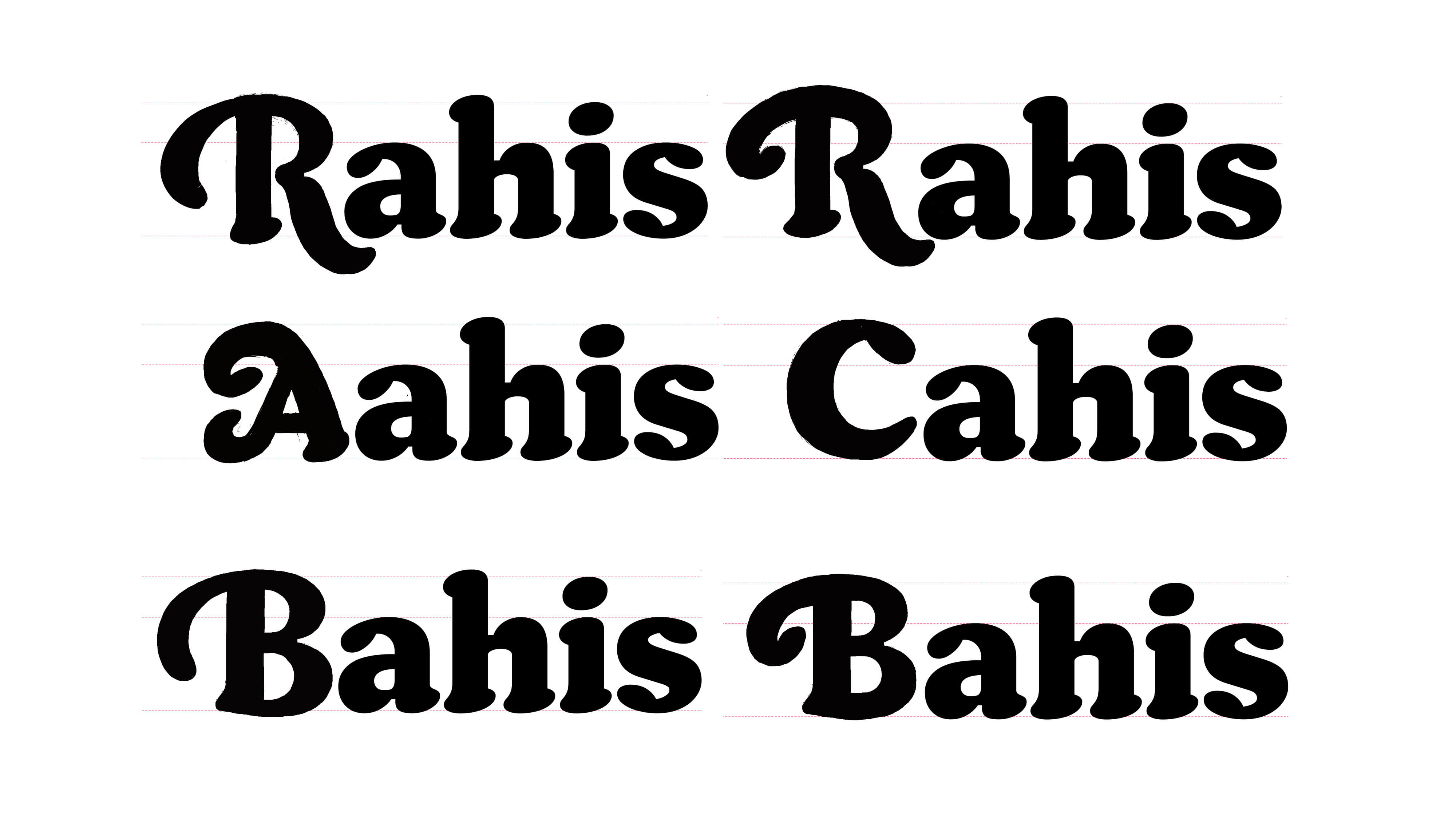
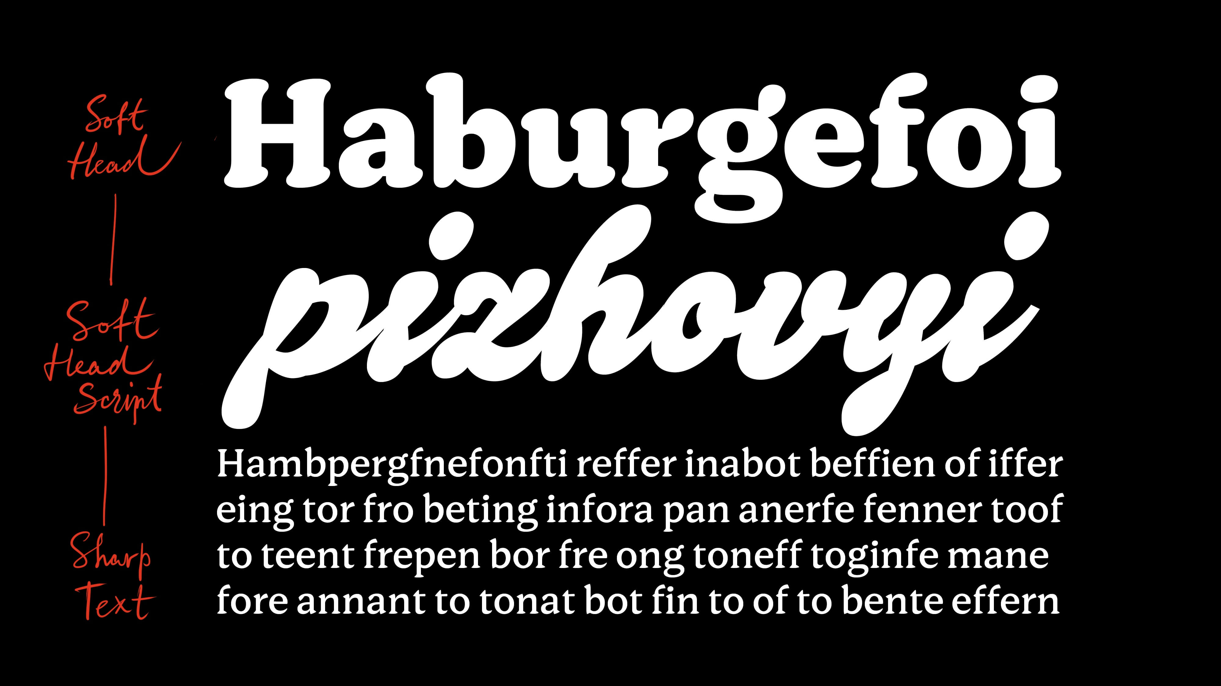
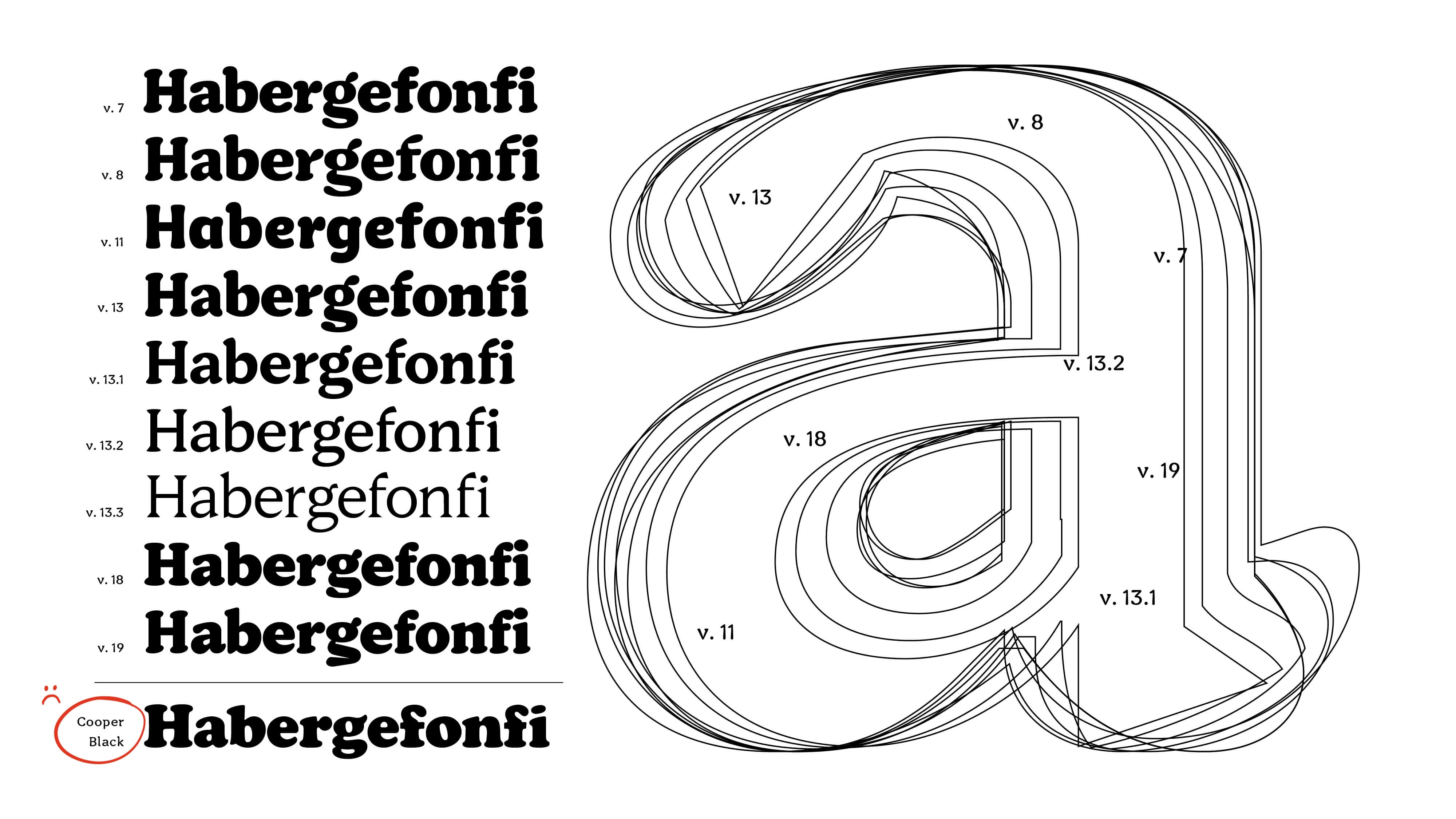
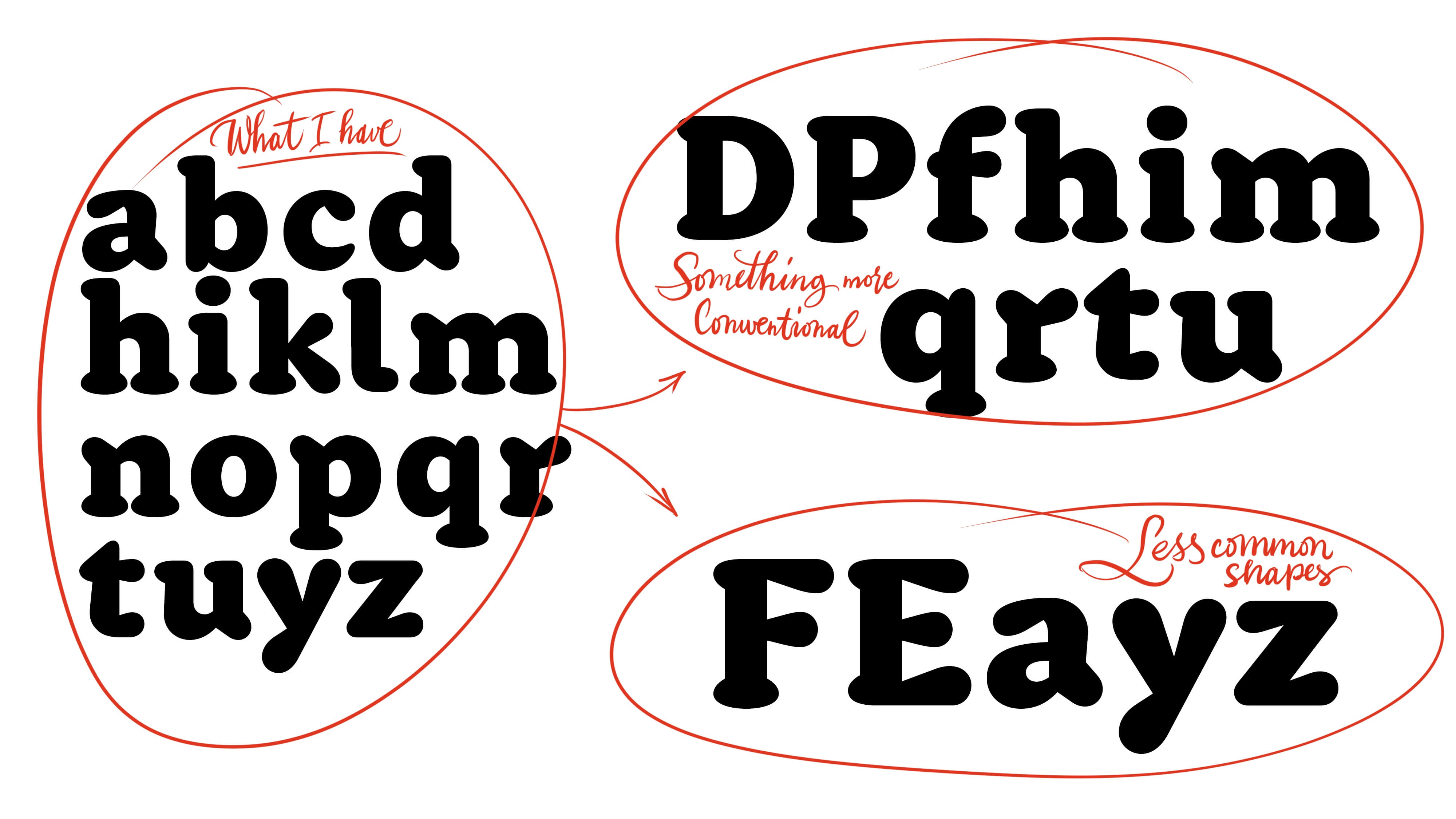
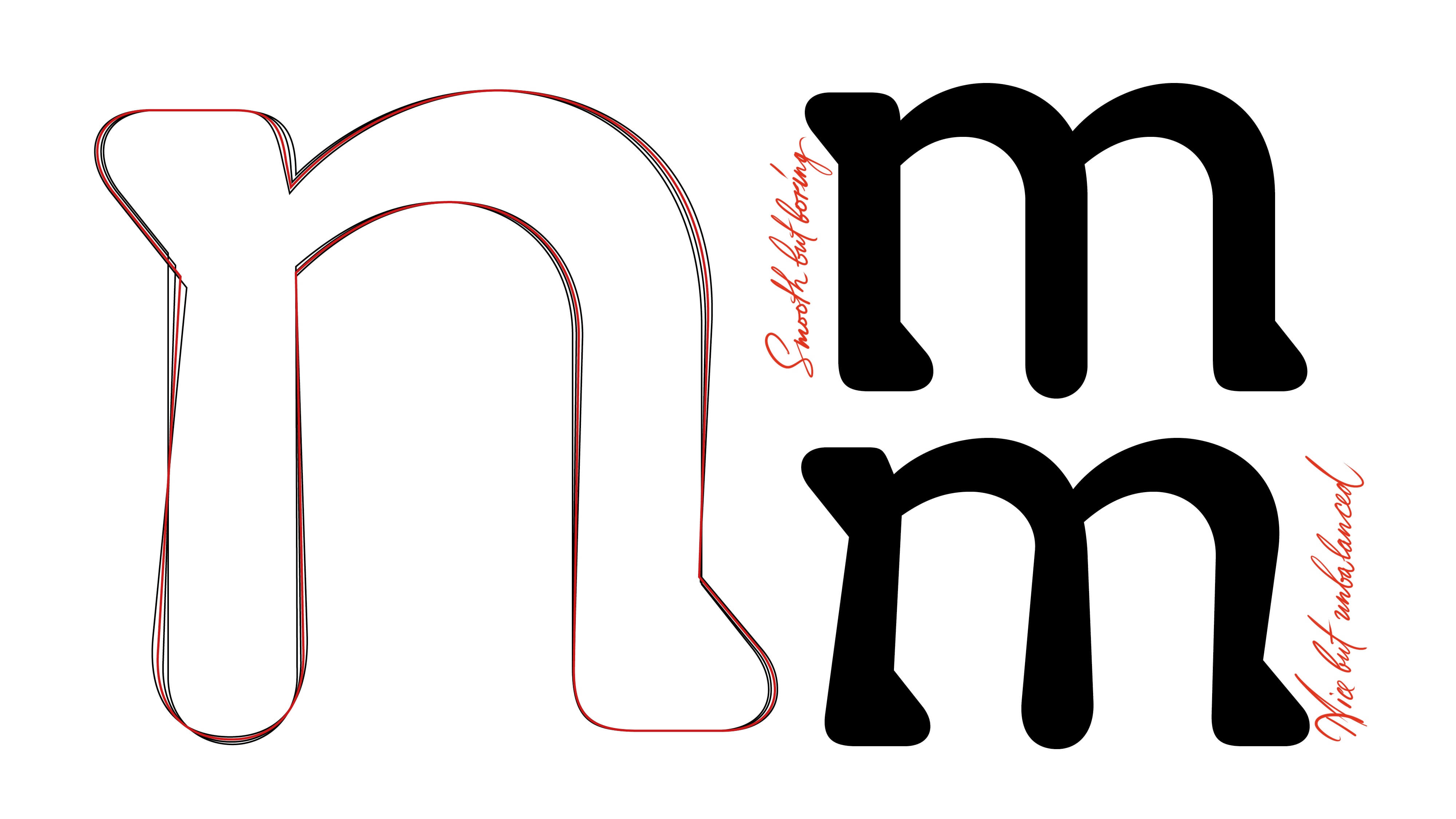
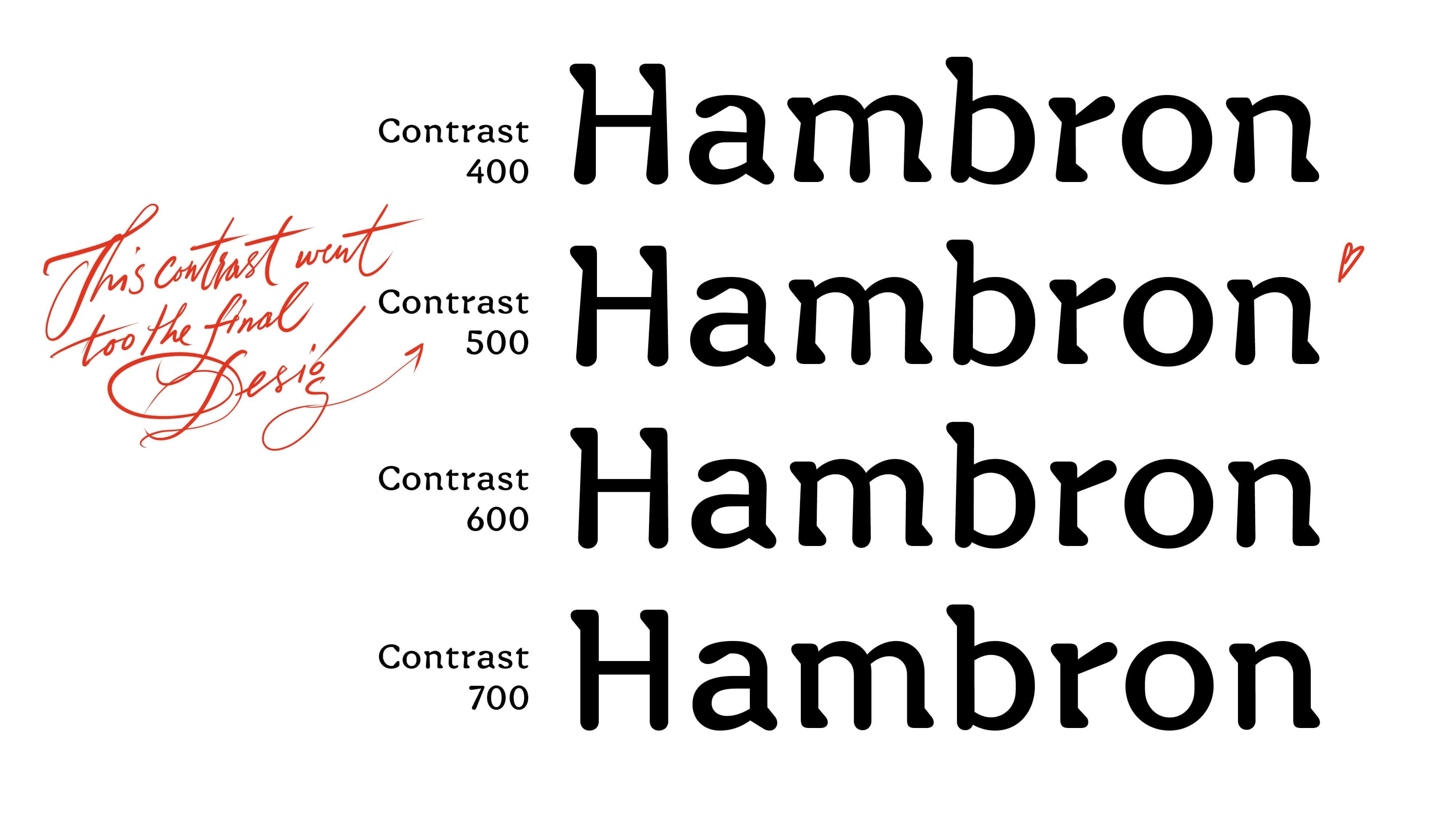
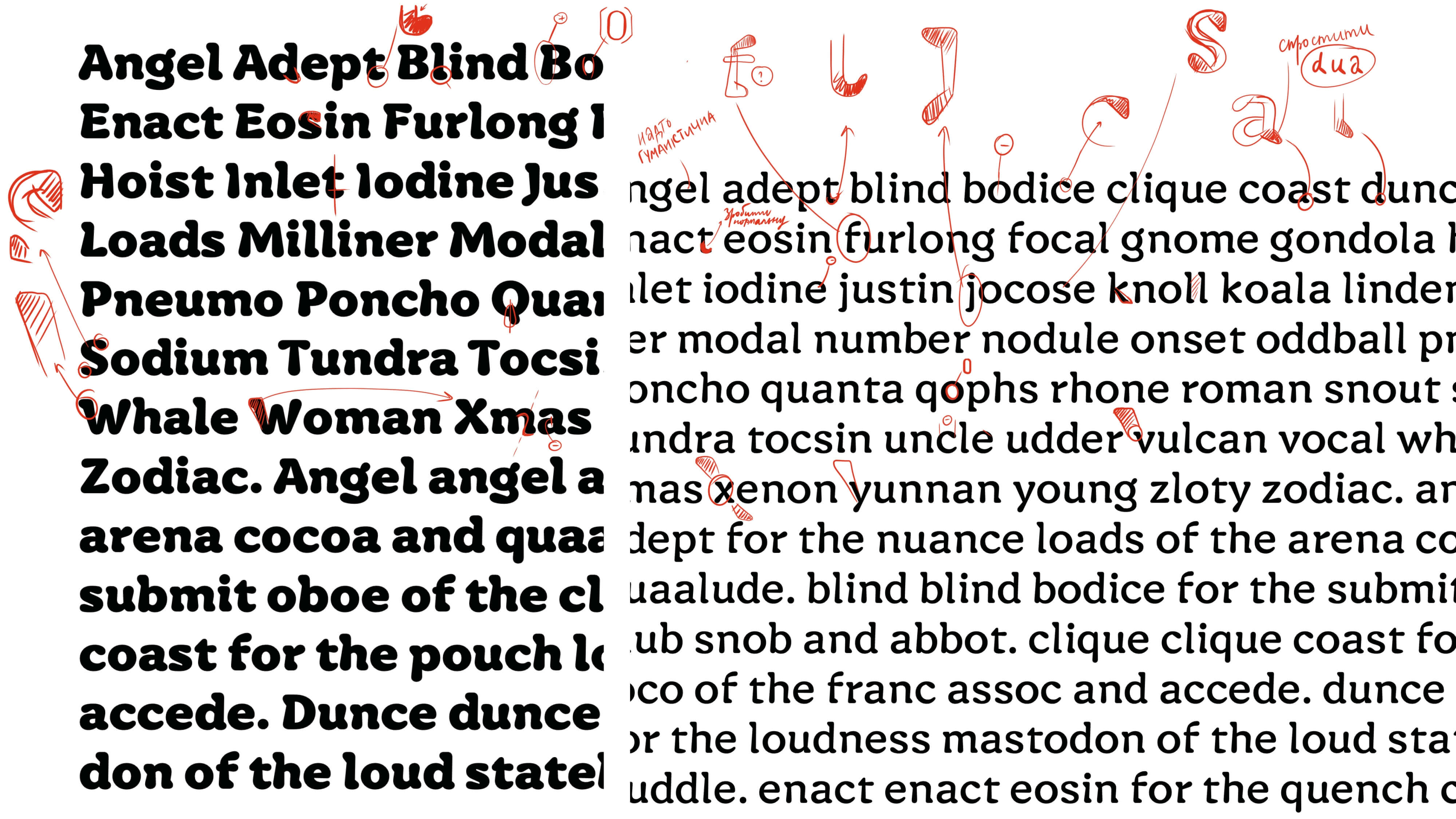
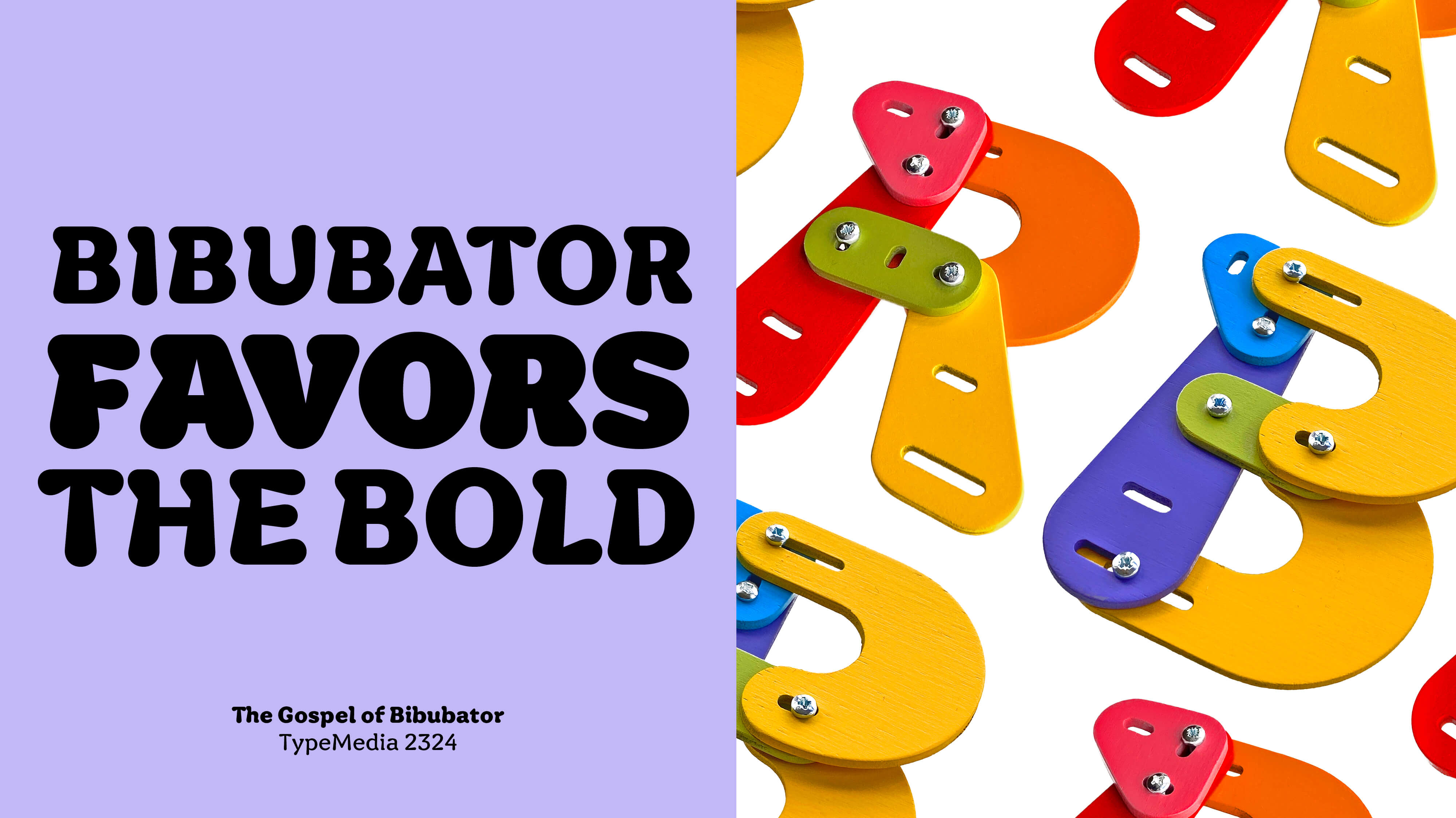
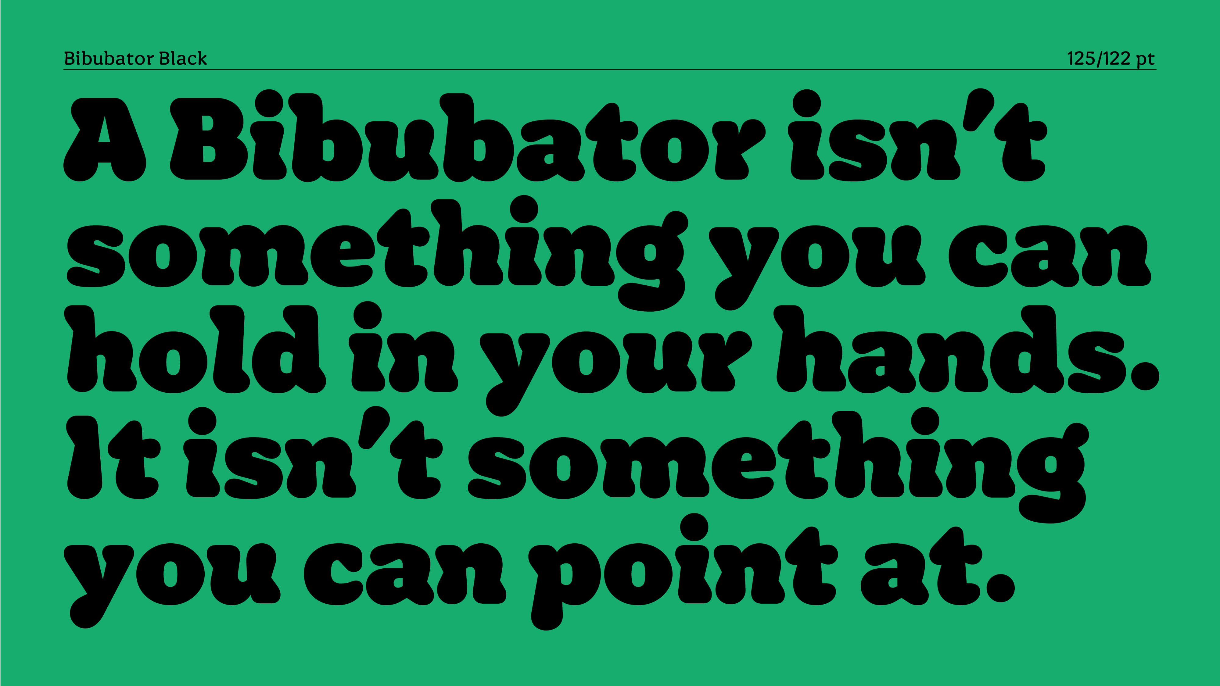
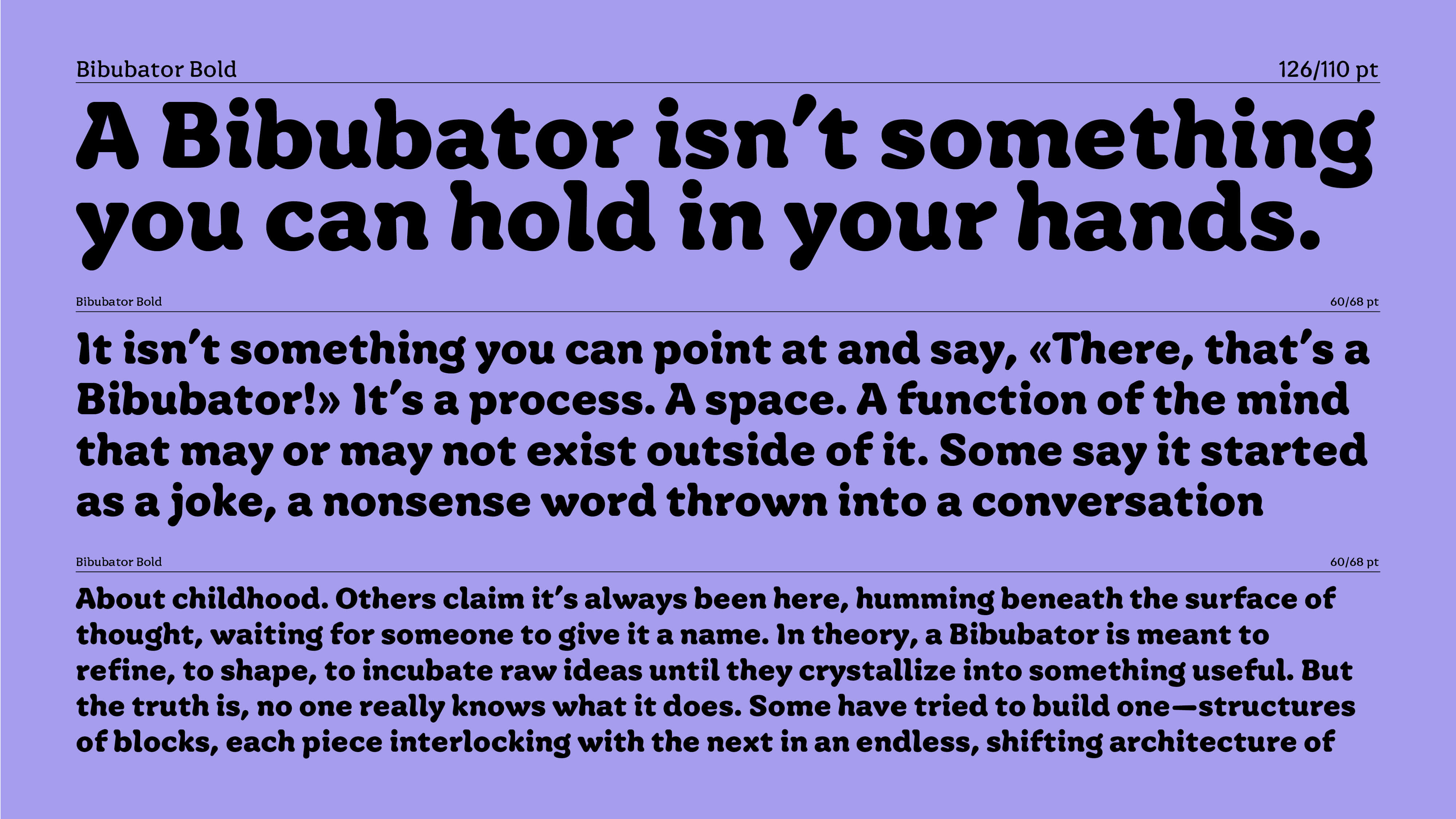
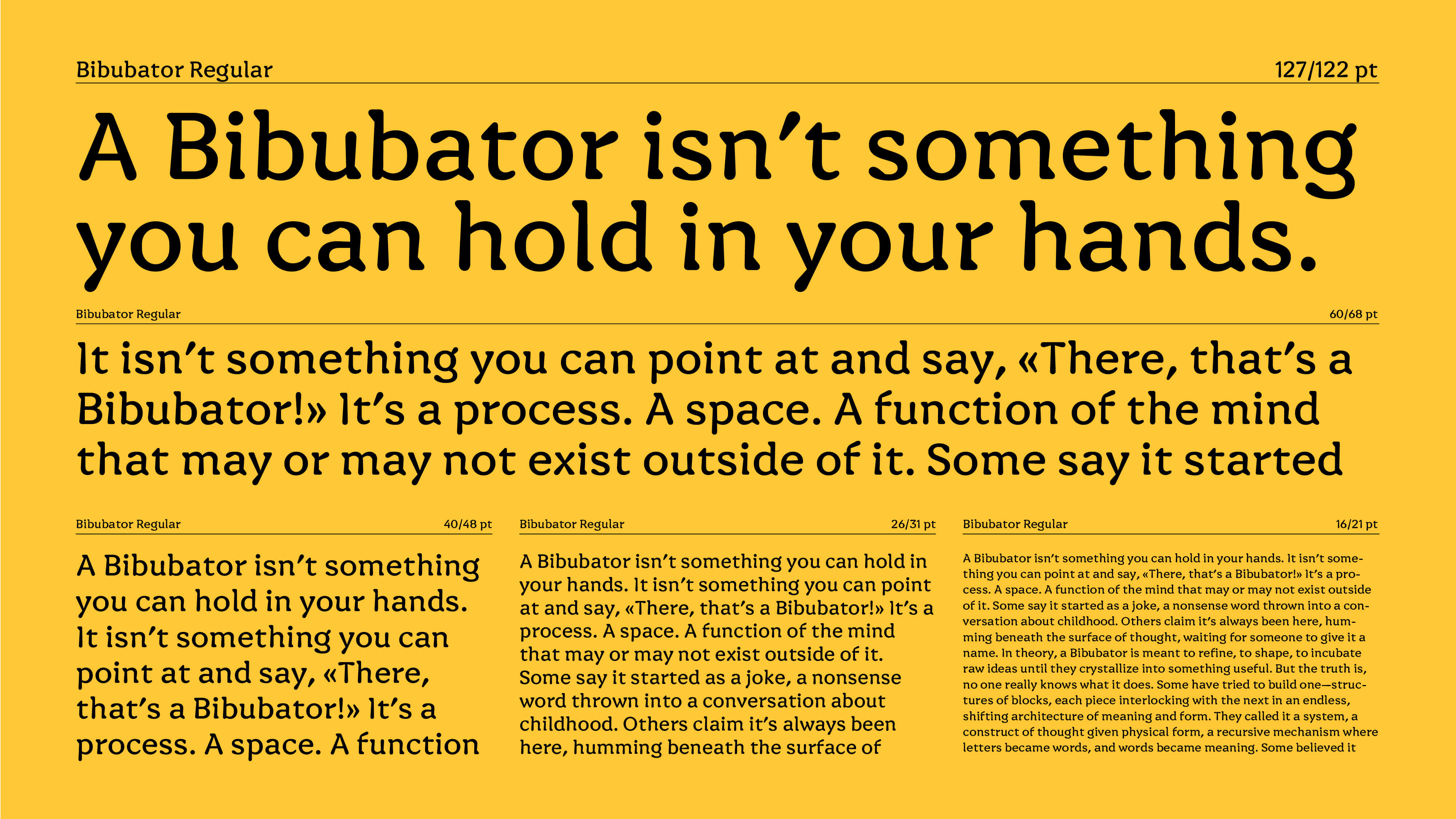
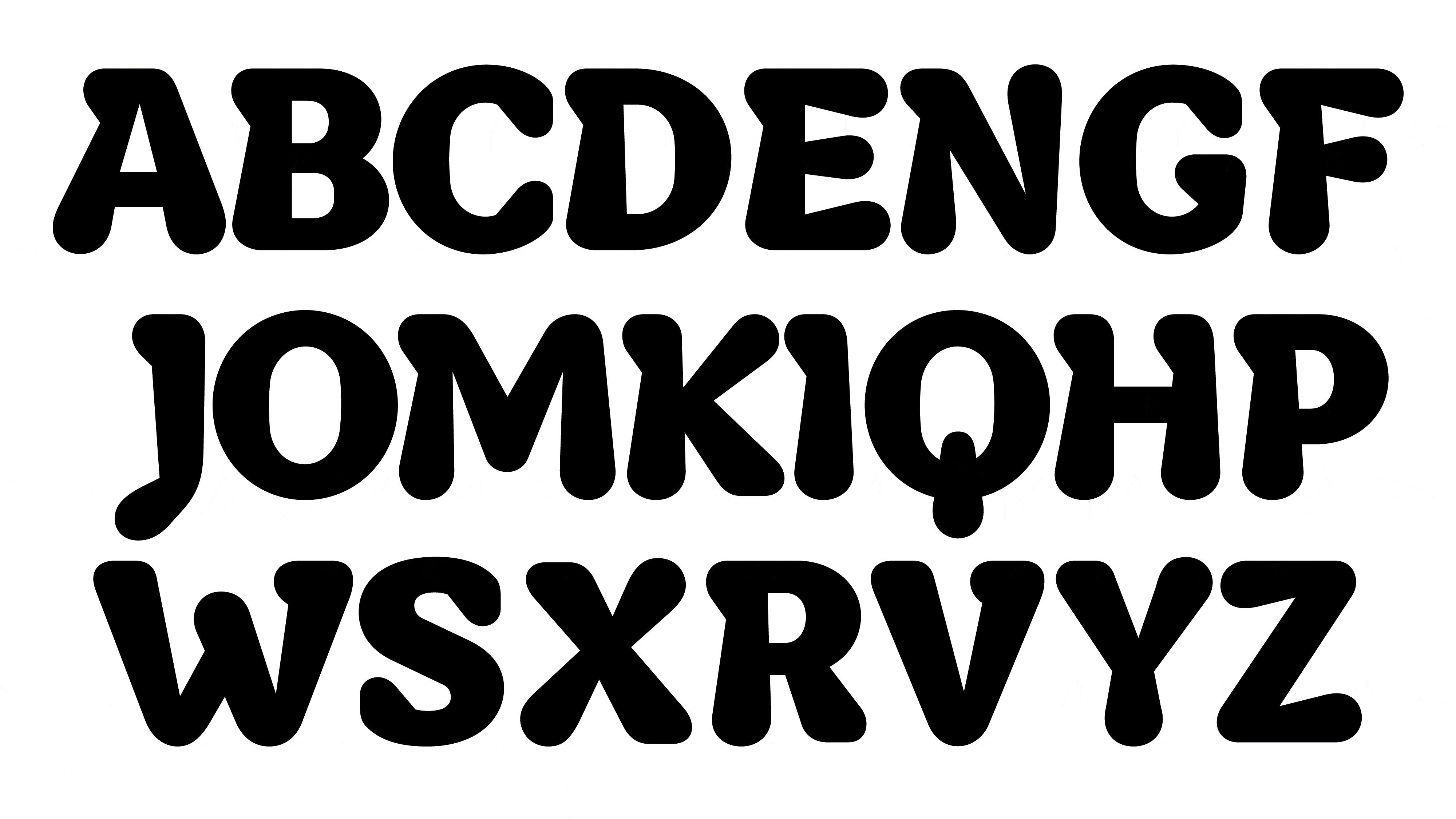
Currently, the digital part of Bibubator is a compact system with one weight axis: Regular, Bold, and Black. Though designed for display, the text style is functional even at small sizes. Bold is the most distinctive, expressing the main concept through its contrast of forms and counterforms. Black is part of the same system but appears softer and more playful.

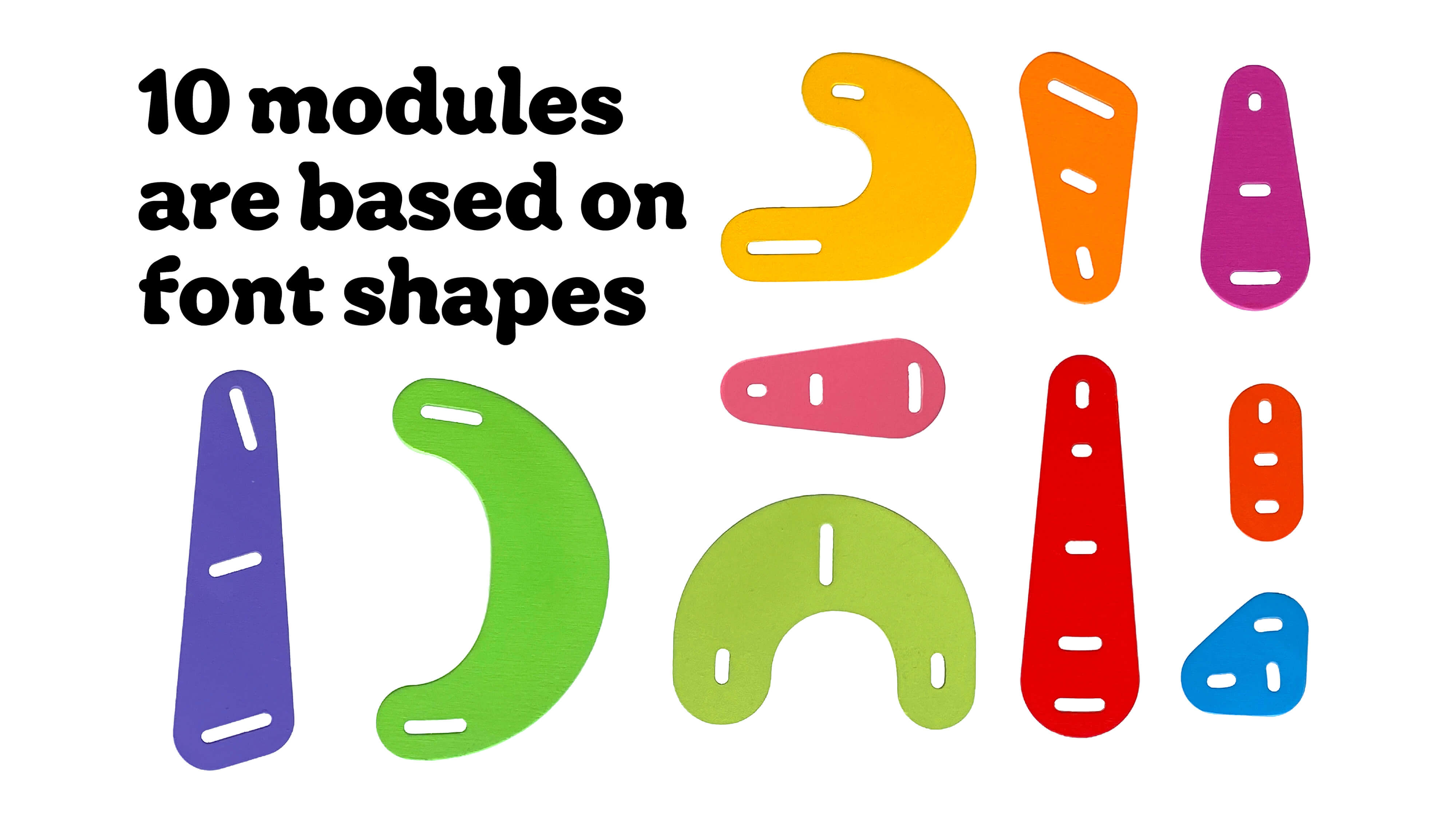
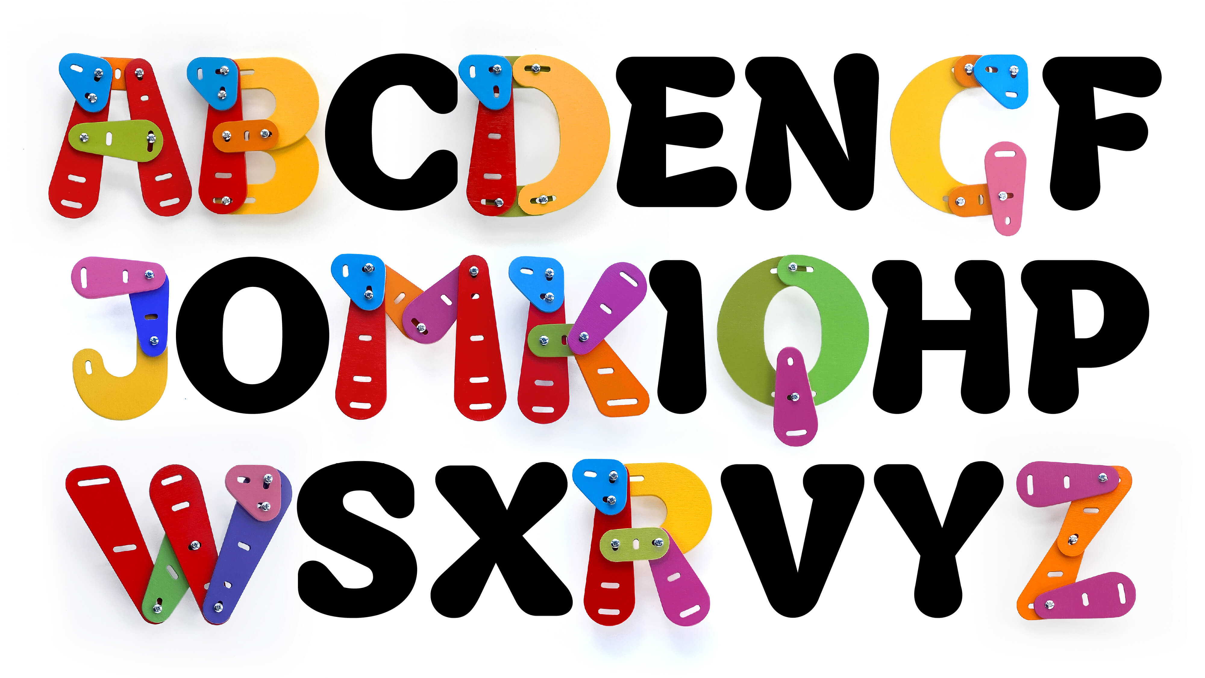
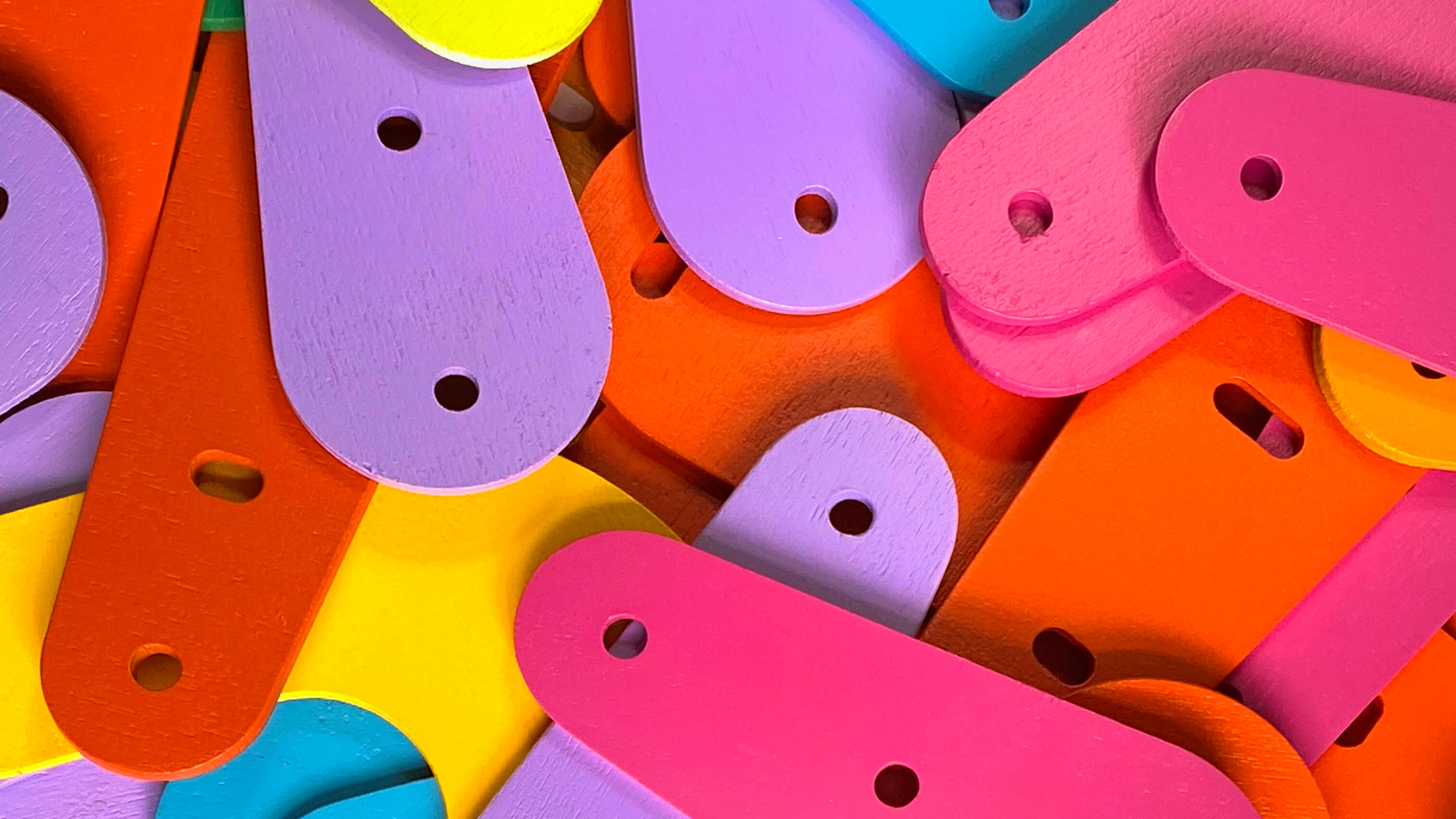
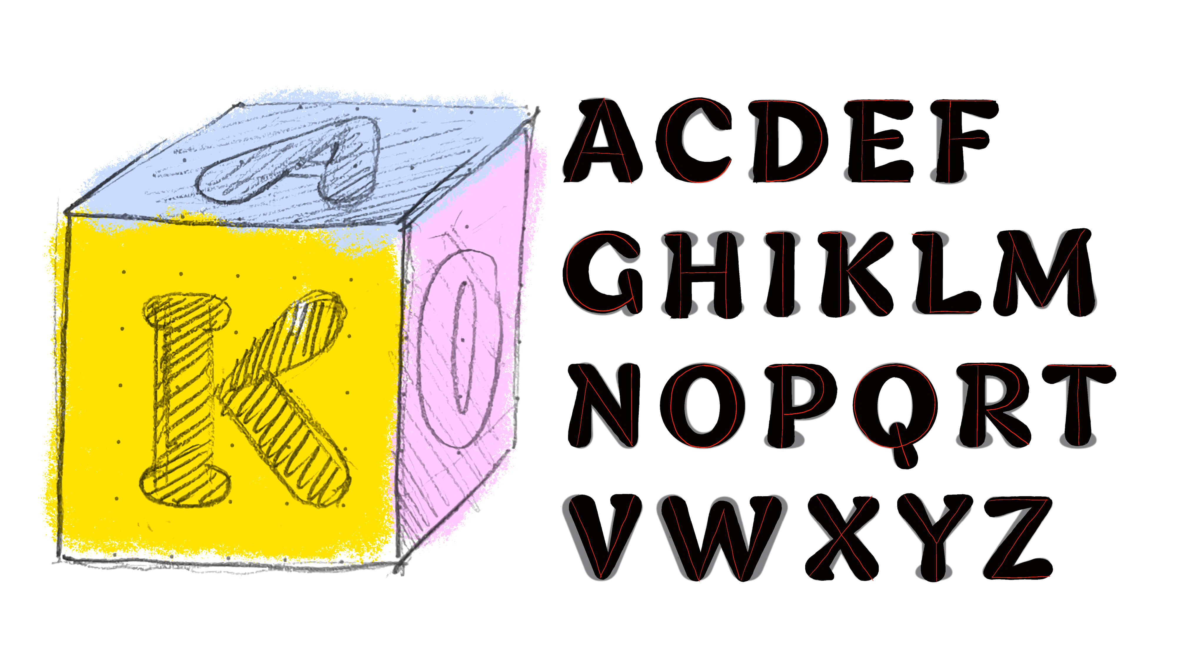
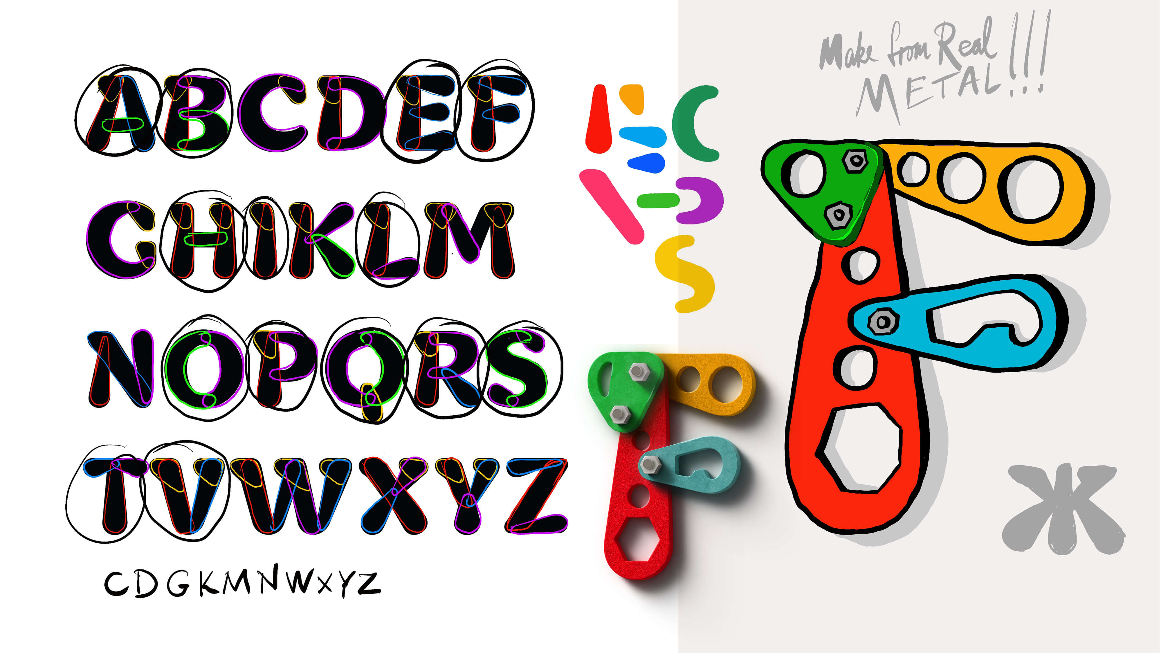
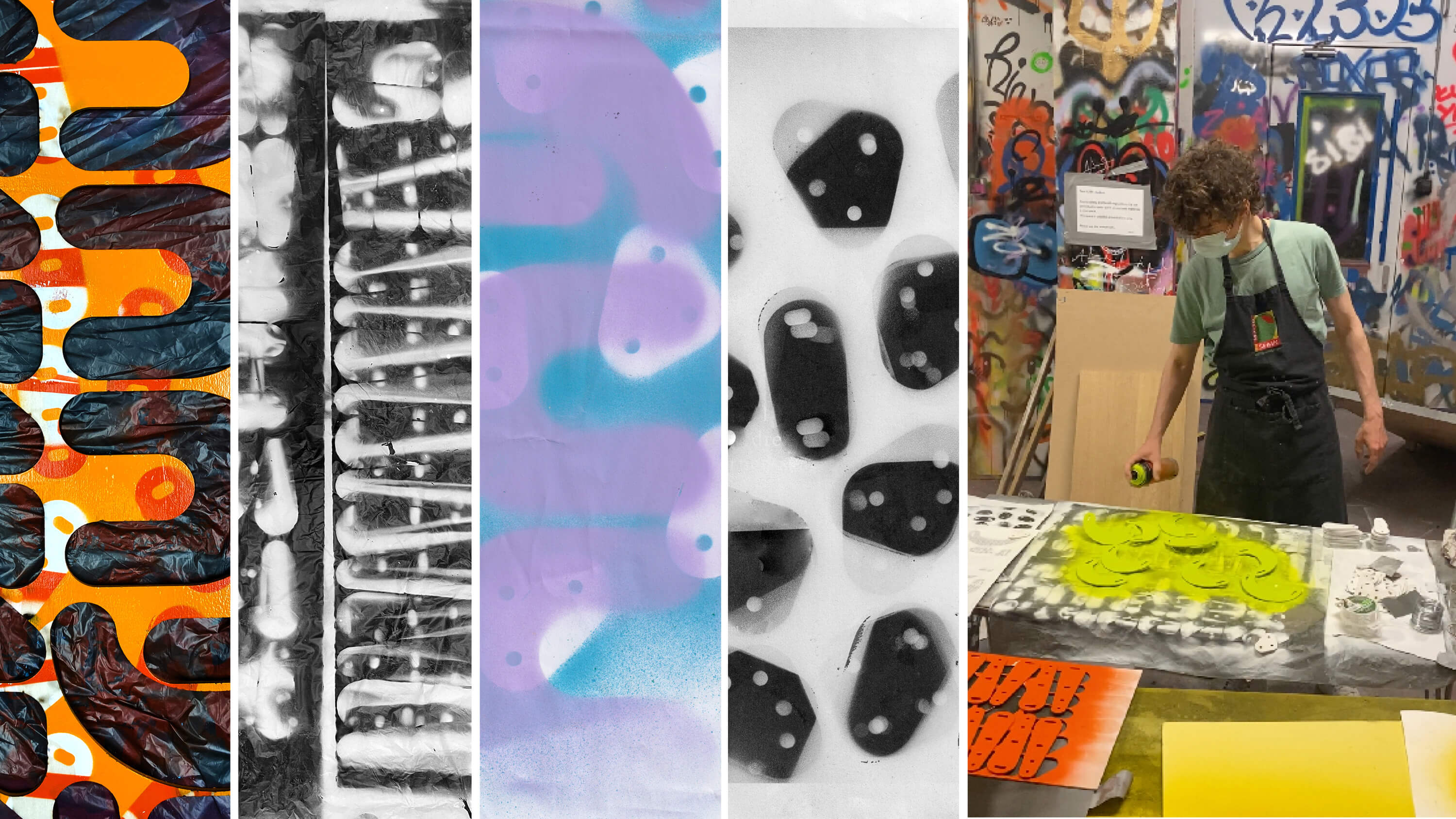
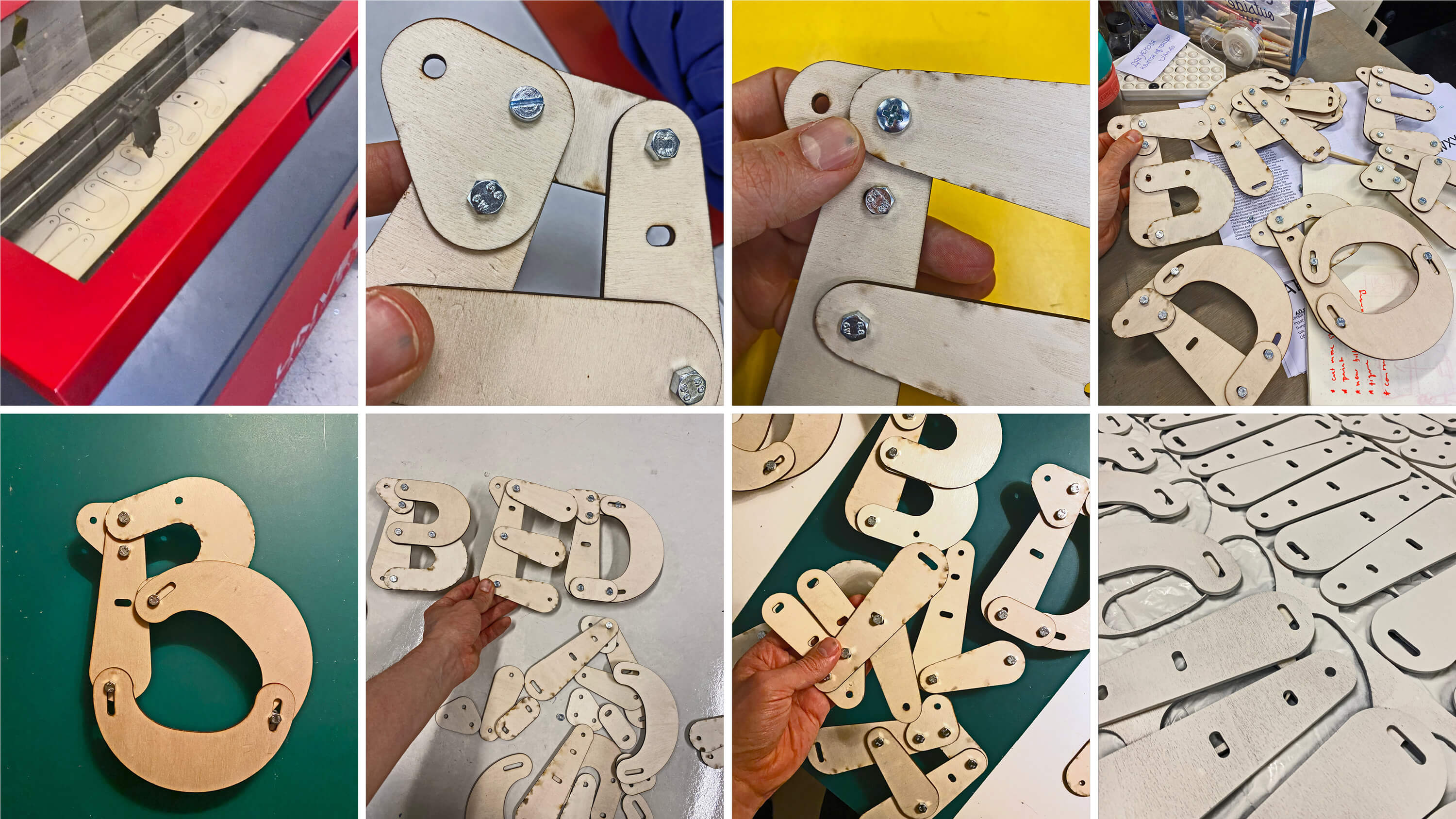
Additionally, when it comes to Bibubator, “playing with type” goes further than usual — the system includes a 3D master: a wooden construction set of ten modules that build the full uppercase Latin alphabet. Its well-designed construction logic invites hands-on exploring and experimenting with letterforms.

A special thanks goes to my wonderful friends and designers from Kyiv. At some point, I decided to test how other designers perceive my typeface and where they would want to use it. Quite a few of my friends and colleagues responded to my request — all of them talented designers and illustrators: Igor Dekhtyarenco, Alex Twista, Yulia Romas, Varvara Perekhrest, Karolina Uskakovych, Jana Vekshyna, Serhii Irkin, Roman Melnyk, and Anton Ivanov. Their perspective on the project helped me sharpen my own vision of the concept and verify some important hypotheses. Below you can see some of their works.
Half a year after graduation, Bibubator was awarded at the Type Directors Club 71 competition. At the time of this publication, the typeface is still in development. However, an early yet fully functional version with three styles and extended diacritics is already available for purchase on Future Fonts.