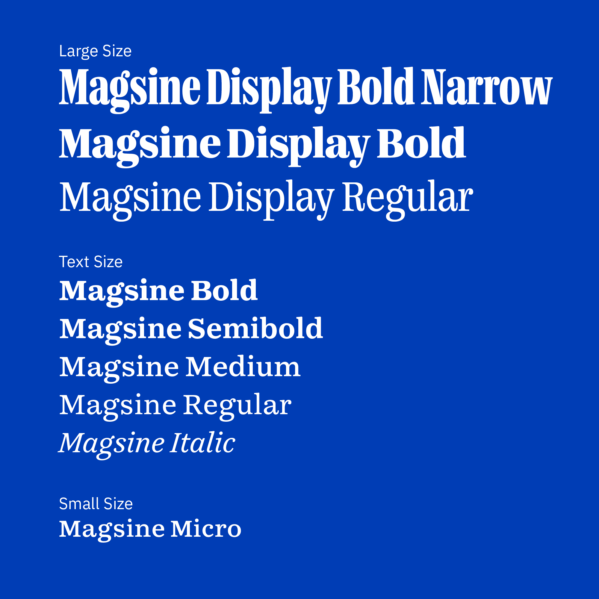
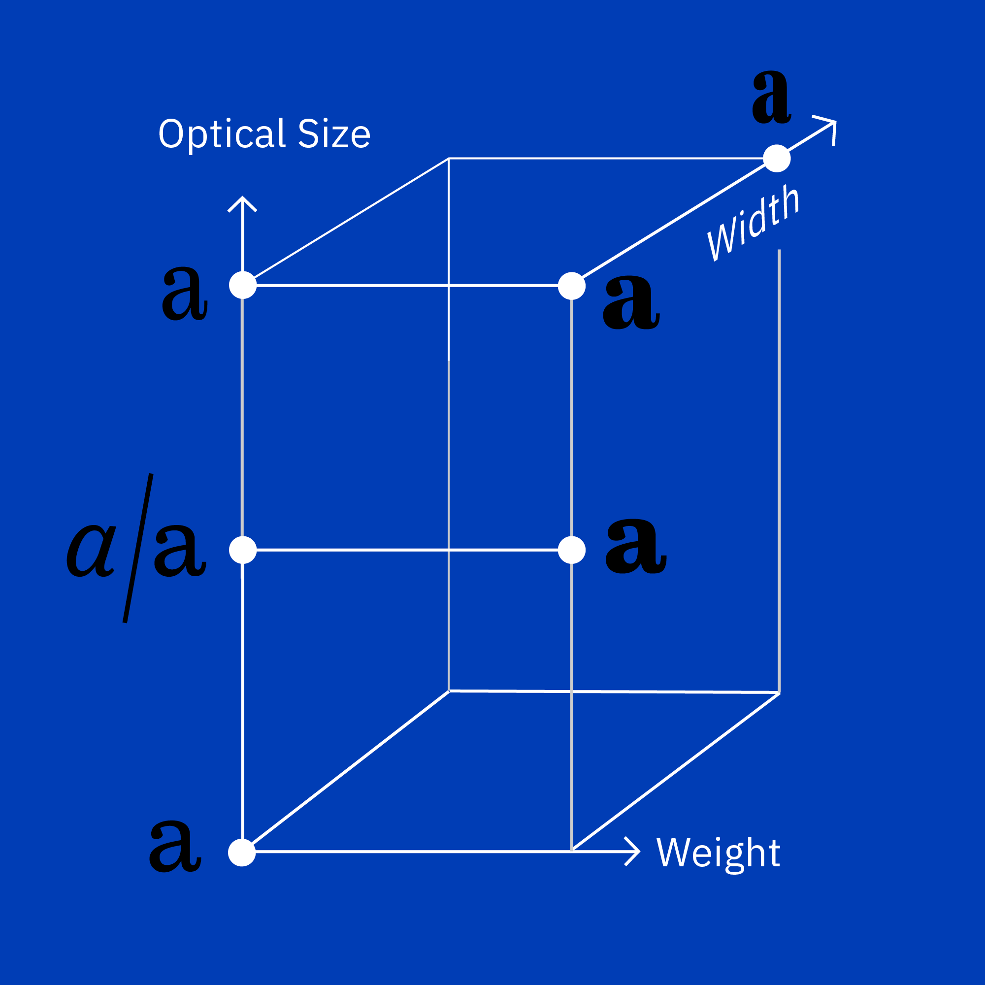
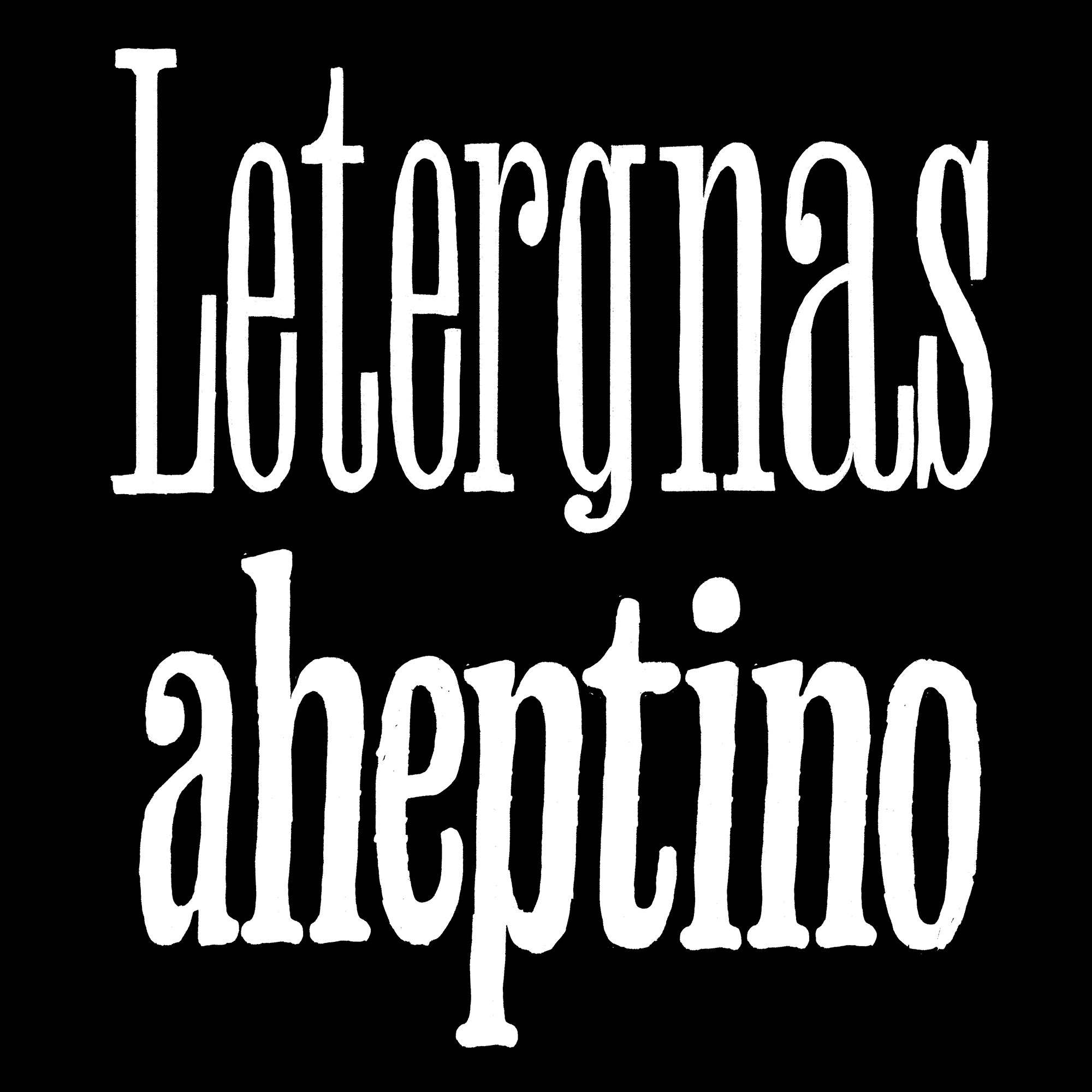
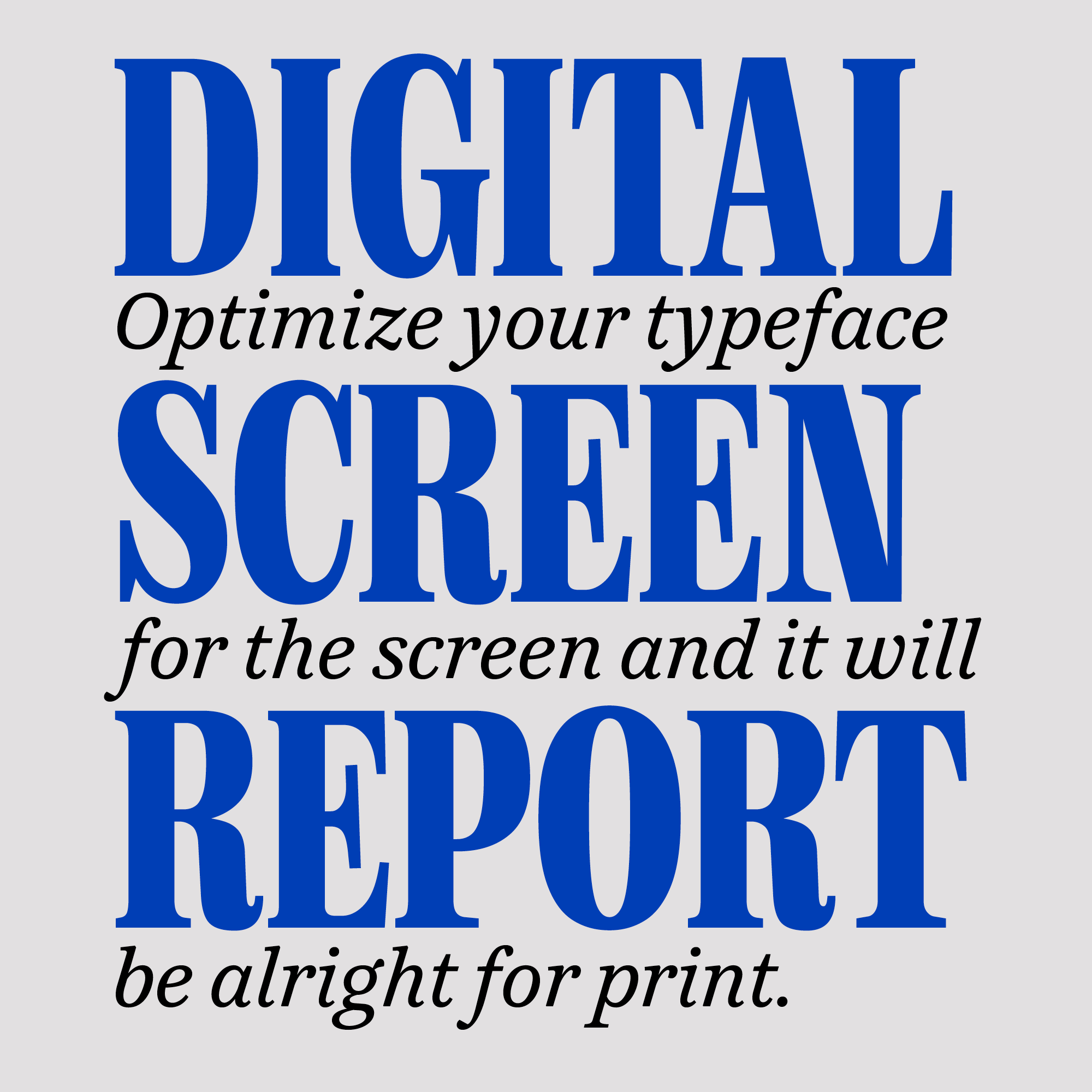
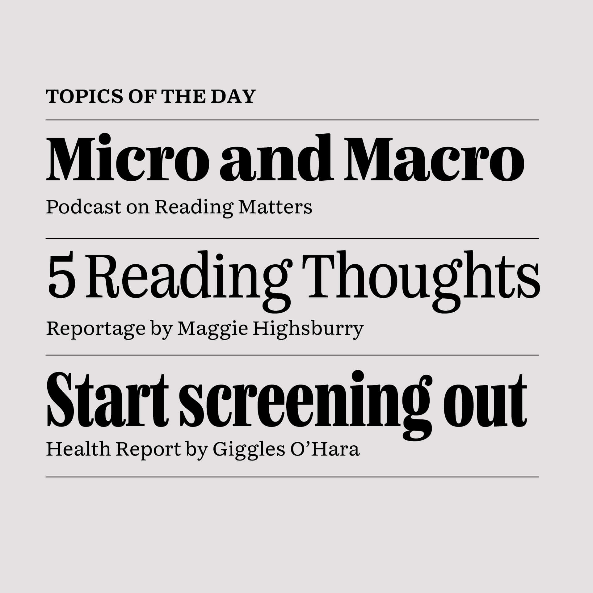
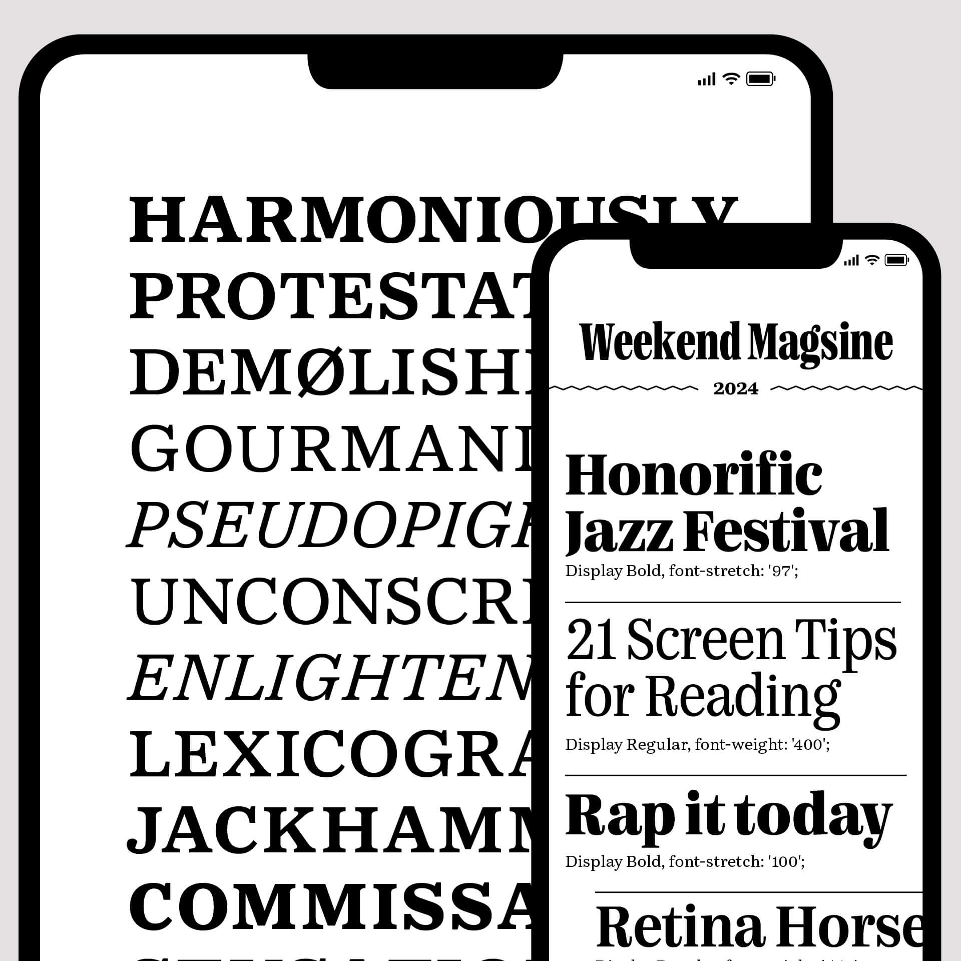
Magsine is an editorial type family that is less dry and more fun to read, with a playful approach to enlighten topics
that you might find in the weekend newspaper or the magazine that comes with it.
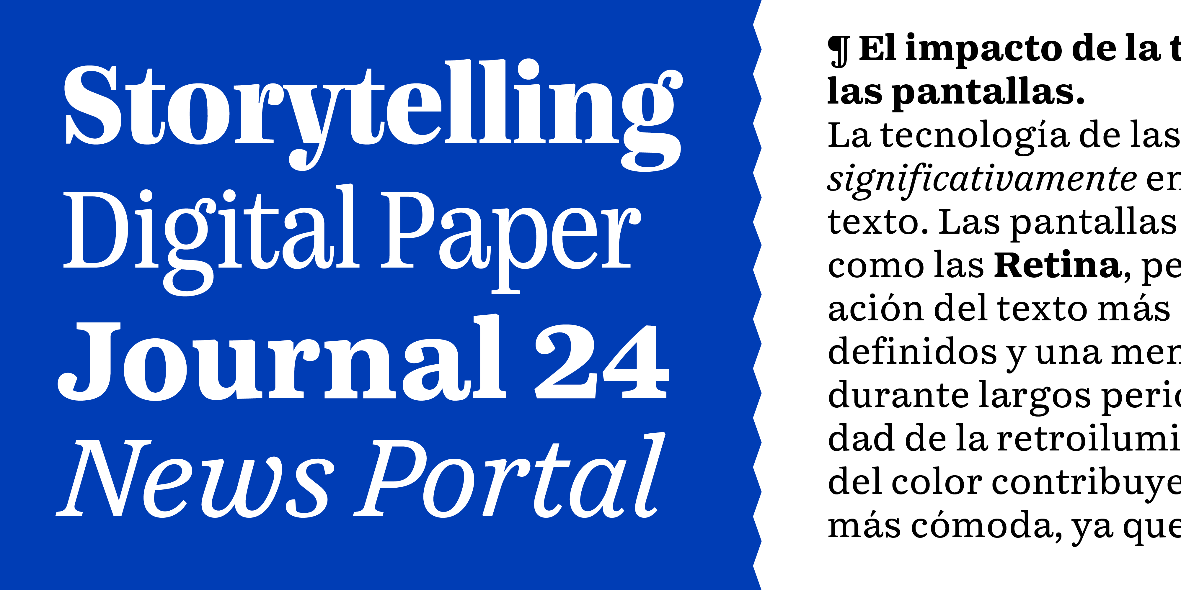
The family started as an exploration for written news both online and in print.
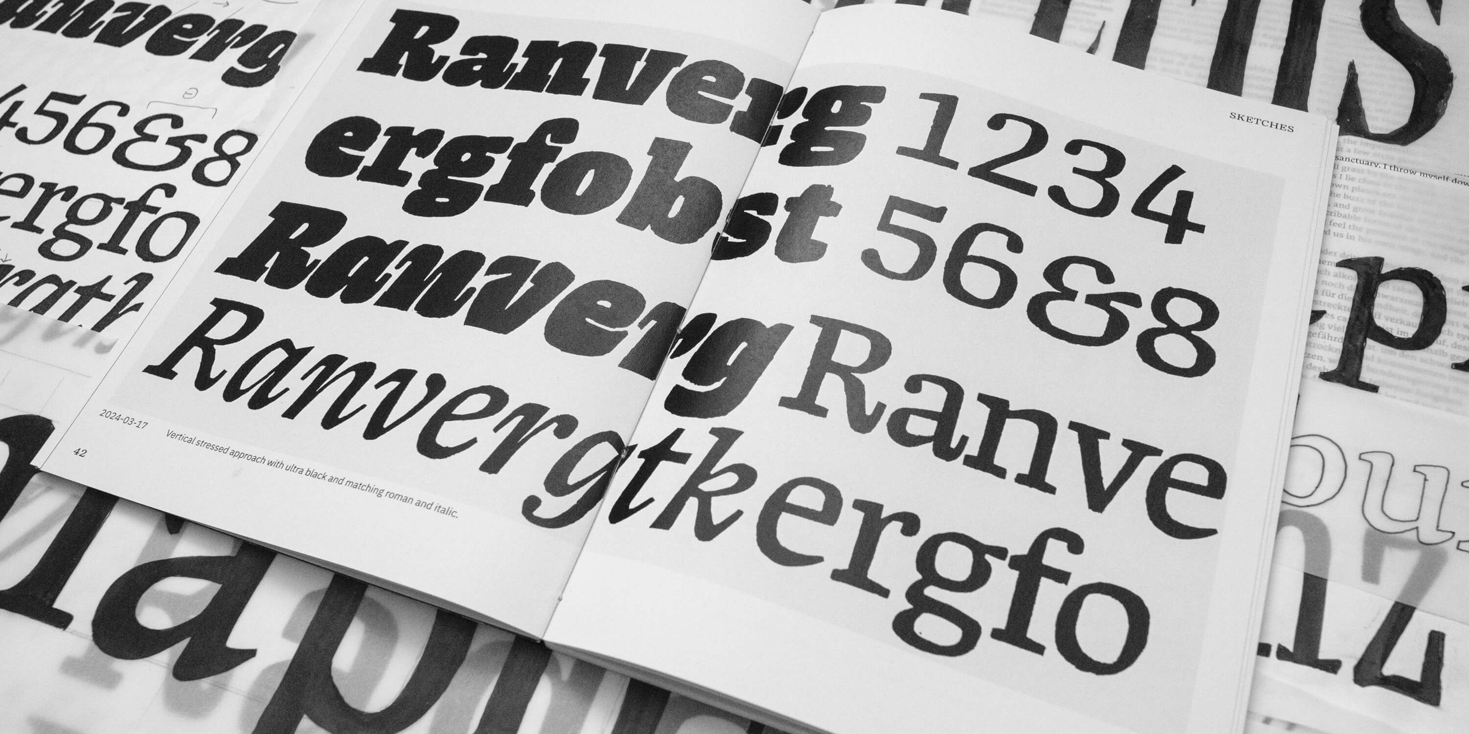
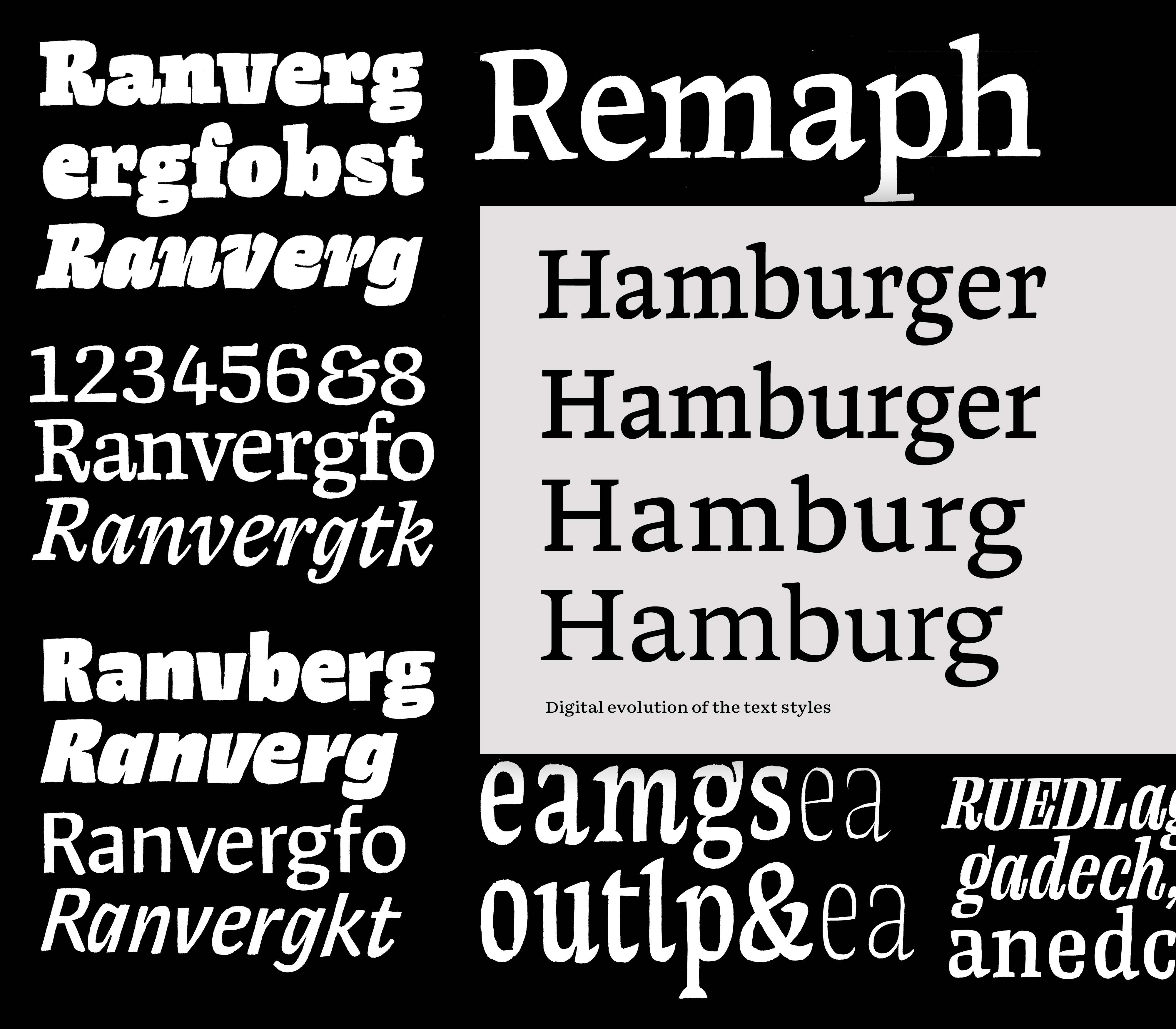
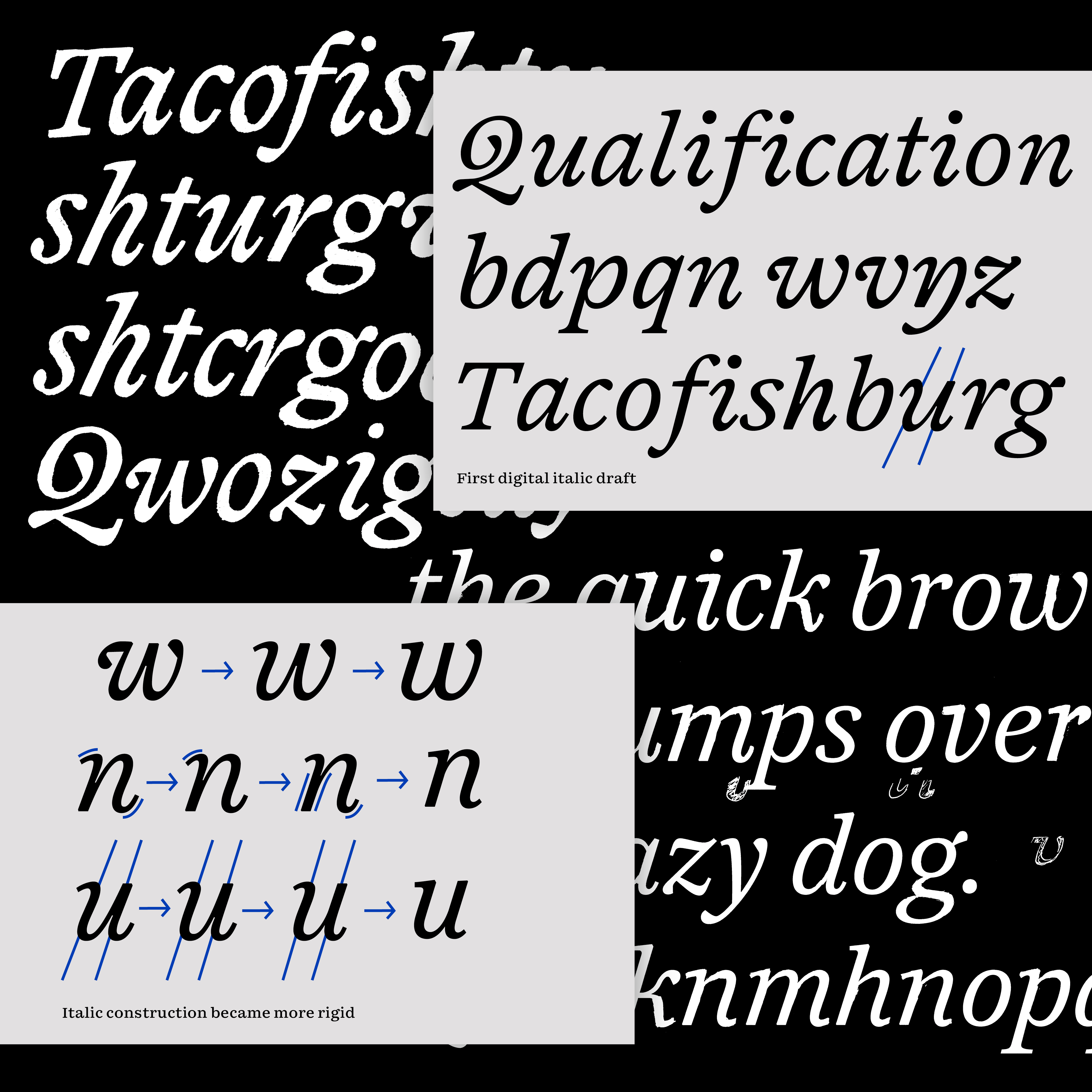
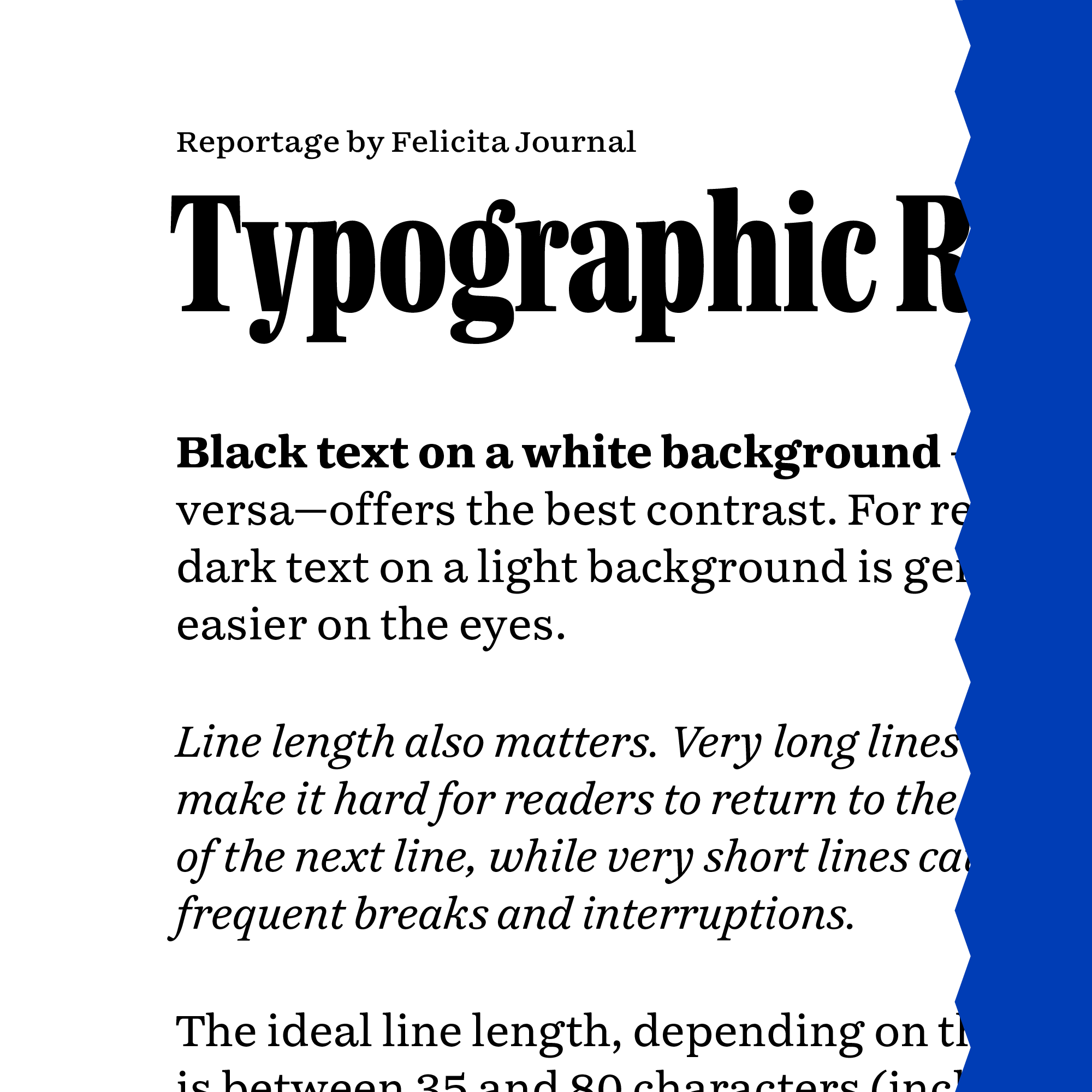
After considering different kinds of directions, twists and styles, Magsine’s final visual voice was inspired by the 19th century newspaper era. This anchor within the big tradition of newspapers applied in a typographic design which serves the reader to its optimum.
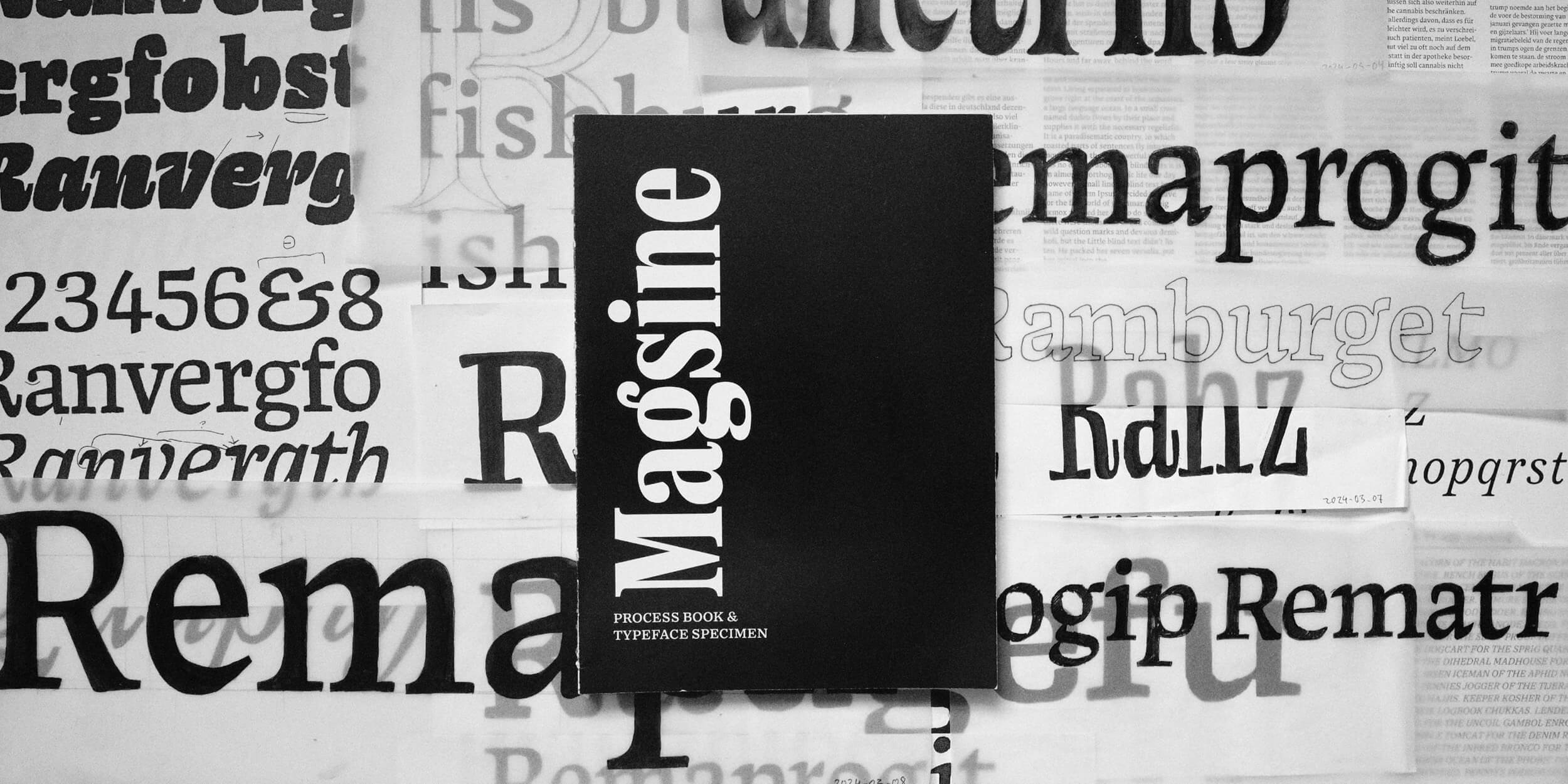
Magsine was designed by Max Holl — a graphic and type designer based in Saarbrücken, Germany. After graduating from Communication Design at HBKsaar in Saarbrücken and working as an independent designer he moved to The Hague to follow his passion for letters, calligraphy and the exciting world of type.
Inspired by the bold headlines of newspapers and magazines, Magsine’s development began with sketches that explored multiple directions through both analogue and digital methods. Early concepts leaned toward bold, narrow forms, which gradually evolved into structured shapes and refined text styles. Drawing from 19th-century newspaper design, the final direction gave the typeface a distinctly journalistic character while preserving the versatility required for contemporary magazine use.
Throughout the process, Max experimented with media- and size-specific techniques. Extensive screen proofing led to improved spacing and a sturdier overall tone of voice. Since editorial typefaces must be flexible, adaptable, and practical, Magsine was designed to perform across a wide design space defined by three axes: weight, width, and optical size.
Once the project’s direction was set—and the text styles were nearing finalization—attention returned to the display styles first explored at the outset. These were systematically refined to align with the underlying typographic logic of the family, ensuring a consistent tone of voice while providing typographers with flexible tools for setting titles. To expand their usability, the three display styles were developed as variable fonts along the axes of width and weight, allowing a wide range of expressive possibilities without sacrificing cohesion across the family.
The scope of this project was ambitious yet grounded in a practical challenge:
designing an editorial typeface that performs seamlessly across various media.
While deeply rooted in the traditions of editorial typography, the design process was not about simple preservation,
but about reinterpreting and extending these conventions to meet the needs of contemporary publishing.
By introducing a variety of variable axes, refining a cohesive balance between display and text styles,
and rigorously adapting the typeface for digital performance, he project expands the possibilities of what a newspaper typeface can offer.
Magsine embodies both continuity and innovation: it honors the heritage of journalistic
typography while offering a distinctly modern tool that expands the creative possibilities available to designers today.