
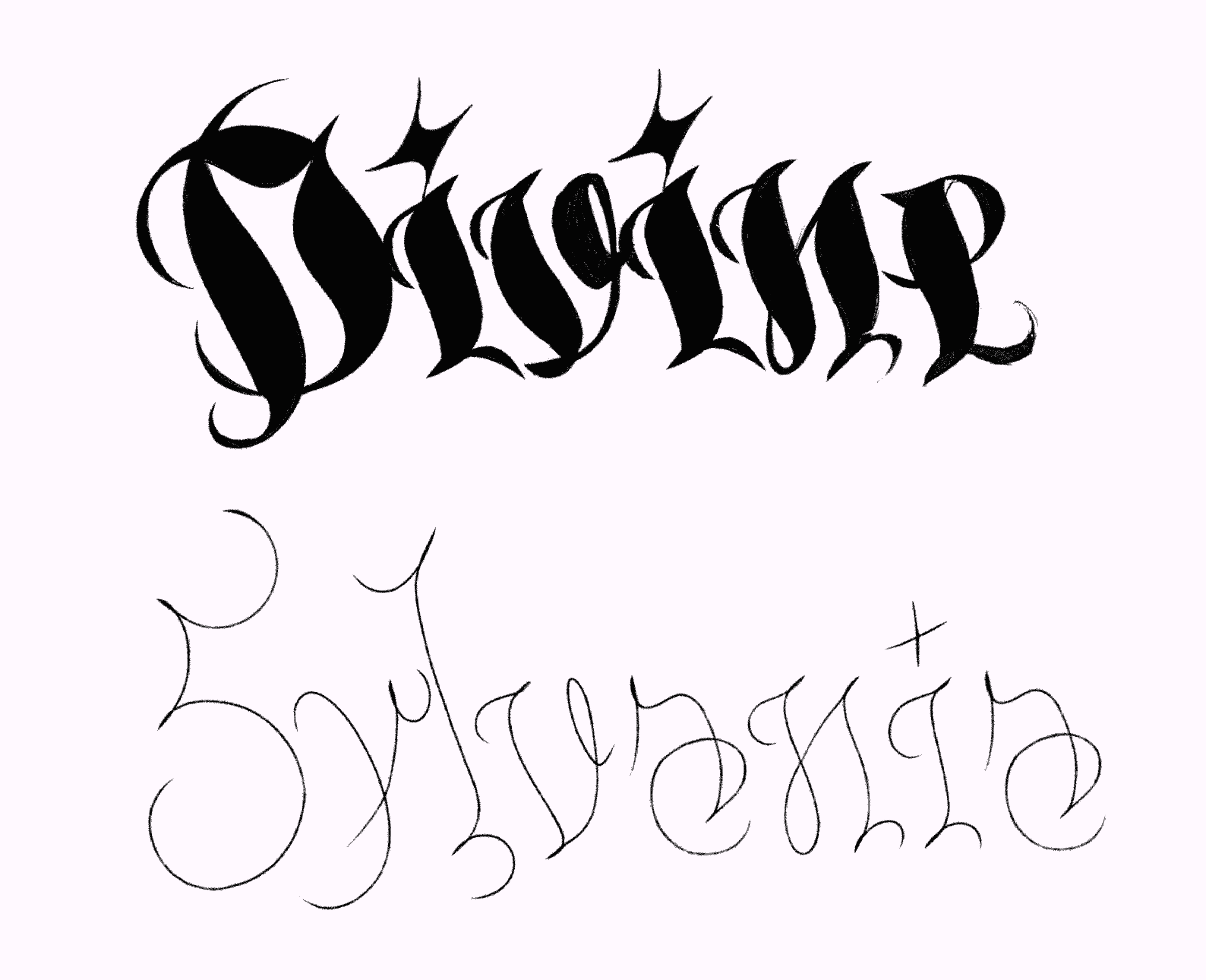
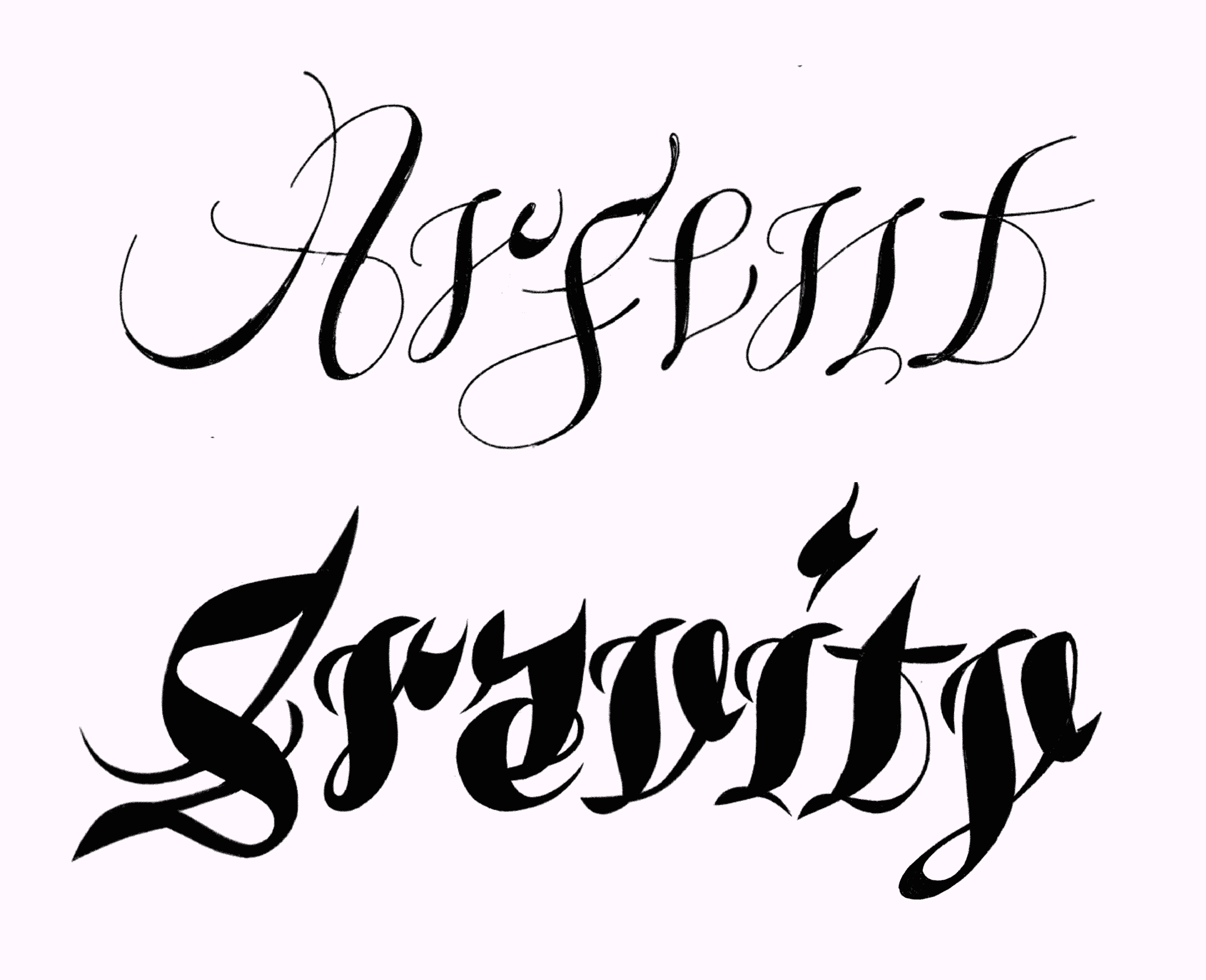
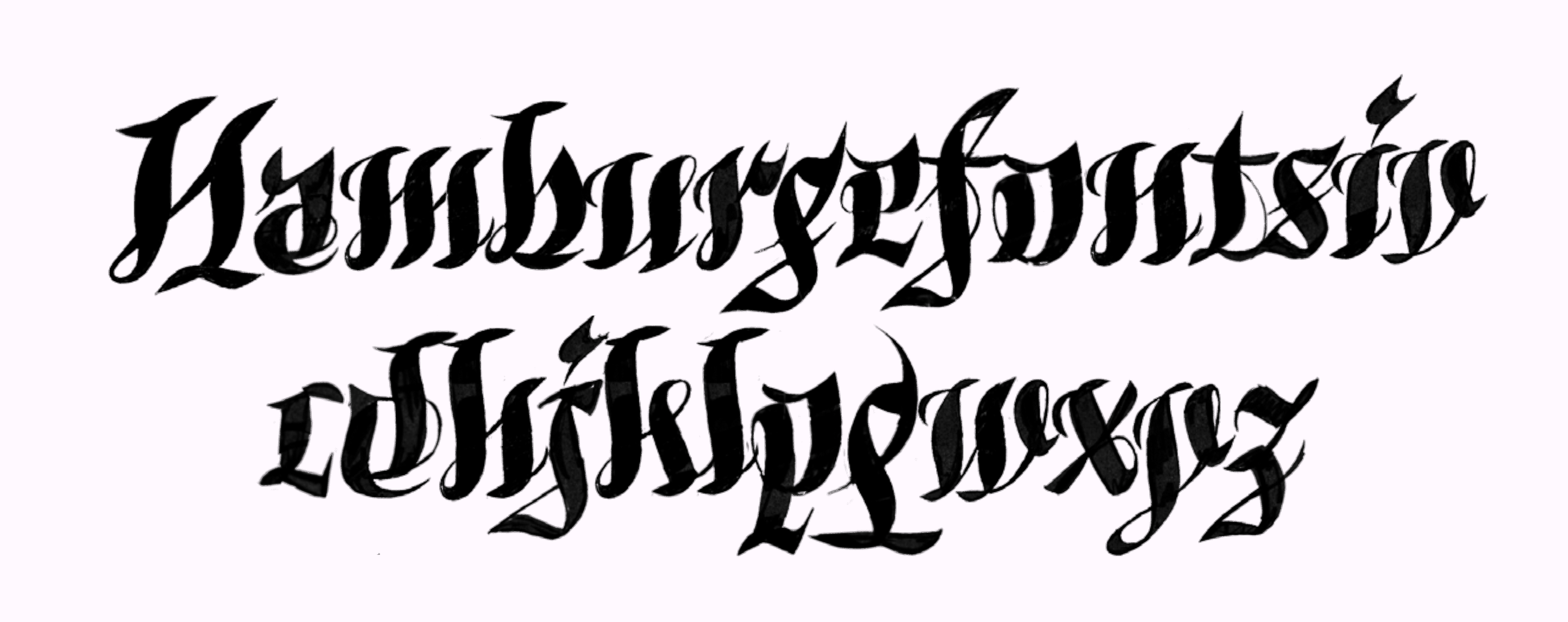
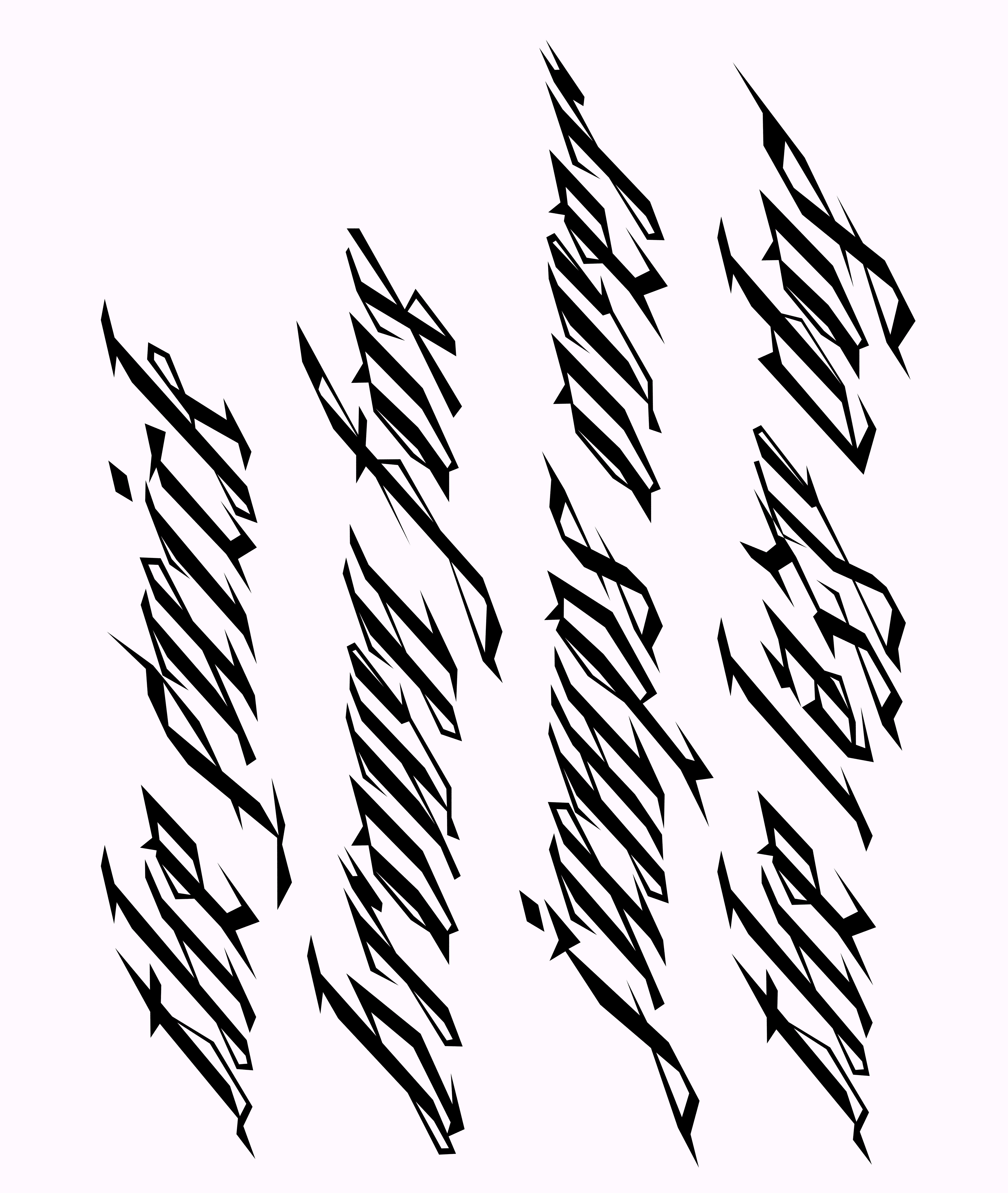
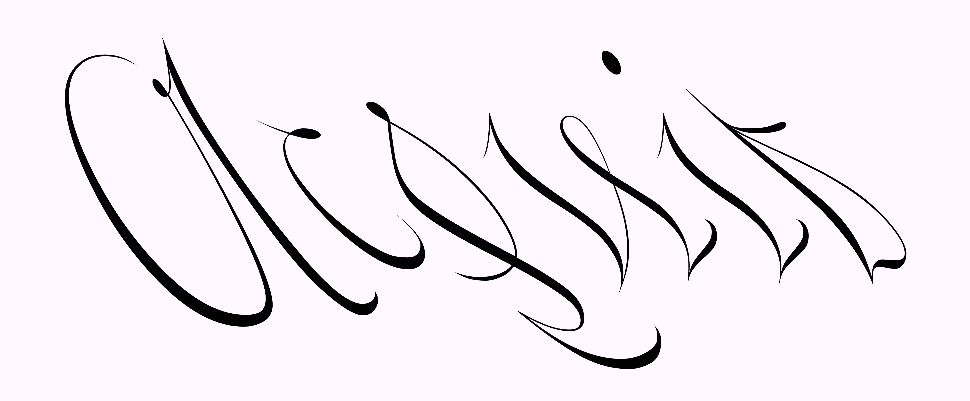
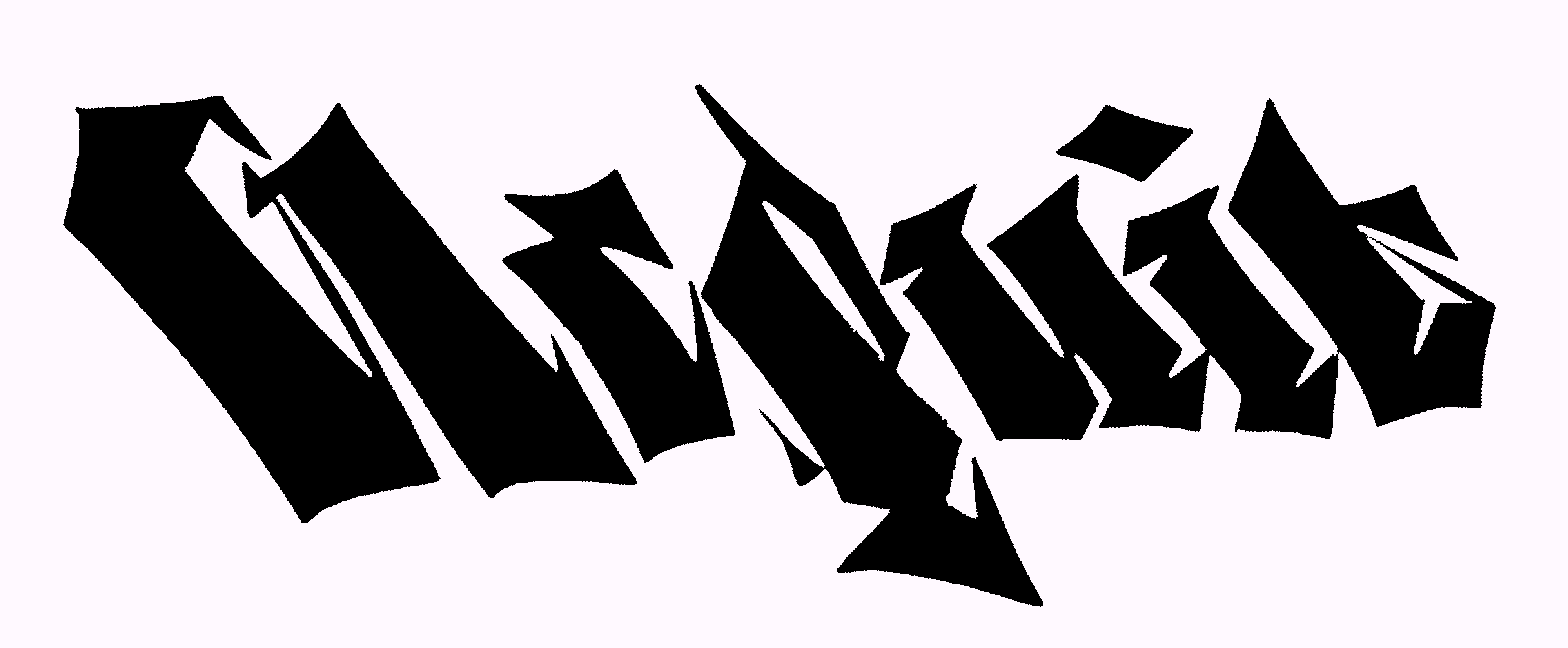
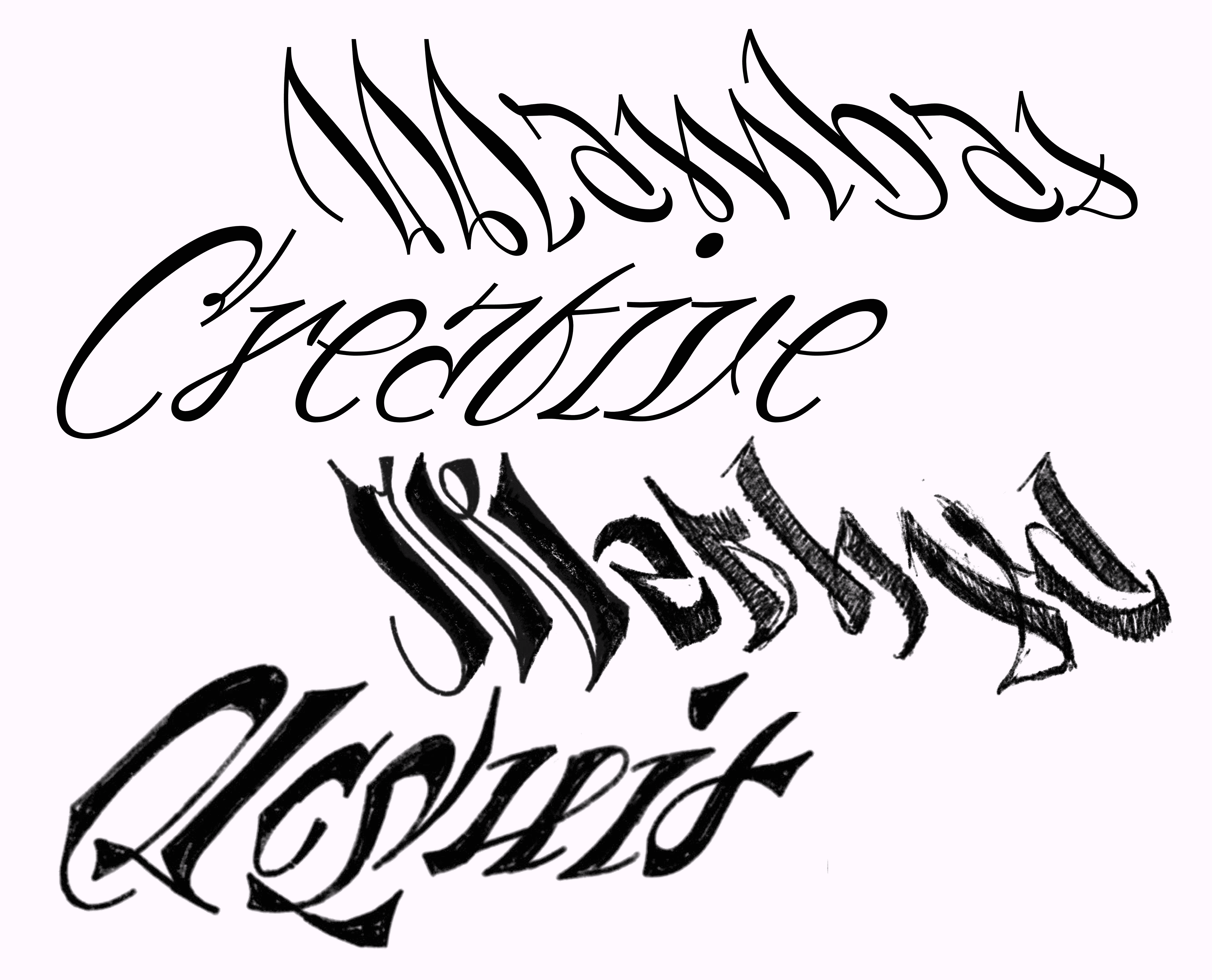
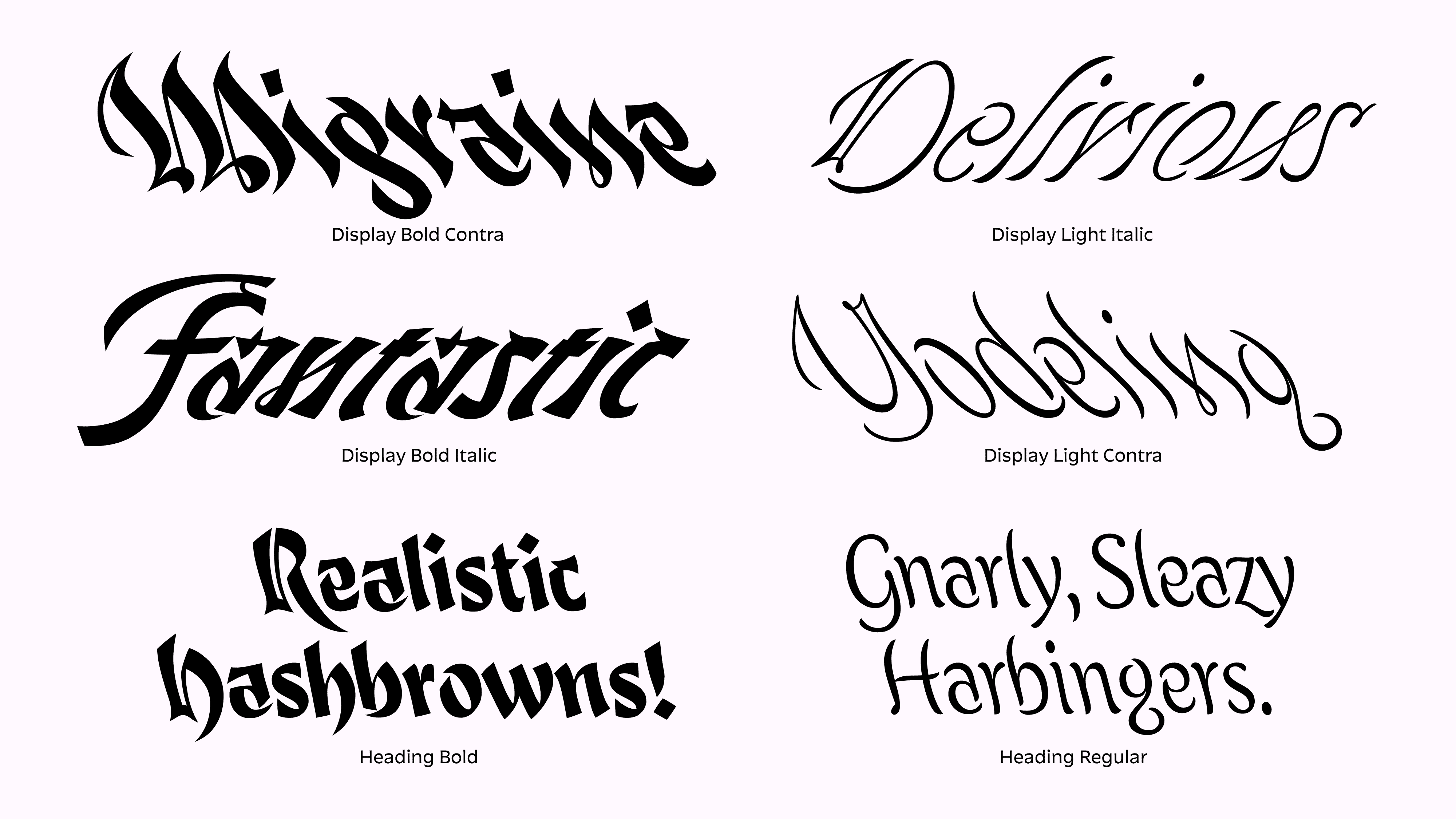
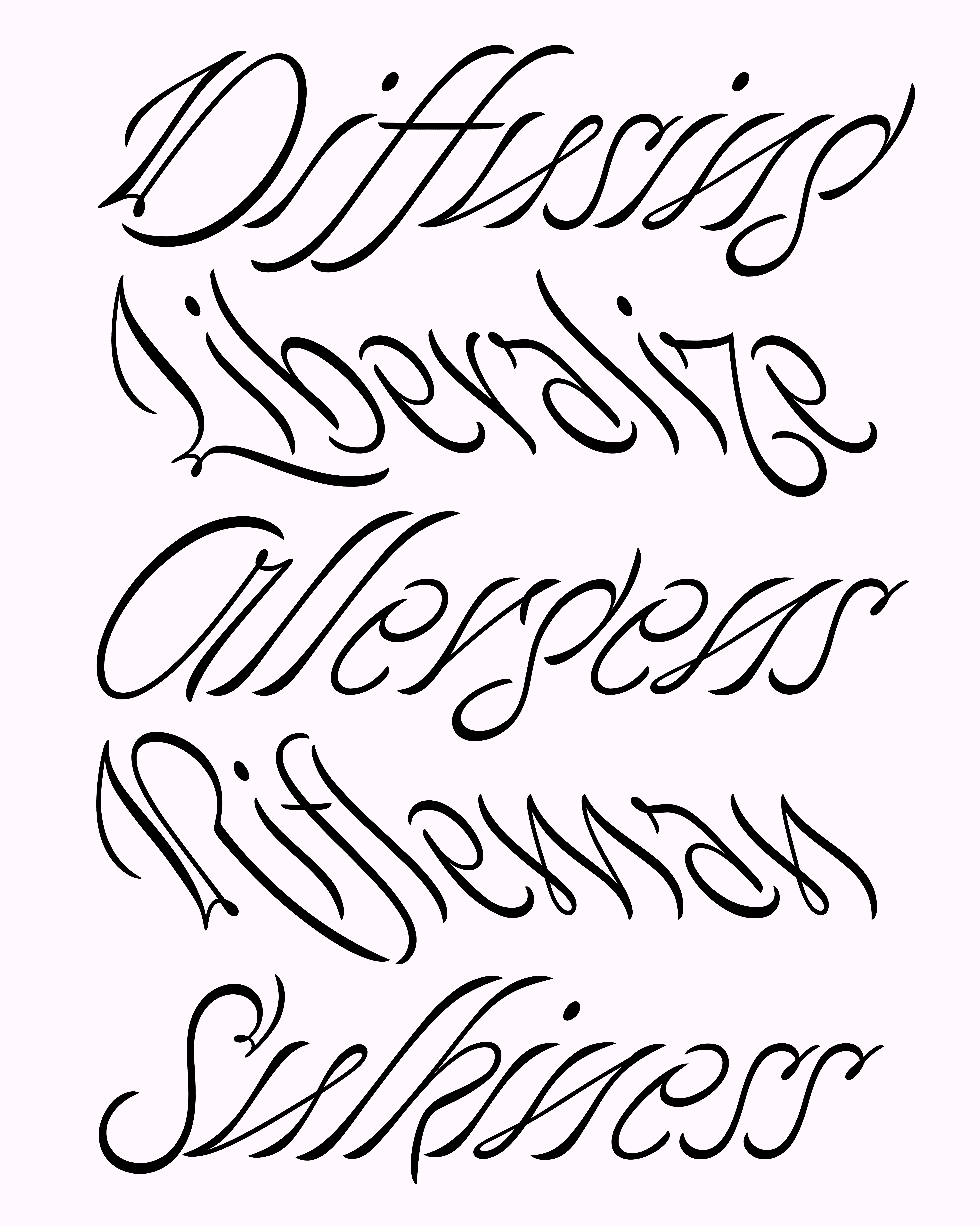
Antiphony is a dualistic type family exploring extremes and harmony through opposites. Its expressive design creates striking contrasts and dimensionality, making it ideal for complex layouts and dynamic compositions.
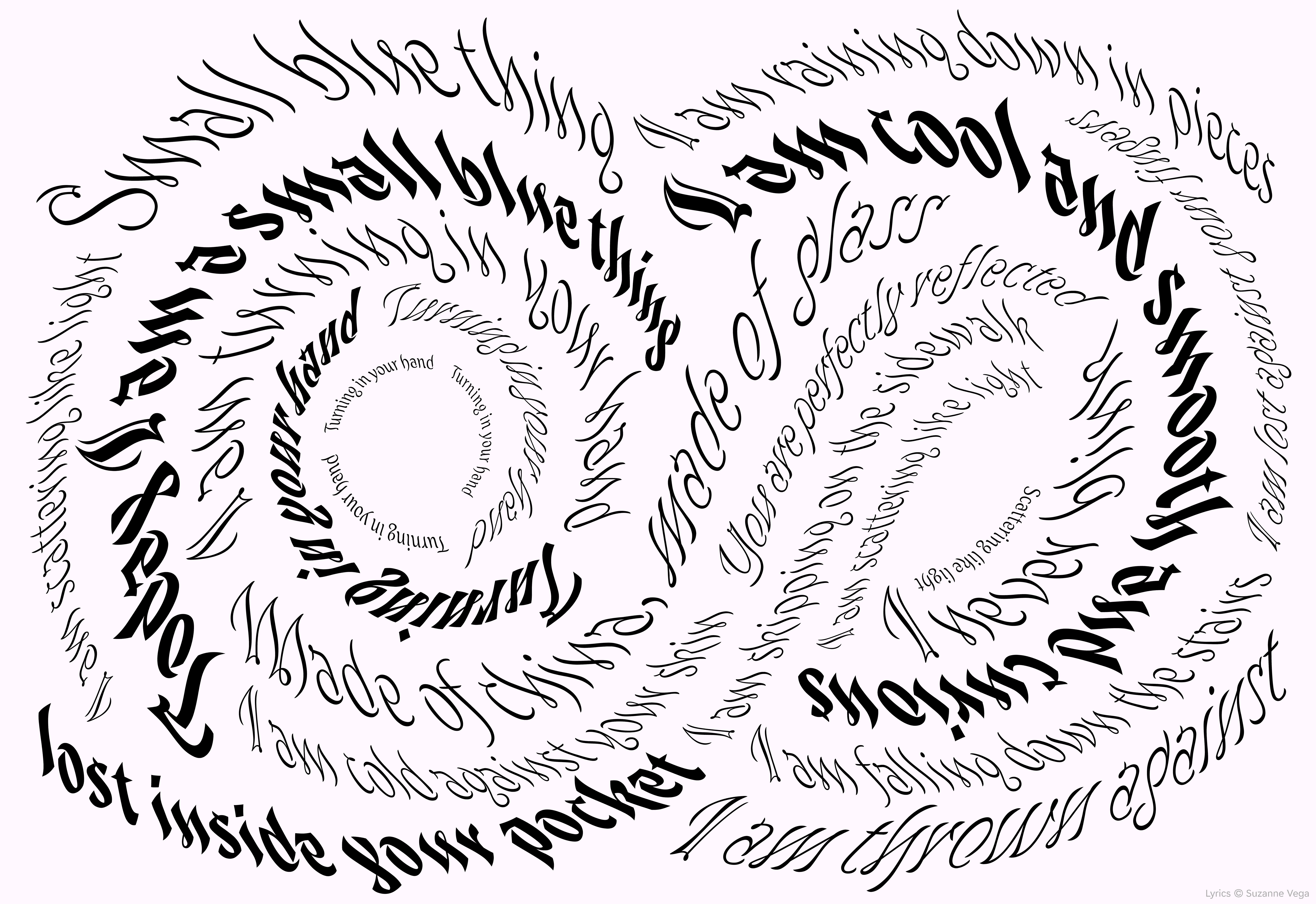
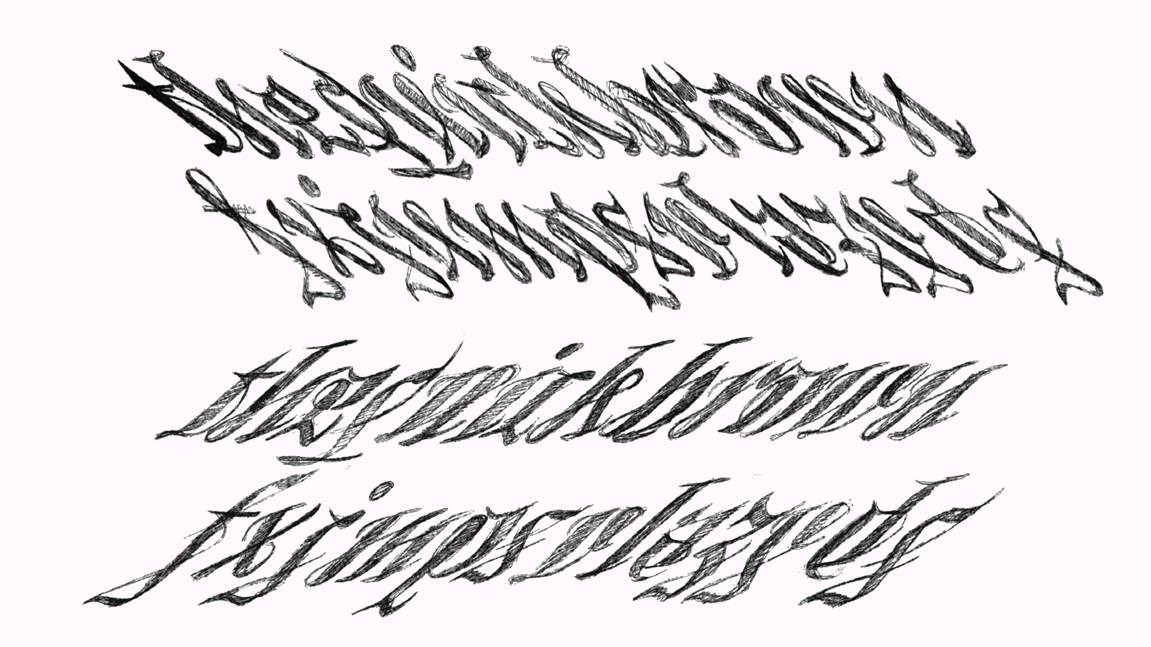
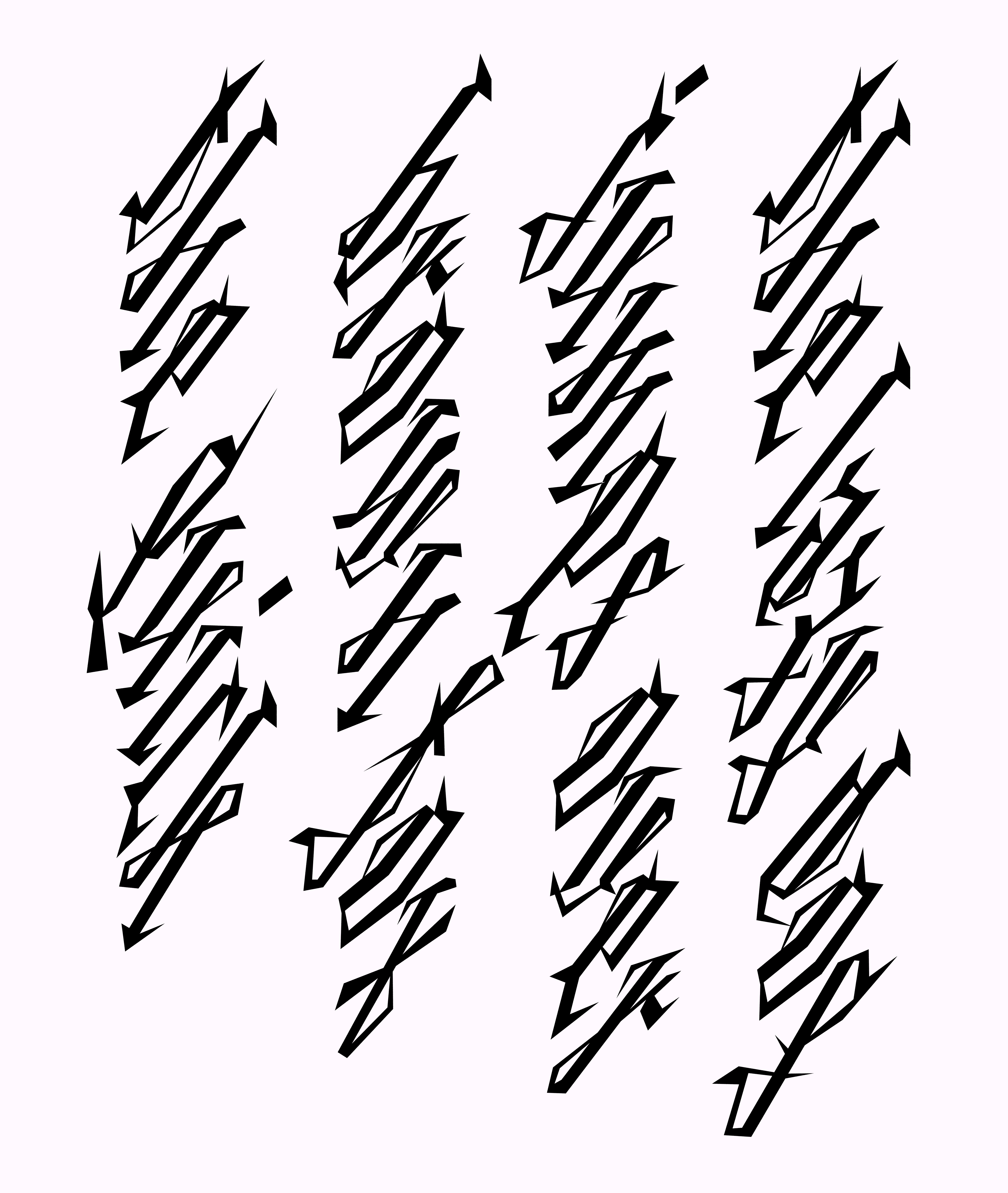
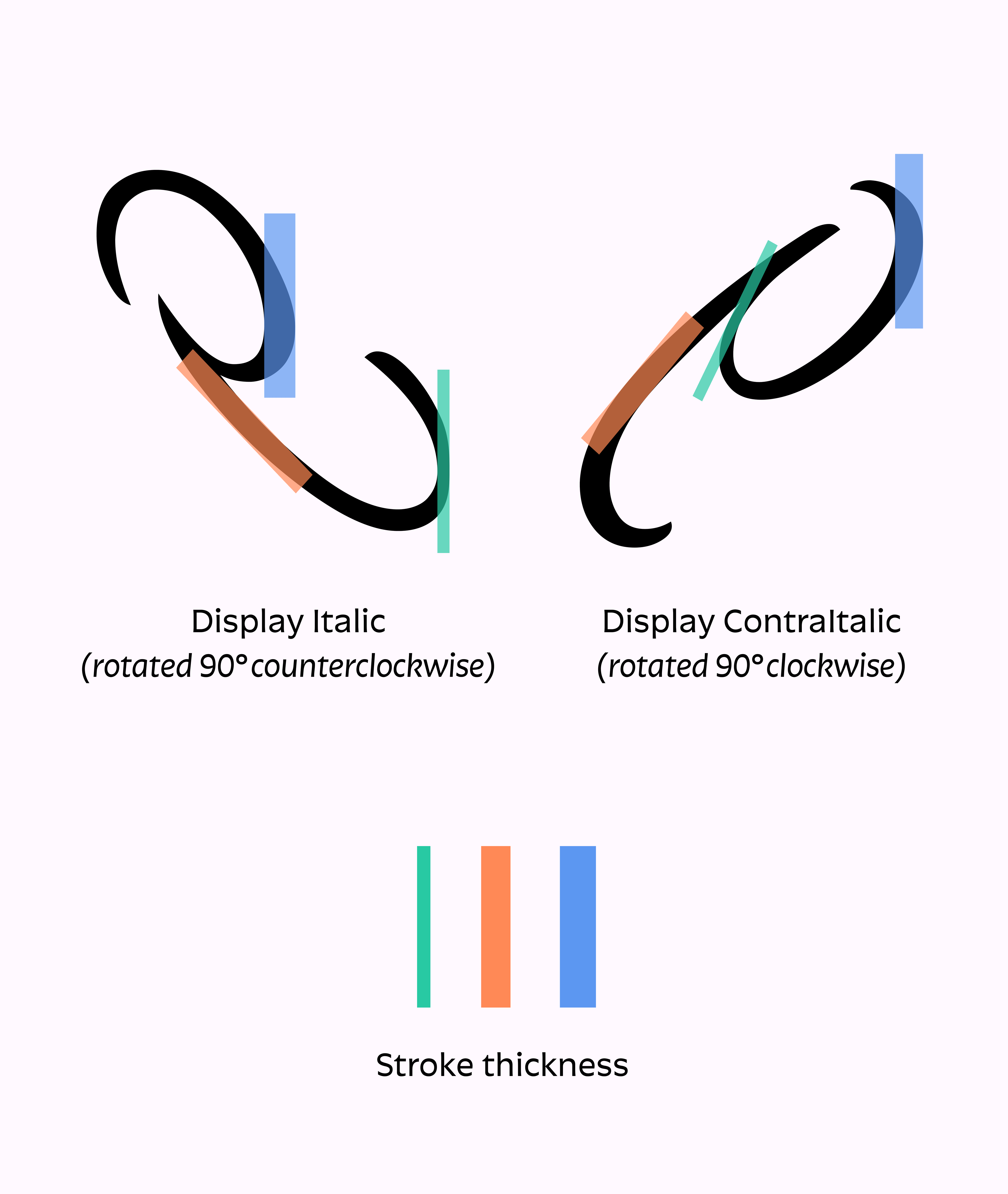
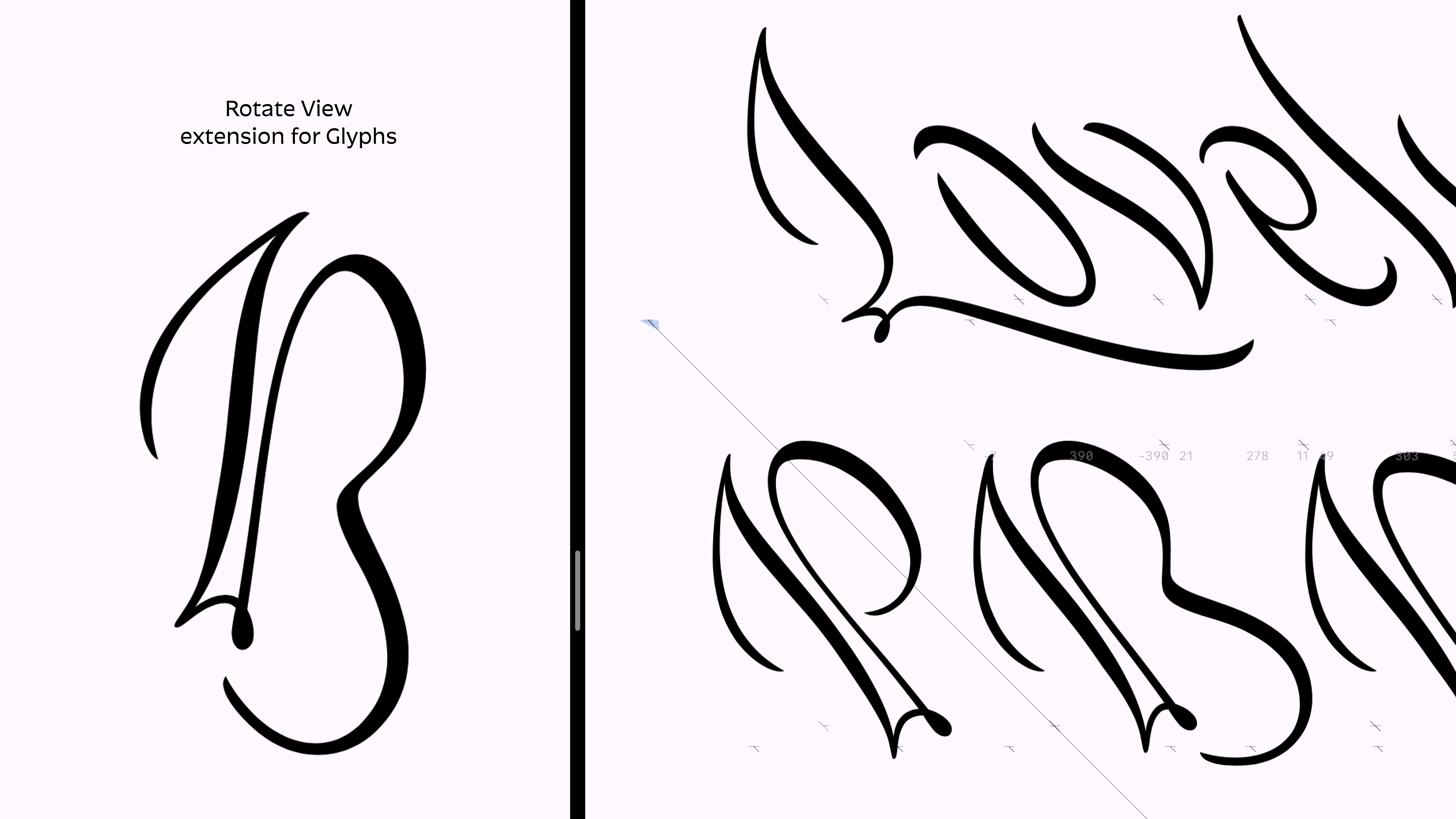
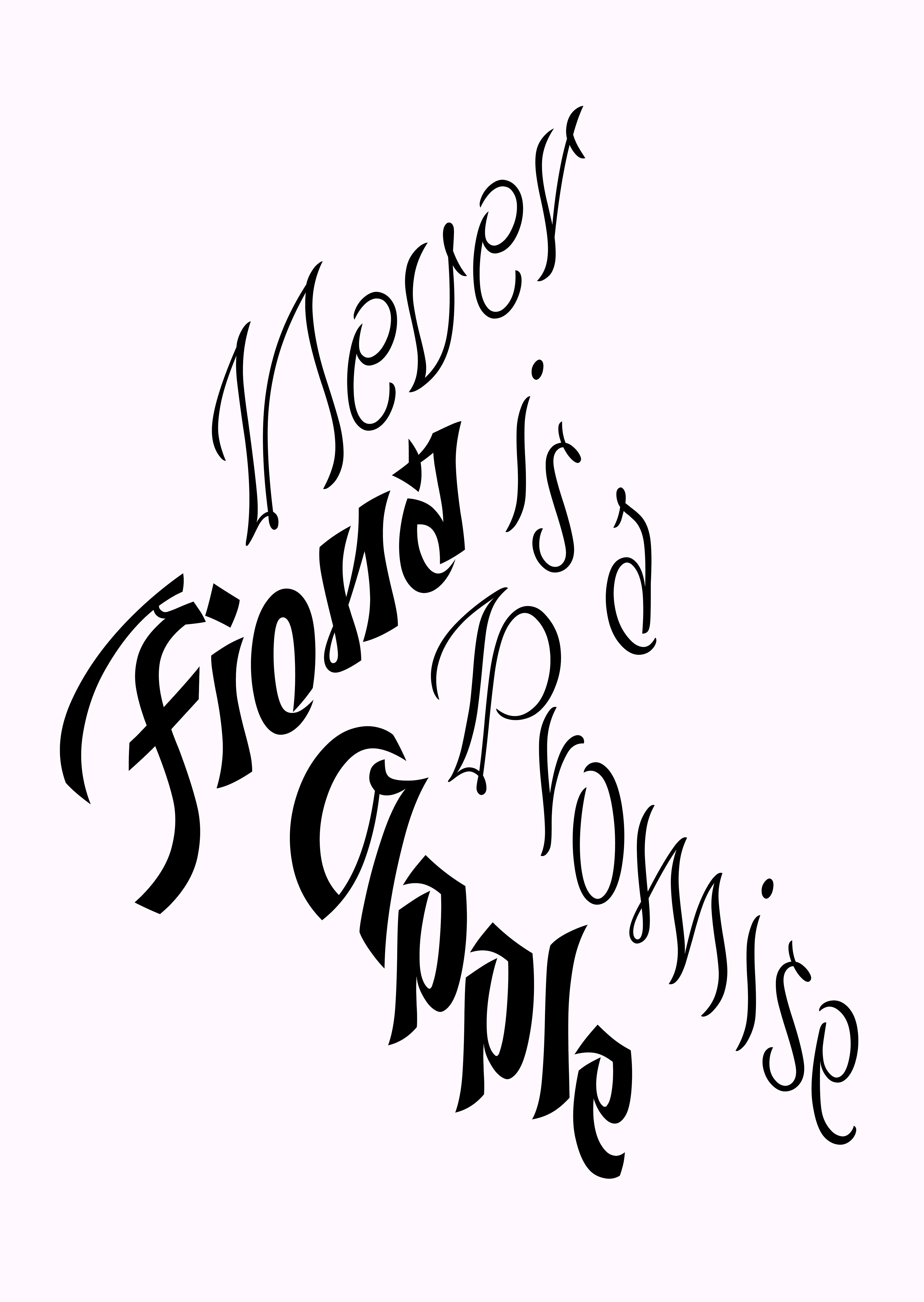
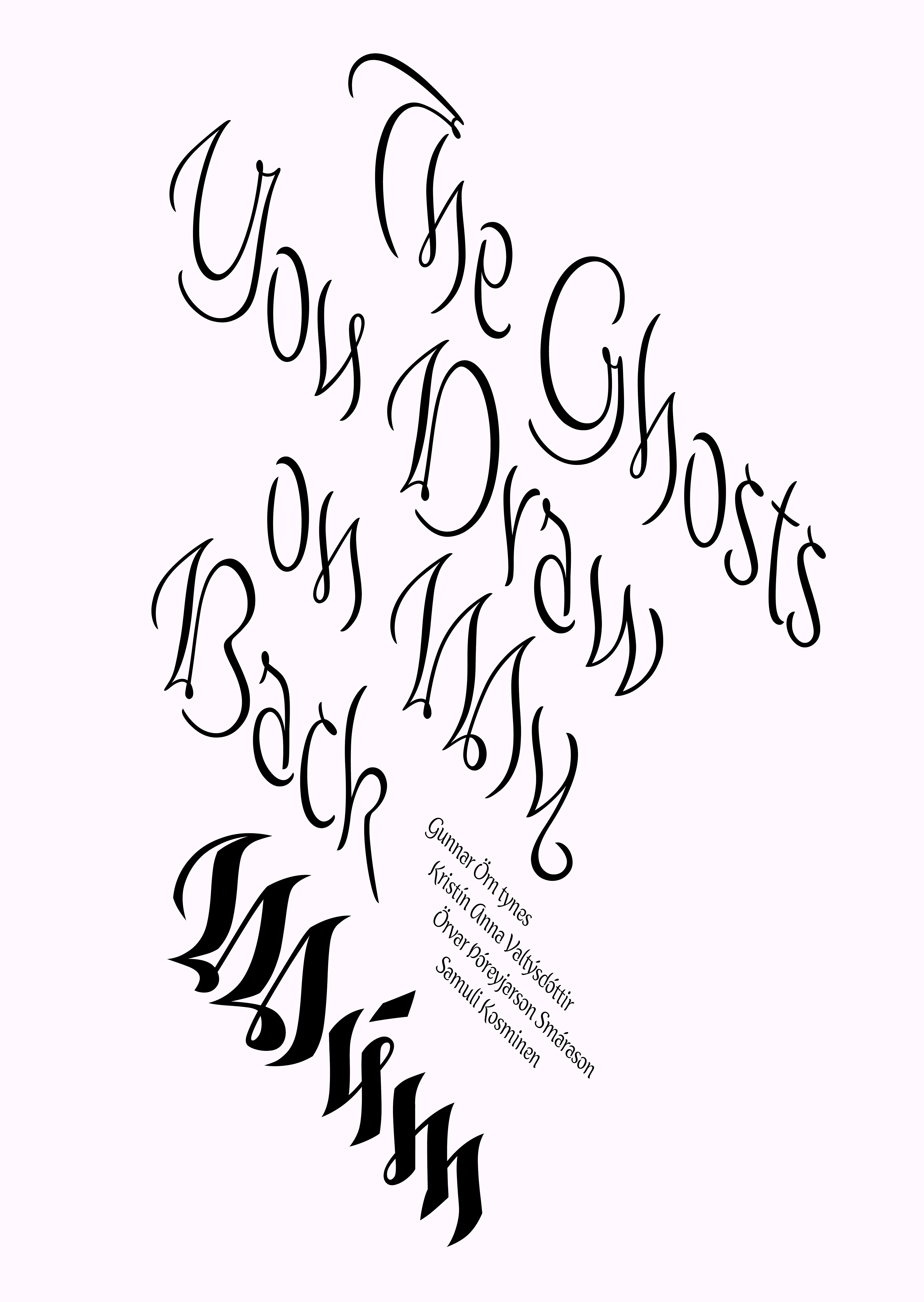
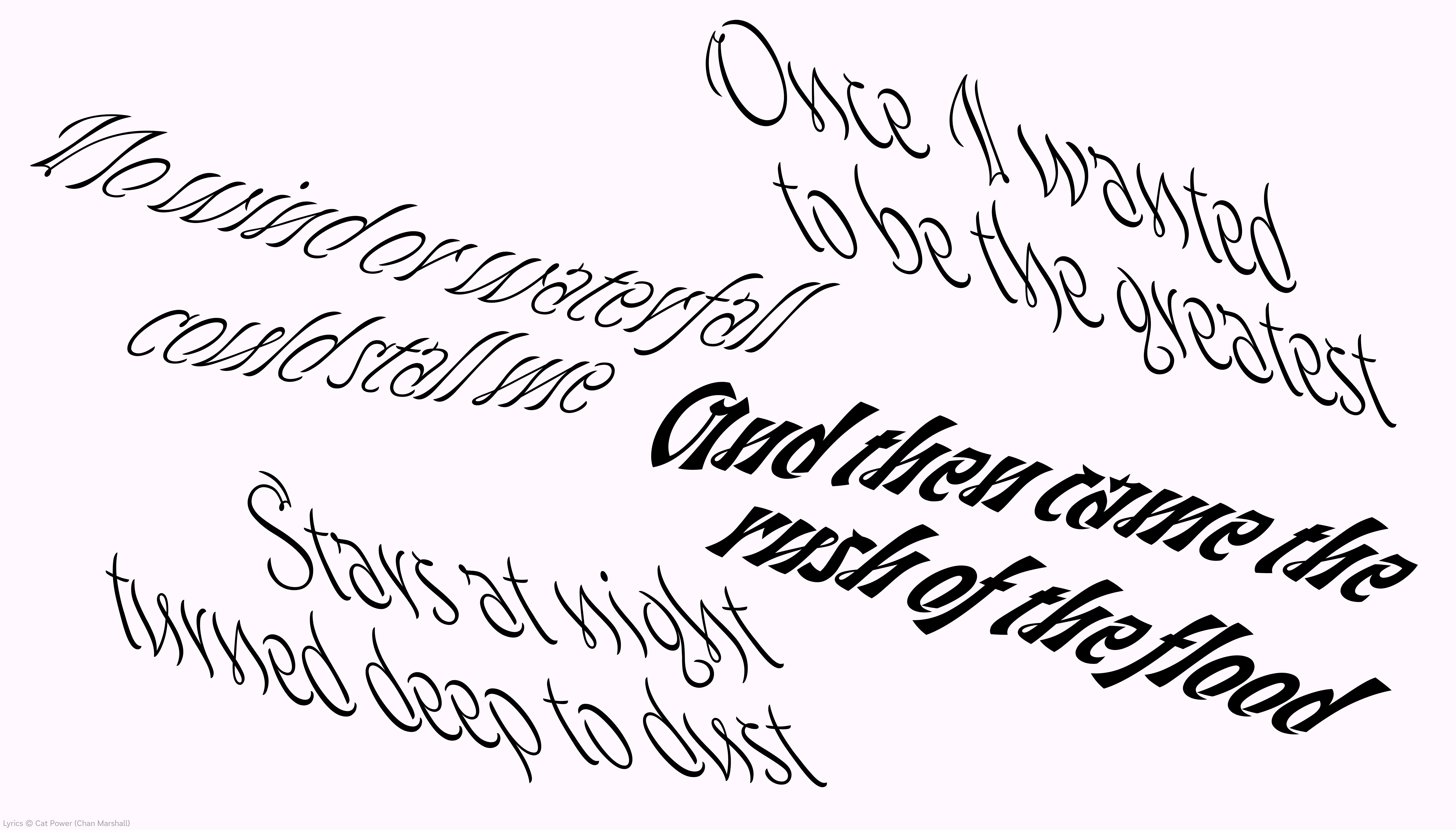
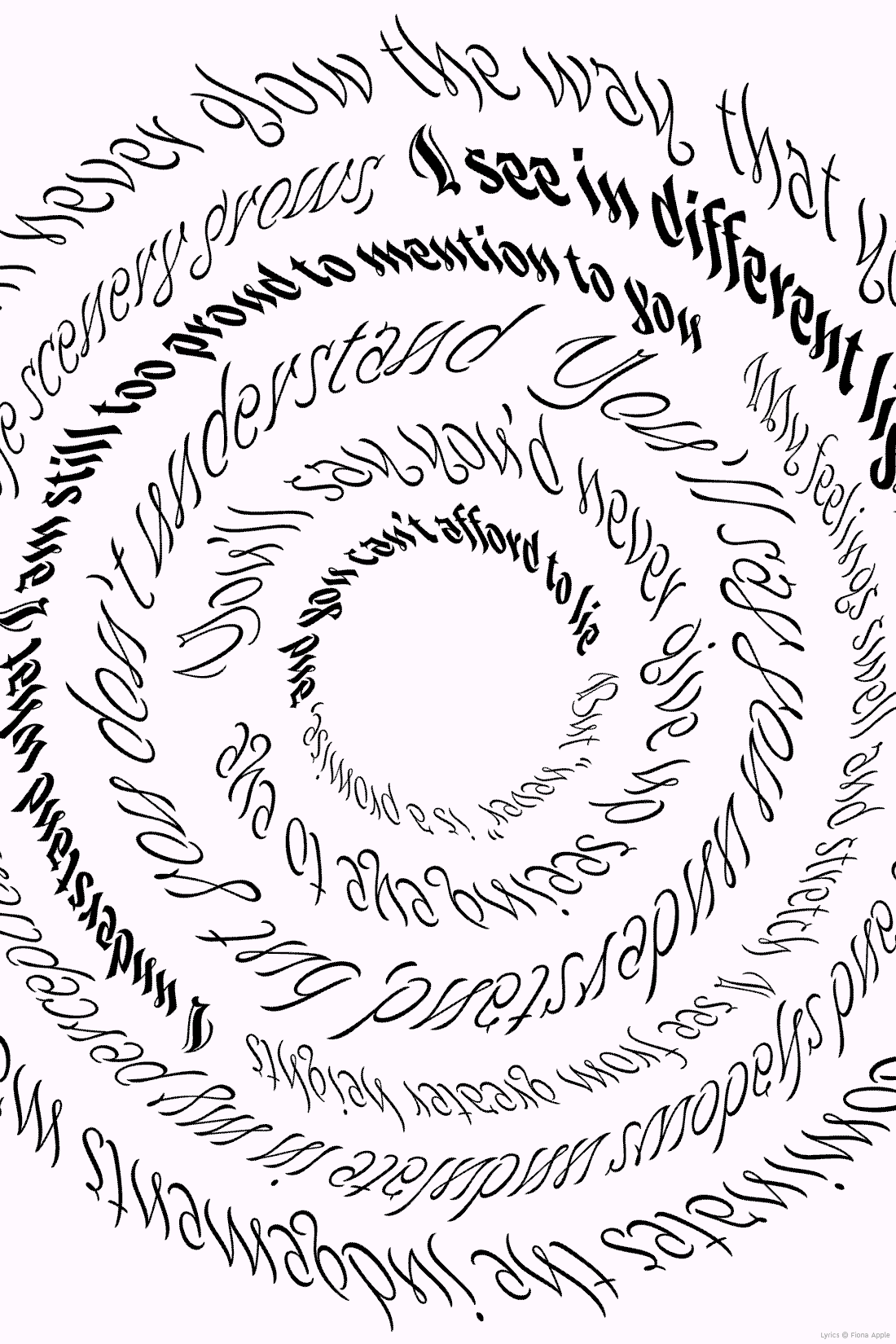
Due to the extreme angle of the forward and reverse italics, Antiphony is suitable for setting type at 45° in either direction. Additionally, the fluid nature of the design allows the type to be set naturally on curved paths.
Hi, I’m Betsy (they/he), a type designer from the USA. After graduating from College for Creative Studies in Detroit, Michigan, I completed the Type@Cooper Extended Program before studying at TypeMedia. I enjoy creating expressive work inspired by the art and people I love.
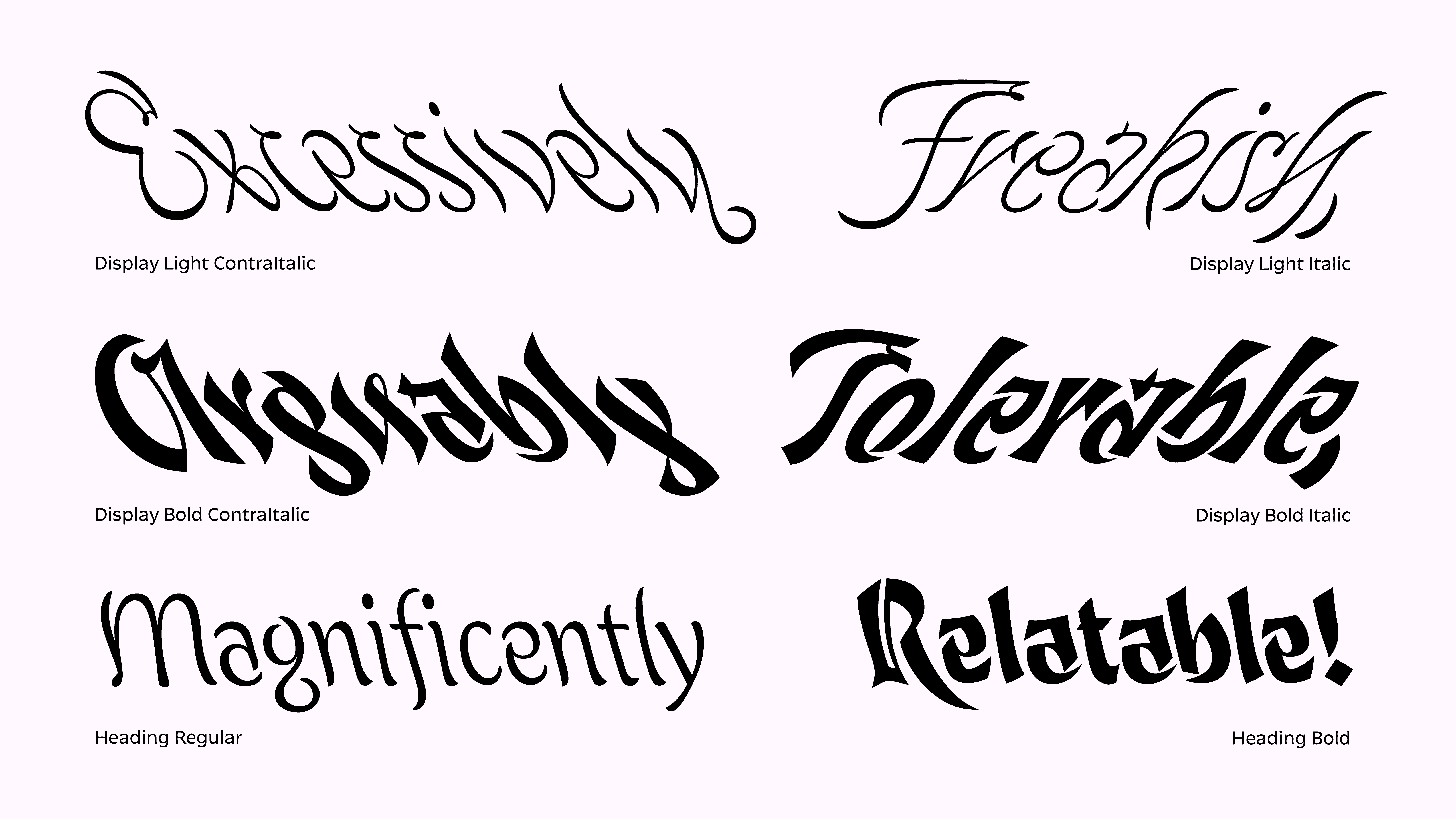
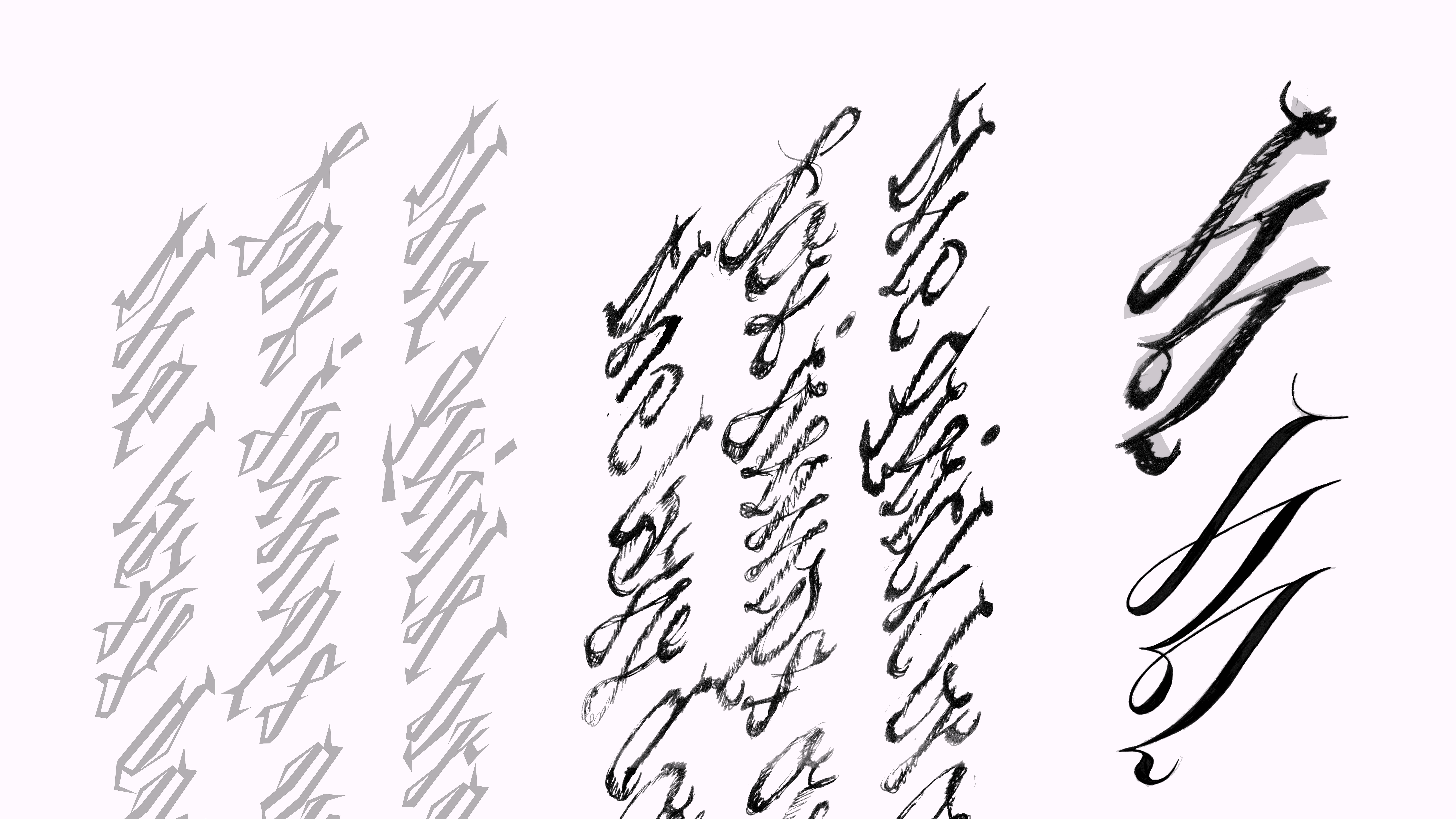
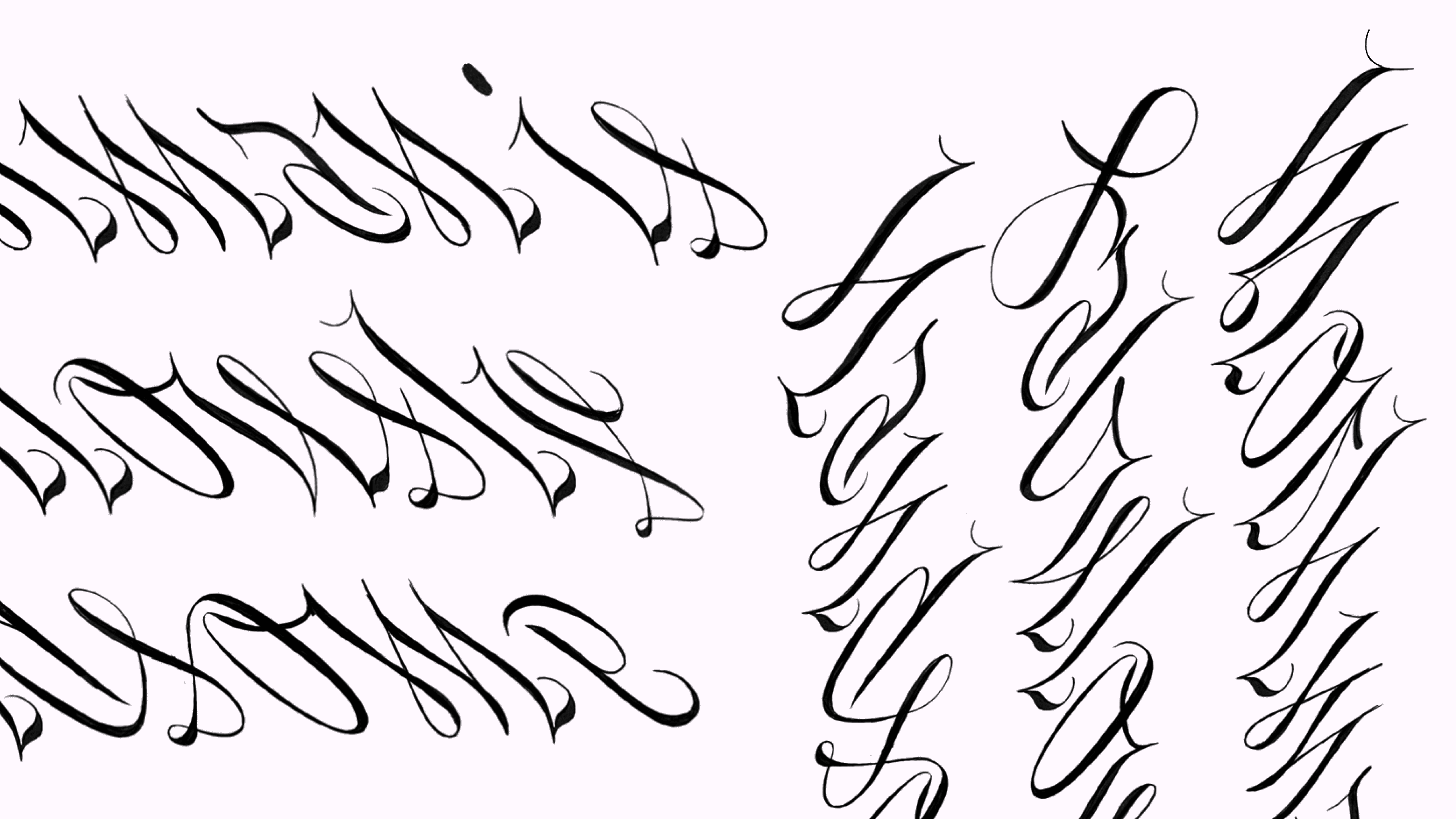
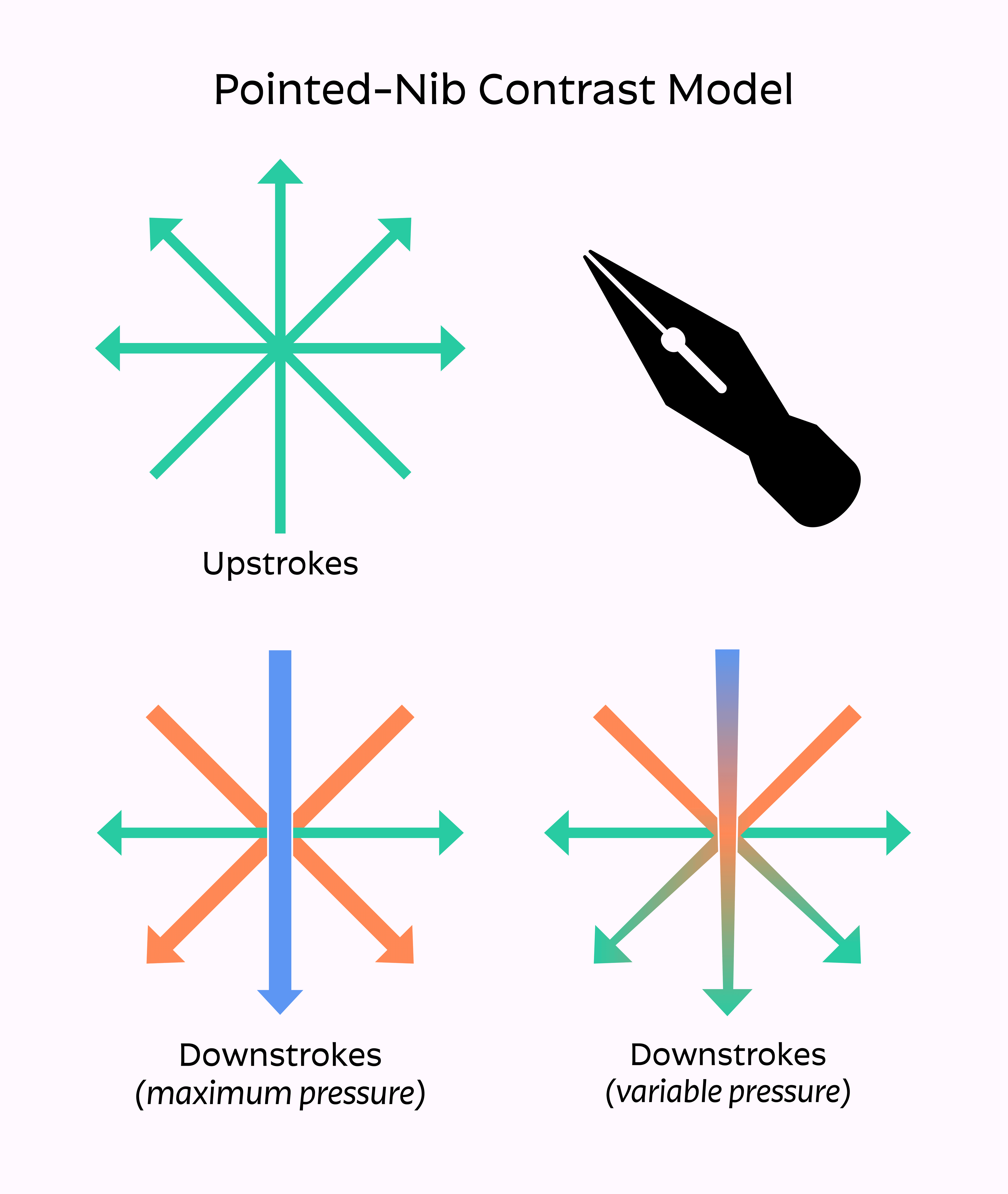
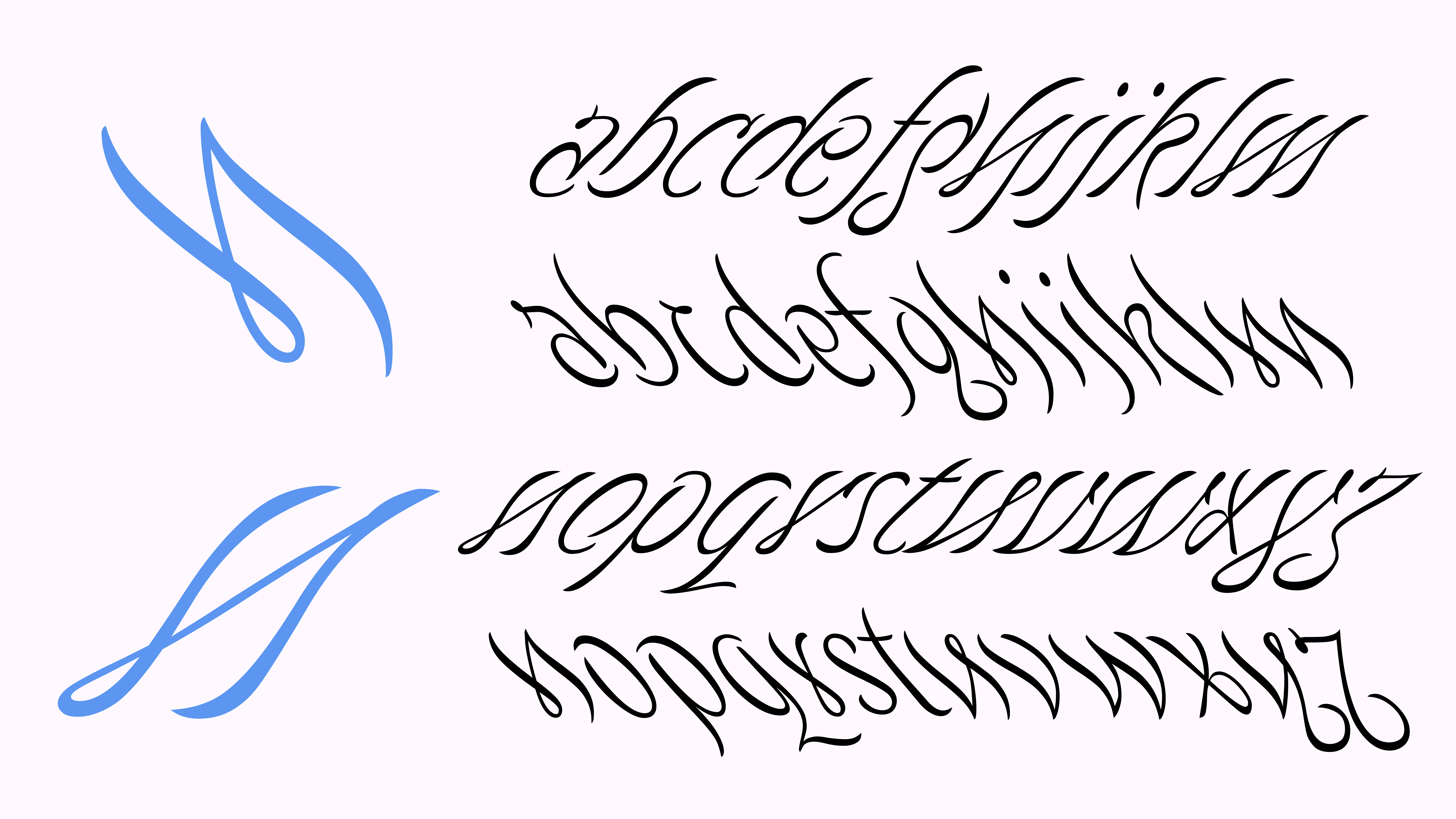
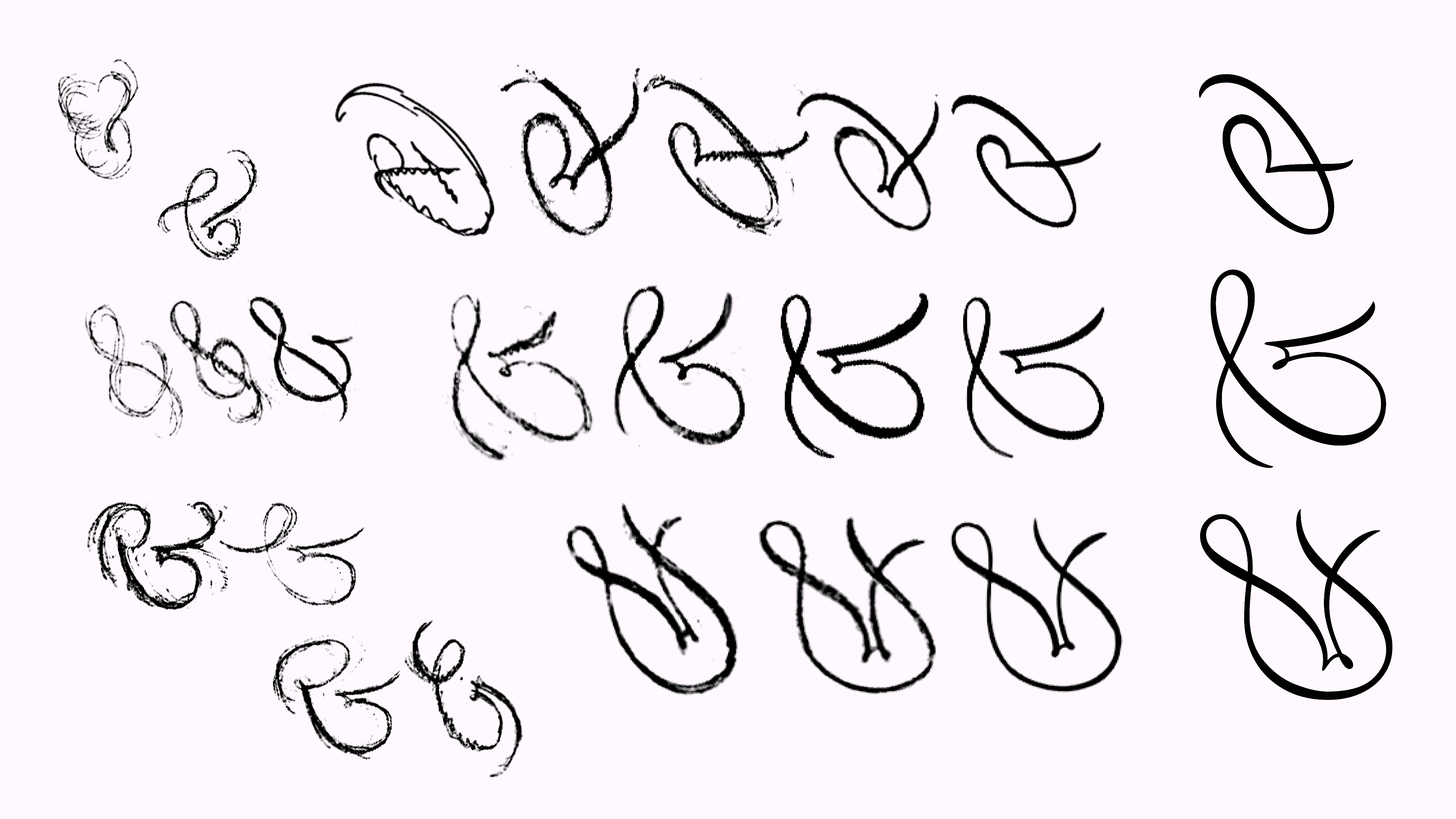
Antiphony is an exercise in extremity, excess, and developing continuity through opposing styles. I create oppositions through multiple vectors: contrast, italic slant, and tool influence. The process involved a lot of trial and error; finding the most extreme versions I could make, then molding them into a cohesive system.
I didn’t have an intended use-case for the typeface in mind when I began. This is different from a more traditional approach, which is to choose an application at the start, and make decisions along the way to achieve optimal results for that application. By having a more explorative mindset, I was able to discover the ways that Antiphony could be used and develop the design alongside those discoveries.
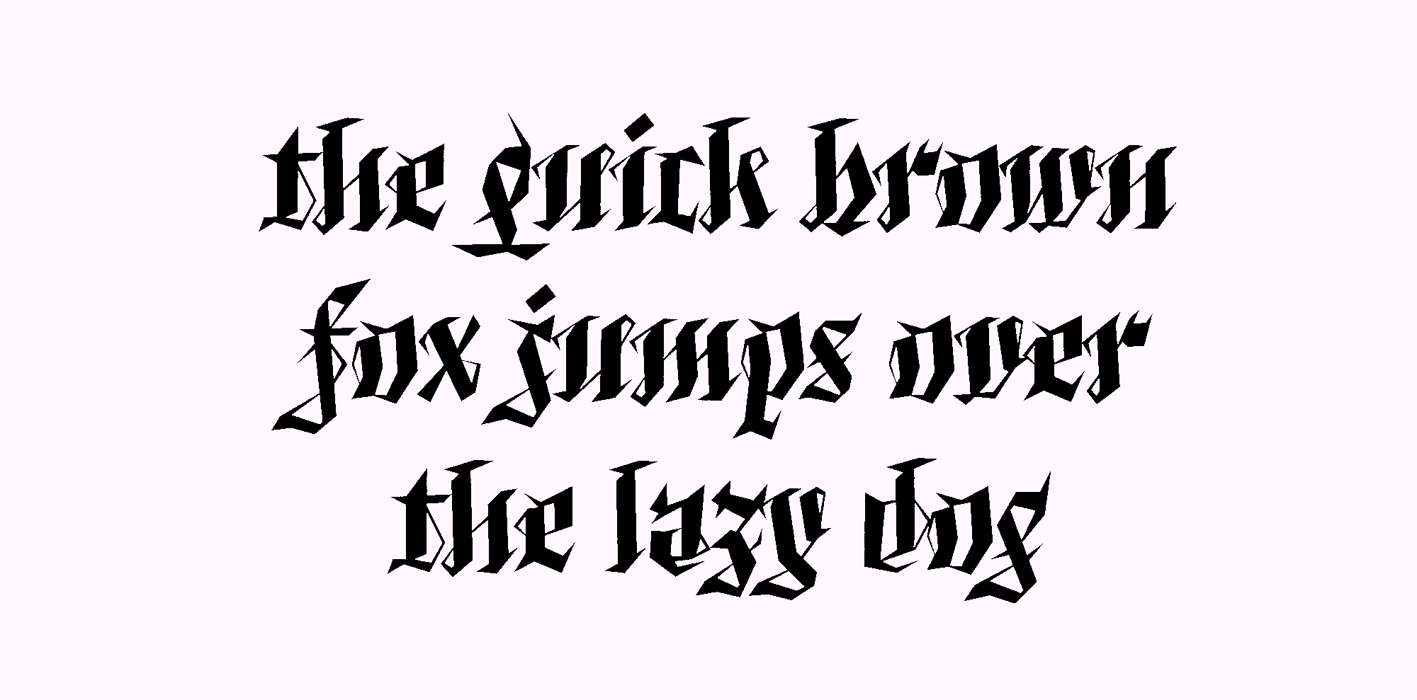
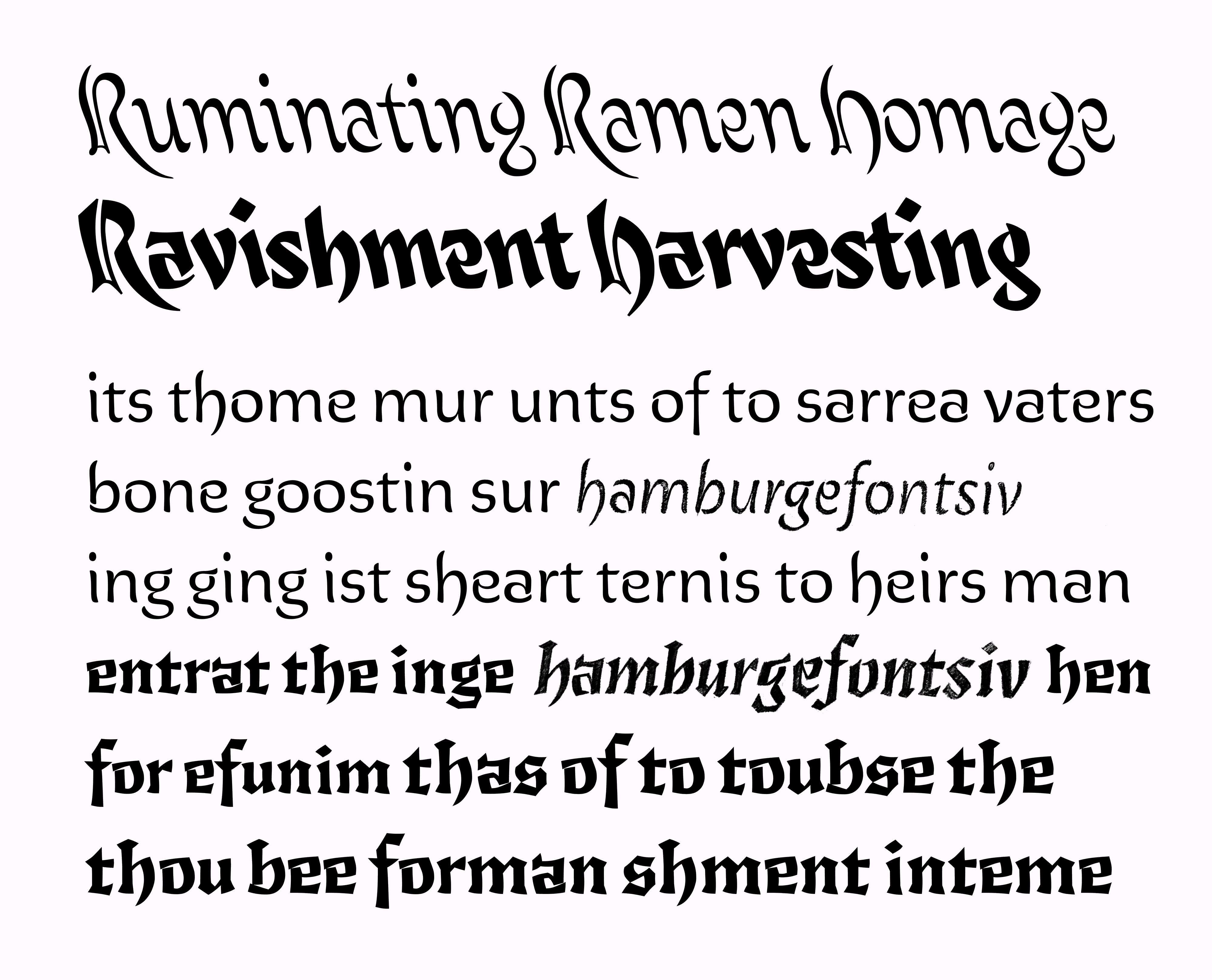
The word Antiphony describes music that is sung, recited, or played alternately by two groups, usually in church music. My project is all about opposition, so I felt that the name fit pretty well. For the specimen, I wanted to see how I could create dimensionality with the styles and utilize its fluid qualities to set lyrics and poetry.
If you’re interested in hearing more, I was a guest on the Chicago Graphic Design Club’s podcast, where I talk about myself, Antiphony, and my process.
Thank you for reading, and please reach out if you’d like to talk type!
–Betsy