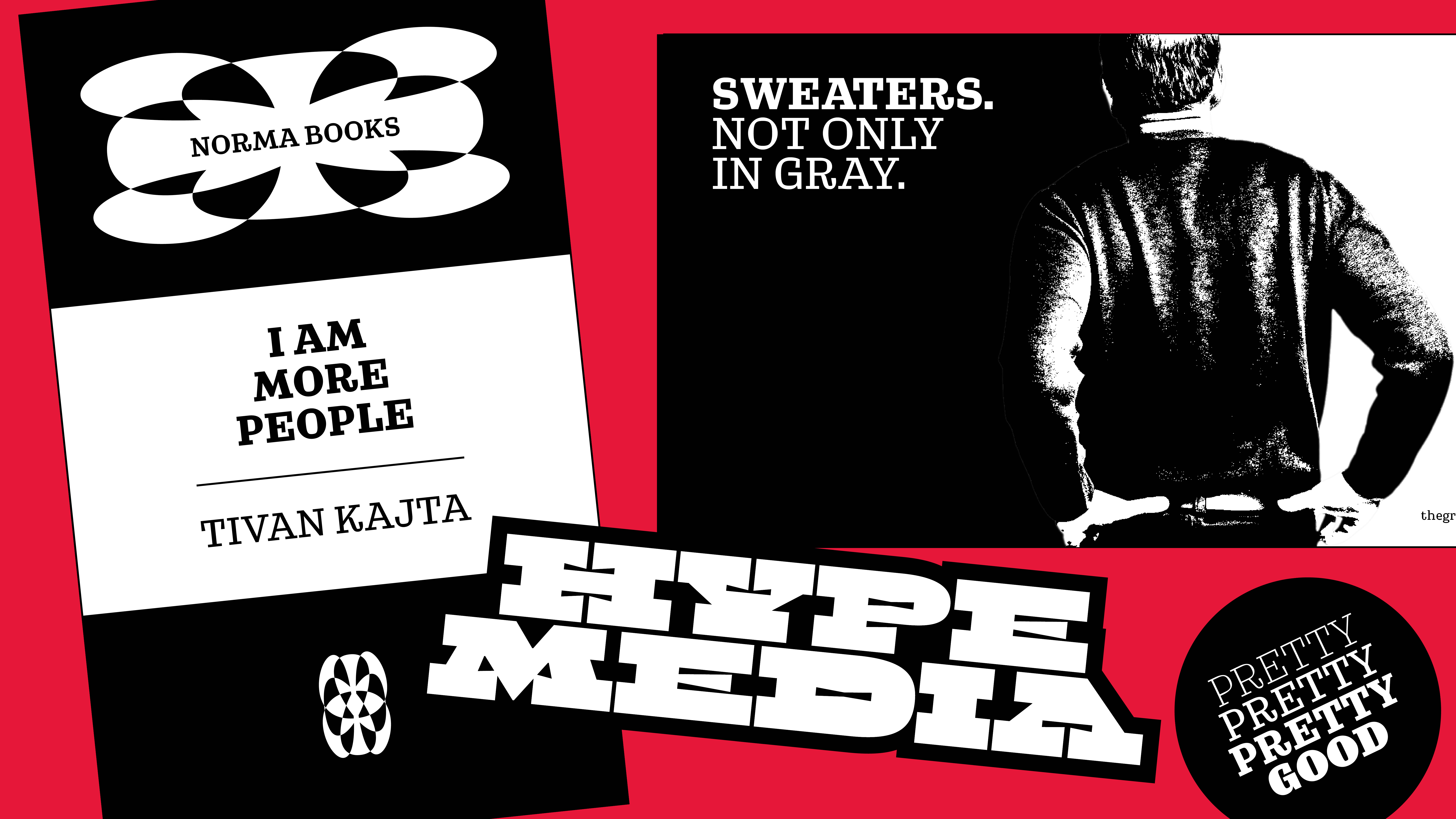
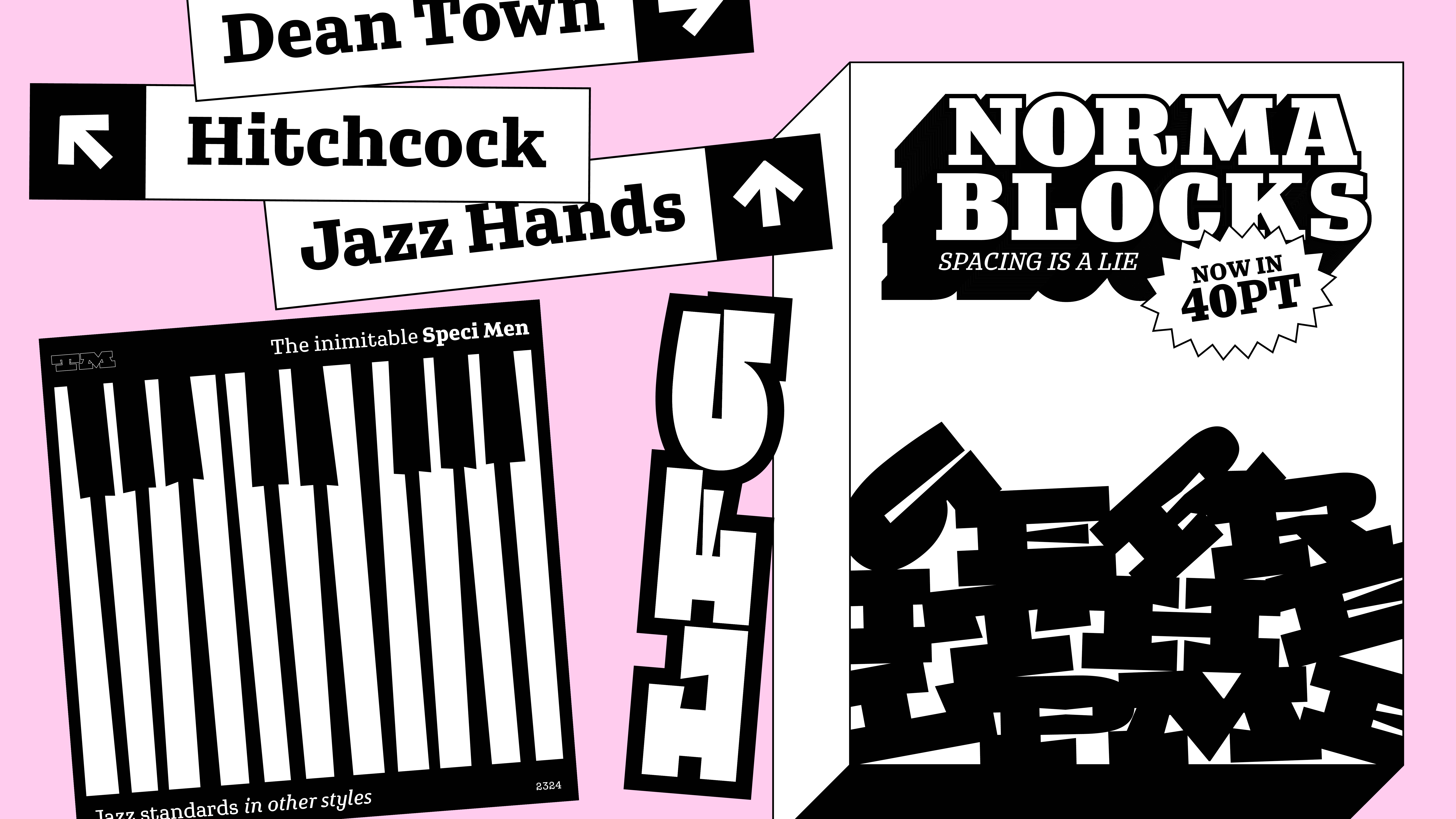
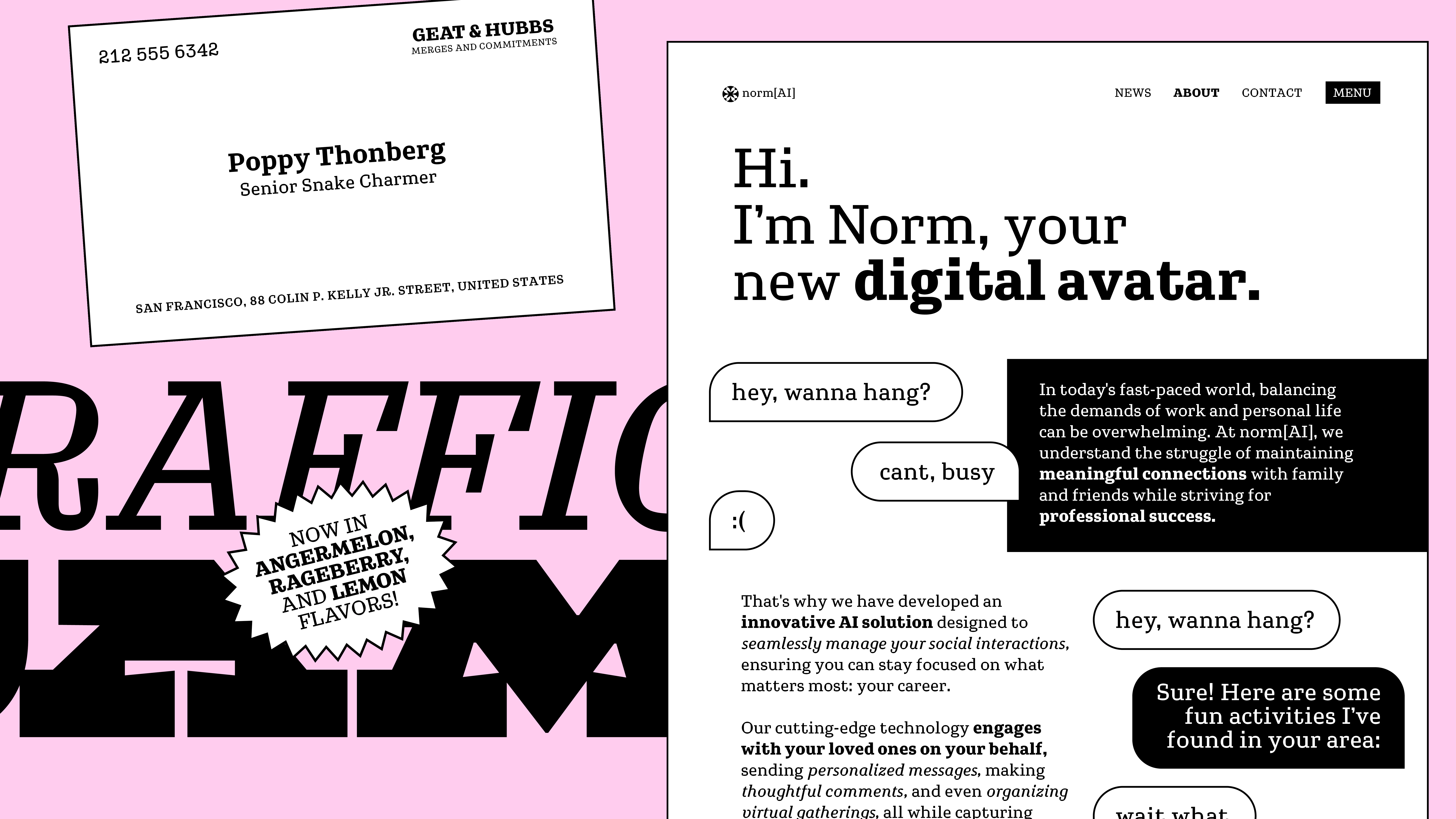
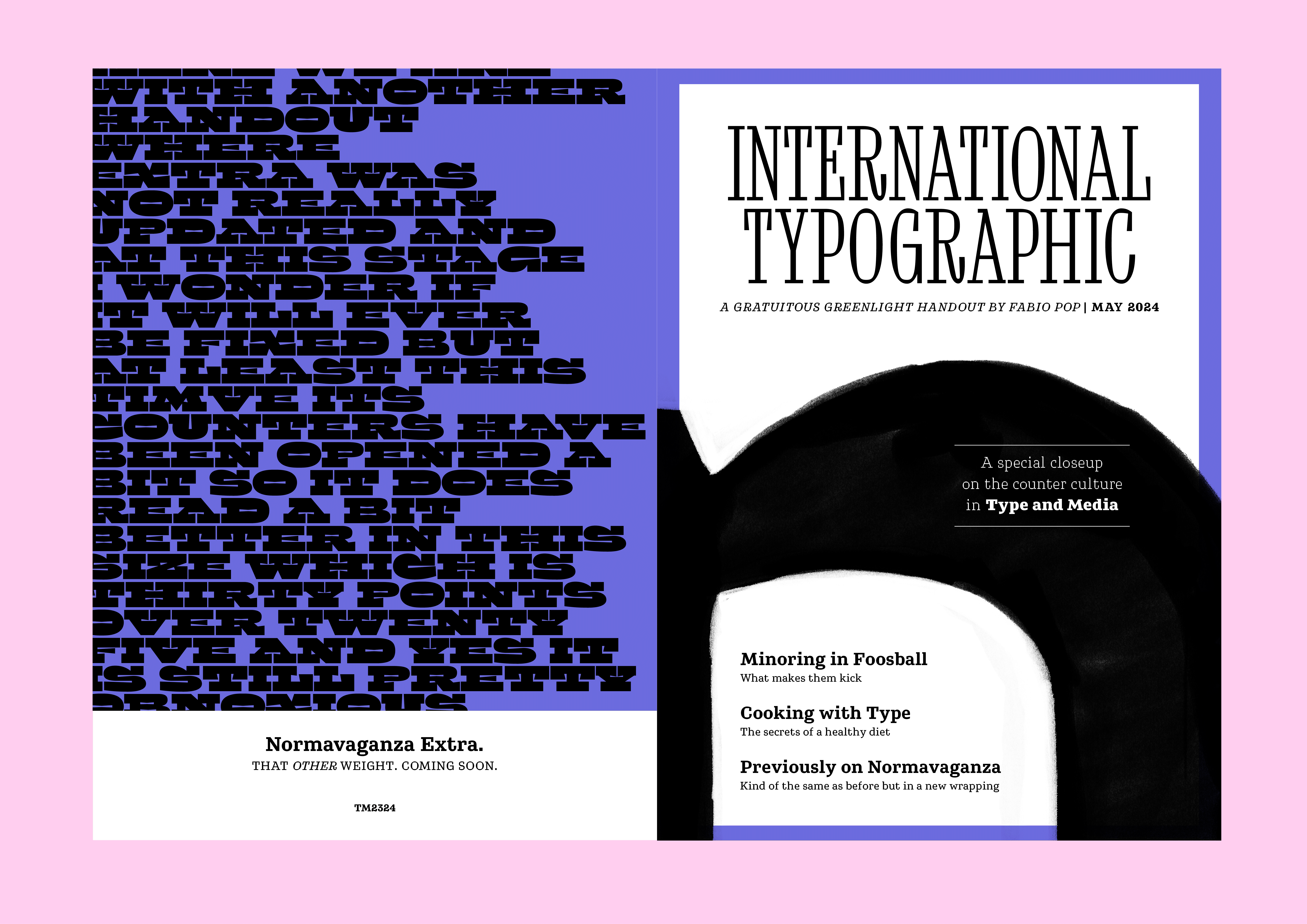
Normavaganza – the culmination of a semester’s worth of feedbacks received, lessons learned, darlings brutally murdered, and games of foosball lost – is all about double contrast and its inherent contradictions. Or is it?
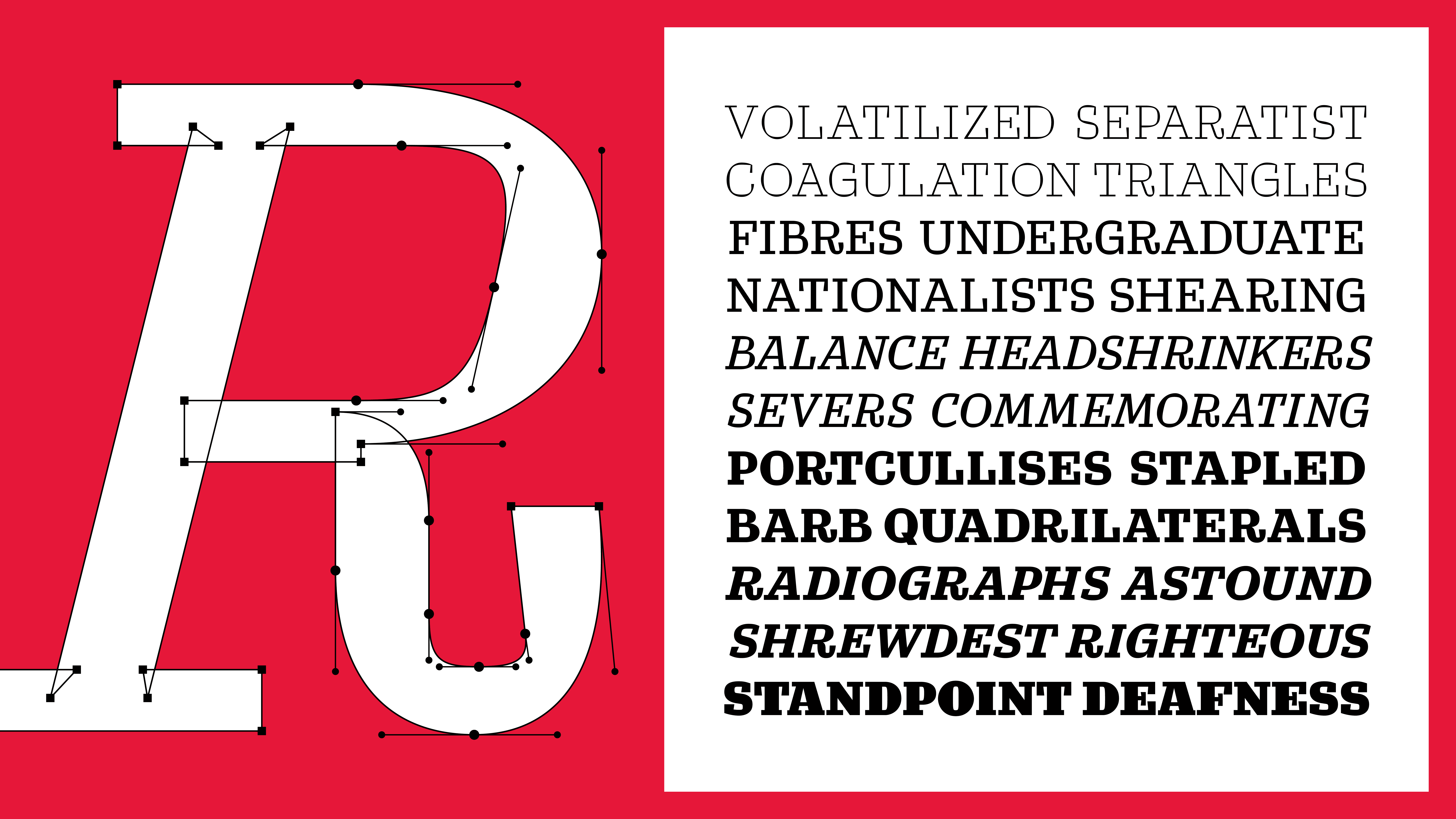
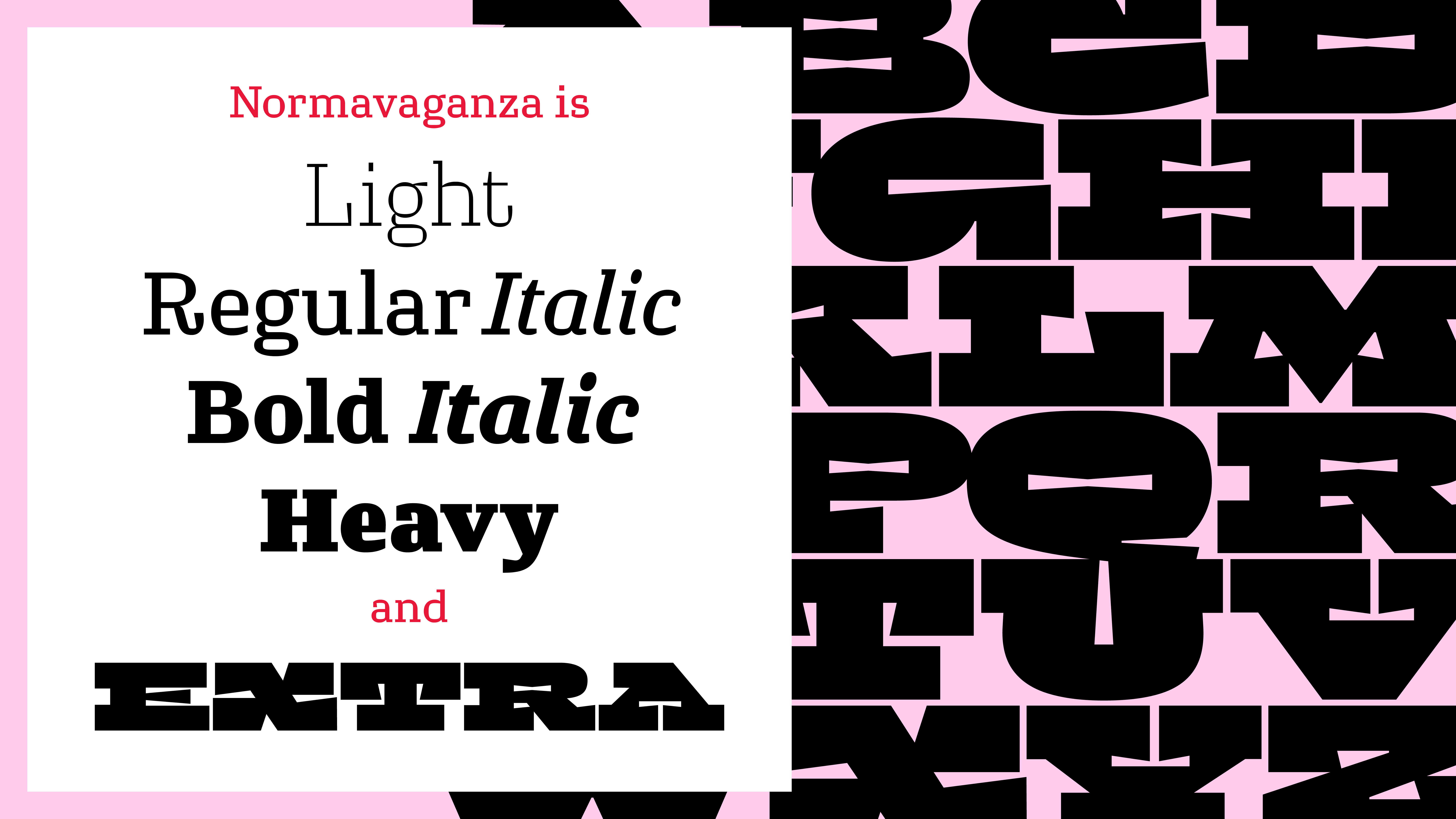
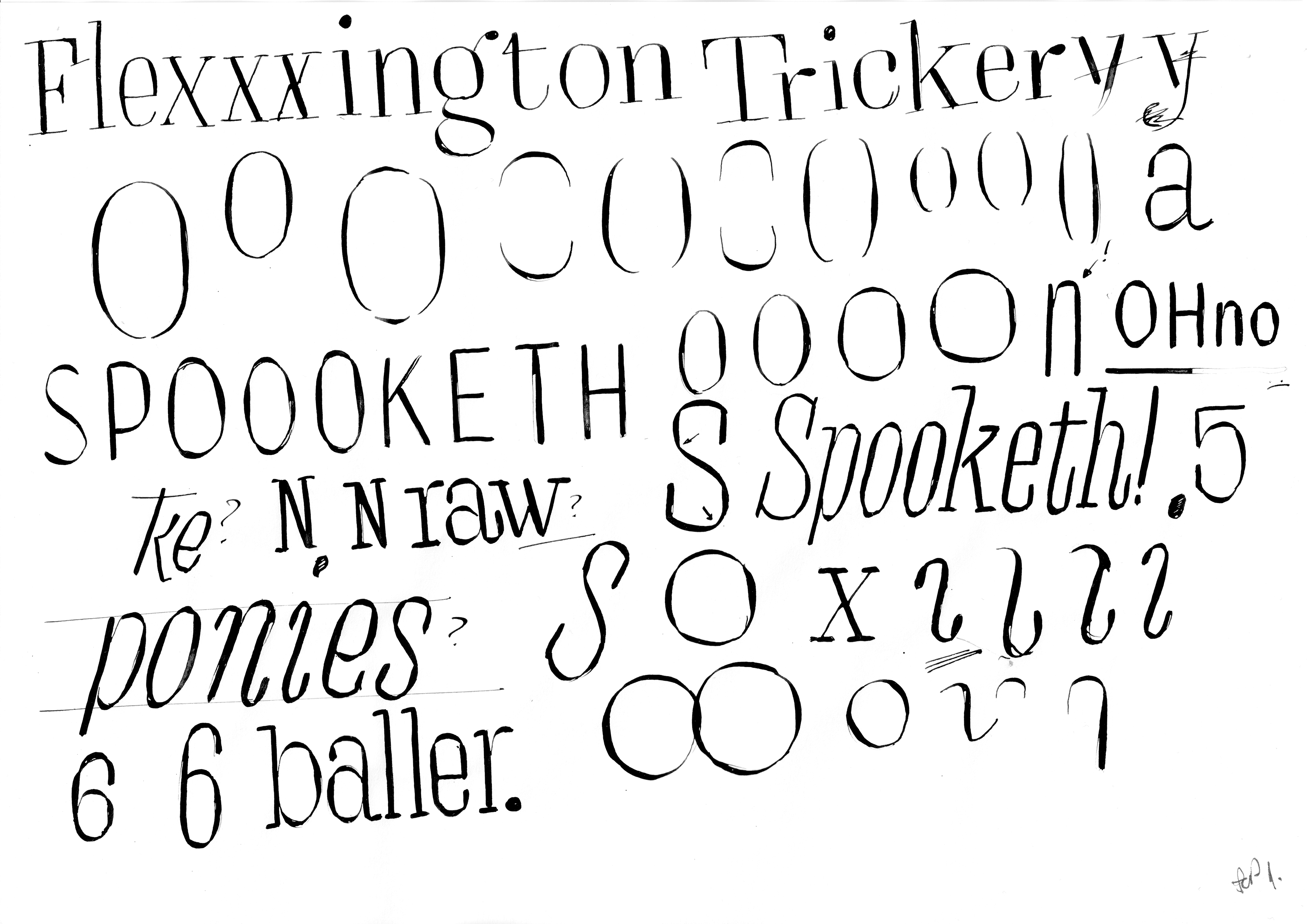
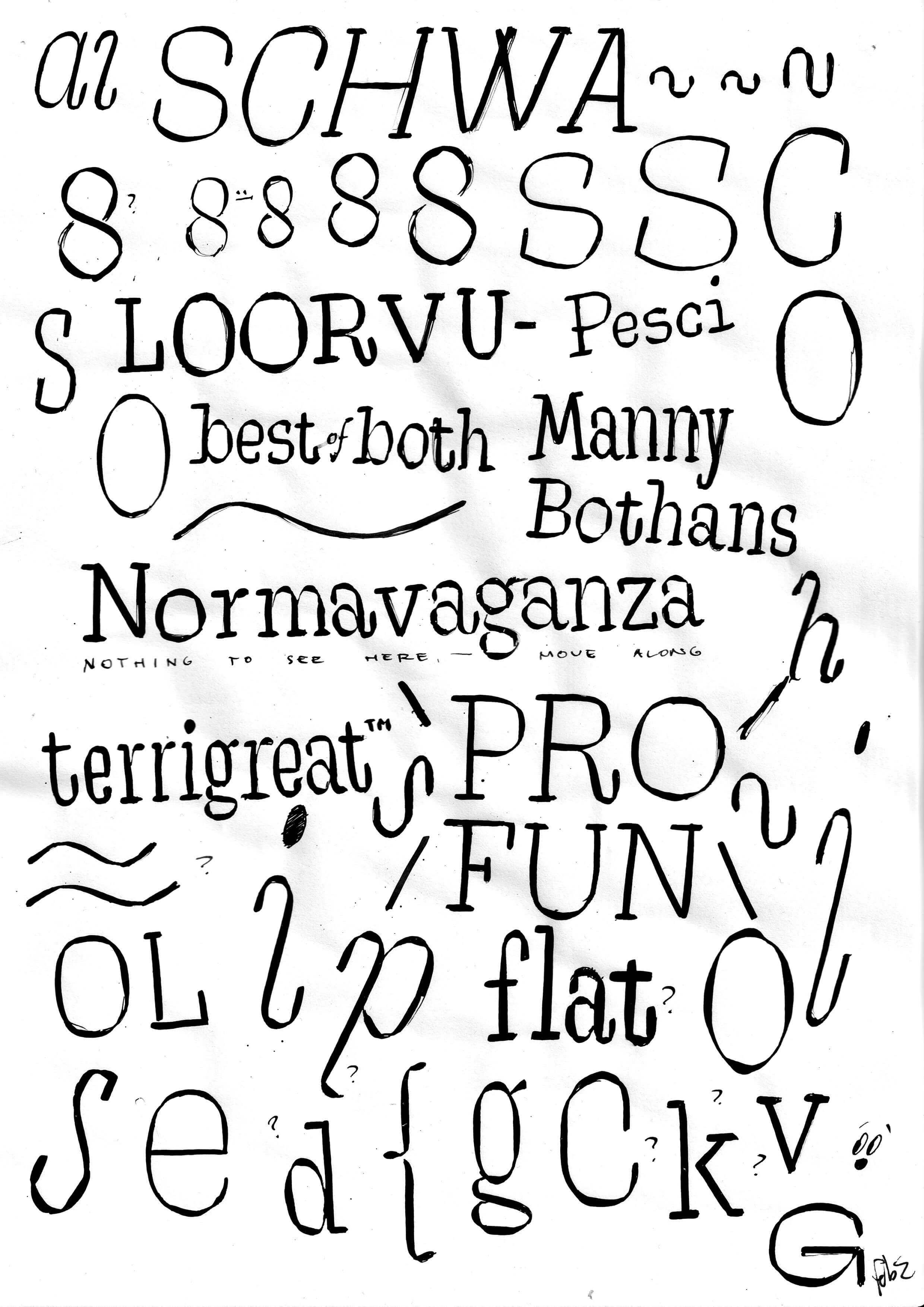
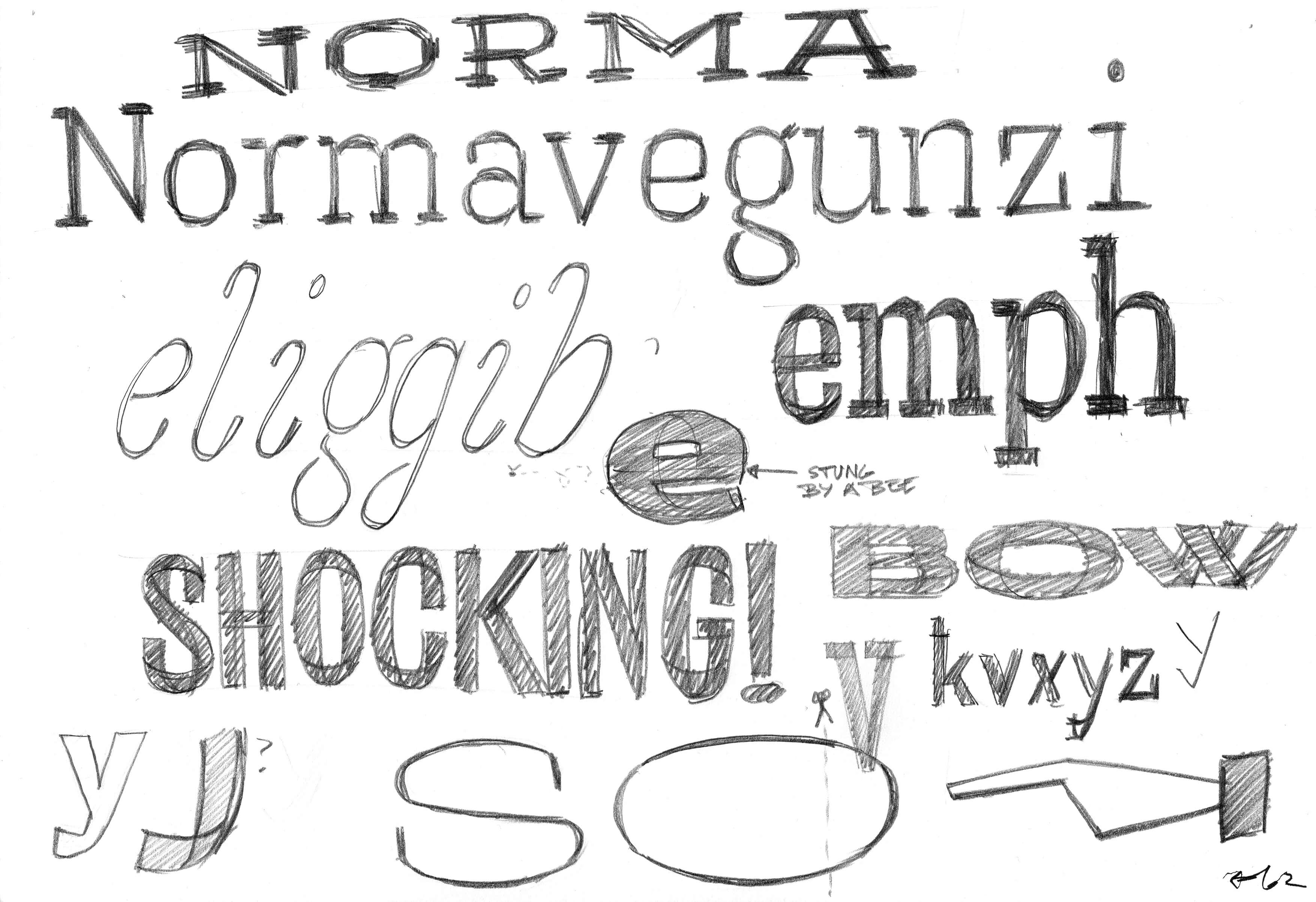
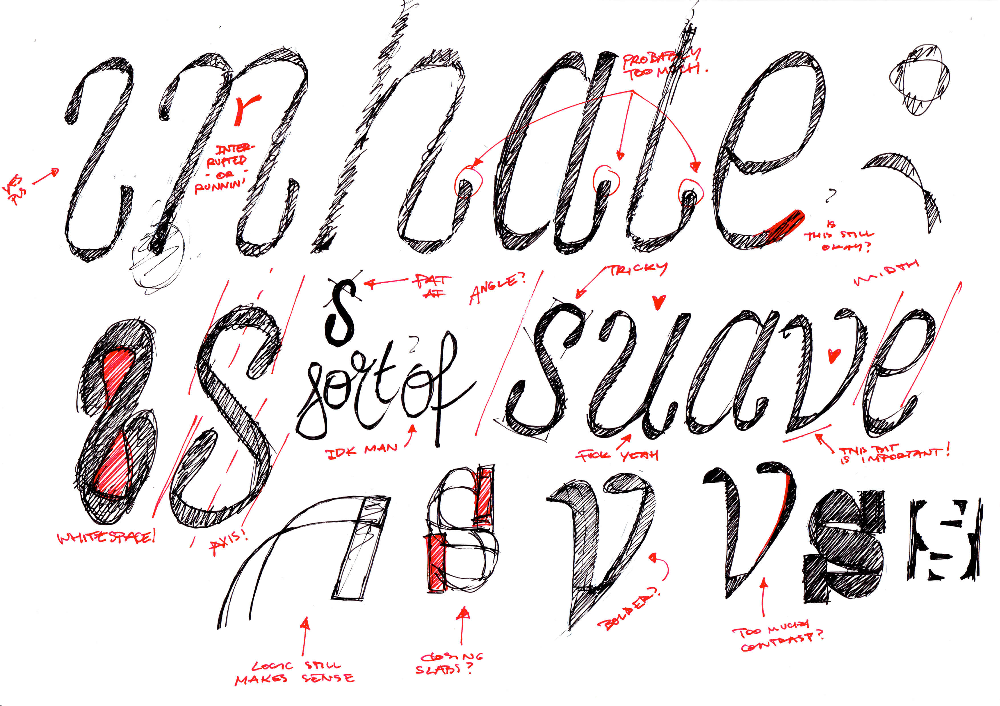
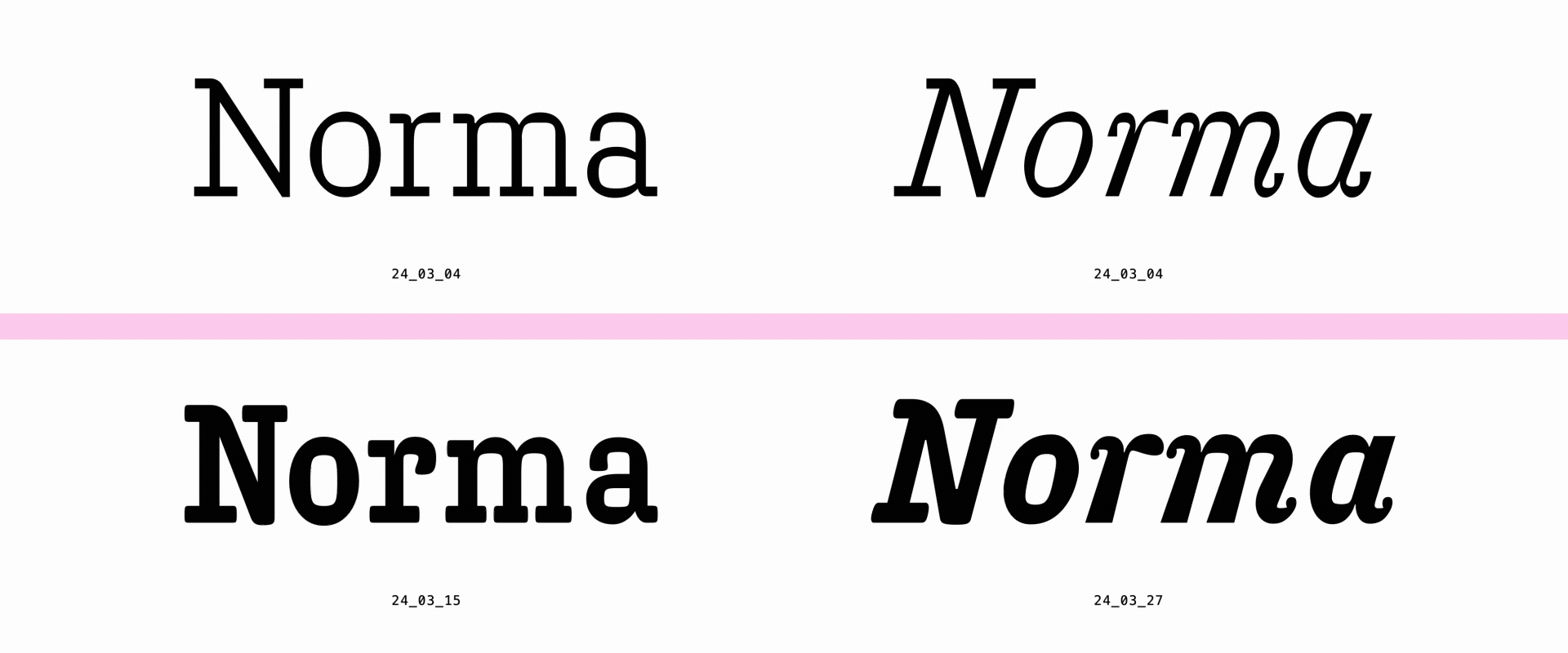
A result of playing around with the pointed nib pen, this type of contrast comes from superimposing both regular and reverse contrasts, yielding simultaneous vertical and horizontal stress to letterforms – with a very distinct superelliptical counter shape and a whole lot of flavor.
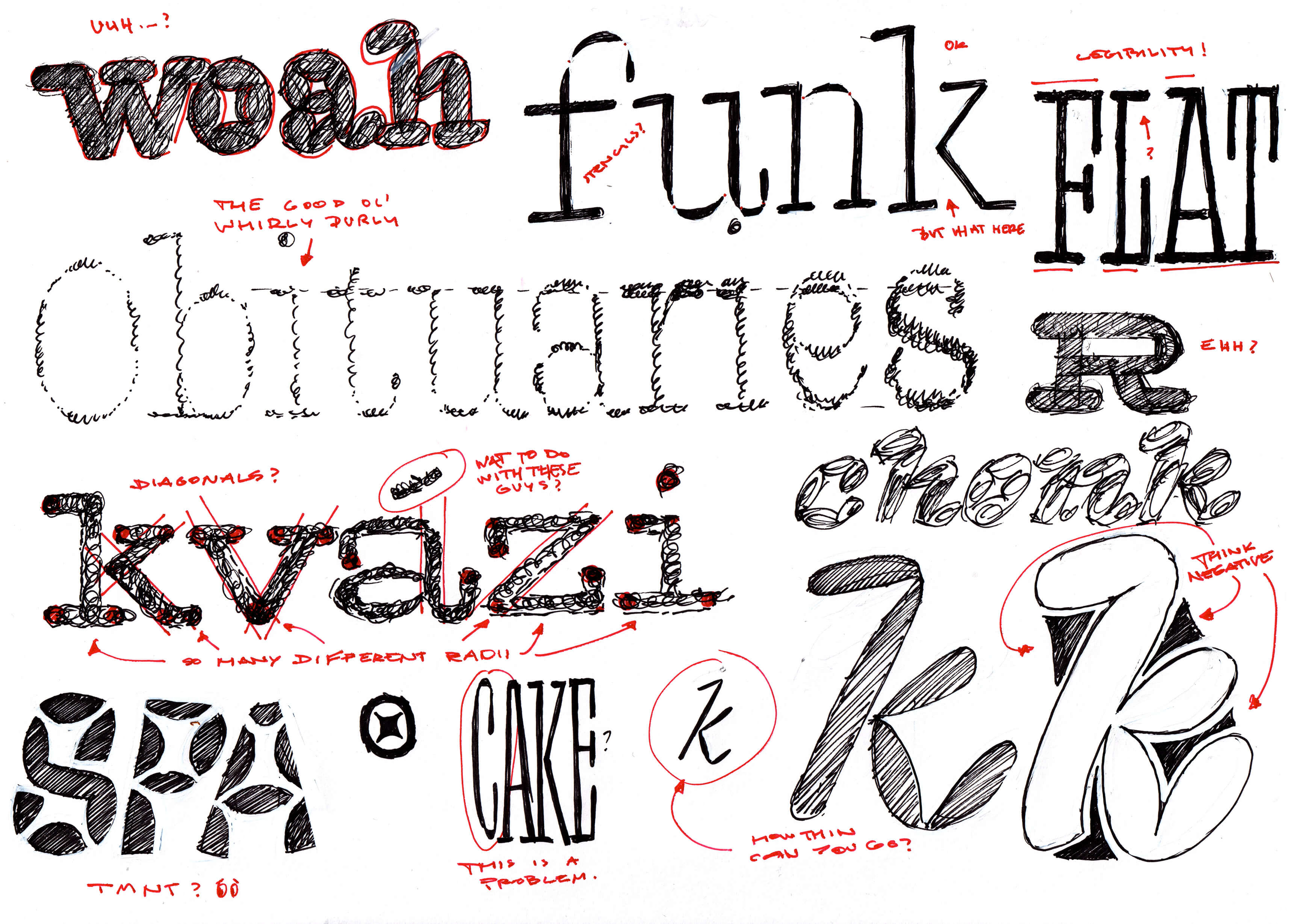
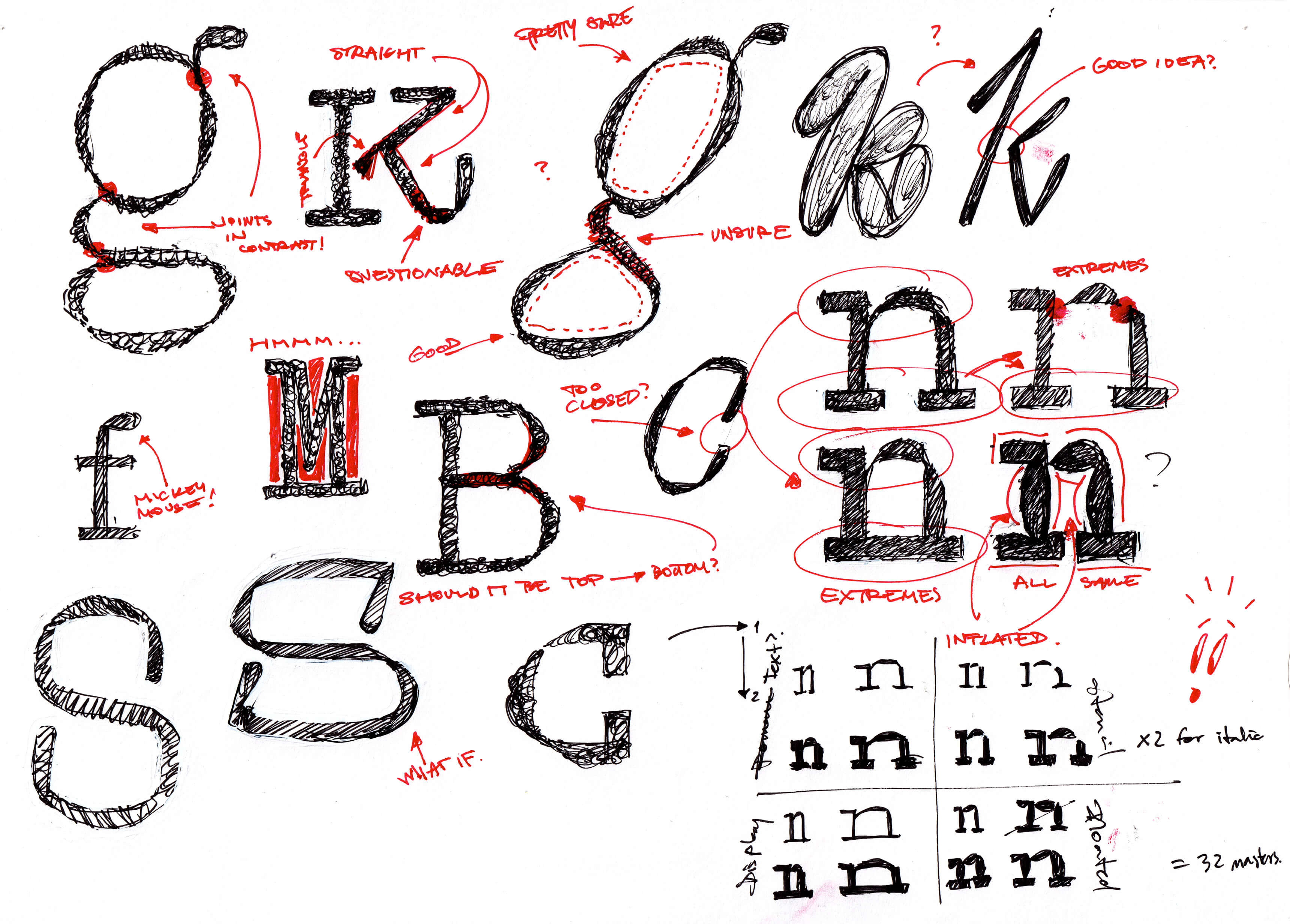
Which is all relevant and true, but ask Fabio and he’ll tell you it’s the process itself what the project was really about. Having some rules do set the stage for experimentation and a lot of fun to be had – but digging deep was much more interesting than going wide, focusing on one idea from the kick-off to the final presentation, learning how to observe and improve along the way, which is ultimately what the work is all about.
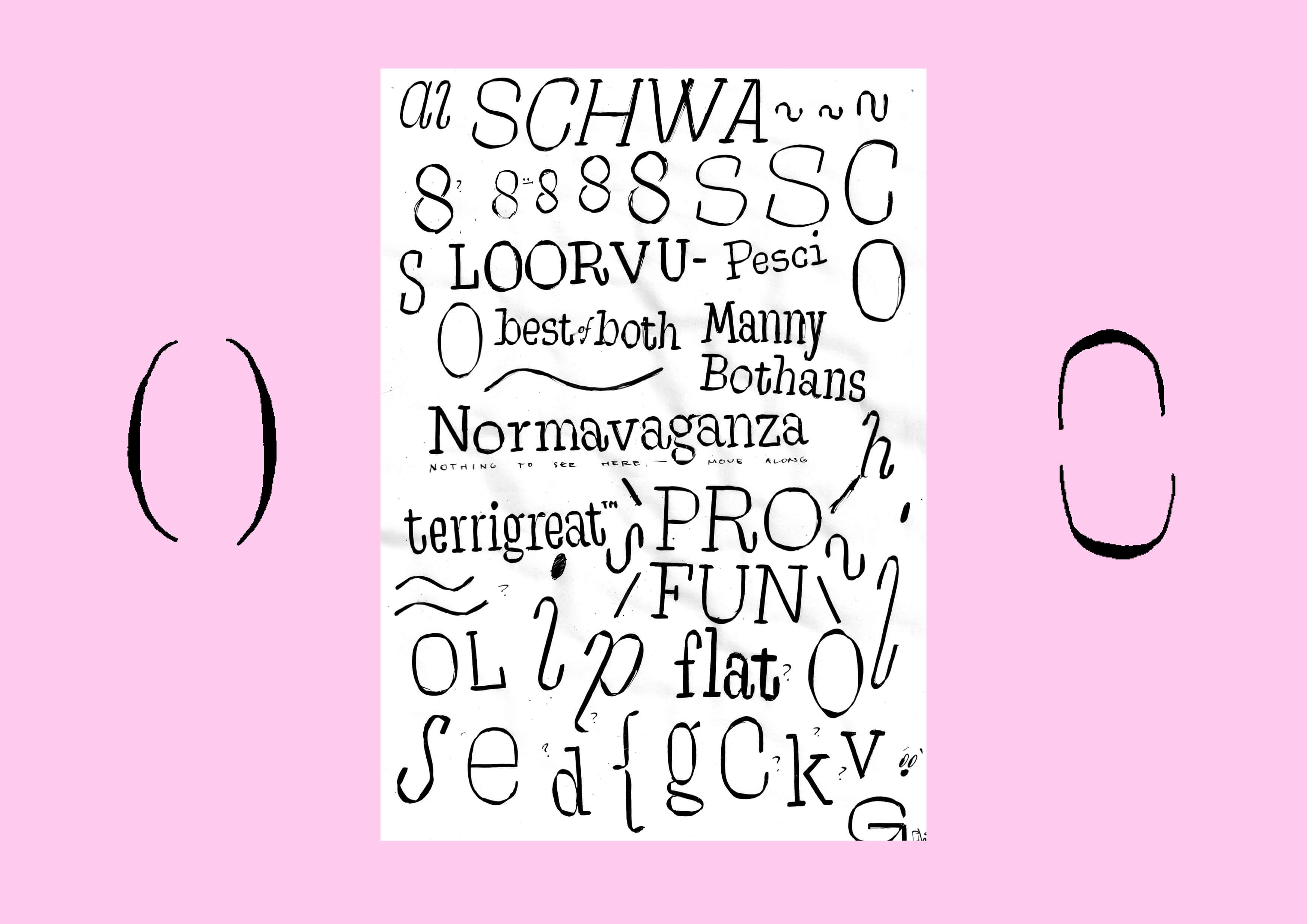
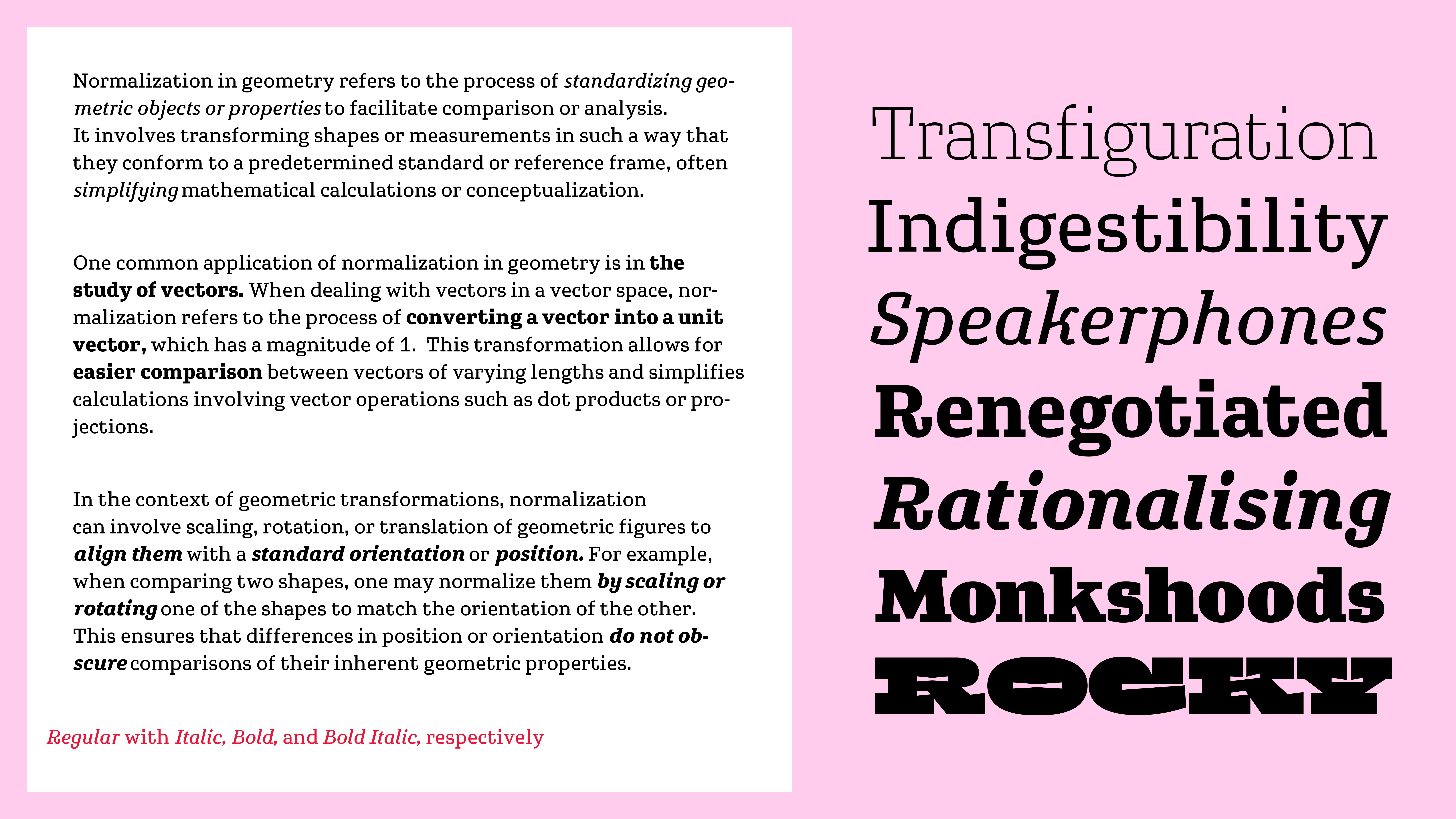
The funny thing about emphasising both verticals and horizontals is that they end up canceling each other – which is what gave the project its name, referring to both normalization and also to something being both exciting and bland at the same time.
Having accepted the fact that the family will not be finished, Fabio concentrated on fitting what’s possible within the timeline and treating the graduation deadline as more of a snapshot of where things were at that time. This was not only a great exercise in project management and design – but it also reduced the pressure to deliver something perfect & definite.
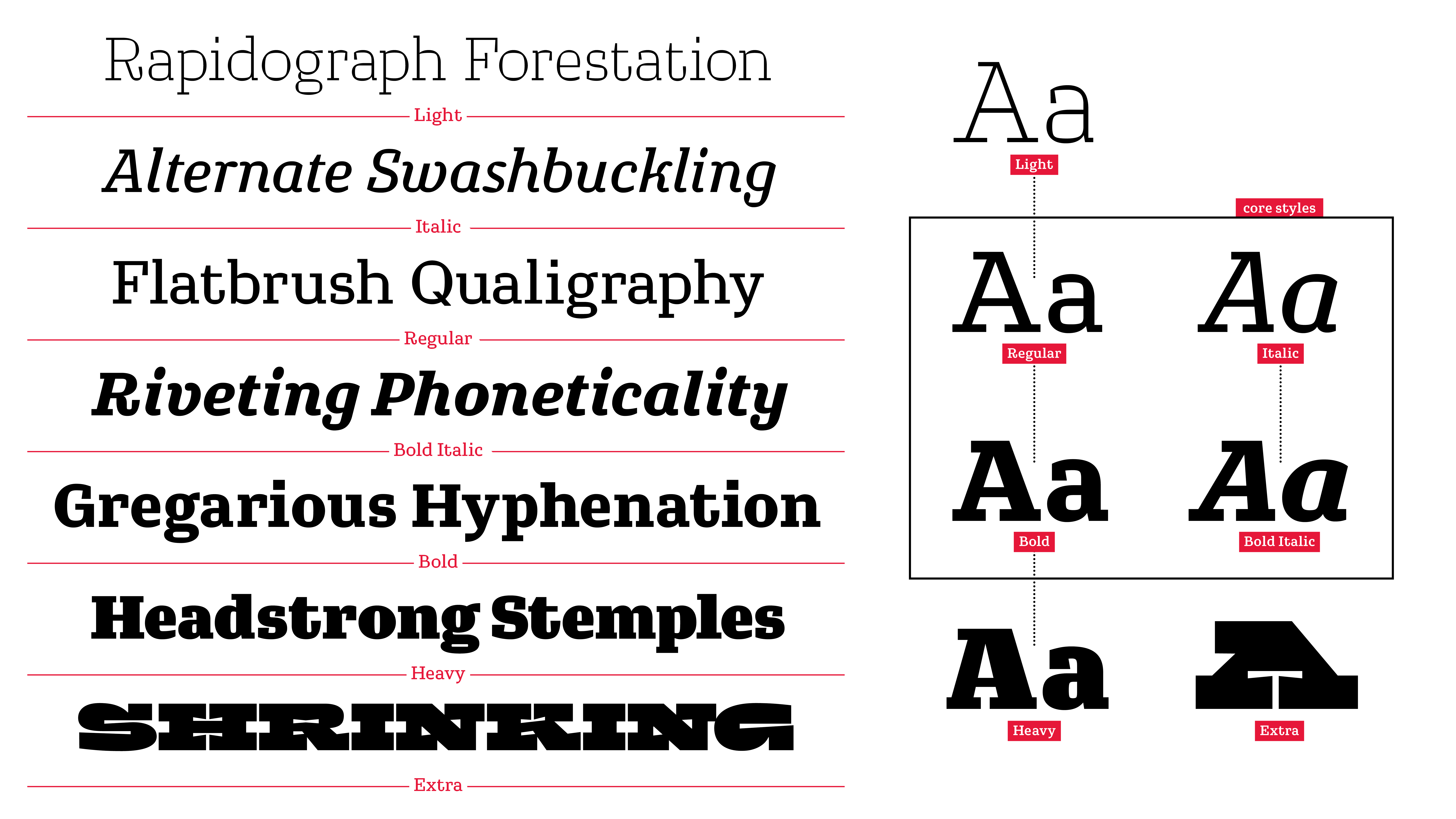
The project at the time consisted of seven sources in total. Four of them are upright, two are italic, and there’s a companion called Extra just to make things more interesting. Regular and Italic being the main focus, the rest of the family have all been derived from these styles both through inter- and extrapolation. This does not cover everything possible within the designspace, but having the luxury to spend so much time with them does provide a solid foundation moving forward – both with this and future projects alike.